I’m probably going to date myself here, but I remember the days when it was a big deal to have a website that used a font other than Arial or any sort of color—let alone one that did anything as “fancy” like displaying galleries or videos. This was the time period where blink tags were one of the best ways to draw attention to text (if you were born after 2000, look them up) and animated gifs made their first major debut (and then died, and then came back to life stronger than ever).
The web has come a LONG way in the past several years.
This post is a bit random, but is the product of conversation Davey and I recently had about how different the web is from when we first started. After we were done, we thought it’d make a good blog post in case there’s anyone out there looking to shake things up on their website.
As always, we recommend adding new features with intentionality and considering the impact that they will actually have on your ideal client. For example, if background videos don’t make sense on your site, skip them!
Background Video
If you own a luxury level brand, a well done background video can help make sure your website meets that standard. A lot of people know that you can embed a video from YouTube or Vimeo, but not everyone knows that you can make a video a background on your site and add text over it. This is a great way to add movement to a site and help make content more engaging.
I’ve seen videographers do this well in the hero spot of their homepage. I’ve seen other people use it to show off products or highlight what it’s like to work with them. If you have a property—such as a wedding venue—background videos are a great way to incorporate drone footage.
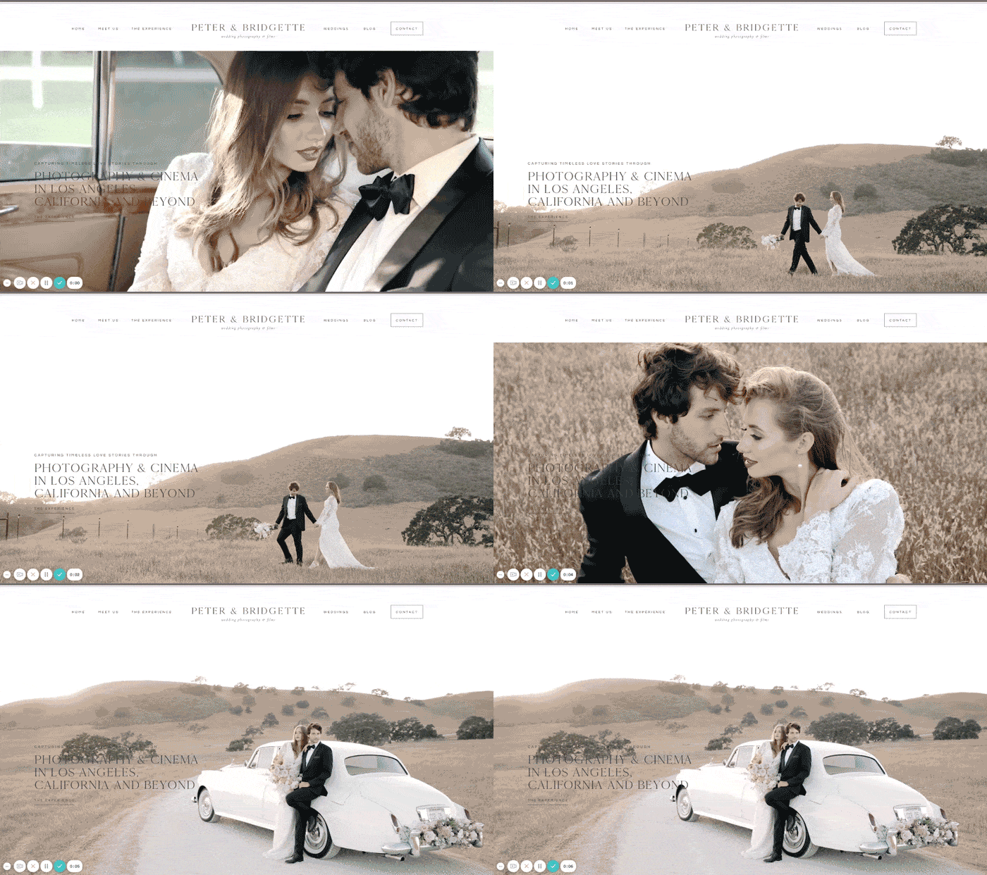
On Showit, these videos are embedded on your site so you want to keep them short + small. Less than 8MB and MP4 format and without sound. Typically you would set them to “loop” so they continue to play. If you’re not sure about formatting, head to Showit’s background video tutorial. Keep in mind that these videos won’t work on mobile. You’ll want to choose an image to use instead on mobile.
If you’re a WordPress/Elementor user, the videos can be longer and have sound, although for site speed purposes we still recommend keeping them short. These videos would be hosted on either YouTube or Vimeo and then connected to your website.
Examples:
Hopkins Heartland
Peter & Bridgette
Always Avery
Integrated Shop
Gone are the days where if you wanted a storefront on your website, you had to use something like Shopify or Esty and link to it from your “main” site. It’s much better for both a user experience and SEO to have everything in one place (usually).
Personally we’re big fans of WooCommerce because it allows for all elements of your storefront to live in the same place as your WordPress website, so there’s no need to pay for extra cart systems or set-up extra URLs for checkouts.
We have designs in our shop that are fully integrated with WooCommerce, including one for Showit.
But you can also embed “buy” buttons onto pages from cart systems like Thrivecart, Kartra, Kajabi and Shopify. This is typically only something we would do if you have a smaller amount of products. If you sell courses, this might be a good solution.
Create Hidden Pages
No need for extra systems like Leadpages. Such products are good if you need a lot advanced functionality on your landing pages, but many of us don’t (and nowadays most of that functionality can be added to your website). You can easily create landing pages on your own site. If you’re using one of our designs, the easiest way to create a new page is to duplicate an existing page and rename it.
From there, you can tweak to your heart’s content and embed mailing list sign-up forms from Kit, Flodesk or just about any third party site.
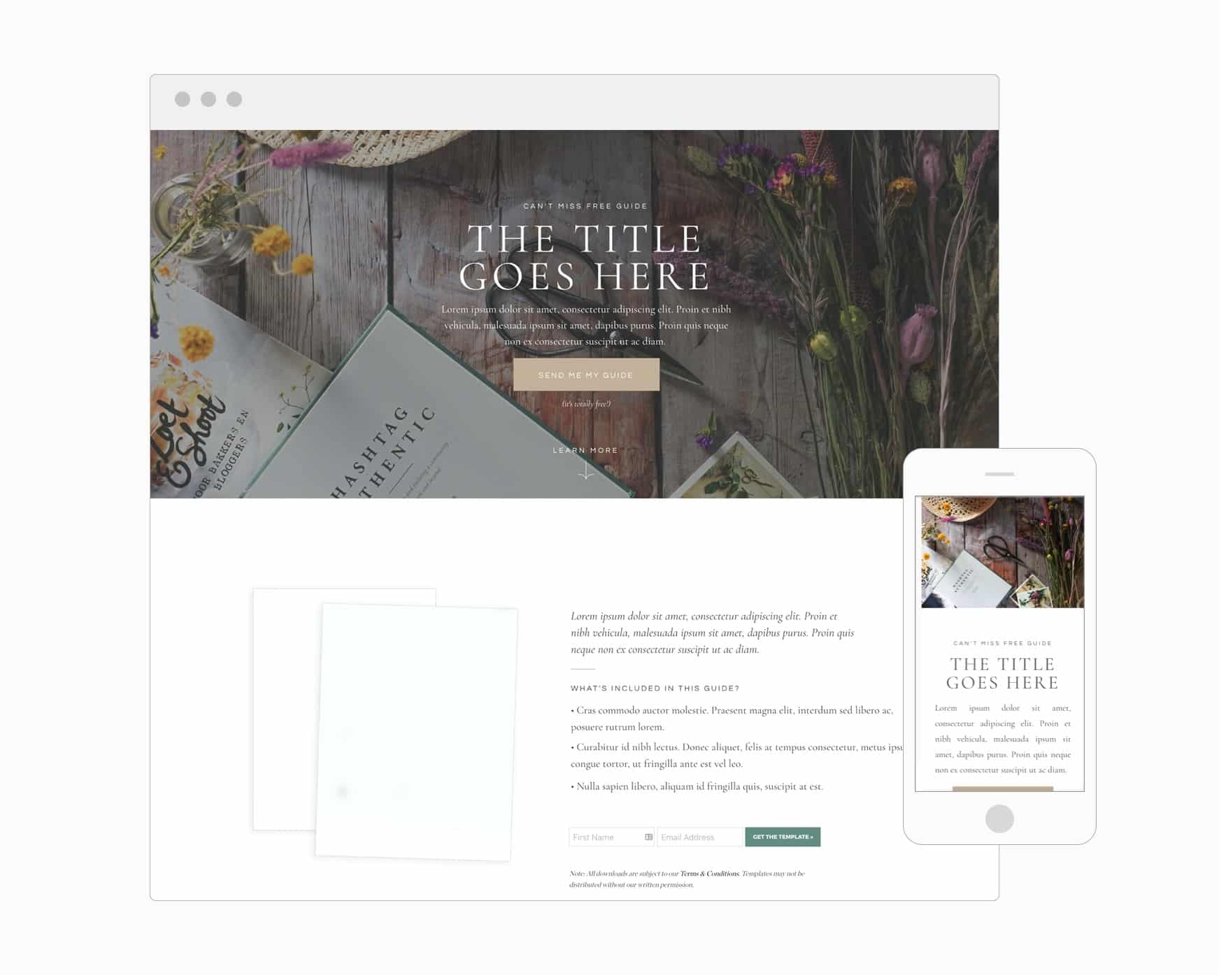
Or you use those hidden pages to create sales pages, pricing guides and vendor guides. These pages won’t be automatically added to your site’s main navigation, and you can set them to be hidden from Google searches.
If you want a few ideas for the types of hidden pages you can create (or you want to jumpstart the design with a template) head to our shop. We even have a free landing page template you can grab.
Create an Instagram Links Page
Since Instagram isn’t really known for being link friendly, a lot of people have used extra services to add a link page in their Instagram bio to send people to blog posts, their website, offers, etc. Social schedulers like Later and Planoly will create pages with links for you, but you’ll typically need one of their paid accounts. And LinkTree, while it has a limited free version, is $/6month and not very pretty.
Why pay for an extra service when you can create a free links page on your site. And bonus – we have a free template you can start with.
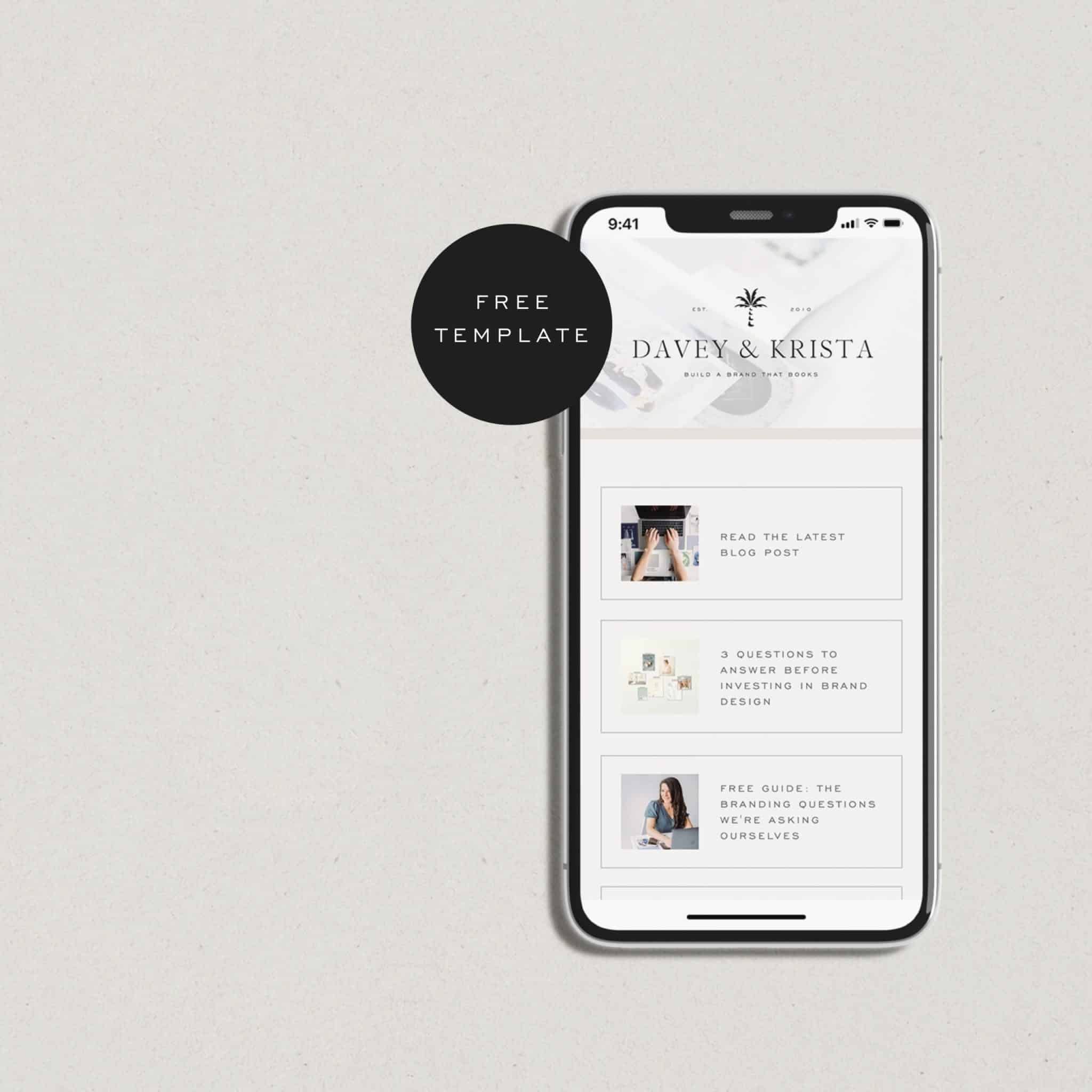
While you will need to manually update the links each time you need a new one added, using a built-in links page helps send traffic directly to your site (instead of sending it to Later, Planoly, LinkTree, etc.).
With that said, if you’re already using something like Later or Planoly for social scheduling, you might as well use their “link in bio” features.
Embedding a Google Map for Directions
Embedding a map for directions is great for businesses with a physical location. If a site visitor clicks the map, it will link directly to Google directions. On some phones, it may even open up the location in Google maps.
To find the embed widget, type your address into Google maps. In the same area where you see “directions”, click “share.” Instead of the link, click “embed.”
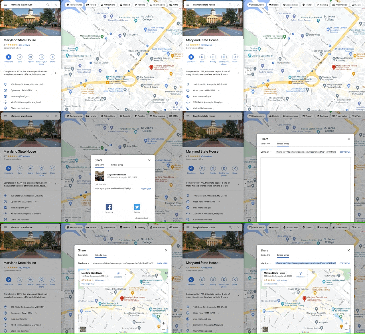
If you’re a Showit user, you’ll want to add an embed code box from the bottom of the Showit editor to your page and paste in the embed code.
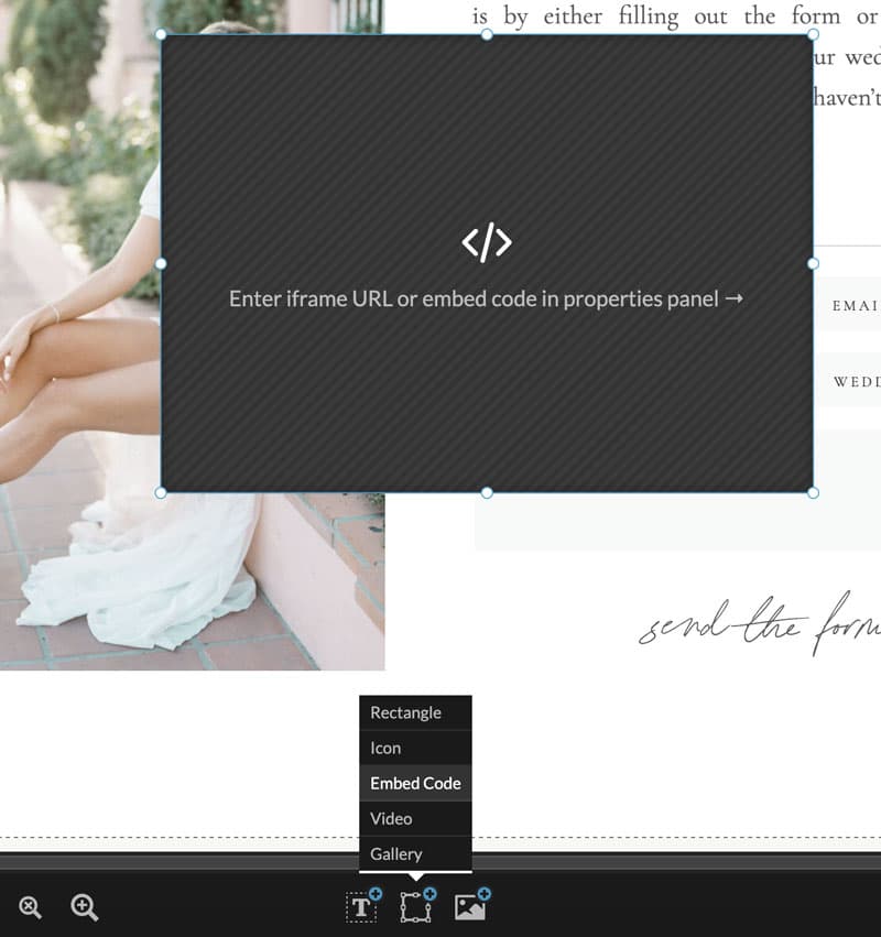
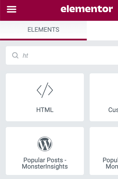
If you’re a WordPress/Elementor user, you’ll want to add an HTML box to your page and then embed the code.
Advanced Lead Gen Targeting
Pop-ups and website interstitials have come a long way, and there are more options than ever. You can target people who are not yet on your list, people who have visited your site for a certain amount of time, coming from specific referral sources, and a whole lot more. It’s a lot easier to put relevant offers in front of people! And these tools can help you segment your list further based on the actions they take on your website.
Elementor has a native pop-up builder that offers a lot of advanced, intelligent functionality around targeting. It’s easy to customize, set-up, and publish to your website. Plus, you don’t have to purchase another tool for your website.
If you use Showit, you’ll need to find a third-party tool to help you with this. Convertbox is our absolute favorite tool for lead gen and building pop-ups. It has all the functionality the Elementor builder has and more. And it’s a one-time purchase (at least at the time of writing this post)!
Location specific landing pages
These are great for service based businesses who want to target different markets or answer the question “have you ever worked at/in _____?” Instead of gathering up links to blog posts or galleries, send inquiries a link to a beautifully design page on your site dedicated to a particular market or venue.
So maybe you’re an LA Photographer who wants to target weddings in San Francisco. Instead of optimizing your entire site for both markets, you could optimize your homepage for the market you reside in and create a landing page that showcases San Francisco weddings. Maybe you share your past work in the city, your favorite venues, tips for traveling to SF and more.
These pages have the possibility of being picked up by search engines and you can make as many as you would like.
We actually have a Venue landing page with a tutorial that you can check out here.
But what should you add?
As I mentioned at the start of this post, just because you can add something to your site doesn’t mean that you should. Use these tools where it makes sense and pay attention to the weight some of them (such as video) add your site.
Have questions or want to let us know about other cool things you can do to your site? Just drop them in the comments below!
VIEW THE COMMENTS
Add A Comment