


In typography, orphans and widows refer to lines of text that stand alone either at the end of a paragraph or block of text. Both orphans and widows interrupt the way our eyes skim the text, thus making texts harder to read.
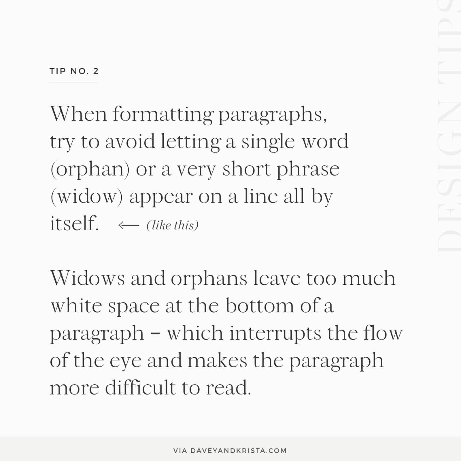
When formatting paragraphs, try to avoid letting a single word (orphan) sit at the bottom of a paragraph (an orphan) or a very short phrase (widow) appear on a line all by itself on a new page.
What is an orphan in typography?
An orphan in typography is a word that sits alone on a line at the bottom of a paragraph. Check out the graphic below for an example of an orphan in typography.
Orphans leave too much white space at the bottom of a paragraph, which makes it harder for the eye to skim the paragraph and thus more difficult to read.
What is a widow in typography?
A widow in typography is the last word or final short phrase of a paragraph that sits alone on the top of a new page. Keeping the paragraph intact on the same page makes it easier for a reader to understand the text.
How to Avoid Widows and Orphans in Typography
It’s more important to avoid widows and orphans when creating certain marketing materials because you want the information to be as easily consumed as possible. If you’re writing a blog post (or, for example, a book), it’s usually not quite as important.
In order to get words in paragraphs to line up in a way that is easier to read, you may need to play around with where other lines in the paragraph break by clicking shift + return.
For more typography tips, check out this recent post on free Google fonts for websites.

Krista is the co-founder of Davey & Krista, a creative studio known for high-converting Showit website templates crafted for photographers, creatives, and entrepreneurs. With over 15 years of branding and marketing experience, she helps business owners launch stunning websites without the tech overwhelm. Krista also teaches designers how to turn their creative skills into a thriving business—through templates, courses, and behind-the-scenes strategy. When she’s not designing, you’ll find her chasing sunshine, color palettes, and gluten-free pizza.
Explore website templates and free resources at daveyandkrista.com.


VIEW THE COMMENTS
Add A Comment