


Table of Contents
Let’s start with a truth that doesn’t get said enough: a beautiful portfolio isn’t enough anymore.
If you’re a wedding stationer, you already know your work is stunning. The letterpress texture, the vellum wraps, the wax seals. You know how to make paper feel like an event. But if your website isn’t translating that into inquiries, the work isn’t the problem. The website is.
Wedding stationery websites have a very specific job to do: they need to help couples fall in love with custom before they even know what custom costs. That takes more than a gallery and a contact form. It takes strategy.
So let’s talk about what’s actually working on wedding stationery websites in 2026, what couples are looking for when they land on your site, and what tends to make them click away before they ever reach out.
But first, if you’re newer to the stationery world, let’s make sure we’re all on the same page.
What Is a Custom Suite, Anyway?
If you’ve heard the term “custom suite” thrown around and weren’t totally sure what it meant, you’re not alone. It sounds fancy because it is, but it’s also pretty simple once you break it down.
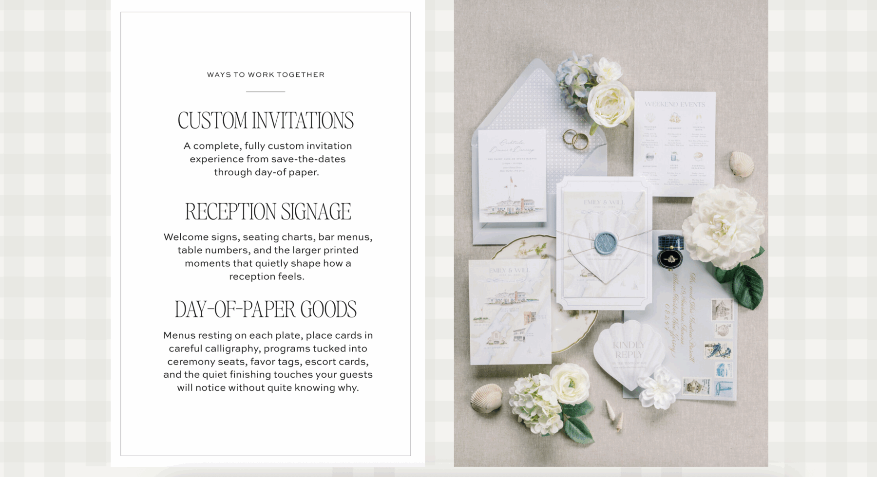
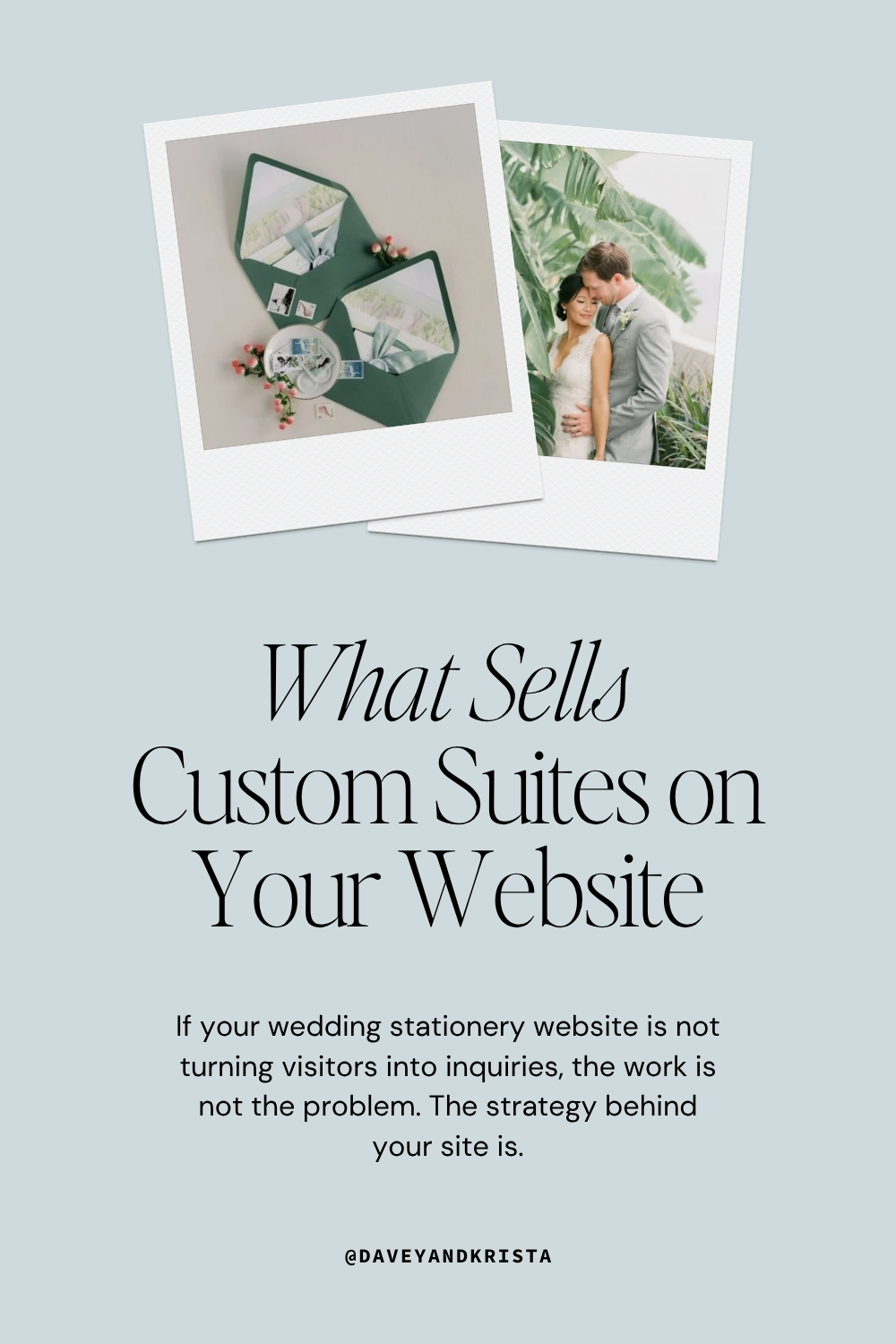
A custom wedding suite is a fully cohesive collection of paper goods, designed specifically for one couple, for one wedding. It typically includes the main invitation, an envelope with a coordinating liner, a details card (with venue info, accommodations, dress code), an RSVP card, and sometimes extras like a map card, menu, place cards, ceremony program, and thank you notes.
The word “suite” is the key part. It’s not one piece of paper. It’s a system, all designed to work together visually, like a brand identity for a wedding day.
When a guest opens the envelope, every piece inside should feel like it belongs. The colors, the typography, the paper weight, the finishes: all intentional, all cohesive, all completely specific to that couple.
That’s what you’re selling. And that’s a hard thing to communicate on a website if the site isn’t built for it.
Why Wedding Stationery Websites Have a Unique Challenge
Here’s the thing about selling custom stationery online: you’re asking someone to invest anywhere from several hundred to several thousand dollars in something they can’t hold in their hands yet.
They can’t feel the weight of the cotton paper. They can’t run their finger across the letterpress impression. They can’t smell the fresh ink or experience the unboxing moment their guests will have.
Your website has to do all of that work through a screen. Which means the way you present your work, tell your story, and guide visitors through your process matters more than almost anything else.
The good news? Couples shopping for custom stationery in 2026 are more design-literate than ever. They’re coming in with Pinterest boards, aesthetic references, and a genuine understanding of what they want. Your job is to meet them where they are.
What Couples Are Actually Looking for in 2026
Before we get into what your website should do, it helps to understand who’s landing on it.
Wedding stationery trends for 2026 are heavily influenced by tactile, story-driven design. Couples want suites that feel like heirlooms, not afterthoughts. They’re asking about letterpress, foil stamping, blind embossing, vellum overlays, and custom illustrations.
They want cohesion across every piece, from save-the-dates through thank you notes, and they want it to feel branded to their relationship, not just their color palette.
They’re also increasingly sustainability-minded. Cotton paper, soy-based inks, and thoughtful materials are showing up in client inquiries in a way they weren’t a few years ago.
And here’s the piece that matters most for your website: today’s couples are treating their stationery as part of their wedding’s overall visual identity. They’re not just looking for a printer. They’re looking for a designer who gets the vision. Your website needs to communicate that you are that person.
What Actually Sells Custom Suites on Wedding Stationery Websites
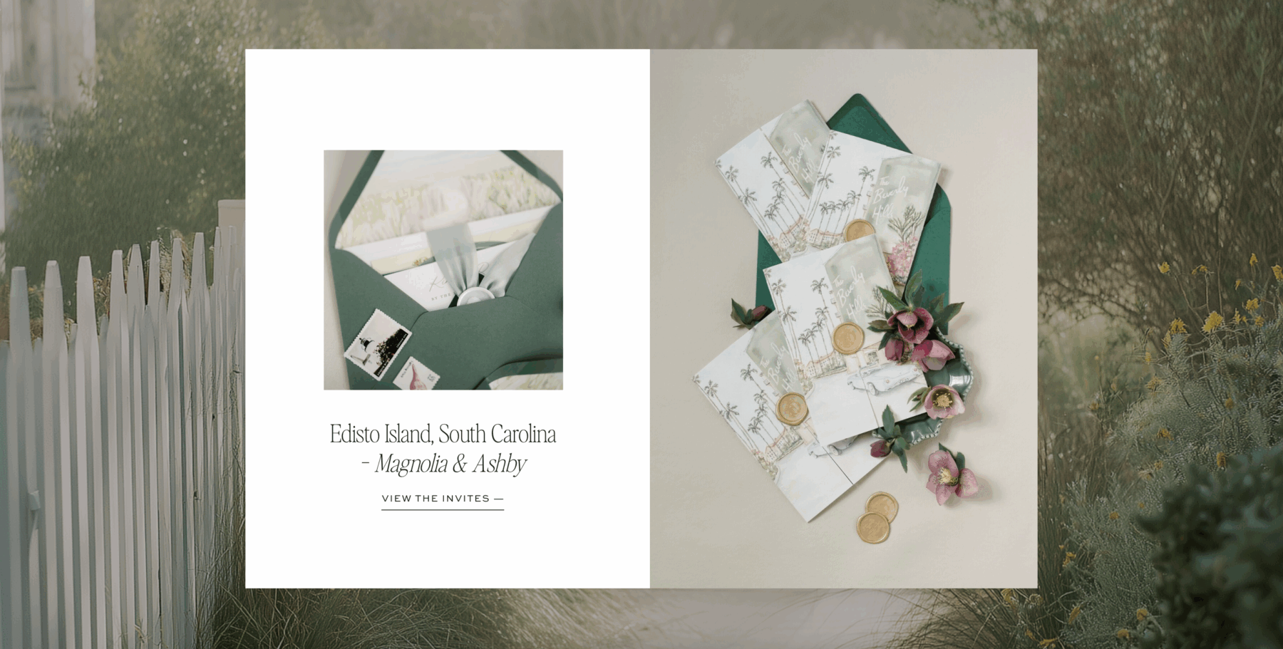
Show the Full Suite, Not Just the Hero Piece
This is the number one mistake on wedding stationery websites. Designers showcase the invitation card beautifully, then show nothing else. A couple can’t understand what a suite feels like if they only see one piece.
Show the whole thing. The envelope. The liner. The details card. The RSVP. If you have day-of pieces, show those too. Lay them out together, photograph them styled as a flat lay, show the unboxing.
Help the visitor understand what they’re actually buying, and what it feels like to receive it.
The couples willing to invest in custom stationery are not making quick decisions. They’re studying your work. Give them something to study.
Let the Texture Come Through
The biggest challenge with selling tactile work online is that you can’t replicate touch. But you can get close.
Close-up photography of paper grain, letterpress impression, foil shine, and wax seal texture communicates quality in a way that a wide shot never will.
If your current photography is all pulled back and styled, consider adding detail shots to your portfolio. A macro image of a letterpress impression on thick cotton stock tells a buyer everything they need to know about the quality of your work, often faster than your words can.
Tell the Story Behind Each Suite
Every custom suite has a story. The couple who wanted their venue’s oak trees illustrated on the envelope liner. The bride who found her grandmother’s handwriting and asked you to incorporate it. The color palette pulled from a trip the couple took to the Amalfi Coast.
These stories are what make custom stationery worth the investment. And they’re what separate your website from a portfolio of pretty pictures.
Wedding stationery websites that convert don’t just show the finished product. They explain where it came from.
A short paragraph under each suite, even two or three sentences, about the couple’s vision and how you translated it tells a prospective client: this person listens, this person gets it, this person can do this for me.
Make Your Process Feel Approachable
For many couples, custom stationery feels intimidating. They don’t know where to start. They don’t know how long it takes. They don’t know what they need to provide. They’re afraid of making expensive mistakes.
Your website should answer all of that before they have to ask.
A simple, friendly process section that walks through what working with you actually looks like goes a long way toward converting a hesitant visitor into a confident inquiry. Keep it warm and plain-language. You don’t need to list every technical detail. You need to make someone feel like reaching out isn’t scary.
Testimonials That Go Beyond “She Was Amazing”
Social proof matters on all wedding stationery websites, but generic testimonials don’t move the needle the way specific ones do.
The testimonials that actually convert are the ones where clients describe the outcome: the guests who kept the invitation instead of throwing it away, the mom who framed it, the couple who cried when they saw the suite for the first time. If you have feedback like that, those are the quotes to lead with.
If you don’t have them yet, it’s worth sending past clients a short follow-up note asking one specific question: “Did any of your guests say anything about the invitations?” You might be surprised what comes back.
Pricing Transparency (Even Partial) Builds Trust
You don’t have to list every price point. But “starting at” language on wedding stationery websites builds trust and filters your audience at the same time.
A couple with a $300 budget and a couple with a $3,000 budget are both going to land on your website. Helping them self-select before they reach out saves you both time.
Even something simple like “custom suites start at $X” gives visitors a reference point and signals that you’re confident in your pricing, which signals that you’re confident in your work.
The Website Itself Has to Match the Work
Here’s something that doesn’t get talked about enough on wedding stationery websites: the design of the site has to match the quality of the stationery.
If your work is editorial, layered, and detail-obsessed, and your website looks like a basic template with default fonts, there’s a disconnect. Couples shopping for elevated custom design are visual people. They will notice.
Your website doesn’t need to be over-designed. Some of the best wedding stationery websites are quite minimal.
But they’re intentionally minimal. The typography is considered. The white space is doing real work. The color palette feels like it belongs to a brand, not just a placeholder.
For years, we watched stationery designers try to make photographer templates work for their businesses. They’d swap the hero image for a flat-lay of an invitation suite, change “photography” to “stationery” in the navigation, and hope it would land.
Sometimes it did. Most of the time it didn’t.
Because stationery designers have a fundamentally different sales process than photographers. You sell pieces, not events. You sell craft and material, not moments. And the couple investing in custom wedding paper is making a slower, more considered decision than the couple booking a photographer.
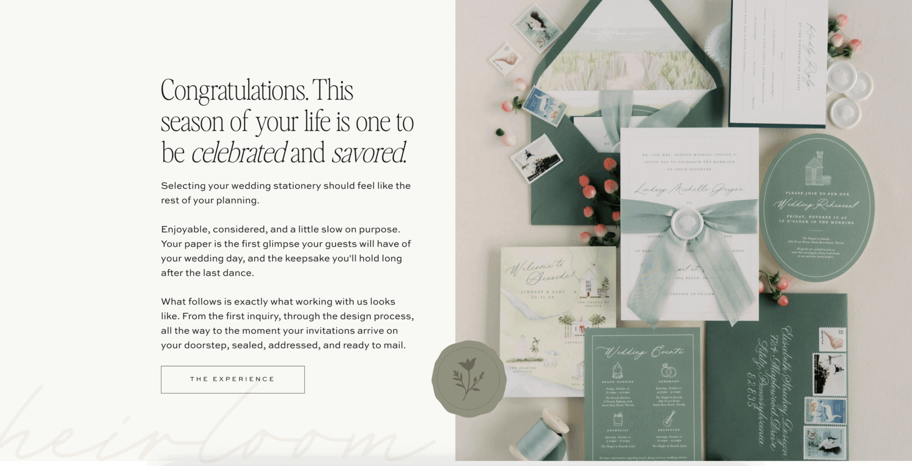
That’s exactly why we built Bellagio.
It’s the first Davey & Krista template designed from the ground up specifically for luxury wedding stationery designers: the kind of designer who works slowly, by hand, with cotton paper and wax seals and watercolor venue illustrations.
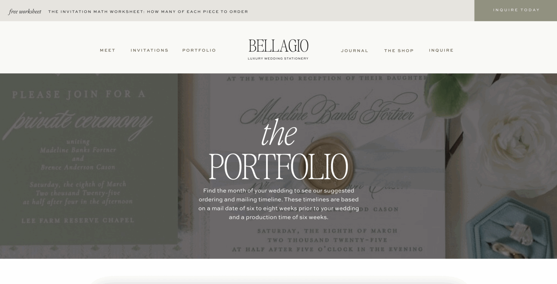
Every page is structured around the questions a custom stationery client actually asks. There’s a full order timeline table, a numbered breakdown of every piece in a suite, a step-by-step process walkthrough, and an investment section that names a real starting price. Nothing buried. Nothing vague.
Visually, Bellagio is built in a soft editorial palette of deep navy, warm ivory, and quiet cream. The display type nods to old engraving plates, and the italic accents feel almost handwritten.
It’s designed to let your work take center stage while the site does the quiet, strategic work of turning visitors into inquiries.
What’s Inside Bellagio
Everything we covered in this post, showing the full suite, making your process approachable, building trust through social proof, answering questions before couples have to ask, is already built into the structure of this template. Here’s what that looks like page by page.
The Home Page opens with a hero that has built-in space for a location placeholder, followed by a problem-and-solution sequence that names the pain points luxury couples actually feel. From there: a designer bio, a featured projects grid, social proof, three featured blog posts, a press strip, a primary call to action, and a lead magnet callout. The flow moves a visitor from first impression to inquiry in one calm scroll.
The Invitations Page is the structural anchor of the site, and it’s where most of the conversion work happens. It includes a five-step process walkthrough, a full portfolio grid with venue and location naming, an investment section, a complete What’s Included breakdown, and an Order Timeline table designed to win Google Featured Snippets. There’s also an FAQ section with eight pre-written questions, a lead magnet callout, and an inquiry form. Everything a couple needs to go from curious to confident, on one page.
Featured Client Galleries & Suites is a clean, filterable grid of project tiles with venue and location attached to every project. It includes an optional filter strip, an editorial mid-page pull quote, a press logo strip, and a closing CTA.
The About Page opens with a belief statement, moves into a behind-the-desk introduction, a deeper biography section, a client quote pull, a favorite things lifestyle grid, and a process, journey, and style three-column section. It closes with dual CTAs to the portfolio and inquiry form, and includes a meet-the-team section with pop-up bios for studios that have grown beyond a solo founder.
The Journal Page is a standard Showit blog layout with a featured post section above the grid and category navigation for couples researching at different stages of the buying journey.
The Inquiry Page is a warm, low-friction contact form with smart field design that helps qualify couples (wedding date, venue, planner, budget range) without making the form feel like an application.
The template also includes an Investment Guide opt-in landing page, a Lead Magnet opt-in landing page, Thank You pages, a 404 page, and a fully designed footer with mailing list signup.
It’s a complete site, not a collection of layouts.
Bellagio drops in July, and the waitlist is open now.
Join the Bellagio waitlist here
One More Thing Worth Knowing
The couples booking custom stationery in 2026 aren’t just buying paper. They’re buying the experience of receiving something made specifically for them, and the experience of giving their guests something worth keeping.
Your website is the first version of that experience. It’s the first thing that tells them whether you understand what they’re after.
If it’s beautiful, intentional, and warm, they’ll feel it before they even read a word.
That’s the goal. And it’s absolutely achievable.
FAQs: Wedding Stationery Websites
What should a wedding stationer’s website include?
At minimum: a portfolio showing full suites (not just individual pieces), a process section explaining what it’s like to work with you, client testimonials, and a clear way to get in touch. Starting price information is a strong addition for filtering the right clients.
How do wedding stationery websites attract more inquiries?
By showing the full story behind the work, including detail photography, suite descriptions, and client testimonials that describe the outcome. Couples book stationers they feel understand their vision, and your website is where that trust is built first.
What is a custom wedding suite?
A custom wedding suite is a fully cohesive collection of paper goods designed specifically for one couple. It typically includes the invitation, envelope, details card, RSVP card, and optional day-of pieces like menus, place cards, and programs, all designed as one unified visual system.
What are couples looking for in wedding stationery in 2026?
Tactile, heirloom-quality design. Couples are asking about letterpress, foil stamping, vellum overlays, custom illustrations, and suites that feel cohesive from save-the-date to thank you note. They want stationery that feels branded to their relationship, not just their color palette.
What platform is best for wedding stationery websites?
Showit is a strong choice for wedding stationers because of the design freedom it offers. You can build an editorial, custom-feeling site without touching code, and control every detail of how your work is presented on both desktop and mobile. Try Showit free for 30 days here.
When is the Bellagio Showit template available?
Bellagio launches in July and you’ll be able to find it in our template shop. It’s the first template we’ve built specifically for luxury wedding stationery designers, with layouts, page structure, and content sections built around how stationery clients actually shop and buy. Join the waitlist here.

Krista is the co-founder of Davey & Krista, a creative studio known for high-converting Showit website templates crafted for photographers, creatives, and entrepreneurs. With over 15 years of branding and marketing experience, she helps business owners launch stunning websites without the tech overwhelm. Krista also teaches designers how to turn their creative skills into a thriving business—through templates, courses, and behind-the-scenes strategy. When she’s not designing, you’ll find her chasing sunshine, color palettes, and gluten-free pizza.
Explore website templates and free resources at daveyandkrista.com.


VIEW THE COMMENTS
Add A Comment