Ch-ch-ch-ch-changes…
The past few months have been full of change. It began with the decision to relaunch The Palm Shop, which Krista initially started to feature her design work. But as we revisited the site, we found that we were making more and more changes so that it reflected our “current” brand (at least how we saw it at the time). It became increasingly apparent that a simple revision wasn’t going to cut it. Too much had changed over the last two years.
Having me come on full time was one of the biggest changes. While I had always been involved with our businesses at some level, the brand was built around Krista. (Which is ultimately a good thing, since she is much brighter and better looking than me.) When someone visited the site, they would see Krista’s face and ‘hear’ her voice. This was fine with me, and we didn’t intend to change anything. But things did change. Because working with someone is different than working alone.
We think this change is a good thing.
Before I came on full time Krista had to take on most responsibilities, whether she felt they were strengths or not. She doesn’t particularly love blogging (writing, specifically) or speaking. I like both, so naturally I picked up those two responsibilities among others. But many of these responsibilities forced me to be ‘out front’ which meant a different experience for people engaging with our brand.
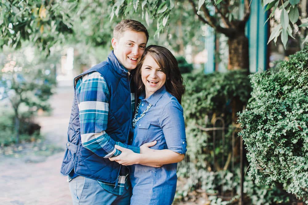
The result: Davey & Krista. And we’ve enjoyed these past few months of Krista’s creative design aesthetic combined with my more light-hearted banter. We didn’t want to get rid of The Palm Shop (Palm trees, blue skies, and white sand are sort of our jam), so we decided we would eventually relaunch it as an actual shop. Which makes sense, ya know… because it’s The Palm Shop.

Photo by Annamarie Akins
So, what about those updates?
Over the last couple months we’ve thought about who we are and what we do. While branding, design, and coaching give insight into what we do, it’s neither a niche nor a position. We believed, however, that more answers would arise once we got started. I think many people incorrectly believe that you figure this all out prior to getting started—maybe that’s why some people never get started (although that’s probably a thought for another blog post).
So as we began this new chapter we took note of things that we really enjoyed doing, and those things others affirmed us in. It didn’t take long before we arrived at that intersection. Among those things were sharing about different tools we use, taking complex topics like SEO and teaching it in a way people can digest and, of course, designing websites that captured a company’s brand.
We eventually settled on Brands that Convert after a lot of discussion. Sounds sort of dry, right? Language like “purposeful” and “heartfelt” was tossed around but ultimately we thought this better captured who we are, what we do, and what we believe. We’re curious, we like to test and optimize, figure out better ways to do things, and ultimately share what we learn with others through our work whether it be coaching, branding, or design. This just seemed to fit. Sure, we absolutely believe in purposefulness and being heartfelt—but we ultimately believe that purposefulness and heart is best demonstrated in a brand when you think through how you want one to experience your brand. Specifically…
- How does your brand educate those that engage with it?
Every touch point in your client experience from the marketing collateral someone sees on Facebook to the delivered product or service says something about your brand. You’re educating your community on what they should expect, how they should feel, and who they should be. What are you communicating? We want to communicate that we’re about creating remarkable brands that do these three things: educate, encourage action, and transform. (How are we doing?)
- What action do you want your visitors to take?
The best way to educate someone is to have them take action. When someone sees a Facebook ad, lands on your site, or purchases your product, what should they do next? We want people find and use new tools that help them build their businesses, or jump into a challenge that gets ’em started on optimizing their website, or to book us so we can help them create a website and brand that is more than just ‘pretty.’
- How do you want to transform those that engage with your brand?
This is perhaps the most powerful question of the three. After someone engages with your brand, what kind of transformation do you want them to experience? We want people to become more confident business owners whether that’s because they’ve invested in a website theme that shows-off their work or found some useful content on our blog. We want people to dig a little deeper into why they do what they do and how it serves their community. We want people to become more courageous, take more risks, and dust themselves off after falling down.
Who said we couldn’t be heartfelt? To be clear, we’re not the place to go if you want hardcore statistical analysis about how 304 different colors of call-to-action buttons stack up against each other. (First, math was never my best subject and second, who has time for that?). We believe conversion is educating and encouraging people to take a specific action, and then transforming them through their action. Doing this well requires equal measure testing, analysis, and intuition.
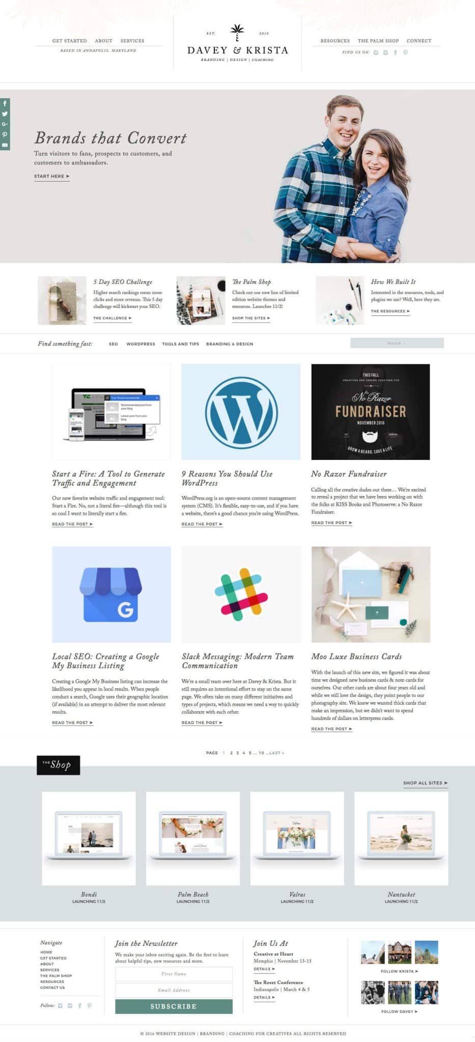
Much of what we discuss above is reflected in the changes we’ve made to the website. Here’s some insight into why we made a few of the changes you see on the site…
The Homepage
We knew as soon as we launched Davey & Krista that we would need to change the homepage. Previously we had four featured posts in the ‘hero spot’ that—to a certain extent—acted as placeholders as we worked through our messaging and explored what we are about as a company.
The new homepage is much simpler and gives people a better sense of who we are and what we do. Most importantly there is a main call-to-action (CTA) that leads to a page that goes into further detail about what we do and believe. This provides a much better ‘flow’ to the site. The other calls-to-action immediately below the hero-spot also draw visitors to a few categories, giving emphasis to a few of the big things we’re doing. Regardless of whether a visitor clicks the main CTA or a sub-CTA, each path provides on some education on who we are and what we do.
The blog is just under the hero spot and remained on the homepage because it’s central to our desire to educate. We removed the sidebar because we thought it was a distraction and ultimately received very little engagement. Instead, we moved that information to the footer.
And underneath the blog is a preview of what’s new in The Palm Shop (which right now, is everything). Since this is a primary component of our business, we thought it needed to be somewhere on the homepage in addition to being in the main navigation of the site. See more details below…

Start Here
We’re not the first people to do this. And to be honest, there was a little debate about it. But ultimately we decided to give it a shot because we do a lot of things, and we think we’ll offer the best experience to our visitors if they’re given some context about what that is.
This page allows us to further develop this idea of creating brands that converts. While this blog post will eventually get buried, the Start Here page will remain there for new visitors to get up-to-speed. We wanted to eliminate the what do they do guessing game. The page funnels into a few of the places we would like our visitors to go. Regardless of what they choose next, it continues to move people through the site.
Resources
Like I mentioned earlier, we love to try out new tools and share about what works. We are frequently asked about different plugins or technical aspects of our site. So we figured we create a resources page that lists some of our favorites.
This page also acts as sort of a complement to the The Palm Shop, which will offer customizable Showit5 website themes and other digital products. It’s sort of like a favorite things page. We’ve got some ideas on expanding this page, so stay tuned.
The Palm Shop
It’s back! Well, almost. We’re officially relaunching The Palm Shop on Wednesday, November 2nd. And yes, it’s a real shop. Full of brand new, limited edition Showit5 website themes.
Showit has recently become one of our new favorite things, especially since they integrate with WordPress blogs. The last few websites we’ve launched have been Showit designs. We’ve started recommending Showit to our clients who want to update their site easily and don’t have much technical experience. Photographers and other creatives especially like it because the backend sort of resembles Lightroom or Photoshop.
We have a few exclusive offers for our newsletter community, so be sure to sign-up here if you want in.
Trial and Error
As with everything we do, we’re excited to see what works and what needs improvement. We’ll be sure to share about it. In the meantime, what do you think? Let us know in the comments.
VIEW THE COMMENTS
Add A Comment