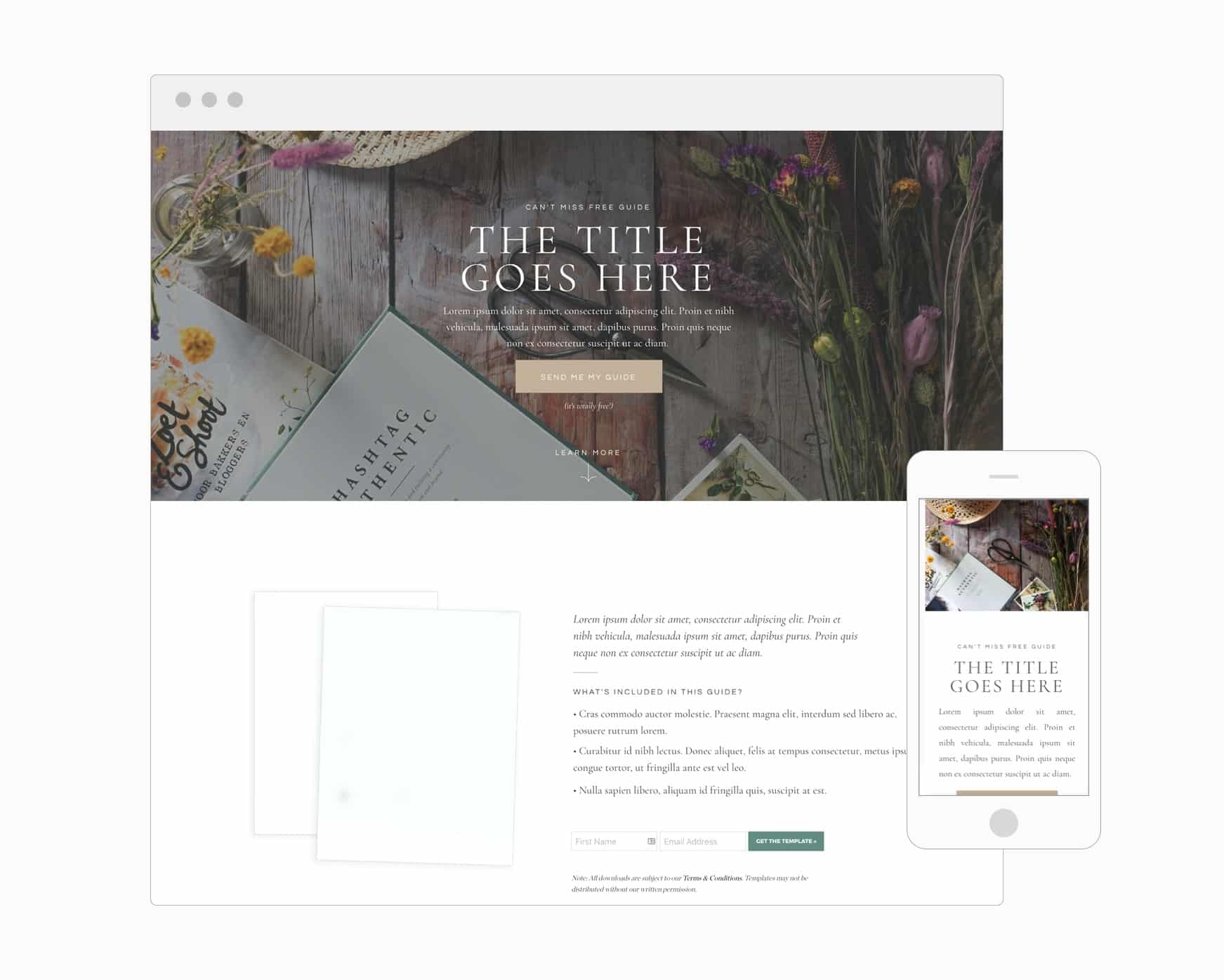
Landing pages are webpages designed to get website visitors to take a specific action. Yes, any effective page on your website should encourage visitors to take action. What makes a landing page distinct is its singular focus on getting a visitor to take one, specific action.
For instance, a common landing page goal is to get a visitor to subscribe to a mailing list. Since that’s the primary objective of the page, it probably won’t contain links to other pages on the website or even include the top level navigation. The entire purpose of the page is to get visitors to subscribe.

The phrase landing page is typically used to refer a page used for generating leads. However, a sales page is technically a landing page too. For the purposes of this post, we’re going to focus on lead generation landing pages, which are typically shorter, more straightforward pages.
Tools for Creating Landing Pages
There are a number of great tools out there that make creating a landing page simple. Here’s a quick list to check-out:
- Email marketing platforms like Kit and Flodesk have built in solutions that make it easy to design effective landing pages.
- Check out your website builder to see if there are any templates available. Both Showit and WordPress have landing page templates… and you can find landing page templates in our shop for FREE (for now).
- Other tools like Leadpages, Unbounce, and Clickfunnels all provide easy-to-use tools to build landing and sales pages. The downside: It’s another tool to pay for when your website builder or email marketing tool will probably get the job done.
If you’re just starting out, we highly recommend keeping it simple and taking advantage of tools you already have access to via your email or website platform. The bells-and-whistles that come with dedicated landing page solutions sound cool (and often are cool), but can overcomplicate things when you’re just getting started.
<<Check out this customizable Showit landing page in The Palm Shop!>>
5 Simple Tips for Creating a Landing Page that Converts
So we know that landing pages are a great way generate leads for campaigns. Here are some ways to make sure your landing pages convert as many visitors as possible:

1. Remove Distractions: Less is more
The easiest way to undermine a landing page is to include competing calls-to-action (CTA), and overwhelm the visitor with too many options or too much text. All CTAs should bring people closer to the desired conversion.
Keep things simple, to the point, and drive people to a specific action. The normal navigation from your site should be removed from the landing page, and all signs should be pointing the CTA. The exception: a subtle link to your website or social media accounts might be included at the bottom of the page to help build credibility. Although credibility can also be achieved with a quick bio or some social proof.

2. Focus on Benefits: Sell the hole, not the drill
When I go to Home Depot to buy a drill, it’s because I want a hole. Marketers have a tendency to focus on features such as the power of drill rather than focusing on benefits.
If I am searching for a wedding photographer, do I care that I am going to get 8.3 hours of coverage, 2 photographers, and exactly 2,001 photos? Or, do I care more about photos that are going to tell the story of the big day perfectly, and will be cherished by my children and their children long after? Probably the latter.
Sure, the features of the drill and the deliverables of the wedding collection matter, but only after the potential visitor knows that value is being added in her life.

3. Create an Attention Grabbing Headline and Sub-headline
One study shows that we have attention span of about 8-seconds. And the truth is, you probably have less than 8-seconds to convince a visitor you’re providing something of value.
Use the headline to grab a visitor’s attention, and the sub-headline to start making the case for why it’s worth subscribing. What big obstacle will you help people overcome? What’s the big benefit of subscribing? Make sure you start to get at these questions in your headline and sub-headline.
If a page isn’t converting, the headline and sub-headline are typically the first things we tweak to see if performance improves. We often find that the content isn’t the issue; it was just a matter of creating a more enticing headline (or renaming the title of the download).
4. A Relevant Image
A picture is worth a thousand words, right? Remember, it needs to be relevant to the page—not merely “pretty.” The images and copy on the page will either contribute or detract from your authority and credibility. Make sure it’s a professional image, and it does not distract from the CTA.
Pro-tip: Did you know that readers are often drawn to look where people in images are looking? Want to draw attention to a CTA? Include an image of someone looking at it.
5. Offer Transformation and Create Urgency
Why should someone subscribe now vs. later? By creating urgency, you’ll increase the chance that visitors don’t procrastinate when it comes to subscribing.
Limited time offers and countdown timers are a great way to motivate visitors to sign-up now, but it’s not the only way to create urgency. Remind people about the transformation you’re offering through your content! Well-crafted copy should remind visitors that whatever the current problem or obstacle their facing could be removed NOW if they download the guide, subscribe to the list, etc.
Remember to Provide Value
You can have the most optimized landing page in the world but it doesn’t matter if the content you’re delivering isn’t of any value.
Whether it’s a checklist or an ebook, make sure to provide practical information. Also, value is not synonymous with length. You don’t have to write a 100-page ebook to create a landing page. As long as it’s helpful and meeting a need, it doesn’t matter whether it’s 1-page or 100.
If you don’t know what to provide your audience, just ask and listen! Are you listening to the questions they ask when you blog or post on social media? Are you asking them for feedback in email blasts? It’s as simple as asking and paying attention.
Don’t be discouraged if your first (or second or third) landing page doesn’t convert. Keep testing, tweaking, and listening. You never know when your effort is going to pay off.


VIEW THE COMMENTS
Add A Comment