


There doesn’t seem to be a more frustrating website page for people than the creation of the About page. That unicorn page that people believe, if done correctly, will result not only in customers, but friendships—a transcendent connection that can’t quite be explained. Like that cat video that you just can’t seem to stop watching.
Joking aside: a well-executed About page can make a great first impression, enhance the experience, and reinforce your competency. And one would assume it’d be an easier page to create since, well, it’s about you and your business.
Related: 9 Ways to Spice Up Your About Page
But for some reason, people seem to get stuck there, staring at blank computer screen. And as a result what’s thrown together often looks disjointed, with too much irrelevant information.
As designers and strategists, we’ve had the opportunity to look over countless websites—either through the web design and branding process or website review. Here are a few things we’ve learned:
Tips for Your About Page
Do this: Tell the beginning of the story.
Not that: Don’t tell people the whole story.
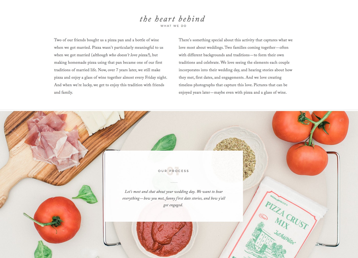
The About page is the beginning of the story. It’s the exposition—introducing characters, background information, and laying the foundation for what’s to come. Maybe that’s a little about why you do what you do or how you got started.
What’s the goal of the beginning of the story? To draw people in, keep them reading, and develop the plot. Each part sets-up what comes next. In this case, you want people to take a look at your work and ultimately inquire.
But remember, the About page is just the beginning and it shouldn’t be anything more. This story will continue to unfold over the course of the entire client experience. Parts of it will be told on your social media channels, your blog, and the interactions you have with your client.
Don’t try to force the entire story into the About page. It’ll make for a bad story and lackluster experience. You wouldn’t try to force an entire relationship the first time you meet someone, would you?
Do this: Share about yourself, but don’t make it all about you.
Not that: Avoid random lists of favorite things.
Yeah sure, the About page is about you… kinda. But it’s also (mostly) about your clients.
When you meet someone, do you introduce yourself, methodically list all of your accomplishments, dreams, randomly list five of your favorite things, and then walk away?
That’s what we see on a lot of About pages. If you wouldn’t do that in conversation, why do you do it on your website?
As our friend and copywriter Jessica Jordana once told me, if it doesn’t help people imagine you doing what you claim you can do for them, it doesn’t belong on your about page. Be sure that anything you include on your About page builds your brand. I love a good burger with sweet potato fries, but since it doesn’t build my brand, it doesn’t need to go on the website.
This is not to say that “favorite things” lists are bad—just make sure that the things you include are “brand-building” and help people imagine you doing what you claim you can do.
If the About page is the beginning of the story, you’re the narrator and the main characters are your clients. So it’s important to guide them through your website and include elements in which they can see themselves.
Do this: Focus on CONVERSION.
Not that: Distract from the primary goals of your website.
Every page of your website should work together to get visitor’s take action—including the About page. That desired action might look different for different businesses, but typically it’s completing a contact form, booking a call, or purchasing a product.
One of your About page’s primary objectives should be to build trust with the visitor so that they’re more likely to take action. This means more social proof and less random lists of your favorite things. If it doesn’t help get people to the next step, then it probably should be removed from the page. Calls-to-action are just as important on your About page as they are on any other page.
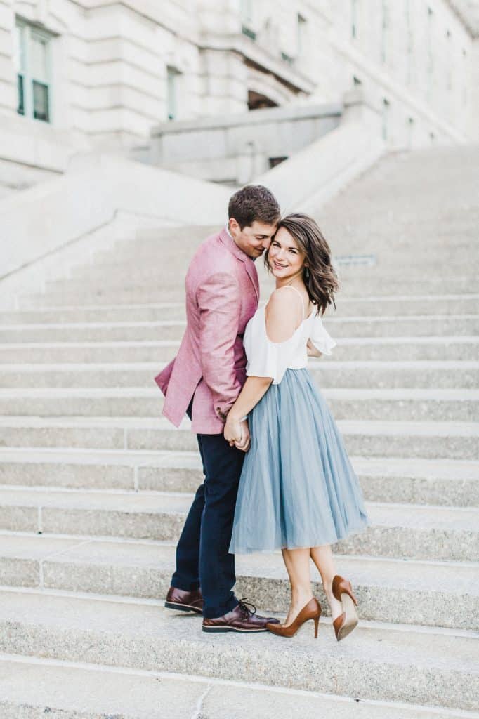
Do this: Get a professional headshot that matches your brand.
Not that: Avoid images that don’t match your brand, either in quality or aesthetic.
There’s something to be said for being authentic. I’m writing this post in sweatpants, but it doesn’t mean I’d show up for a meeting with a client dressed that way.
You don’t have to use your Linkedin profile picture. Just something that’s professionally done and matches your brand. If that’s you relaxing in yoga pants at your computer, go for it.
But remember, just because it’s a professional photo doesn’t mean it matches your brand.
Do this: Be clear and concise. Simple usually gets the job done.
Not that: Don’t be cutesy for the sake of being cutesy.
We’ve all done it: Looked at other About pages in the industry and thought, “Well, that’s clever! I need to do something like that.” But you don’t. Seriously.
There are three reasons you don’t have to do something like that:
- It’s not as clever if you do something someone else is already doing. Just do you.
- We often look at other websites with our business-owner lenses on, and forget that our prospects aren’t looking at websites with those same lenses on. We might think something is clever, but it doesn’t mean our prospects do.
- Simple can book, too. And we’d argue more effectively than cute.
The previous version of our photography website had a very simple About page. It was a few short paragraphs with an image of Krista and me. That’s it. And guess what? We never had any issues getting steady inquiries or bookings.
No one ever said, “We love your work, but your About page isn’t creative enough. If you had images flying around the screen and knew that you loved a good burger we totally would have booked you.”
Do this: Assess how important an About page is for your business.
Not that: Don’t let your About page stop you from moving forward.
If your business is branded around your team or you’re a solopreneur, it’s likely that your About page should be in your top-level navigation. People will want to know a little about the face behind the business, and the About page is a great way to continue to build trust. But as we’ve already mentioned, About pages can be super simple and still result in bookings.
For other businesses, however, the About page might not need to be in the top-level navigation. Instead it might make more sense to put it in the footer of the website. SAAS companies and bigger businesses often take this approach, and reserve top-level pages for educating people about their product.
Regardless, don’t let the About page keep you from launching a website! You can (and should) iterate it on as your business grows.
Words are like Rope
There’s nothing wrong with keeping things simple. The more words you use, the more opportunity you have to get tripped up (or to trip up your visitors). If you’re struggling writing your About page, think through what you would tell someone if you had just met them. They’re probably wondering what you do, who you do it for, how you got started, and what you enjoy most about your job. Answer those questions and you’ve got an About page. From there you can continue to develop it as your brand develops.

Davey is the co-founder of Davey & Krista, a creative studio known for high-converting Showit website templates crafted for photographers, creatives, and entrepreneurs. He helps businesses craft an answer to that question and then develops a strategy for communicating it. After years of running agencies that have managed millions in ad spend, he’s seen firsthand the power of effectively answering that question.
Explore website templates and free resources at daveyandkrista.com.


VIEW THE COMMENTS
Add A Comment