


After reviewing hundreds, if not thousands of landing pages, we’ve learned what works and what doesn’t when it comes to creating a landing page design. Why do we do landing page reviews? It’s simple, we want to improve the conversion rate of a page.
Here’s what we’re looking for…
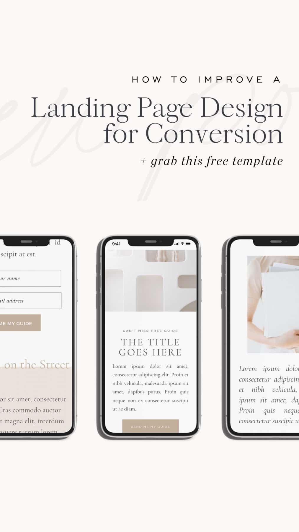
Mobile responsiveness and page structure: Content should be neatly organized when accessed by any device. As you’ll see in the walk-thru, we’re looking for things like the CTA (call-to-action) to show up above the fold.
Calls-to Action: A single, clear call to action. There should be no question where the CTA is, and what step the visitor needs to take.
A hook: Something that will catch the attention of the visitor and draw them in. It could be the title of your download or webinar, but doesn’t have to be. You should use benefit focused language.
Bullet points that outline what the visitor should expect upon downloading the file, signing up, or whatever it is that they’re doing.
Social proof: This can be general social proof like “as seen in” or specific to whatever the landing page is advertising.
An abbreviated “about section”: this should not distract from the goal of the page, but can be helpful in building trust. Make sure you highlight relevant accomplishments that establish you as an expert in your field.
AND EVERYTHING SHOULD BE BENEFIT DRIVEN: I discuss what I mean in the live review.
Alright so what you’re about to see is a landing page review I conducted for one of our Till Agency clients webinar registration pages (I am no longer involved with Till Agency; however, we still recommend them if you’re looking for an advertising agency). I actually used this as a demonstration to provide some guidance to our account managers for future reviews.
One thing I don’t demonstrate is checking the conversion rate of the page. Obviously this is the first thing you would if you have a landing page with some data. We’re looking for conversion rates above 50% for things like free download, and then typically conversion rates will decrease the bigger the ask—whether that be time or money.
Alright, so here we go…
It doesn’t really matter what kind of landing page you’re trying to review, we’re almost always looking for the same things. The only difference is that certain elements might be more emphasized on one kind of landing page than another.
For instance, on a webinar registration page, I might emphasize social proof more than on a lead gen page because I’m asking for a bigger investment of time. This doesn’t mean that social proof isn’t important for a free download—just that it might not be as necessary.
Have questions? Think I missed something? Let me know in the comments below!
And if you want a head start when it comes to designing your landing page, grab our free landing page template.

Davey is the co-founder of Davey & Krista, a creative studio known for high-converting Showit website templates crafted for photographers, creatives, and entrepreneurs. He helps businesses craft an answer to that question and then develops a strategy for communicating it. After years of running agencies that have managed millions in ad spend, he’s seen firsthand the power of effectively answering that question.
Explore website templates and free resources at daveyandkrista.com.


VIEW THE COMMENTS
Add A Comment