For years neutral colors ruled all aspects of design—including color palettes for websites. Last year we saw vibrant, playful colors break through the muted trend. Now in 2024, color experts predict rich, balanced colors to step into the forefront with soft pinks, soothing blues, and deep nature tones.
What impact will these new color trends have on web design color palettes? Read on for our take!
Table of Contents
Why Gentle Color Palettes are Ruling in 2024
The resurgence of soothing and deep colors is most likely a way for people to feel balanced – we stepped boldly into a vibrant era of playful color palettes last year and now we are settling into a softer scene. The color is still present, but we are more grounded – a timely direction especially given anticipated political, economic, and social uncertainty.
Fashion and design are pulling many elements from nature, including ocean blues, forest greens, and warm, earthy tones.
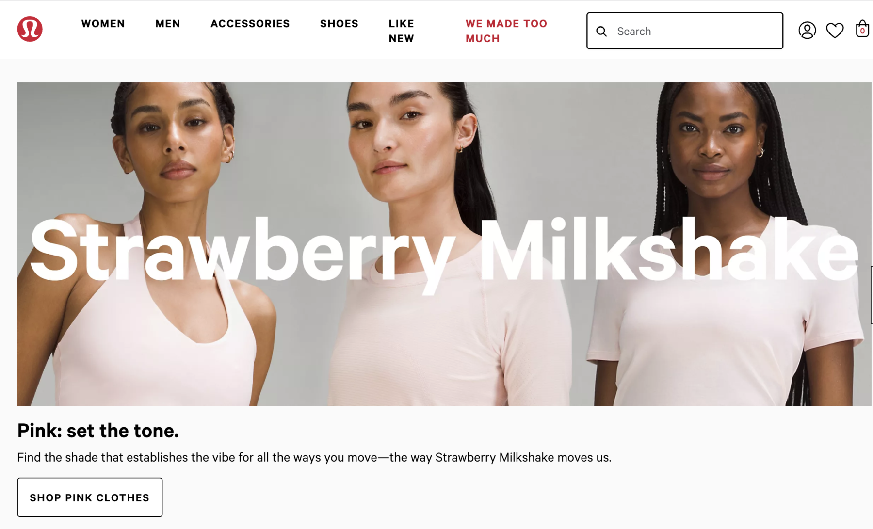
Top color experts have asserted that elegant pinks did not end with Barbie in 2023. Rather, we’ll see warm pinks paired with breezy blues to create a comforting pairing. They’re predicting a rise in rich, but restful tones.
Why Color Matters in Design
Color is one of the most important elements of design. Different colors evoke different emotions and feelings. Blue is associated with feelings of peace and serenity. Yellow and orange are energizing. Green feels fresh and organic.
We’ve also learned to associate particular colors with brands. Have you ever asked someone wearing a red shirt in Target for advice on finding a particular item? Or maybe you were the one wearing red in Target…
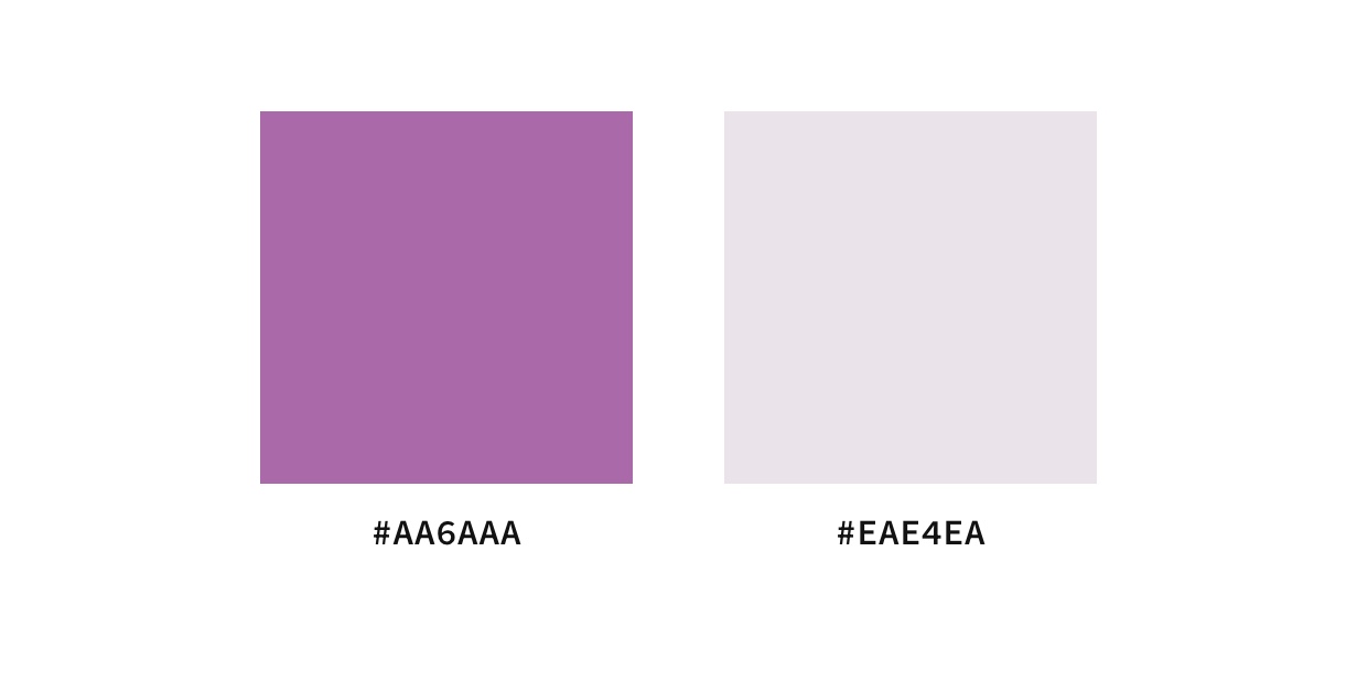
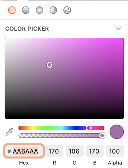
While I don’t think that you need to look into the psychology behind every color you choose for your brand, I do think it’s important to pay attention to the overall feelings your color palette exhibits. For example, the vibrant purple on the left feels much more energizing whereas the lavender on the right is more calming. Both of these colors are from the same hue, but the one on the left is from a brighter end of the spectrum.
If you’ve never generated a color palette for your brand, this video walks you through the exact process we use for the brands we create.
Should you update your current color palette to match current trends?
There isn’t an easy answer to this question. It might be a good idea to update your existing brand color palette if your current palette isn’t attracting your ideal client.
Businesses looking to attract younger audiences would likely see the most benefit from a modern color palette. Think: senior portrait photographers, clothing boutiques, and influencers.
It’s also possible to experiment with trending 2024 colors without overhauling your entire brand. Test them out in a few spots on your website or social media.
Another idea is to experiment with milder variations of these soothing tones. Soothing does not necessarily mean pastel. But if you’re a newborn portrait photographer looking to appeal to trendier clients, a balanced, calmer color palette like this might work well for your brand. The colors are fresh and warm but pastel enough to fit in with the aesthetic often associated with nurseries.
Each year several different companies release a “color of the year”. The most popular color is the Pantone Color of the Year, but we think Benjamin Moore (yes, the paint company) does a great job of selecting colors that we’ll see in everyday life.
Pantone 2024 Color of the Year: Peach Fuzz
The 2024 Pantone Color of the Year is the soft Peach Fuzz. This uplifting, welcoming peach is far more tranquil than the vibrant colors we saw dominate last year.
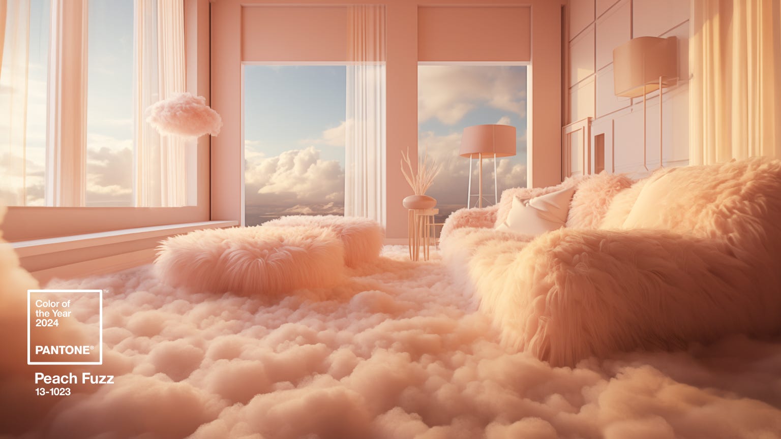
Pantone’s Executive Director Leatrice Eiseman calls it a “shade that resonates with compassion, offers a tactile embrace, and effortlessly bridges the youthful with the timeless,” and we couldn’t agree more.
Alongside Peach Fuzz, Pantone also released complimentary color palettes. In these palettes, you’ll see both warm, earthy tones and bold, calming colors.
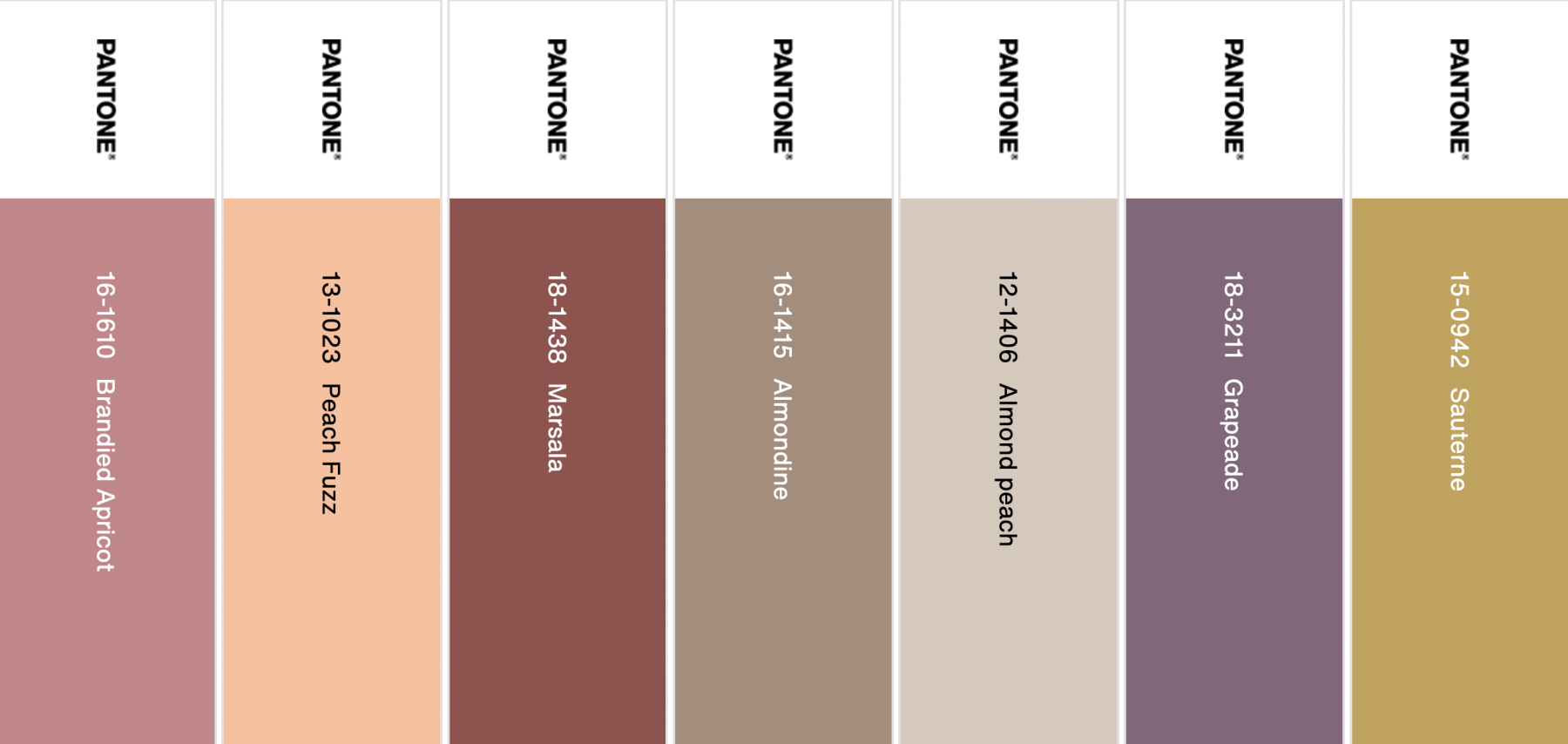
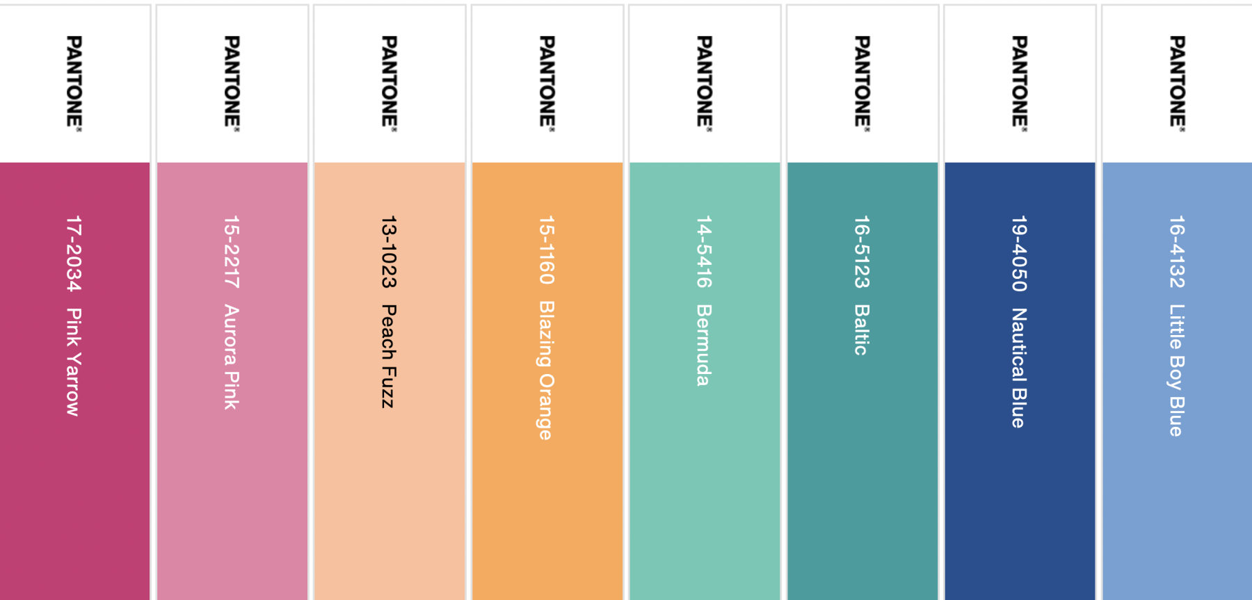
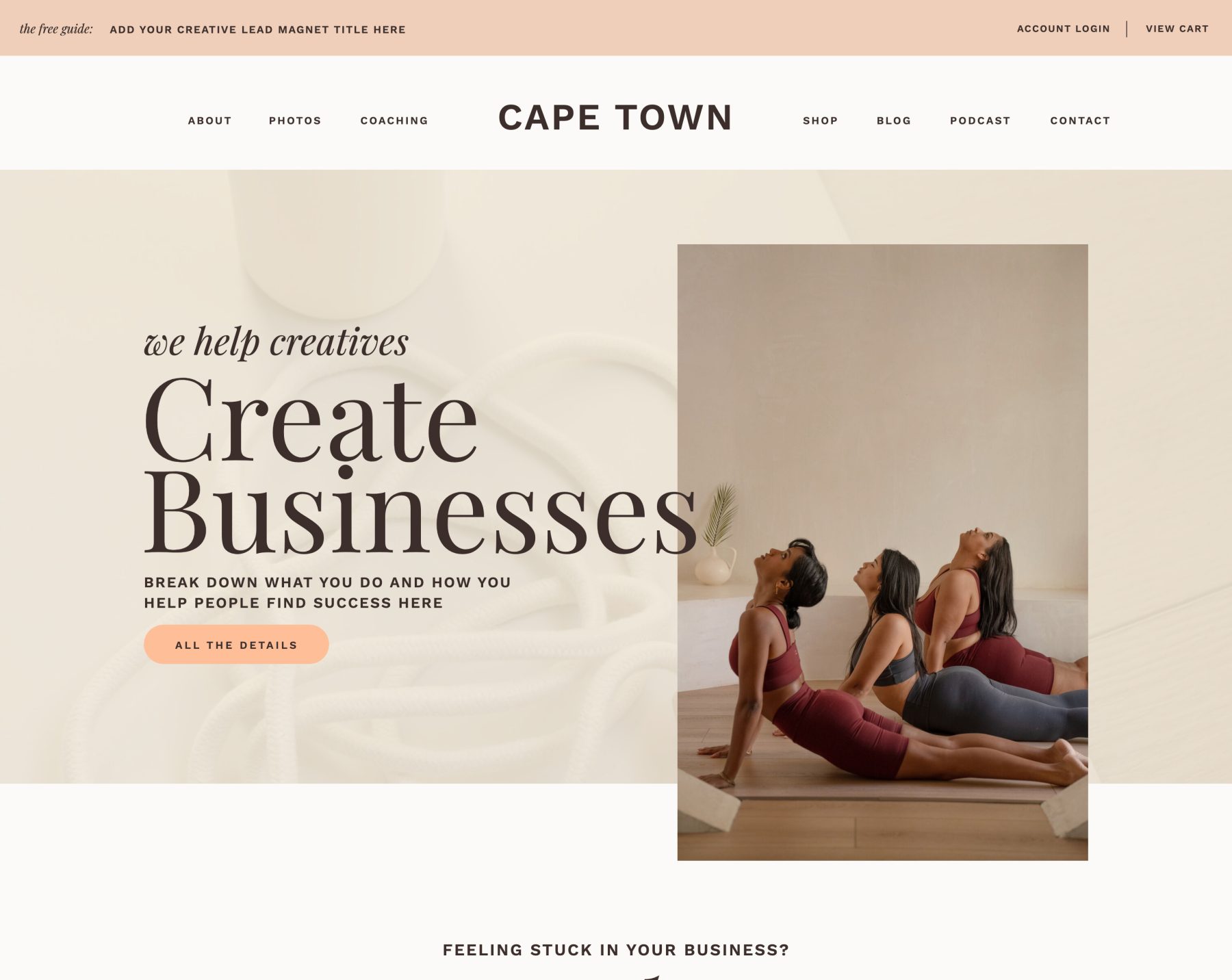
Peach Fuzz is a versatile color that can be used as both the primary and neutral colors on your website.
Check out the image below for an example of this palette in one of our designs:
Benjamin Moore 2024 Color of the Year: Blue Nova 825
Benjamin Moore’s color of the year is Blue Nova 825. Like Peach Fuzz, it is also soft and comforting.
Benjamin Moore’s Color Marketing & Development Director Andrea Magno described this color as “an alluring mid-tone that balances depth and intrigue with classic appeal and reassurance.”
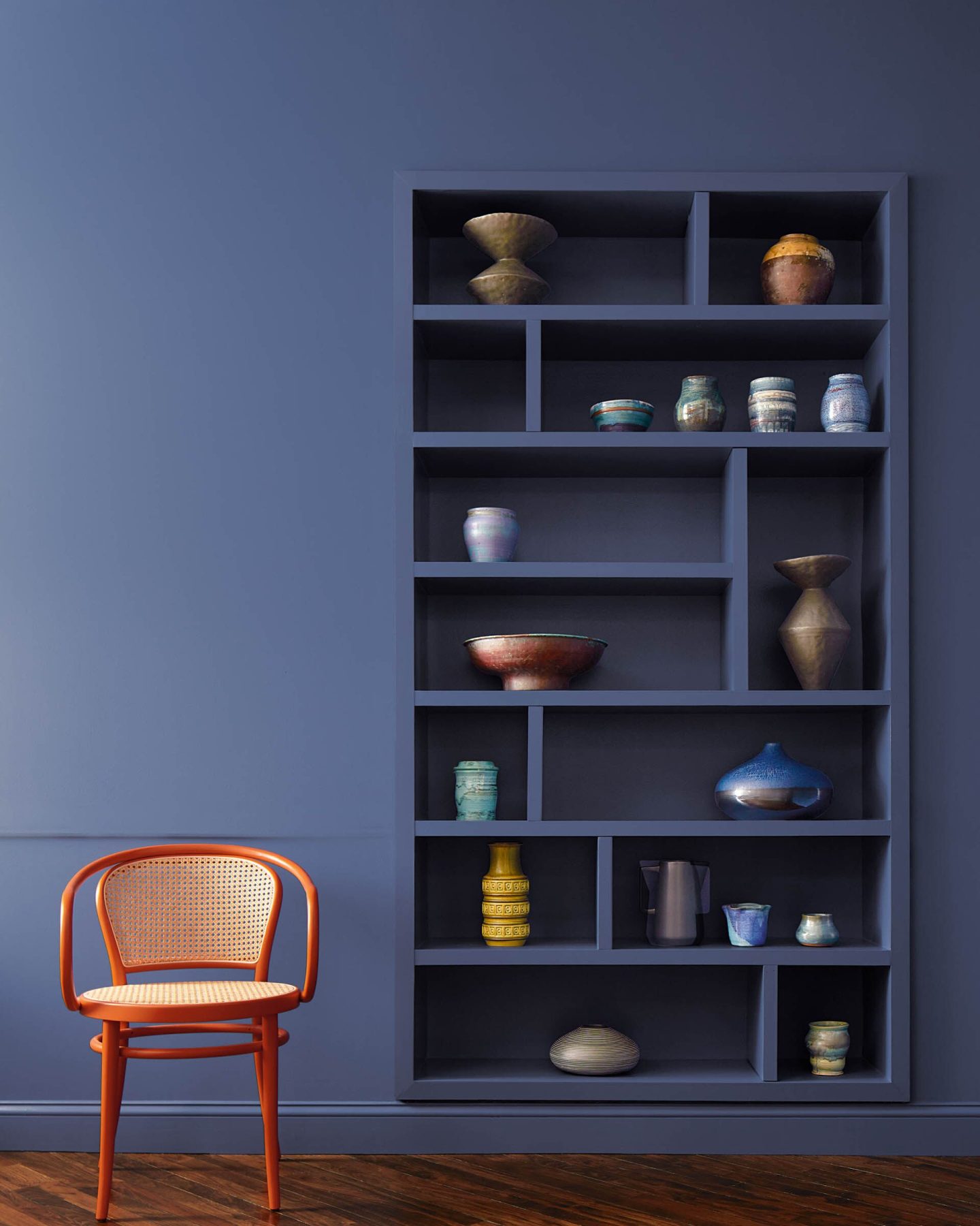
Benjamin Moore recommends using this tone to bring enchanting comfort into your home – such as in the dining room or a cozy study.
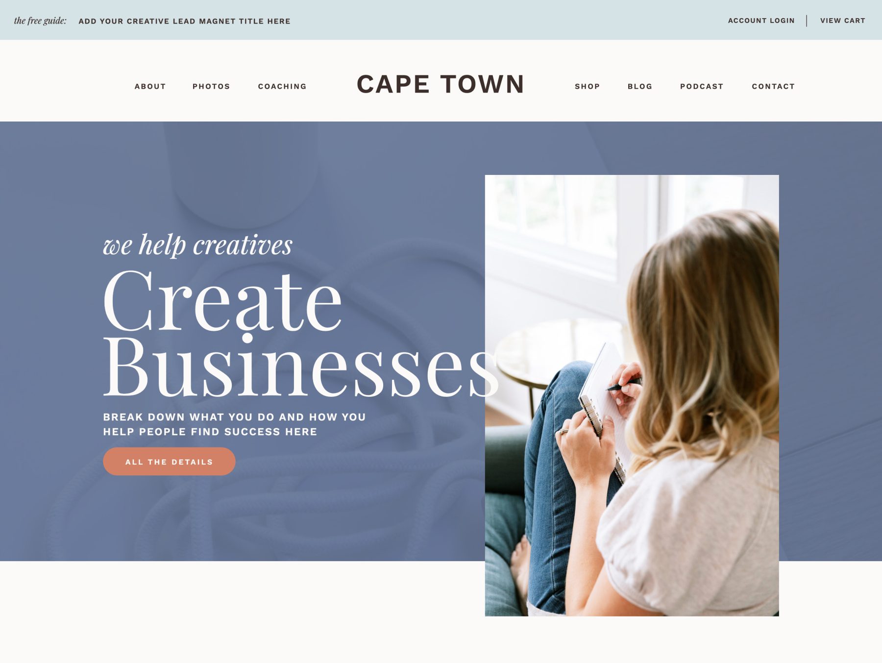
And just like with Peach Fuzz, you can use this color as a primary color or an accent to a more neutral color palette.
If we were going to use this color palette on a website, we would use Mount Saint Anne for buttons, headlines, and anything that needs to stand out.
If we were going to use this color palette on a website, we would use Raspberry Blush for buttons, headlines, and anything that needs to stand out.
Dutch Boy 2024 Color of the Year: Ironside
According to their site, Dutch Boy’s color of the year was chosen to bring “an allover sense of sophisticated comfort to our 2024 Color Trend palettes – Embrace, Retreat, and Inspire.” Ironside is a deep forest green with dark undertones, designed to bring a feeling of calm sanctuary to any space
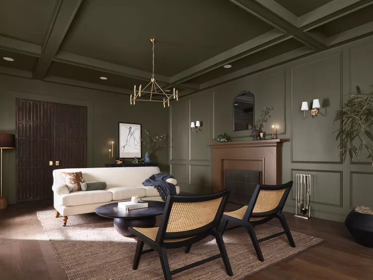
Photo courtesy of The Nordroom
Sherwin-Williams 2024 Color of the Year: Upward
As we mentioned above, Sherwin-Williams’ Upward is a bright and breezy blue that was designed to infuse peacefulness into any space. According to their website, “The color found when we slow down, take a breath, and allow the mind to clear.”
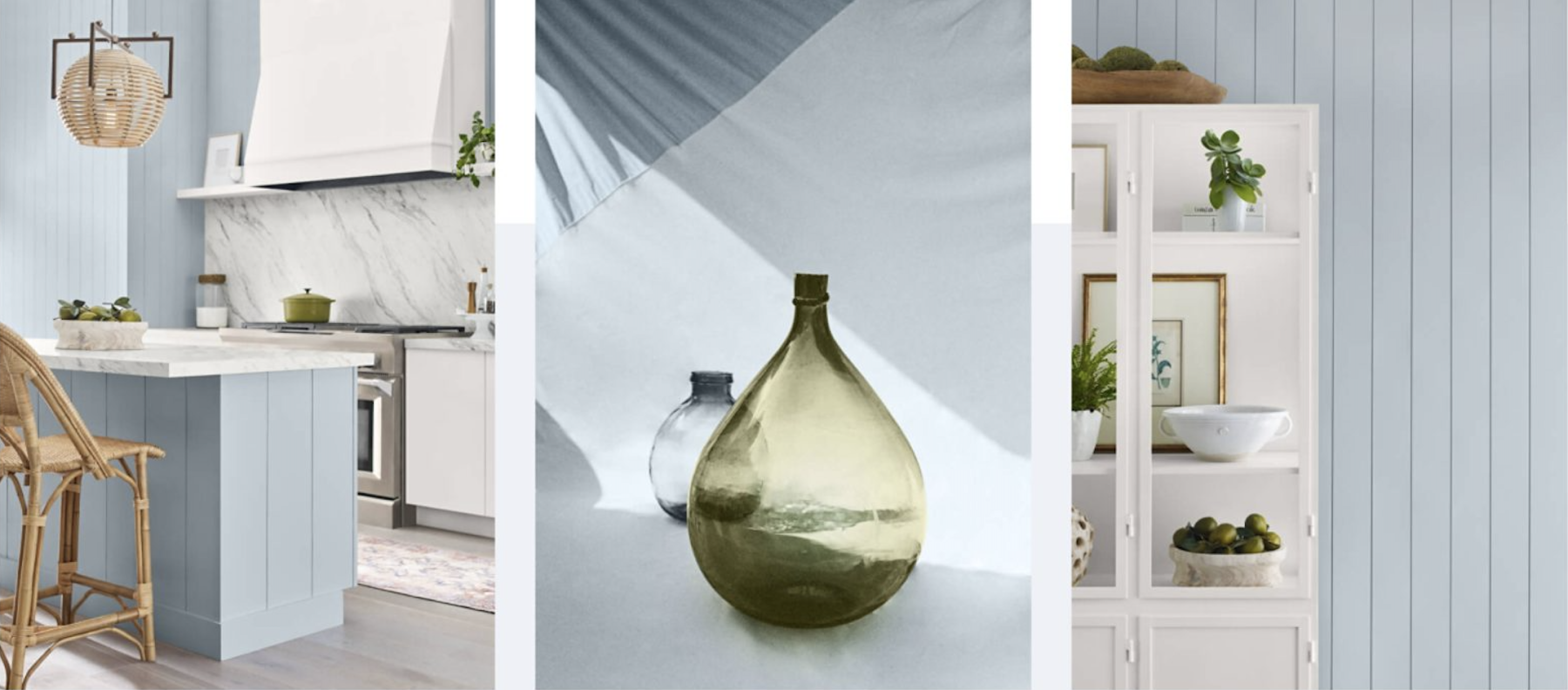
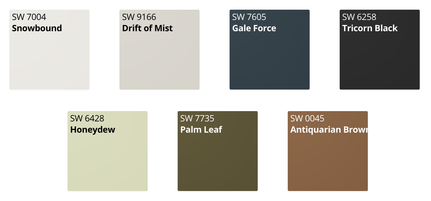
Sherwin-Williams recommends pairing Upward with calming earth tones like the following color palette. Notice the rich green: Palm Leaf. This closely resembles Dutch Boy’s Ironside and the greens that appeared on spring and summer ‘24 fashion runways.
A color palette will set the tone for your website and show your personality but it can be hard to find the palette that fits your content the best. If you’re looking for a place to start, check out these 17 color palettes to inspire your website.
17 Fresh Color Palettes for Your Website in 2024
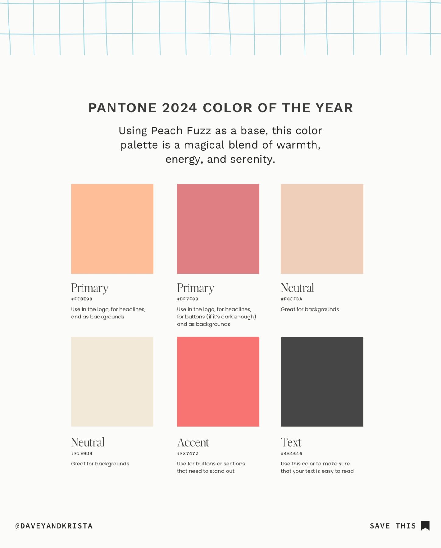
Pantone 2024 Color Palette
This palette highlights the Pantone 2024 color of the year in a big way. Try using it in the logo, for headlines, as backgrounds, and for calls-to-action. Play on the softness with a bright, warm accent, or pair it with a richer pink. I recommend using this brand for creatives who like bold pops of color but want a sophisticated feel
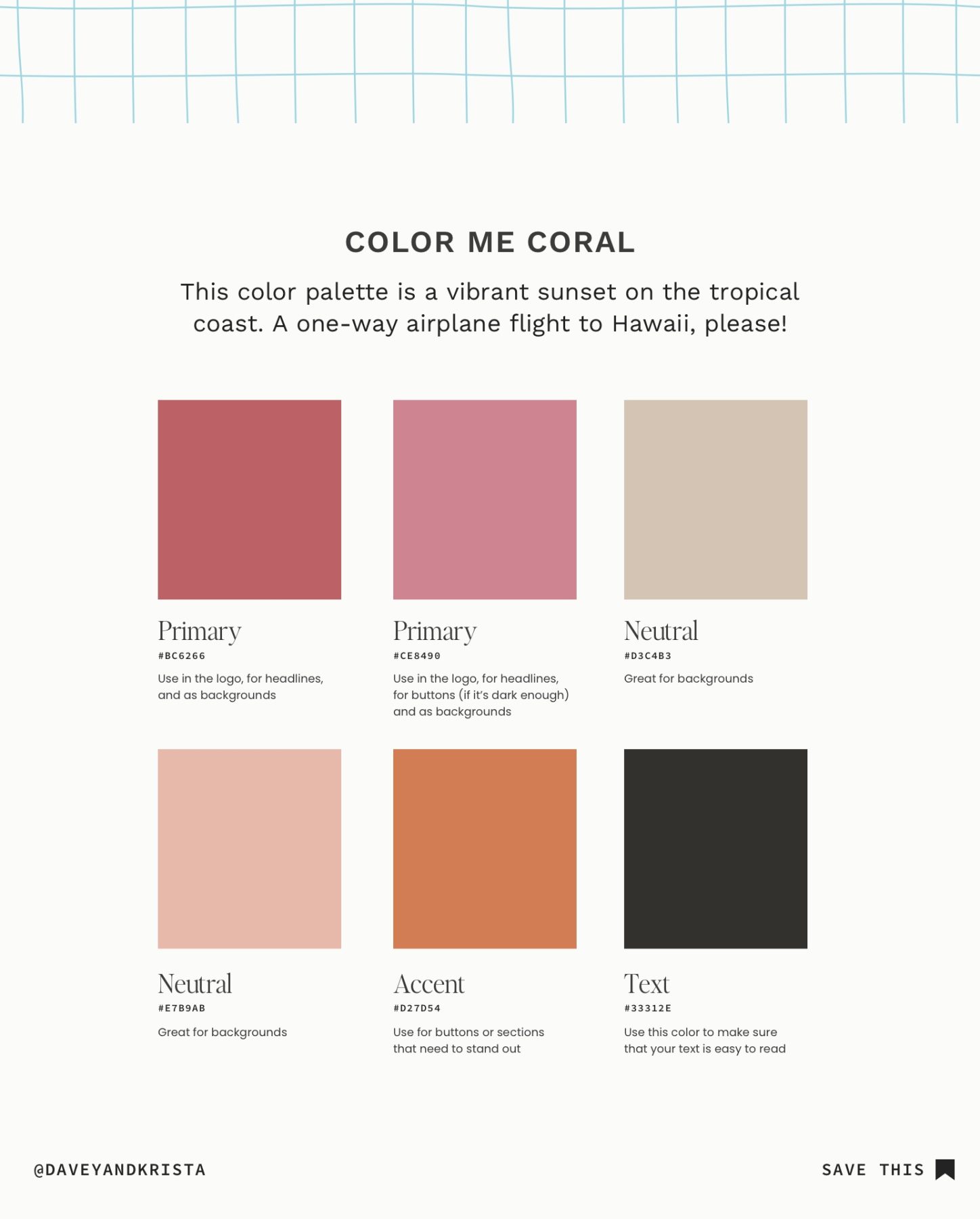
Color Me Coral Color Palette
In this color palette, we’re walking closely alongside the Pantone Color of the Year, but adding more mature tones. Try using the burnt orange in your logo, for headlines and buttons, or (sparingly) for backgrounds. The lighter pinks would look great for backgrounds and the vibrant pink could be fun for buttons.

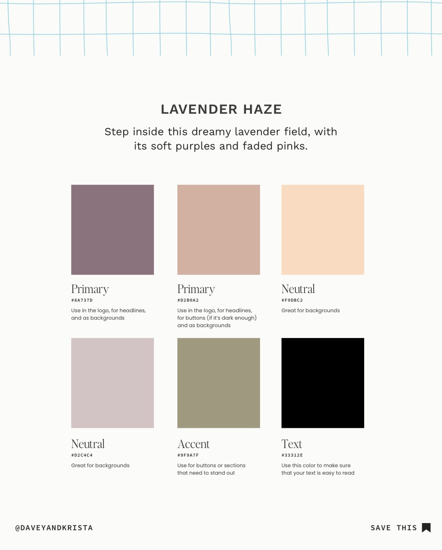
Lavender Haze Color Palette
We shared this color palette above, but I thought it might be nice to explain it a bit. This palette would be great for anyone working in the newborn or child space (such as newborn photographers or pediatric sleep coaches). While the colors are reminiscent of a nursery, they incorporate the sweet purples and soft greens of nature.
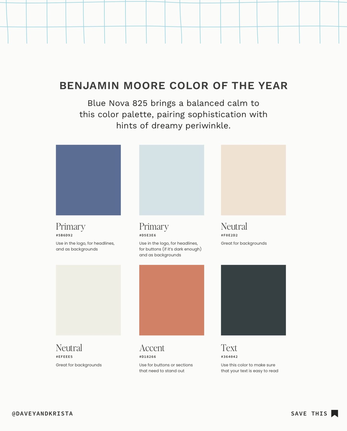
Benjamin Moore Color Palette
This color palette incorporates Benjamin Moore’s Blue Nova 825. We used this starry blue and a soft sky blue as the primary colors in the brand, and then offset them with two light neutrals. A rustic orange stands out as an accent for buttons or headlines. If I were going to implement this palette, I would ground it with a lot of white to keep the colors from feeling too strong.
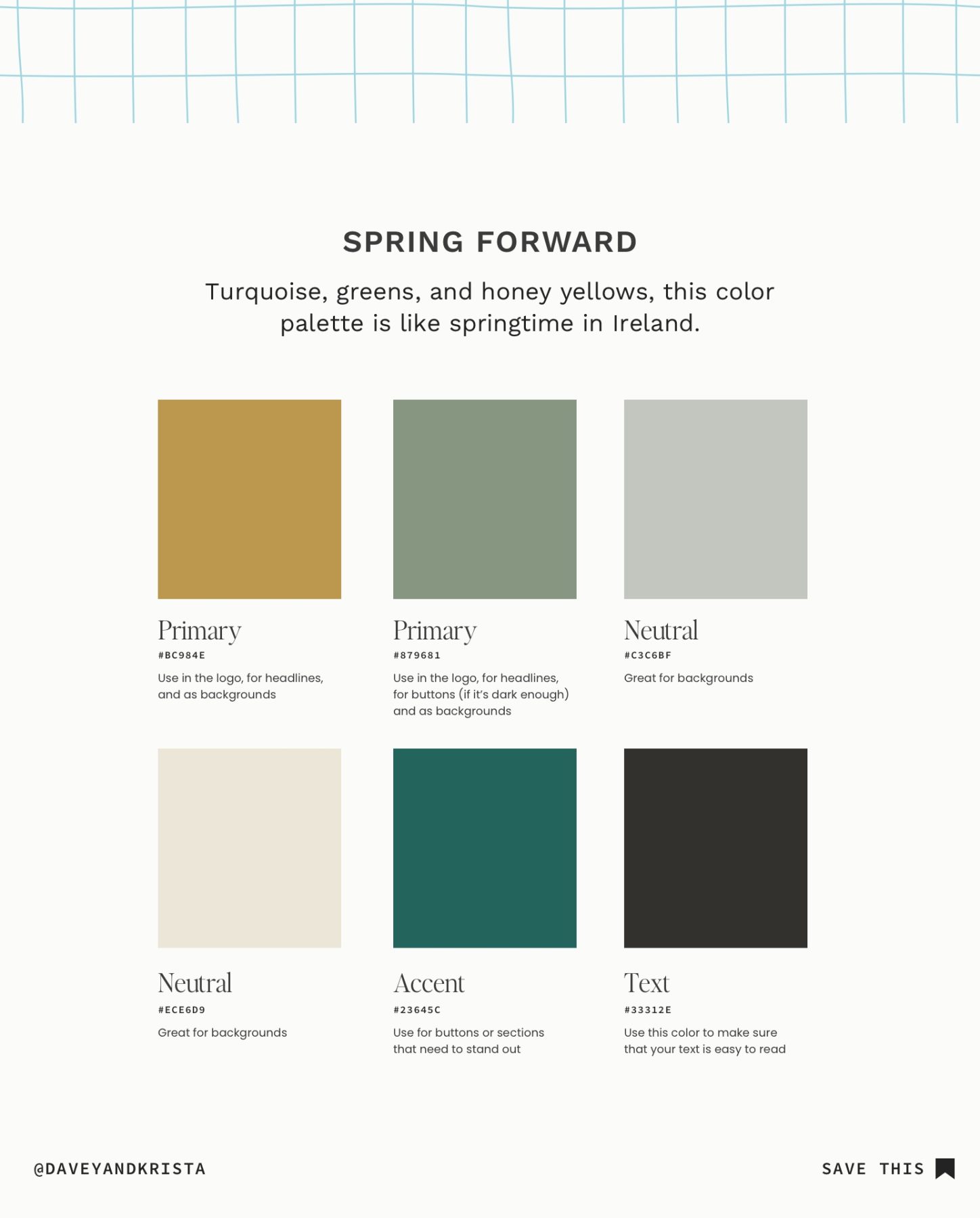
Spring Forward Color Palette
With its golden yellow, pale green, and rich emerald tones, this palette feels very “spring” to me. The pale green is soft and on-trend with what we’re seeing this year, but it’s balanced out with a deep emerald green and neutral creams.
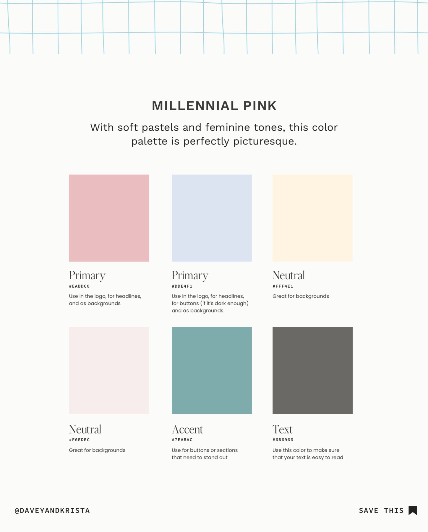
Millennial Pink Color Palette
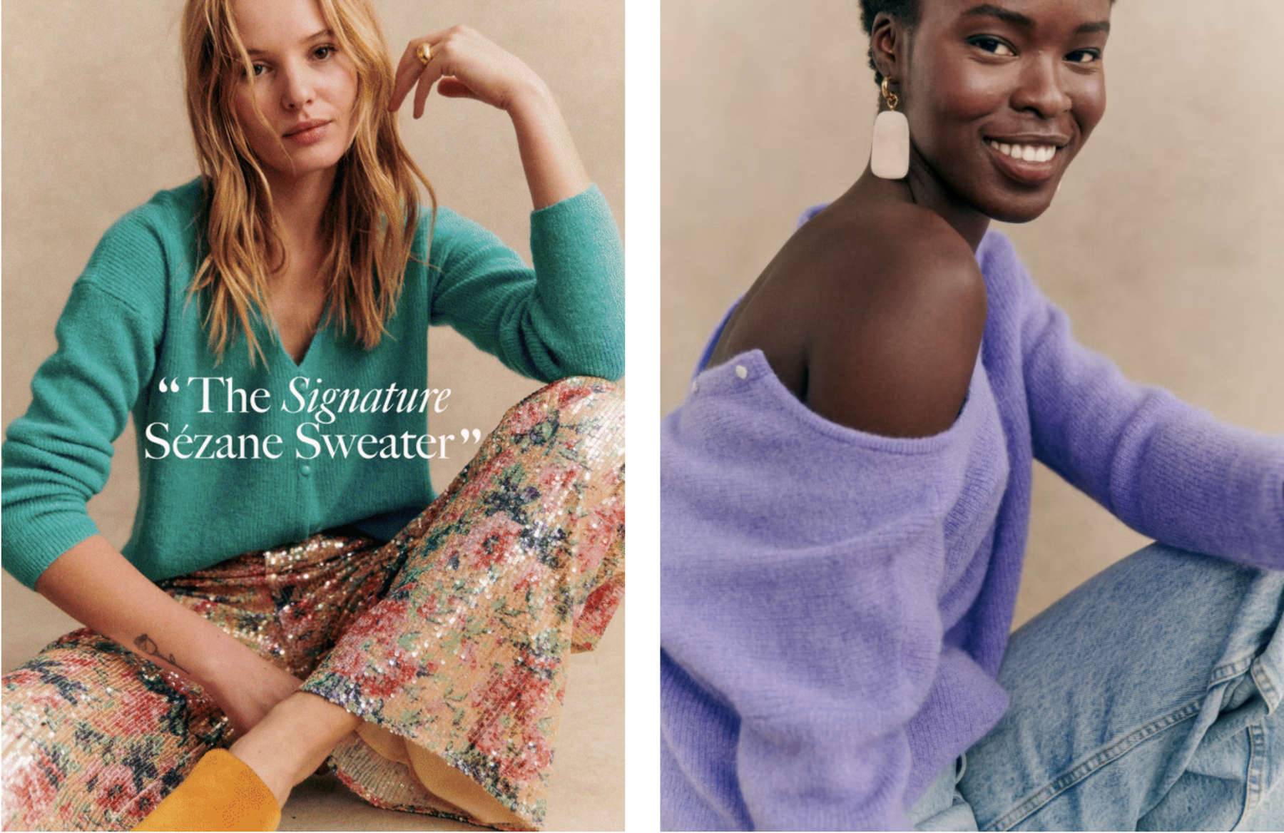
With its various pink tones and soothing lavender, this palette feels very feminine. We added a butter-soft yellow for the neutral and paired it with a fun turquoise accent. You may recognize the accent shade from the Sézane sweater featured above.
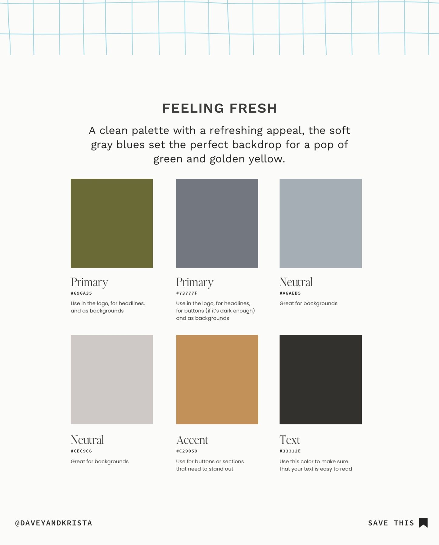
Feeling Fresh Color Palette
This color palette is as fresh as walking through a forest in the Pacific Northwest. The green resembles the dazzling dress Taylor Swift wore to the 2024 Golden Globes and pairs beautifully with the soft grays. A warm shade of honey brown makes up the accent color.
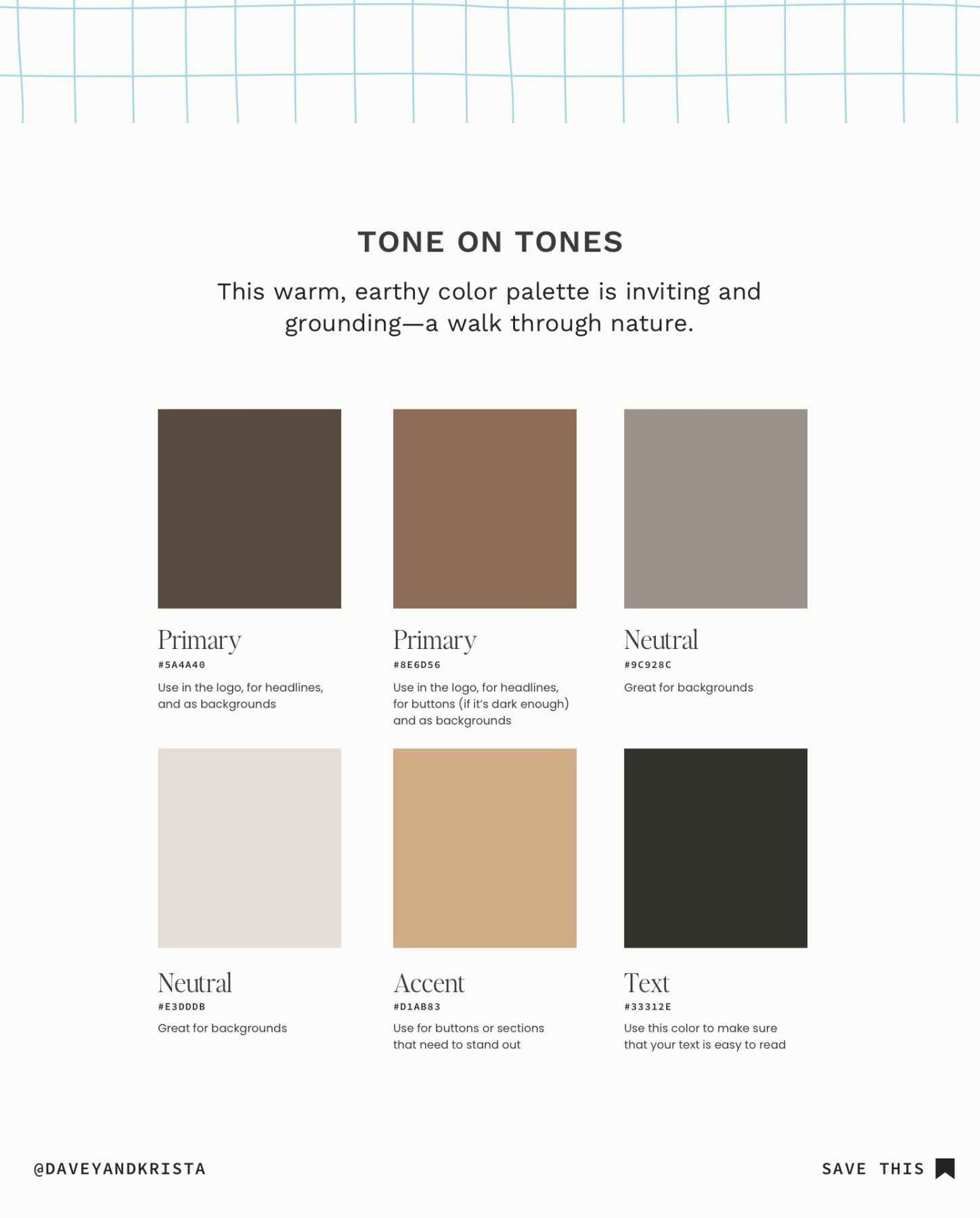
Tones on Tones Color Palette
I like to think of this color palette as an update to the cooler neutrals that dominated the last few years. The colors are warm, inviting, and on-trend for this year. According to House Beautiful, Sunbrella’s Greg Voorhis describes tone-on-tone color palettes, saying, “Spaces that play with colors within one family look sophisticated and effortlessly chic.”
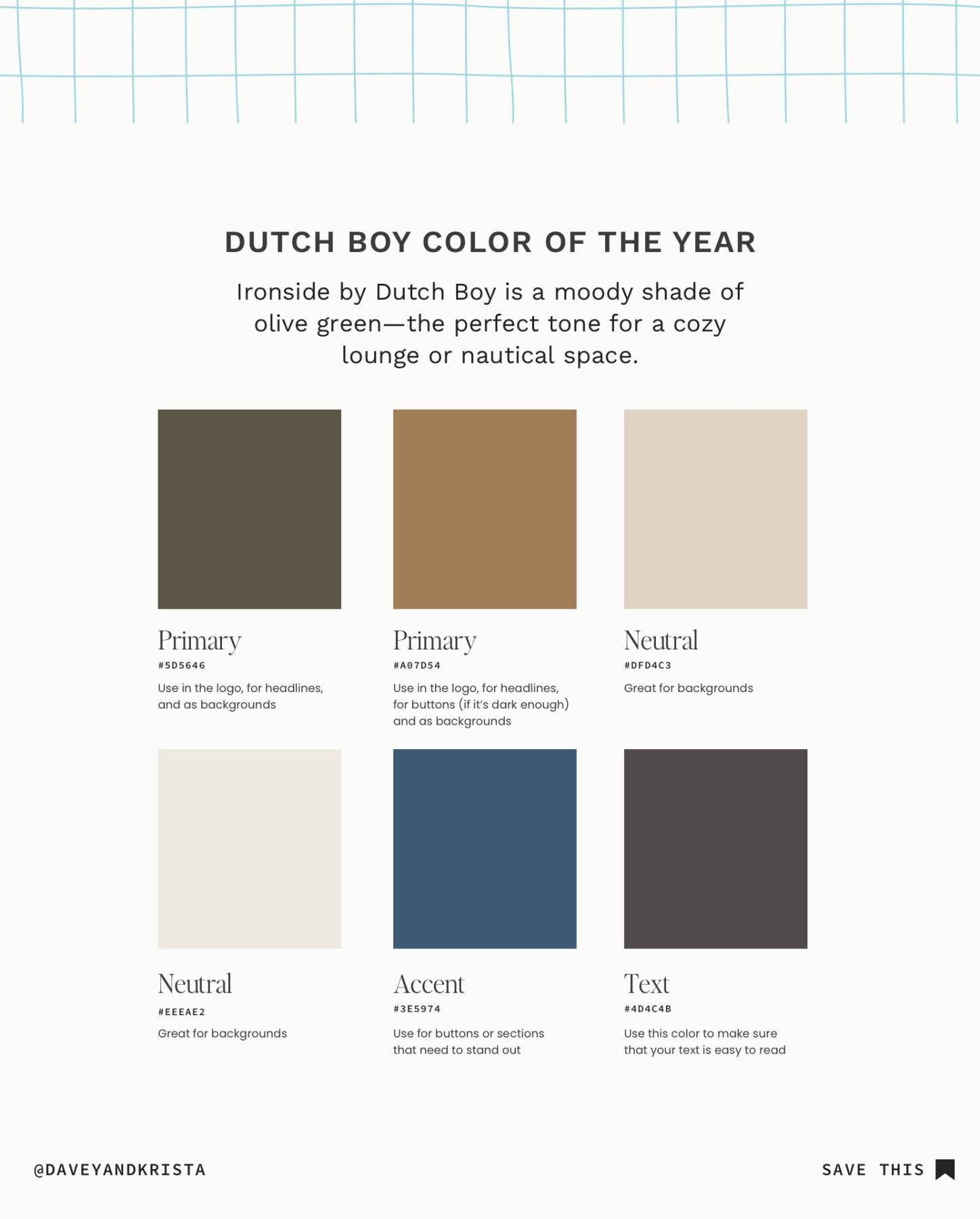
Dutch Boy Color Palette
Maybe it’s because I hail from the sailing town of Annapolis, Maryland, but this color palette feels nautical and a bit preppy to me. Dutch Boy’s Ironside stands as the primary color, balanced by soft creams and deep ocean blue.
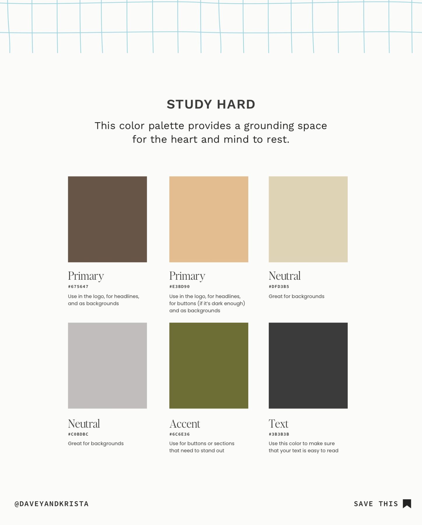
Study Hard Color Palette
This neutral brown palette reminds me of our Cannon Beach design. It embraces various shades of brown for the primary and neutral colors. If this color palette jives with your brand and you’re looking to implement it on a website, I would choose one of the neutral colors as the “base” background color instead of white. Take a look at how we did this in our Cannon Beach design.
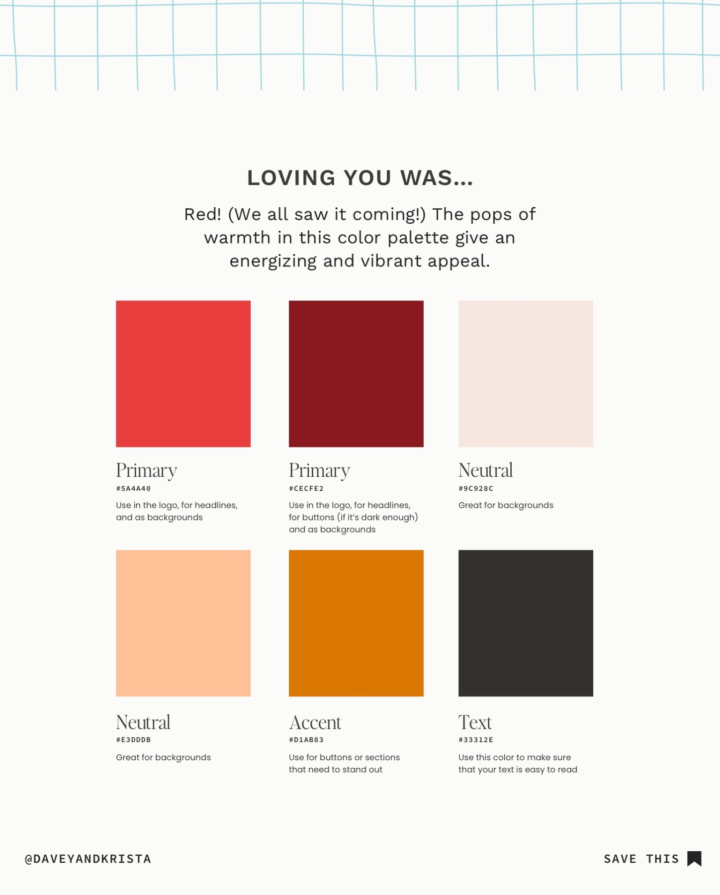
Loving You Was… Color Palette
This palette incorporates colors we saw throughout 2023, but the soft pink and dark red bring a bit more balance. It reminds me of a warm autumn day or spices (saffron, chili powder, paprika, etc). If you wanted to tone it down a bit, you could make the bright red your accent and bring in a lighter shade of one of the primary colors as the other neutral.
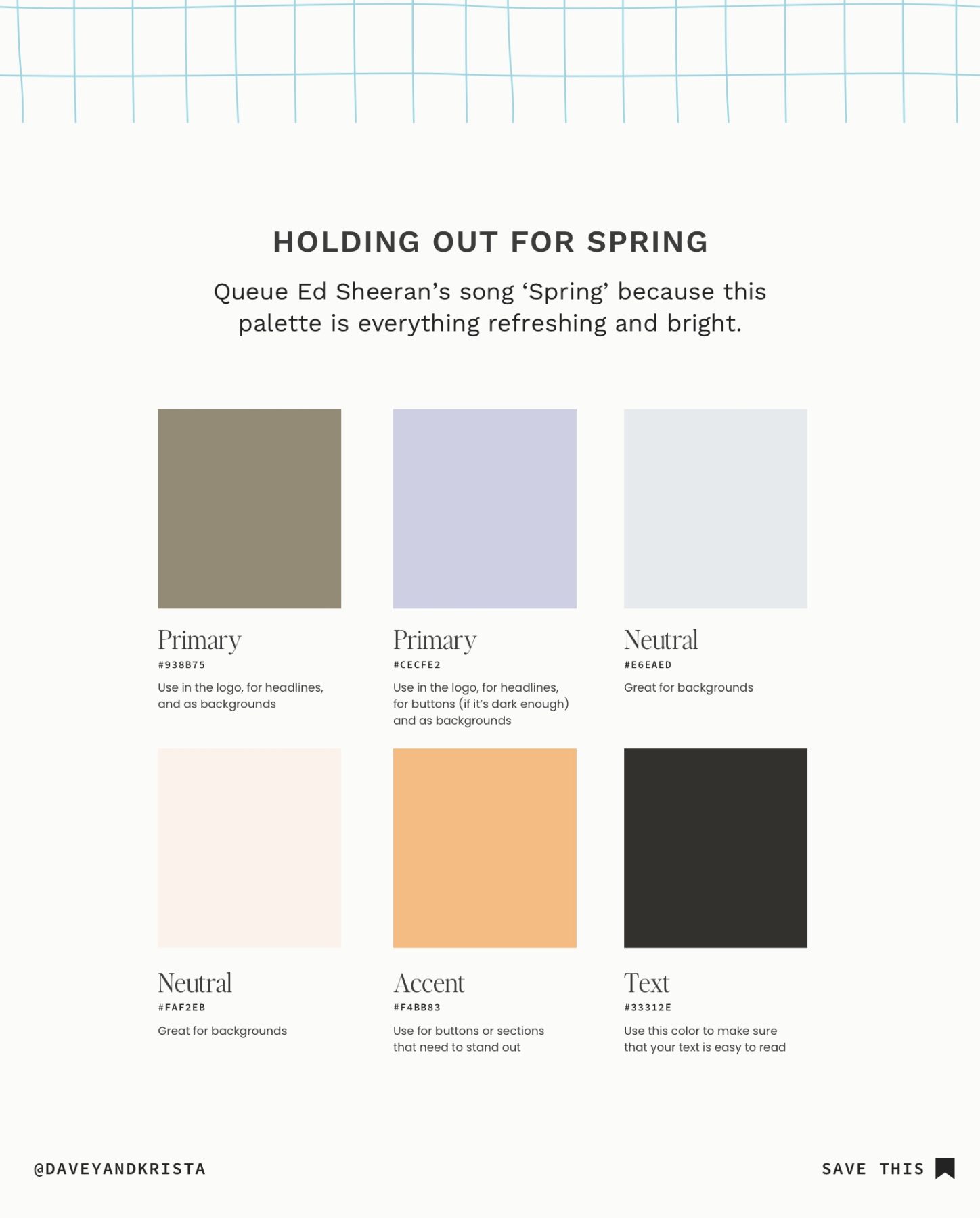
Holding Out For Spring Color Palette
This palette was inspired by fresh, springtime flowers. It pairs a soft lavender and fresh green with neutral pastels and a tangerine accent.
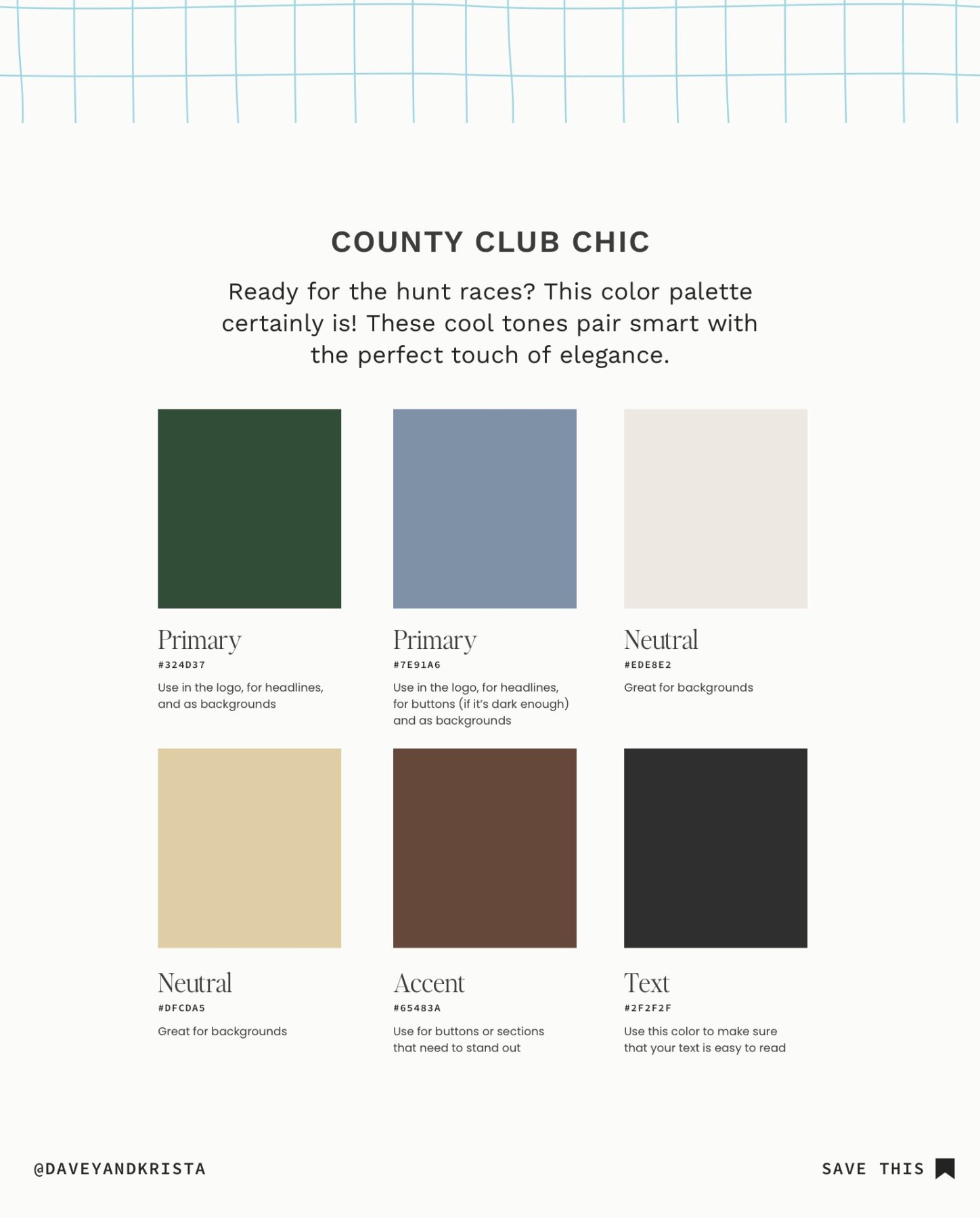
Country Club Chic Color Palette
Embrace the English countryside with this sophisticated color palette. Various neutral, brown shades are offset by a rich green and a very soothing blue. The green reminds me of a sturdy oak tree and the accent brings to mind the thick coat of a newborn colt.
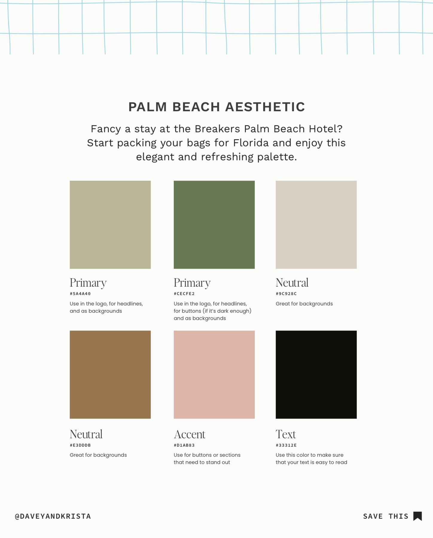
Palm Beach Aesthetic Color Palette
These colors have a classy but tropical appeal. The base of the palette is made up of soft greens and a rosy pink serves as the accent. The neutrals of this palette enhance its warmth, keeping on trend with 2024.
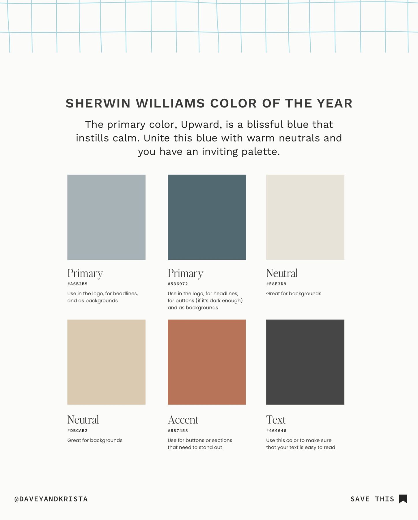
Sherwin Williams Color Palette
This color palette features Sherwin Williams’ Upward as the primary color. Pairing this delicate blue with a deeper blue allows the eyes to rest. Both neutrals are a soft cream and the accent gives a flash of warmth.
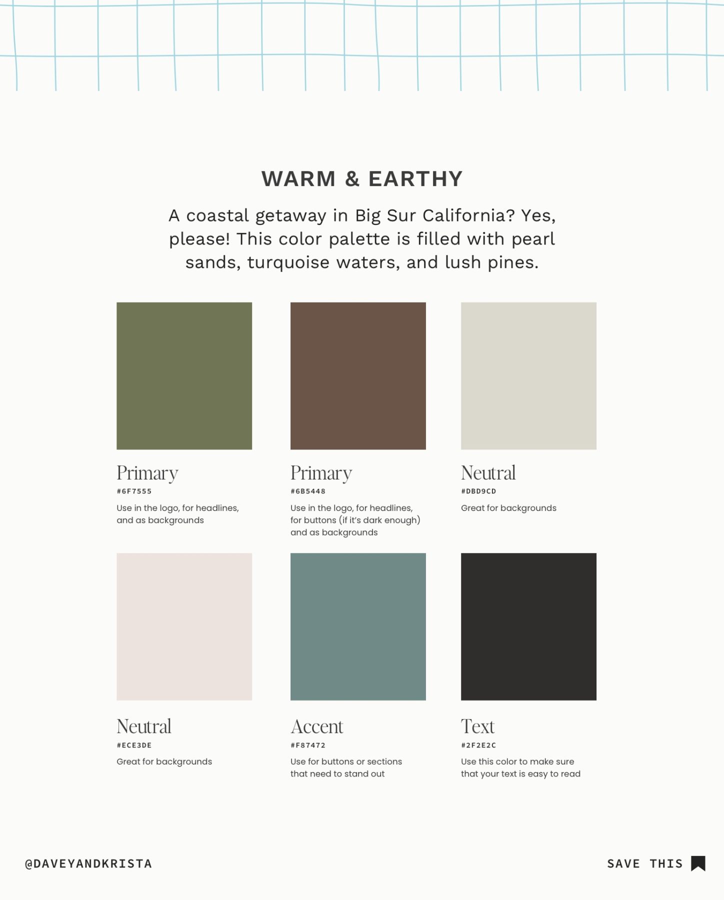
Warm & Earthy Color Palette
This color palette is restful, inviting, and perfectly balanced. The primary colors are rich and earthy, while the neutrals are light and calming.
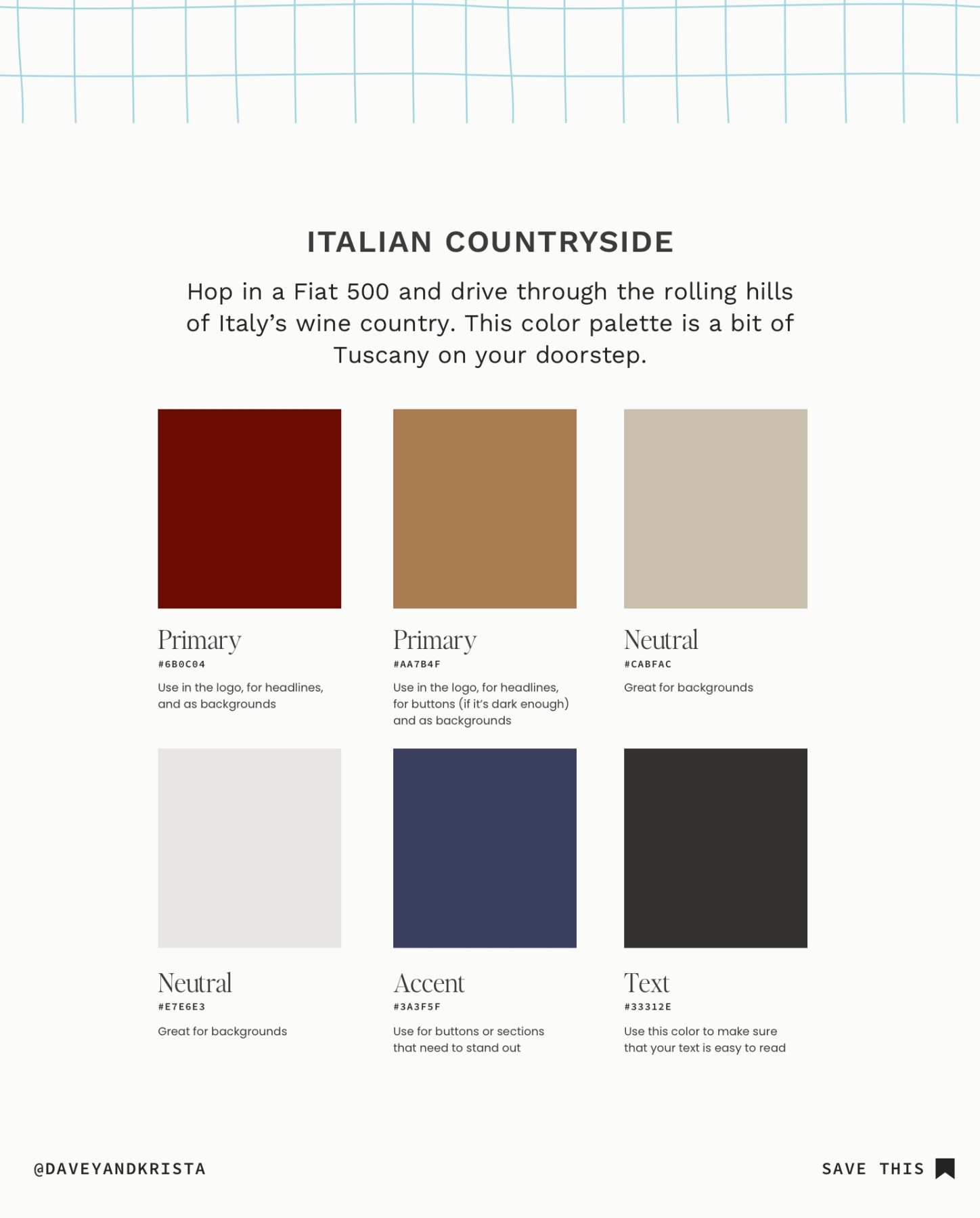
Italian Countryside Color Palette
With a deep burgundy as the primary and a nighttime blue as the accent, this color palette is rich and decadent. The neutrals bring a refreshing lightness to the brand, and together they whisk you away to the Italian Countryside.
How to Implement a Color Palette on Your Showit Website
If you’re looking to try one of these color palettes on your Showit website (or you’re new to Showit) be sure to check out the video below. We’ll walk you through the (very easy) process of updating the colors on your website.
If you’re testing out one of these color palettes in your next project, include a link in the comments below. We would love to see how you bring these to life in your brand!
VIEW THE COMMENTS
Add A Comment