


Neutrals have had their moment, but in 2025, color is taking center stage. Over the past few years, we’ve seen a shift from bold and playful to more grounded, soothing hues—yet warmth is making a big comeback with rich earth tones, vibrant pops of color, and palettes that balance nostalgia with innovation.
So, what does that mean for branding and web design? We’ve been following the trends and put together a collection of 2025 color palettes to inspire your next project. Read on to find a palette that speaks to your brand’s style and target audience!
Related: A Guide to the Psychology of Color
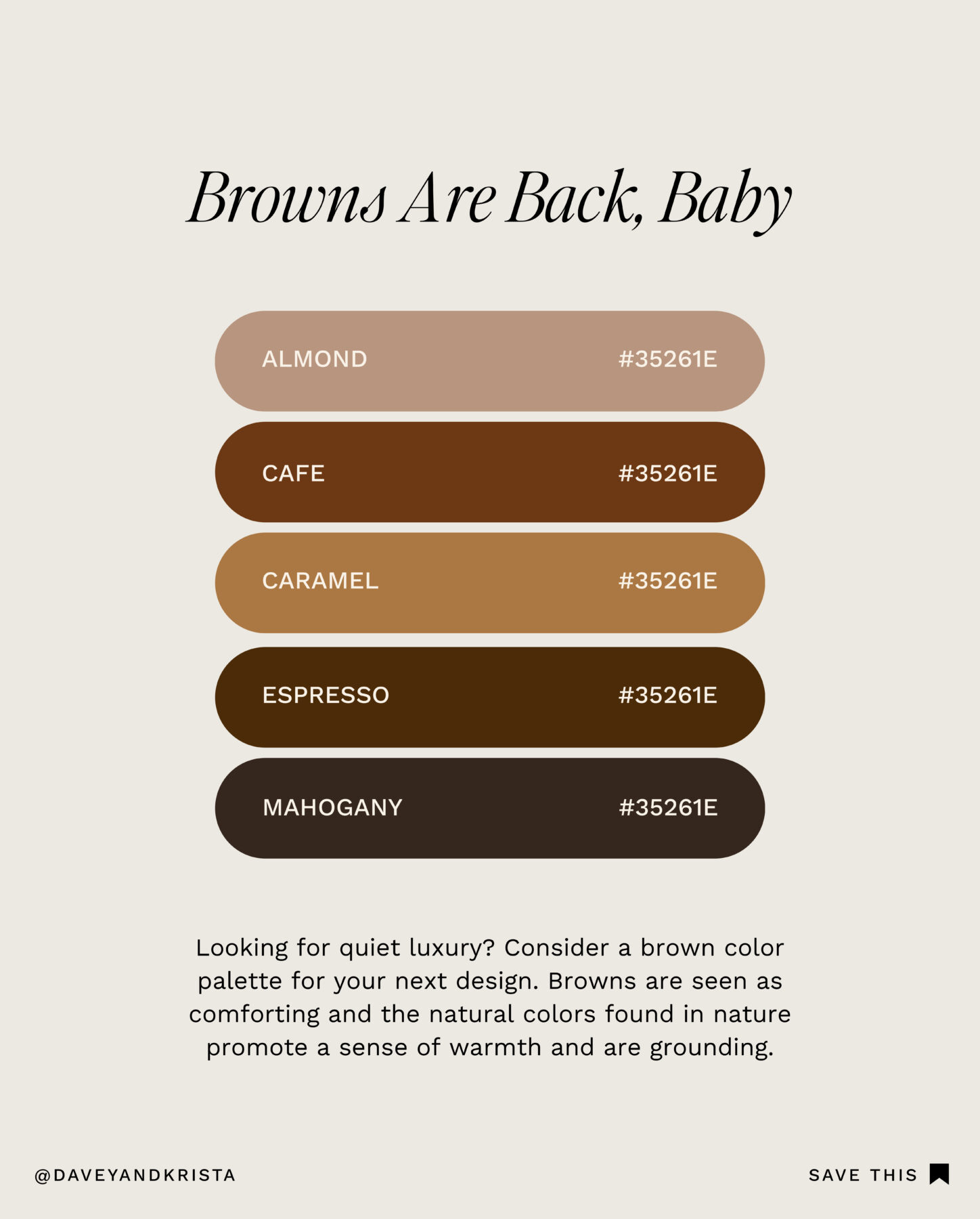
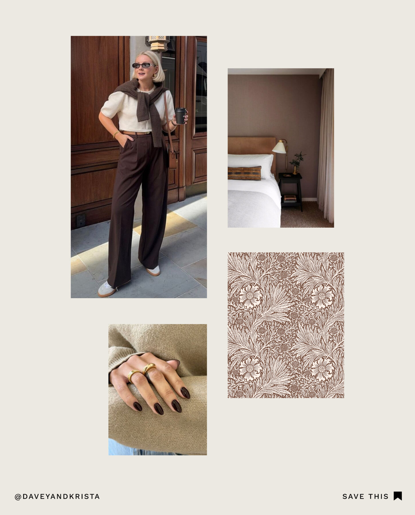
Browns Are Back, Baby
Looking for quiet luxury? Consider a brown color palette for your next design. Browns are comforting, and natural colors promote a sense of warmth and grounding. If you want to embrace a timeless, earthy, and sophisticated aesthetic—this is the palette for you.
Brands that emphasize sustainability and natural elements, like Aesop and Everlane, will often incorporate warm brown tones. Other examples include coffee shops, high-end skincare brands, and boutique interior design firms.
This palette is a great fit if your brand caters to an audience that values warmth, coziness, and organic materials.
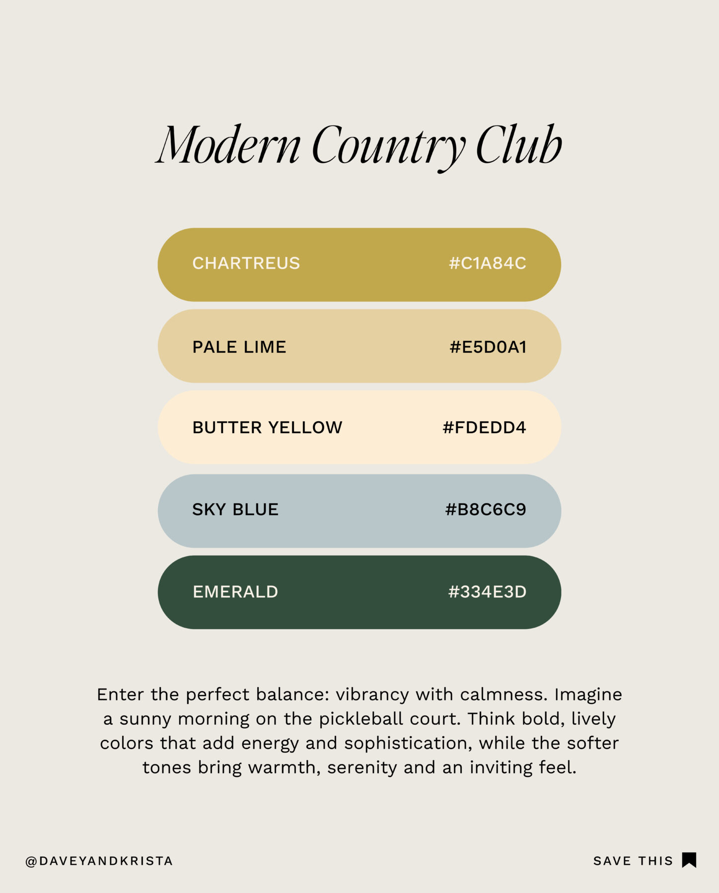
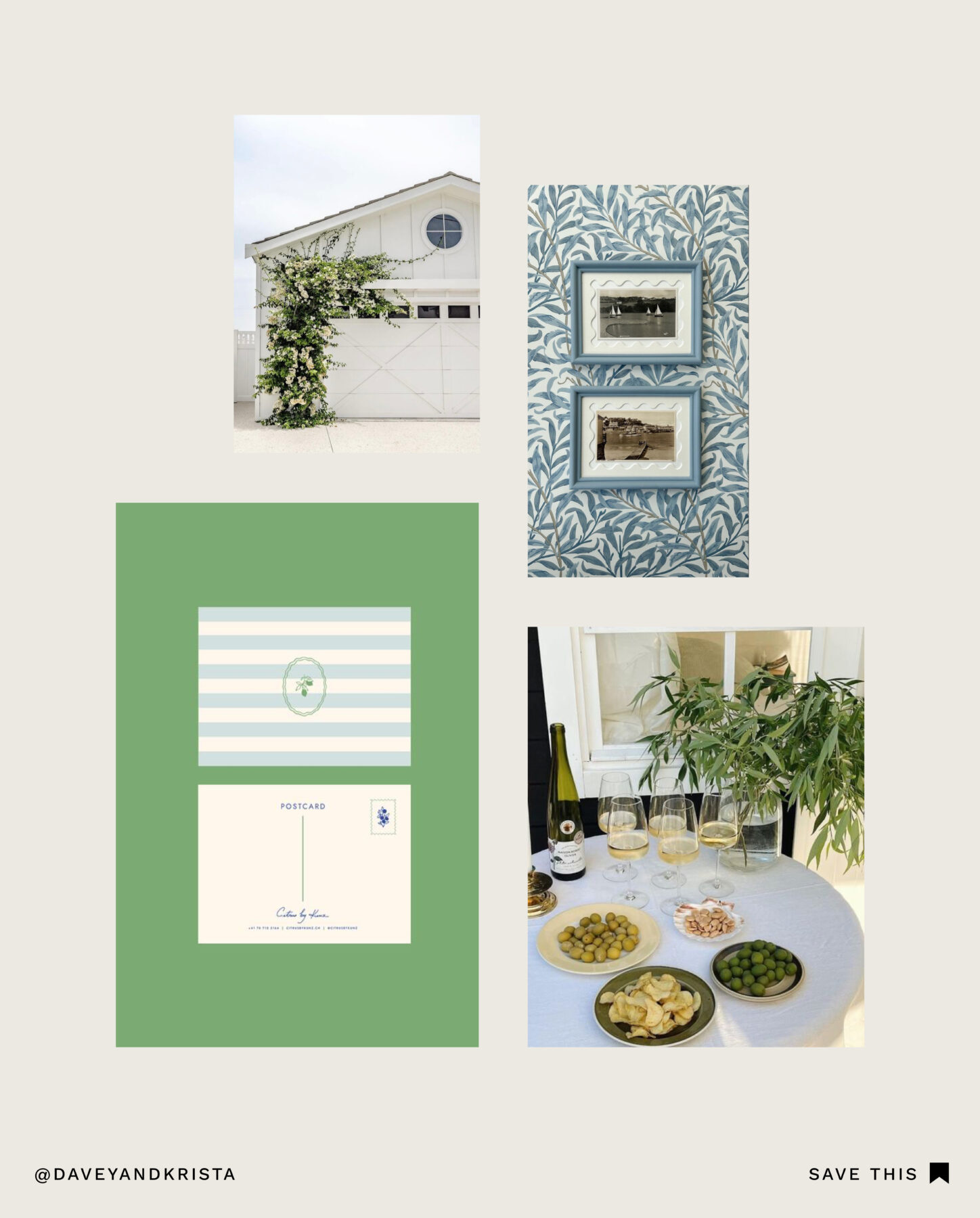
Modern Country Club
Enter the perfect balance: vibrant with a sense of calm. Like a sunny morning on the pickleball court, this lively color palette blends energy and sophistication. Chartreuse packs a punch, while softer tones bring warmth and serenity.
We love this palette for upscale lifestyle brands, boutique fitness studios, or waterfront resorts that want to capture a modern yet classic look. You can catch brands like Ralph Lauren and Lacoste donning this aesthetic.
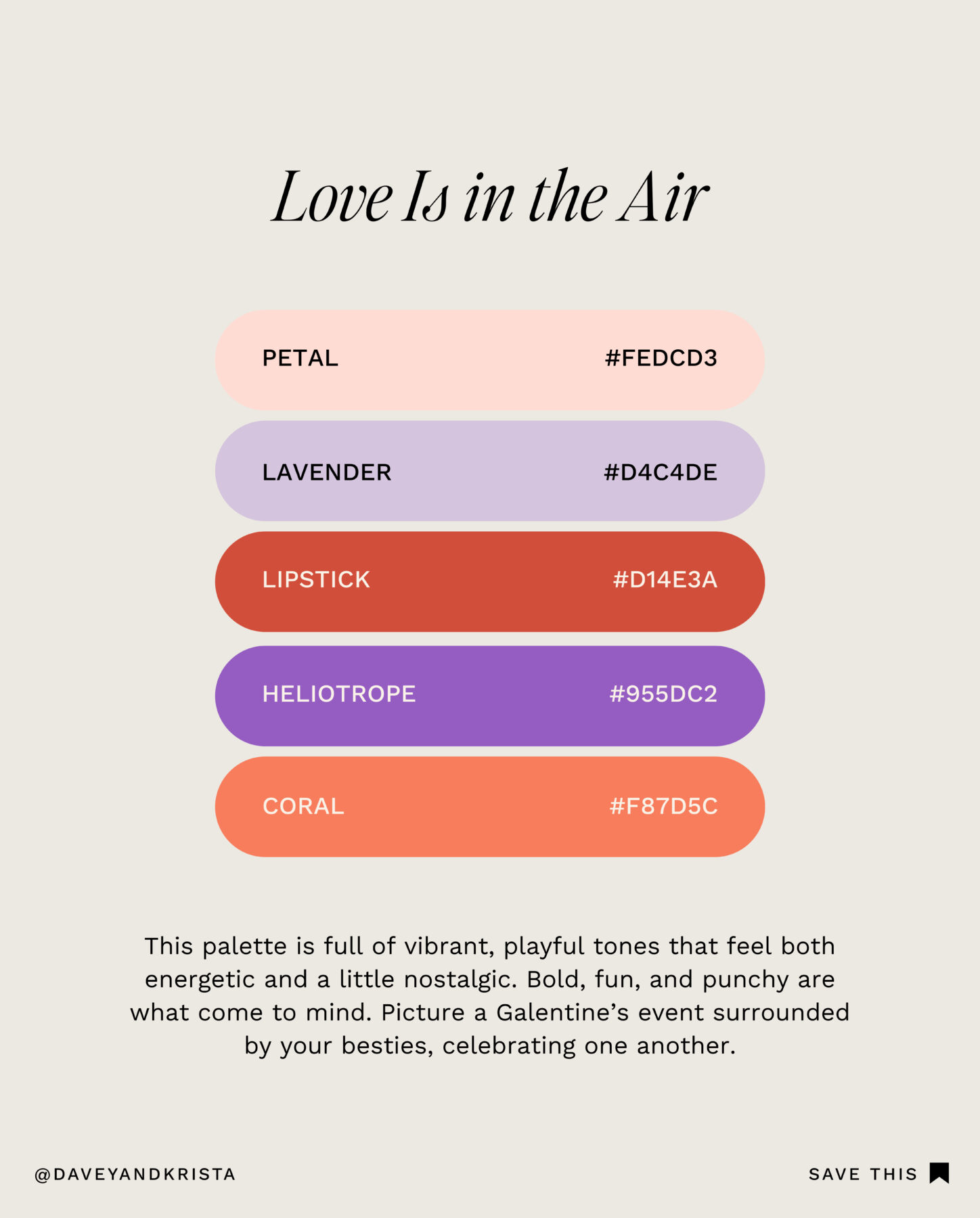
Love Is in the Air
This palette is full of vibrant, playful tones that feel energetic and nostalgic. Bold, fun, and punchy came to mind when we created this one. Picture a Galentine’s event surrounded by your best friends, celebrating one another.
This color combination feels joyful and fun—perfect for beauty brands, event planners, and lifestyle bloggers. Brands like Glossier and Fenty Beauty embrace similar shades to create a youthful, energetic, and engaging aesthetic. This is the perfect palette if your audience is young, fun, and looking for something bold yet stylish.
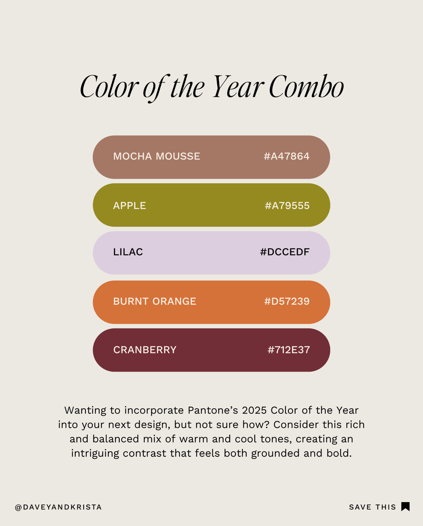
Color of the Year Combo
Want to incorporate Pantone’s 2025 Color of the Year into your next design, but not sure how? Look no further than this mix of warm and cool tones. The contrast creates a harmonious balance of comfort and energy.
We love this color combo for creative agencies, tech companies, and forward-thinking brands who march to the beat of their own drum. It feels innovative yet approachable for brands that want to stand out while maintaining trust and balance. Part nostalgic, part unexpected, and entirely fun to design with.
We see similar color palettes play out with brands like Mailchimp, Headspace, and Anthropologie.

Related: 17 Trending Color Palettes for Websites in 2025
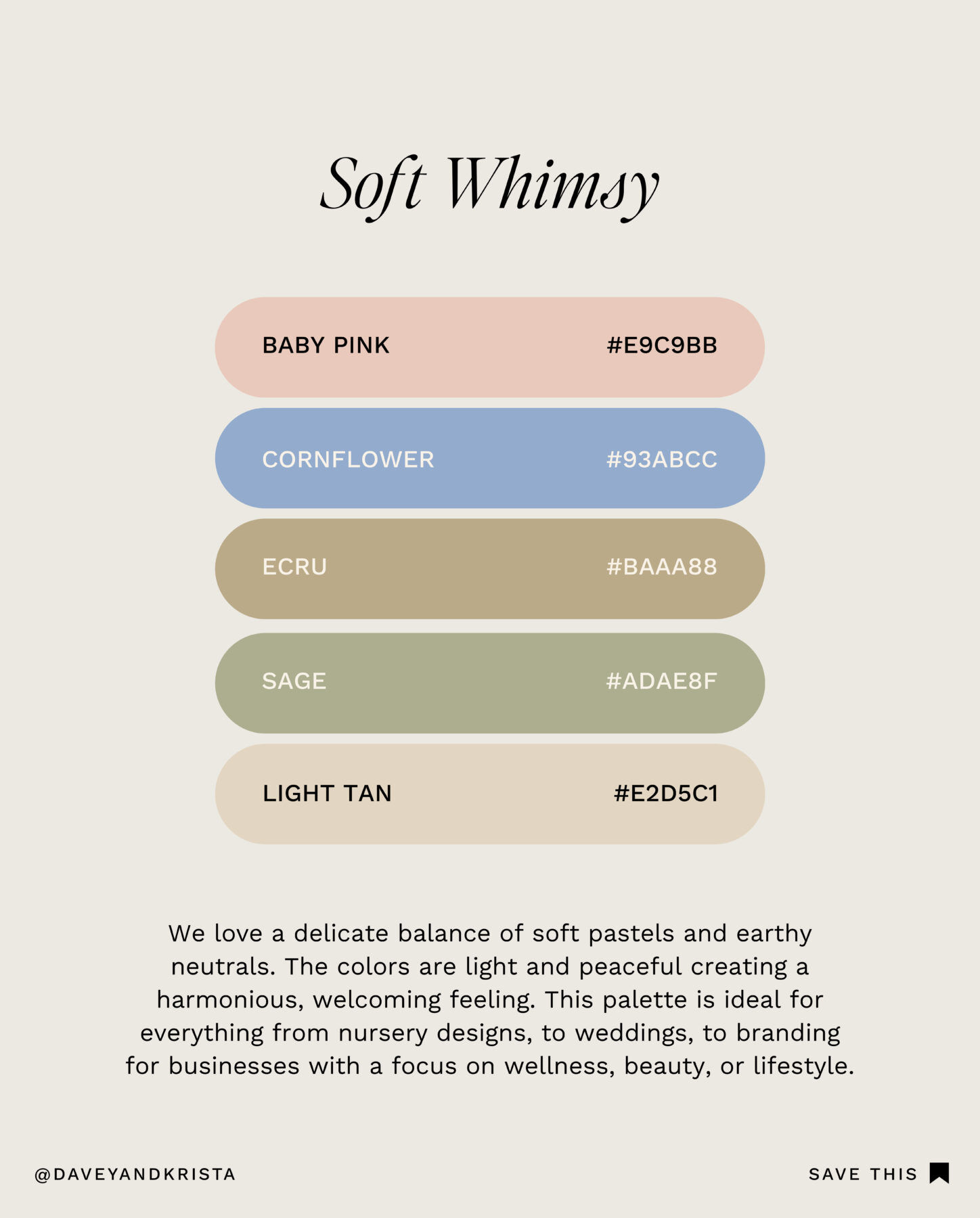
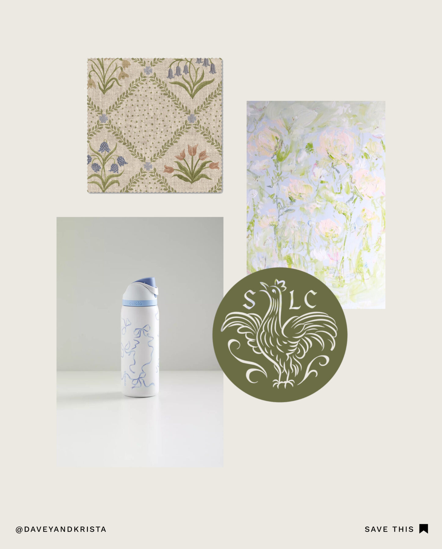
Soft Whimsy
We love a delicate balance of soft pastels and earthy neutrals in brand color palettes. The colors are light and peaceful, creating a delicate and soothing vibe with plenty of room to breathe. This palette is ideal for everything from nursery designs to weddings to wellness, beauty, and lifestyle branding.
Baby and kid’s lifestyle brands like Pehr and Mushi embrace similar shades of soft pastels and earthy neutrals to create a warm, gentle aesthetic that works perfectly for nurseries and children’s products. This palette is excellent if your audience resonates with inviting and serene designs.
Ready for a Color Refresh?
Your color palette can go a long way toward expressing your brand personality and connecting with your target audience. Whether you’re looking for something bold and vibrant or soft and sophisticated, the right color choices can set the tone.
Which of these palettes are you most likely to use for your next brand design project? Let us know in the comments!


VIEW THE COMMENTS
Add A Comment