


Table of Contents
Something is shifting in the visual landscape right now, and if you’ve been paying attention, you’ve probably already felt it.
Across fashion week runways, interior design editorials, and the most-saved images on Instagram, a consistent pattern keeps showing up. The 2026 brand color trends aren’t about one breakout color. They’re about a whole new approach to how color, texture, and light work together. And they’re going to shape what standout branding looks like over the next 12 months.
Here’s what’s actually happening, and what it means for your website.
The Bigger Shift Behind This Year’s Color Direction
Before we get into specific palettes, the most important thing to understand about the 2026 brand color trends is this: flat color is fading.
The brands that feel elevated right now aren’t using bolder colors or busier layouts. They’re using more dimensional ones. Edges are softening. Color is layered, not blocked. Texture is doing the storytelling that solid fill used to handle.
The next wave of standout brands will feel less like layouts and more like environments, where color, light, and surface all work together. That’s a meaningful shift for web design specifically, because it changes what “minimal” actually looks like. Minimal is no longer flat. It’s breathing.
To put this in context: the three trends below are pulled from Fashion Week palettes (Pantone, WGSN, runway coverage), interior design direction from editorial trend reports, and high-performing Instagram interiors filtered for visual repetition and engagement. The consistent pattern across all three? A calm base plus an expressive accent plus visible material texture is now the dominant formula.
Here’s how the 2026 brand color trends play out for branding and Showit web design.
Trend 1: Airy Mineral Neutrals with Light-Based Texture
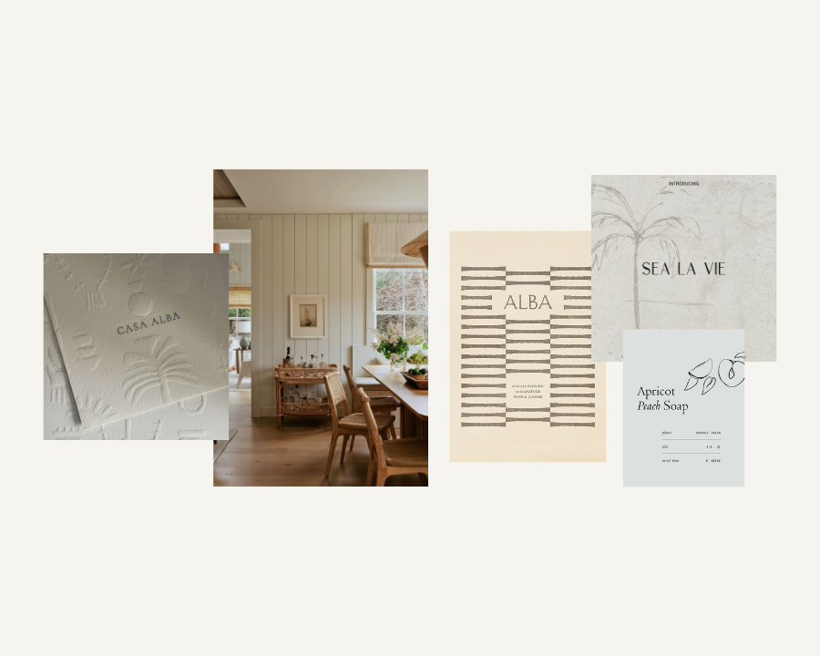
The Evolution of Minimalism
If you’ve been watching interiors accounts lately, you’ve probably noticed a certain quality of light that keeps showing up. Soft, luminous, and slightly dimensional. Not stark white. Not cold. More like the walls have a breath in them.
That’s one of the most defining 2026 brand color trends. “Cloud Dancer,” by Pantone, described by forecasters as a defining soft white for the year, is shaping both fashion and interiors right now. Flat whites are giving way to layered, breathable surfaces. Natural light and subtle variation are replacing harsh contrast.
Palette:
- Cloud White: #F2F2EE
- Mineral Mist: #E6E8E7
- Pale Blue Aura: #D6E3EA
- Soft Stone: #C9C3B8
- Dust Grey: #A8B0B2
Texture pairings: limewash, plaster, frosted glass, sheer diffusion, paper grain.
Why this matters for your website: This palette creates high-end calm without looking empty. It’s the difference between a site that feels sparse and one that feels intentional. It works especially well for long-scroll sites, education brands, and refined service providers who want to signal quality without a lot of visual noise.
Trend 2: Deep Teal and Organic Earth Contrast
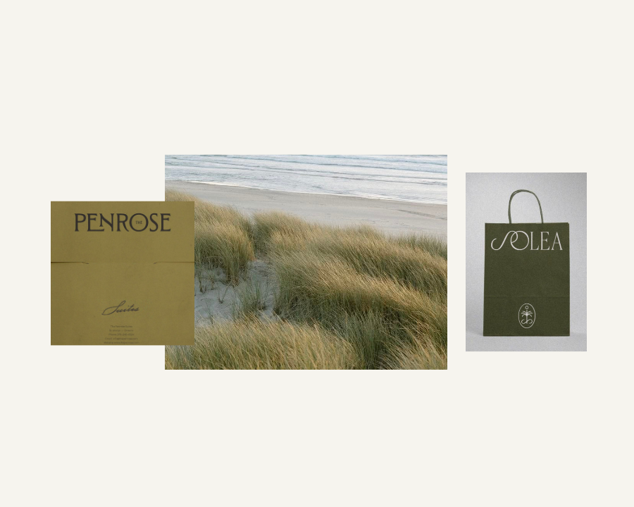
The Sweet Spot Between Nature and Modern Depth
Teal is having a significant moment in this year’s forecasting. “Transformative Teal” is showing up consistently across fashion trend reports, and at the same time, cool neutrals are being replaced by earth tones: olive, cocoa, clay. Interiors are leaning into warmth and lived-in natural materials.
The combination of a deep, slightly saturated teal against warm earth tones creates something genuinely interesting. Grounded but not heavy. Rich but not dark. Modern but not cold. It’s one of the 2026 brand color trends that translates particularly well to web design because it’s versatile across both light and dark layouts.
Palette:
- Transformative Teal: #1F5C63
- Deep Moss: #5F6F52
- Cocoa Brown: #4A3A32
- Clay Sand: #C2A58C
- Warm Cream: #EFE7DB
Texture pairings: aged wood, raw linen, ceramic and clay surfaces, matte painted walls.
Why this matters for your website: This combination hits three marks that are surprisingly hard to achieve at once: trustworthy, premium, and human. Brands that have leaned cold and digital are starting to feel dated. This palette offers depth without heaviness and warmth without looking rustic or casual. It’s going to become a go-to for brands that want to signal both expertise and approachability.
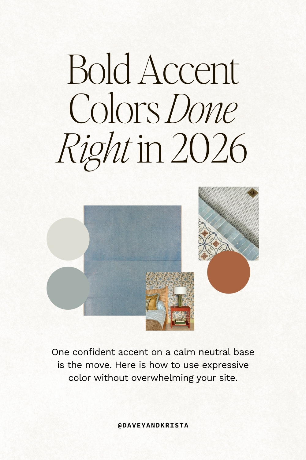
Trend 3: Digital Bright Accents on a Soft Neutral Base
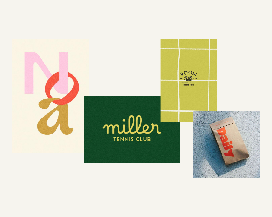
Controlled Boldness
This one isn’t about going maximalist. It’s about using one confident, intentional accent against a foundation calm enough to carry it.
Runways are pushing expressive colors: purple, red, green, saturated accents that don’t apologize for themselves. Trend data from Pinterest highlights plum, persimmon, and electric green as breakout tones. But the 2026 brand color trends are also showing us how to use these without overwhelm: pair bold with calming. Let the neutral do most of the work.
Palette:
- Royal Purple: #5B3FA6
- Persimmon: #E85D3F
- Apple Green: #7ED957
- Soft Sand: #F4EFE6
- Warm Taupe: #B8AFA3
Texture pairings: glossy resin, lacquer, glass and chrome accents, smooth gradients, subtle iridescence.
Why this matters for your website: A neutral foundation is easy to read and easy to trust. One bold accent becomes memorable. Together, they let a brand stand out without overwhelming the visitor. Expect to see this direction especially in creative studios, digital products, and brands targeting younger audiences.
What the 2026 Brand Color Trends Are Really Telling Us
Three trends, one underlying message.
Flat color is out. Designers are replacing it with surface and light interaction. Warmth is overtaking cool minimalism. Even palettes that lean cooler now include softness or grounding tones to keep them from feeling sterile. And bold contrast is becoming strategic rather than constant: color used sparingly and with intention, not spread evenly across everything.
The practical takeaway for your branding and web design? The 2026 brand color trends will reward brands that build around one dominant neutral environment, layer in two or three tactile textures, and introduce one intentional accent color.
Not louder. Not busier. More dimensional, more human, and more considered. That’s a good direction for thoughtful, strategic design. It rewards restraint, intention, and craft over volume.
Ready to see how these trends translate into a real website? Browse the Davey & Krista template shop to see how color, texture, and layout work together in sites built specifically for creative businesses.
FAQs: 2026 Brand Color Trends
What are the biggest 2026 brand color trends?
The three dominant directions are airy mineral neutrals with texture, deep teal paired with warm earth tones, and bold accent colors used intentionally against soft neutral bases. The common thread across all three: dimension and texture are replacing flat, solid color.
How do I choose a color palette for my website in 2026?
Start with one dominant neutral as your base, then layer in one or two complementary tones and one intentional accent. The brands standing out right now aren’t using more color. They’re using it more deliberately.
Are bright colors part of the 2026 brand color trends?
Yes, but with restraint. Bold tones like royal purple, persimmon, and electric green are showing up on runways and in trend forecasts, but the brands using them well are pairing them with calm neutral bases. The goal is one memorable accent, not a full bright palette.
How do these color trends apply to Showit websites specifically?
Showit’s design flexibility makes it easier to apply these trends well. You can control exactly how color, texture, and spacing work together across both desktop and mobile, which matters a lot when you’re working with layered, dimensional palettes.
What textures pair well with 2026 brand color palettes?
It depends on the palette, but across all three trends, natural and tactile textures are the common thread: limewash, linen, plaster, aged wood, matte surfaces. Even in digital design, you can bring this in through background treatment, overlays, and image selection.

Krista is the co-founder of Davey & Krista, a creative studio known for high-converting Showit website templates crafted for photographers, creatives, and entrepreneurs. With over 15 years of branding and marketing experience, she helps business owners launch stunning websites without the tech overwhelm. Krista also teaches designers how to turn their creative skills into a thriving business—through templates, courses, and behind-the-scenes strategy. When she’s not designing, you’ll find her chasing sunshine, color palettes, and gluten-free pizza.
Explore website templates and free resources at daveyandkrista.com.


VIEW THE COMMENTS
Add A Comment