How to make sure your work looks great and gets seen by visitors on your website.
Most of us realize that images play a crucial role in how our websites, and ultimately how our services, are perceived. Knowing how to size images, where to share them, how many to share, and what kinds of images to share can be tricky.
But the good news is that with most websites, updating images is one of the easiest and quickest ways to improve your overall web presence.
And all of this can be done without hiring a designer.
In this post we’re going to walk you through:
- How to create event galleries that better show off your work
- Why you might want to get rid of the portfolio page
- Why you should show off less work
- How to size images so they look good on your website
- How to keep your imagery looking consistent
So let’s dive in…
5 Tips for Making Your Work Look Great on Your Website
While many of these tips are most relevant for photographers and event-based businesses, the concepts could be applied to any business. Here are five tips for making sure your work looks great for your website visitors…
1. We highly recommend creating galleries by event—not by category.
Instead of having Weddings, Engagements, and Proposals galleries, create galleries by event or couple. This way visitors don’t see a random collection of work from different events all grouped together in one gallery. Since different events might have different aesthetics, keeping them separate helps you define a more coherent aesthetic for each gallery.
Not only does sharing highlighted event galleries enable you to share more images from your favorite events, it also gives site visitors a better sense of your overall style.
This isn’t just true for photographers—we recommend this to florists, invitation designers, etc. It might not be as easy because you probably won’t have as many photos to choose from, but galleries don’t have to be dozens of photos (see tip #3).
As a side note: Be sure to choose a gallery that’s easy for your visitors to use and navigate. If you’re curious about whether it’s easy to use, ask somebody (ideally someone who is not very web-savvy) to give it a shot for you.
2. Get rid of the portfolio page (maybe).
While there are a few exceptions (such as only offering one kind of service or product*), we’re not fans of a portfolio page. We recommend moving your galleries into your services page to give visitors a more seamless experience.
Think about it.
Do people have to leave an Amazon product page to see pictures of the product? Of course now. As people are reading about your services and the experience you provide, doesn’t it make sense for you to show them a few examples of your work instead of expecting them go searching for the relevant portfolio? This is an especially helpful tip if you offer multiple services and don’t want to have a bunch of drop-down menus or links to sub-pages in your navigation.
Use your beautiful galleries, testimonials, service details, and social proof to help build a “case” for hiring you and encouraging people to inquire.
Wanna see an example of this? Check out this services page and then read our post: How to Create a Services’ Page that Sells
*If you only offer one product or service, a portfolio page might make sense. If you offer multiple services and still want to include a portfolio page, just be sure it’s easy to navigate and people can find relevant information quickly. Adding some text to the page can also make the page feel more built out and maybe even help with SEO.
3. If you don’t LOVE it, cut it
Galleries on your website should only consist of your very best work. The kind of work you love and want to do more of.
We only include 20-25 photos in each gallery. If people want to see more work, they’ll ask. We always send 2-3 full galleries after someone inquires. Courting a new client is kind of like dating. You don’t need to share everything on the first date. And with the limited attention span of most site visitors, it’s probably best to limit what you share.
This rule applies to any galleries on your homepage as well. The first gallery people see on the homepage should be a highlight reel with a cohesive aesthetic (see tip #5). We don’t recommend adding more than five images to that space. Most likely, people won’t sit there long enough to view the full gallery anyways.
So show them the best of the best and encourage them to head to your services page to learn (and see) more.
4. Size images appropriately.
This is more of a technical tip, but important so that the page loads quickly.* If you’re more of a visual learner, check out the quick video below.
One mistake we see a lot of people make is uploading full resolution images. We were guilty of this ourselves early on in our career. You want you images to look good and you aren’t sure what size to make them, so you upload the original files and let your website size them down (hopefully it’s one that does!).
The problem is that those image files are probably MUCH larger than they need to be. And if your images are so large that they do one of those slow loads from the top down, visitors may move on (or worse yet, click away) before they ever see that beautifully chosen image.
So what size images should you share? To take into account retina devices (which need a larger file in order to appear crisp), we recommend:
[Width of images displayed on your website] x 1.5 = [size file you should upload]
So what does that look like when it’s actually applied?
Well, the images in this blog post are displayed at 655 pixels wide.
If you aren’t sure how to figure out the width an image is displayed at, try hitting Command + Shift + 4 on a Mac. This feature is technically for creating pieces of screenshots, but it creates a little cursor with pixel dimensions that is great for measuring the size of different images on your screen.
So for the images on our site:
655 pixels wide x 1.5 = 982 (We normally round up to 1000)
Keep in mind that that method for sizing and uploading images only works if your website sizes images down for you. If you’re working on a site or in a space that won’t size your image, you’ll want to upload the exact size image you need.
<<Related Post: Optimize Images for Search Engines>>
One exception to this rule is if you’re working with an image that needs to span the entire width of a page. To take into account larger retina screens, we normally recommend keeping these images around 1800 pixels wide.
If you have the ability, consider lowering the quality of the image a bit to help keep the file size from becoming too large. Working with these kinds of images isn’t an exact science and often requires a little experimentation to figure out if an image is going to load quickly.
And one last thing about optimizing images: once you’ve loaded a page once, your internet browser has most likely stored (cached) those images to help the page load quickly in the future.
If you’re experimenting with image sizes and trying to figure out if your images do load quickly, it’s best to clear your cache of images before reloading a page or using a tool like Google PageSpeed Insights.
*A word about page-speed: Even if you received a perfect page speed score, that doesn’t mean your website is “optimized.” For instance, you could probably increase the loading speed of a page by removing all of the images on the page, but does that improve the user experience? Probably not. And it probably would be an extra silly move if you’re a photographer or visual artist. Wanna know how many people are bouncing off a page on your website? Check out Google Analytics and use that to make decisions.
5. Keep Imagery Consistent
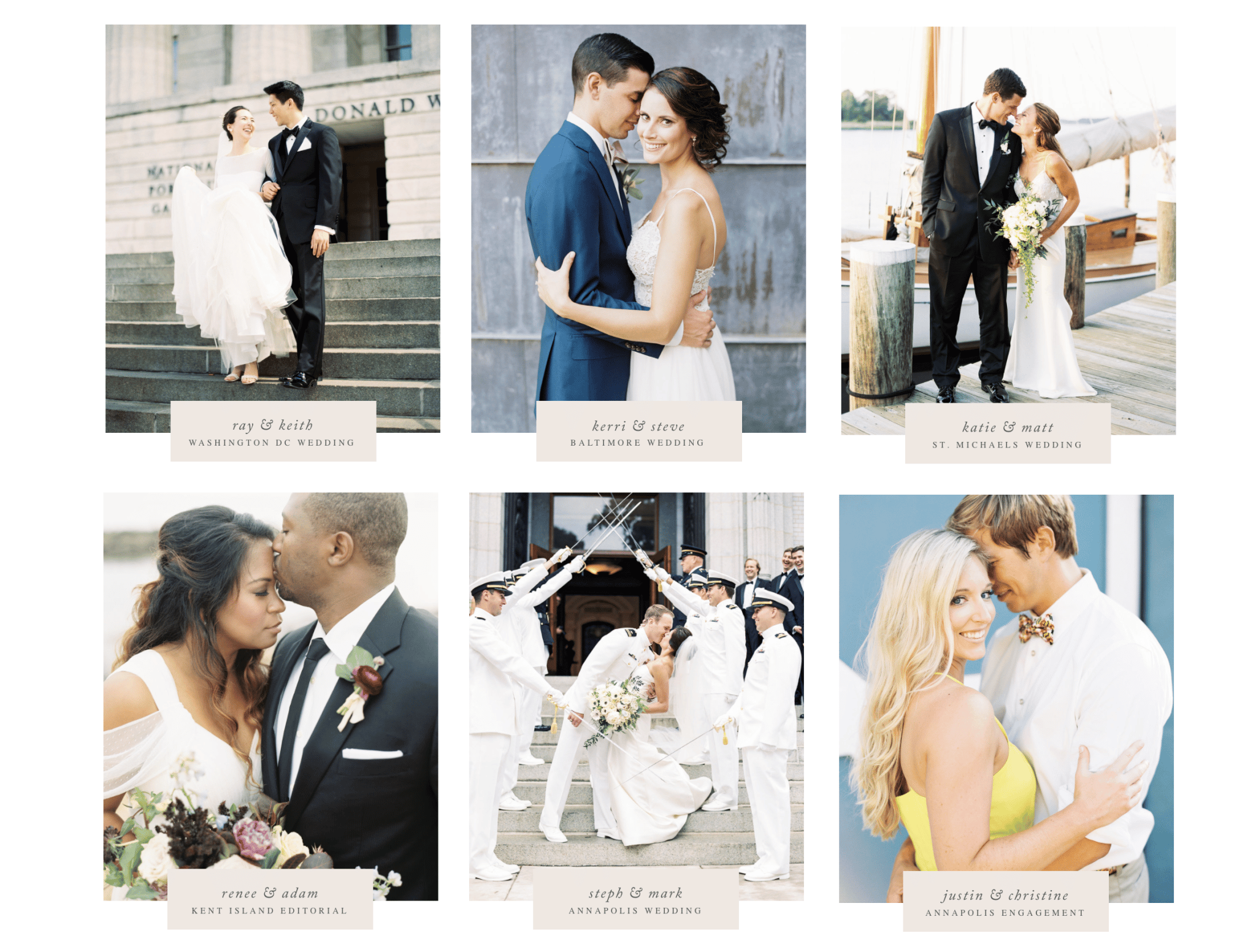
The last mistake we see people make on their websites is using inconsistent imagery. It’s easy to think that you need to show a little bit of everything on your website when in reality, it’s better to develop a consistent style.
When you’re consistent with color, light and overall mood in your images, your style is going to come across much more clearly and your work will be elevated. Even though we showcase weddings from several different locations in our portfolio, the images themselves feel consistent when it comes to color, light and overall aesthetic.


And that in turn helps us to book more of those types of clients.
And you know what’s great about these tips? On most website platforms you’ll be able to implement them on your own.
Have a question? We wanna hear it. Let us know in the comments or send us an email.

Davey is the co-founder of Davey & Krista, a creative studio known for high-converting Showit website templates crafted for photographers, creatives, and entrepreneurs. He helps businesses craft an answer to that question and then develops a strategy for communicating it. After years of running agencies that have managed millions in ad spend, he’s seen firsthand the power of effectively answering that question.
Explore website templates and free resources at daveyandkrista.com.
VIEW THE COMMENTS
Add A Comment