After building and reviewing hundreds—if not thousands—of websites, we’ve found there are a few common mistakes that people make when DIY-ing their website.
Don’t get us wrong, we don’t have anything against the do-it-yourself route. It’s a great way to save some money, especially when you’re getting started. Plus, you’ll gain valuable experience thinking through the customer journey, and you’ll learn a lot along the way.
We do, however, see quite a few common mistakes. Some of these are design-specific, which we’ve covered in this post about 10 Common DIY Design Mistakes (another good post to review if you’re currently customizing your own website). Others, and the ones covered in this post, are conversion focused.
These are the five conversion website mistakes that we most commonly see on DIY websites.
Mistake #1: The website is not laser focused on the end conversion.
What’s the point, what’s the end conversion, you’re looking for on your website?
If you’re a a service based business? It’s likely getting someone to inquire.
Are you selling a product? It’s likely getting that purchase, or at the very least lead generation.
Whatever it is, everything on your website should help get visitors one step closer to it… and nothing should distract from it. We all want our websites to be unique and creative, but don’t chase after that at the expense of conversion.
Pretty doesn’t necessarily mean high converting, so don’t mistake one for the other.
Mistake #2: Lead generation isn’t a priority.
Not everyone is ready to purchase or inquire when they land on your website. Offer them something of value in exchange for a way to follow up, such as an email address.
Lead generation gives you an opportunity to nurture relationships. And the content you give away is a good way to build trust. It gives you an opportunity to follow-up with people instead of having to wish and hope they’ll come back to you to purchase.
After running an agency that has managed millions of dollars in ad spend, I can confidently say that businesses who take lead generation seriously typically get more sustainable results.

Mistake #3: Not closing the trust gap with reviews, testimonials, and features.
Websites are important, social media is important, brand design is important… but you know what’s even more important?
Bridging the trust gap.
And one of the best ways to bridge the trust gap is through social proof.
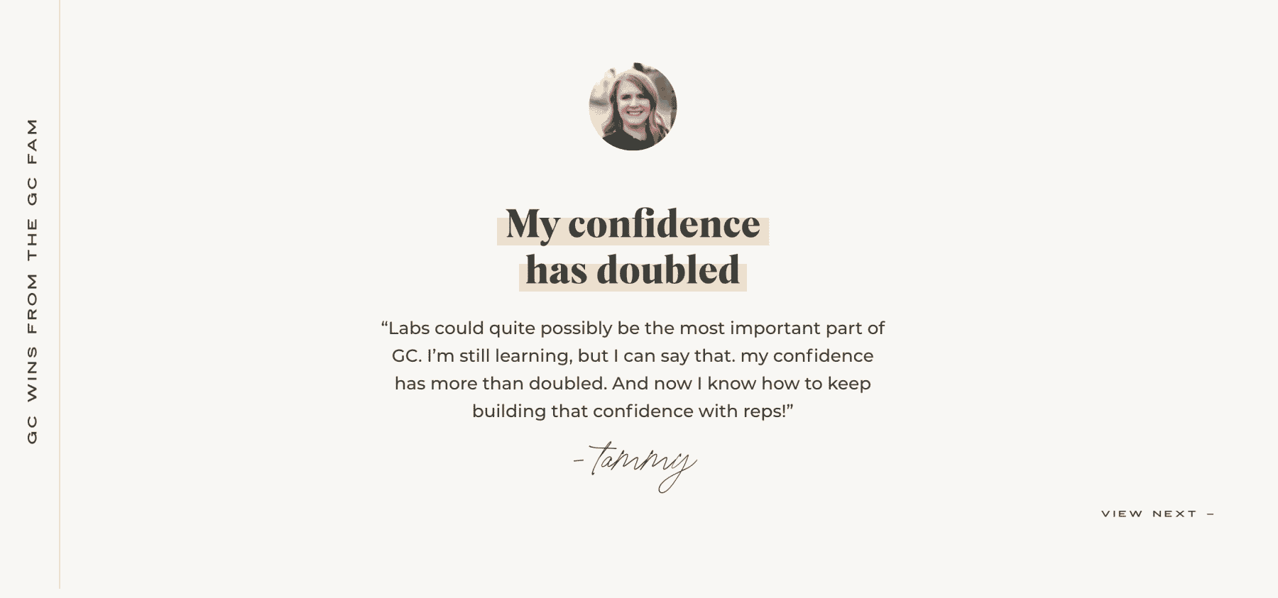
So if you have testimonials, reviews, and features, be sure to show them off on your website.

Mistake #4: Not doing basic optimization on your website.
SEO plugins like RankMath make it super easy to do things like add page titles and meta descriptions to pages on your website. You don’t have to be an SEO genius to figure out how tools like RankMath work.
And website platforms like Showit have their own SEO tools that you can use (we even have a video on it!)
If you’re wondering why you’re not showing up in online searches and your pages currently have titles like “Home” and “About”, that’s a good place to start.
Most SEO plugins have simple set-up wizards that automatically configure the most common settings, and help documentation that will help you become familiar with basic optimizations that you can do on your own.
Mistake #5: Not investing in copy.
It’s often the website copy that needs to be leveled up.
We’re designers so we obviously love good imagery. It matters. A lot. But many of our clients work in creative fields and already realize the power of investing in brand imagery.
What we find lacking is attention to website copy. Quite simply, copy converts, whereas good imagery assists.
Copy is a crucial part of a high converting website. We all seen some ugly websites that are high converting because the messaging is that good. I’m not necessarily saying you have to invest in a professional copywriter, but we have yet to work with a client who did and regretted it. And the websites we launch where intentional time was spent developing the copy always turn out to be some of our best work.
Want to hear about more mistakes to avoid when designing your own website? Check out 10 Common DIY Website Design Mistakes.

VIEW THE COMMENTS
Add A Comment