We’ve all heard that brands are important, but with so much content out there about brands, it can be hard to figure out exactly what a brand is—let alone how to come up with a solid one for your business.
Is a brand just the logo or the fonts you use? Is it your website? Is it the messaging or the story? Is it all of the above? Here’s a hint – it’s all of the above.
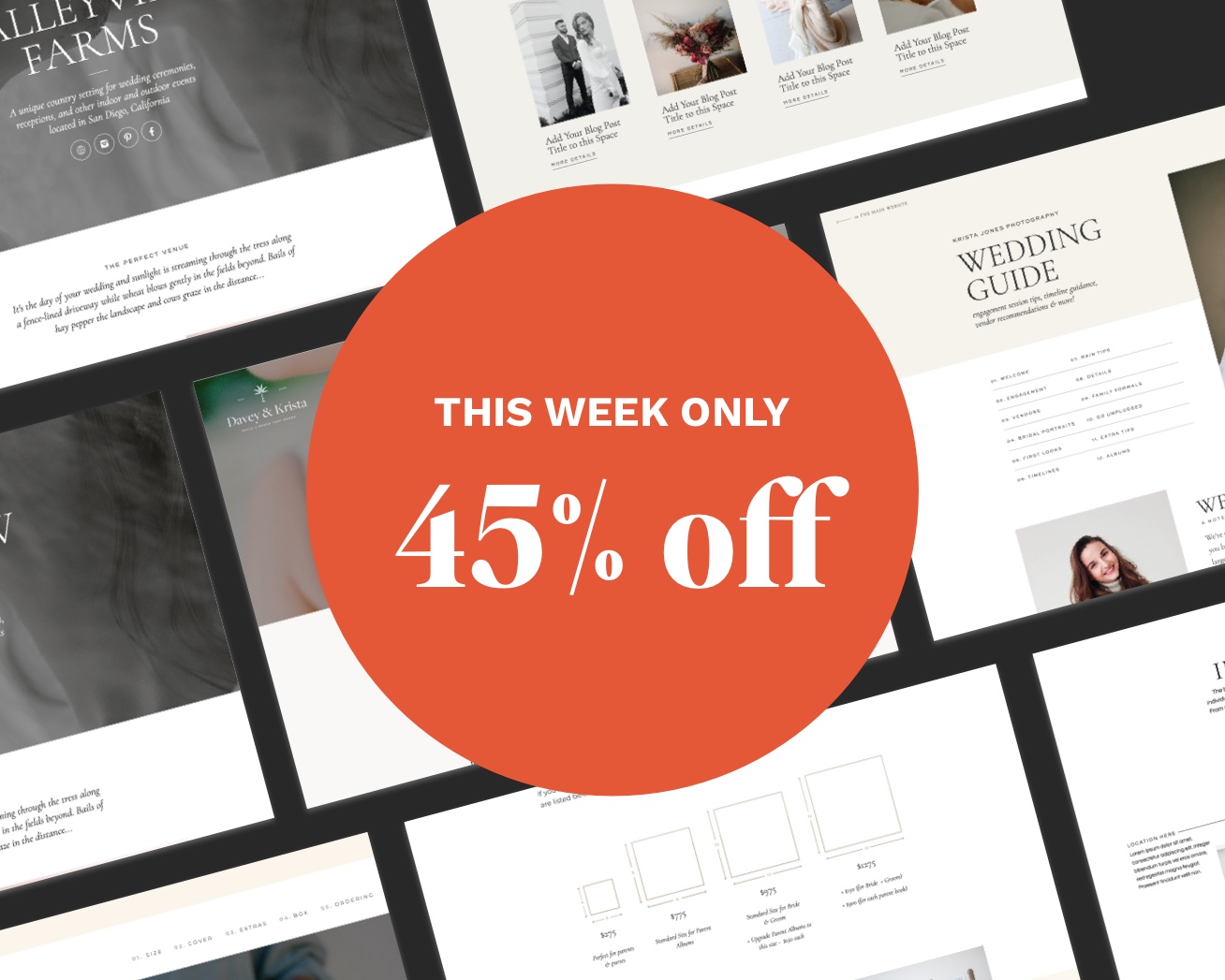
Today I’m sharing how to create a strong visual identity that captures your ideal client’s attention and makes them want to work with you. And if you want a jump start when it comes to branding, check out our line of premium website templates and semi-custom brands.
Start With Your Audience
When it comes to a brand, your audience is always the first thing to keep in mind. Ask yourself: Who does your brand serve?
The best brands choose a very specific person to serve. It’s really impossible to serve everyone and do it well. Even major brands like Target and Apple don’t try to appeal to everyone. Some people prefer upscale, boutique brands to budget shopping and some people are Microsoft people (why?!?).
When we’re working on a brand, we ask our clients to think about a very specific person and answer the following questions:
- Where does this client shop?
- How do they spend their free time?
- What kind of art decorates their walls?
- How old are they?
- Where do they work?
- What do they do in their free time?
When you understand who your ideal client is, it’s easier to pull together an aesthetic, language, and overall brand that will appeal to her.
If you want to walk through more of the questions we ask our branding clients, you can check out our branding questionnaire.
Mood Board
So a mood board isn’t necessarily something that would be shared publicly, but it’s something that can be helpful to determine the visual aesthetic of a brand.
Our team uses mood boards for our clients to make sure we’re on the same page as far as the look and feel go. The mood boards also visually represent the kinds of imagery we envision the brand using and we often pull the color palette for a brand from the mood board.
When we’re gathering images for a mood board, we try to stick to images of interior design, clothing/fashion, locations, brands our client mentioned and visuals that would appeal to the brand’s ideal client (such as dinners al fresco or coffee in bed with a book on Sunday mornings,) and our client’s own work.
Once you have a mood board together that appeals to your ideal client, you can even use it to generate a color palette.
PS – We have a free mood board template you can grab to help streamline this process!
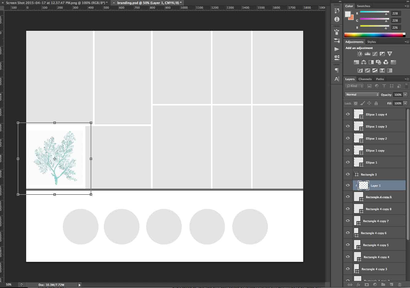
Download the Photoshop Mood Board Template
** download will only work on a desktop computer
Logo
The logo is probably the most common element we think of when we think of a brand. It’s the Nike Swoosh. The script type treatment in Coca Cola. The bold sans-serif type with the hidden arrow in FedEx.
A strong logo can bring all the other elements of a brand together but that doesn’t mean it needs to be a work of art in itself. Logos can include an icon (like we do with our palm tree) or they can be more simple.
Think about everything Anthropologie has accomplished with their simple typographic logo. They have a simple logo yet a very aspirational brand (thanks in part to a lot of the elements we’ll talk through next!)
Depending on your skill level, a logo may be something you hire a designer for. Or you could start with something like one of our semi-custom brands or create something simple for yourself.
While it’s tempting to tell yourself that your entire brand depends on an amazing logo, we’ve never found that to be true. Start off with something simple that will resonate with your ideal client and leave room for your brand to grow and evolve.
Colors
If you’ve gone through the mood board activity, you may have generated a color palette. A color palette is a group of several colors that you use consistently throughout your business presence.
A consistent color palette helps make brands more identifiable. Think about Target red or Southwest Airlines’ blue, red, and gold. If someone were to hand you a teal jewelry box with a white ribbon, you would probably know exactly what is inside.
Ideally, a color palette should appeal to your ideal client and be an extension of your brand’s overall aesthetic.
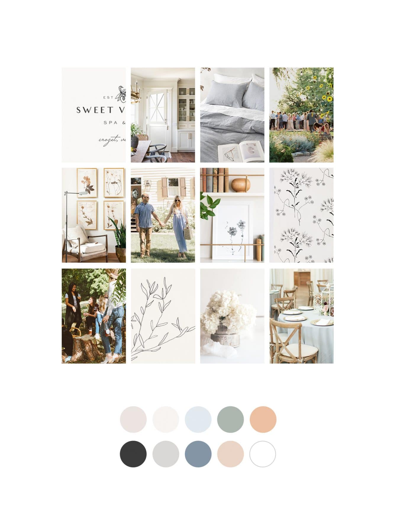
Pay attention to the colors you choose and the overall feelings they evoke. Brighter colors tend to communicate youth, energy, and a more relaxed brand whereas softer, lighter colors often communicate a more sophisticated high-end brand.
Fonts
You’ve probably realized by now that every single aspect of your brand carries a deeper meaning. The same is true when it comes to fonts. Thinner (“lighter”) fonts tend to feel more high end whereas thicker fonts feel more casual and youthful. Lowercase letters also tend to be a bit more youthful while uppercase letters feel more elegant.
Tiffany & Claires both sell jewelry, but I bet you could guess just from the logos alone which one is going to be more expensive.


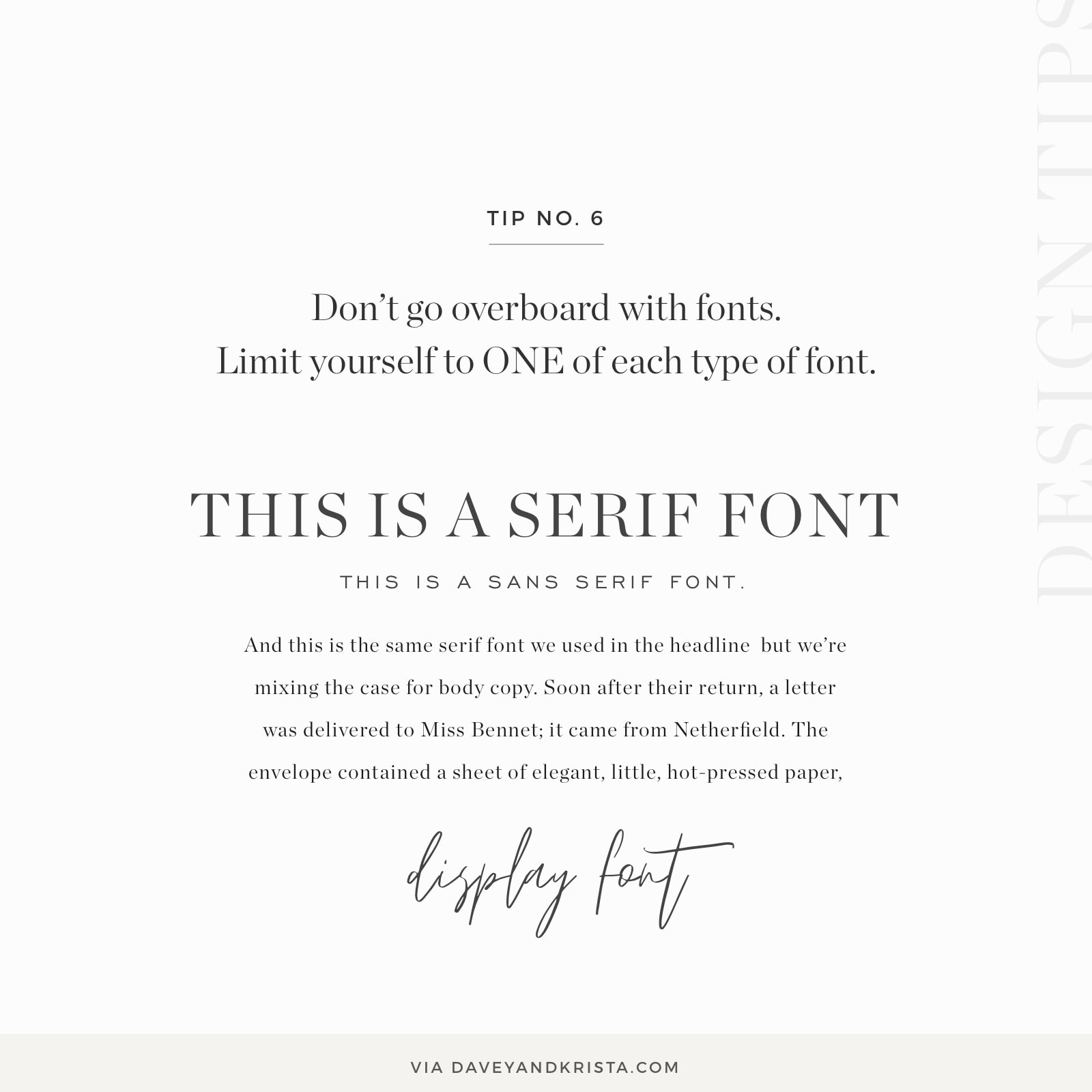
When it comes to choosing fonts, try to make sure they coordinate with your logo and limit the number of fonts you use.
A good rule of thumb is one serif (fonts with the little “feet” on the ends of the letters), one san-serif, and one display font (a script or some other specialty font).
Imagery
We talked a bit about imagery when we discussed mood boards, but I think it’s important to note that imagery should be consistent throughout a brand. Ideally, the kinds of images you share on your website, social media, and marketing materials should carry hints of your brand colors.
It’s even important to make sure that your headshots are consistent with the overall imagery of your brand.
So if you’re a photographer who tends to shoot with a dark and moody style, you want to make sure that your headshots are also dark and moody. Ideally they would look like they were taken by you.
Website
Whether you’re starting with a template (which we highly recommend), hiring a designer to create a custom website or creating your website yourself, if you’ve established all of the other elements of a brand we already discussed, by the time you get to the website, it should be pretty easy to implement your brand.
The logo, fonts, colors and imagery all come together on the website. Your website should almost feel like an extension of your mood board.
When we’re customizing a website template, we generally start by changing the colors + fonts first to match a particular brand. Then we’ll add the logo, images, and finally, copy.
[add customize Showit website template video here]
Be Consistent
When it comes to your brand’s visual identity, I can’t stress how important it is to be consistent. If you’re going to send your clients a welcome gift, make sure the overall aesthetic matches the vibe of your brand.
For example, a newborn photographer whose brand is classic, light and a bit airy and whose ideal client values fewer but better quality items would want to search for client gifts that meet that aesthetic. So maybe it’s an organic cotton coming home outfit or a high end baby toy. This gift probably wouldn’t just be drop shipped from Amazon. It would be wrapped in a neutral wrapping paper with a handwritten note on thick, uncoated cardstock and a neutral bow (bonus points if it’s hand dyed).

The same is true for sharing on social media, sending email or ordering print materials. Using consistent colors, fonts and imagery throughout your brand is going to go a long way towards creating consistency.
Anywhere that your business shows up should feel like an extension of your brand & website.
And there you go! The exact visual elements you need to create a strong visual identity that appeals to your ideal client and hopefully helps you book more work.
If you want to dive more deeply into creating a visual brand identity and check out an in-depth, check out our Anatomy of a Brand guide linked below.

Download the FREE Anatomy of a Brand Guide »
