Building your own website? Keep clear of these 10 common DIY website design mistakes.
When your business is new, there’s good reason to design your first few websites yourself.
The design process will help you refine your messaging, understand your goals, and think through what kind of imagery you want to use. That can be a valuable experience to have before investing in custom brand and website design.
And, of course, it’s also less expensive than hiring a website designer.
But after countless website reviews, we’ve noticed some common mistakes that people make when it comes to DIY-ing their own website.
10 Mistakes to Avoid When Designing Your Website
1. The text is difficult to read due to poor formatting.
The problem: Text is too hard to read because it’s centered, all caps, a hard-to-read script, etc.
Text is easiest to read when it’s aligned left and set in regular case. And that’s how text should be formatted in most instances on a website, especially on a blog. We often see text centered on the page, which makes it difficult to read.
The exceptions are elements like headings and subtitles, and when you’re including short descriptions under those headings and subtitles.
Also make sure that whatever color text you use has some contrast against its background. A light pink text on white is tough to read—especially on a mobile screen.
The fix: Use the mom test – If mom can easily read it, you’re probably good to go. Choose an easy to read font, make it big enough so it’s easily read on mobile, and align it left (in most instances).
Related: Beginner’s Guide to Website Typography
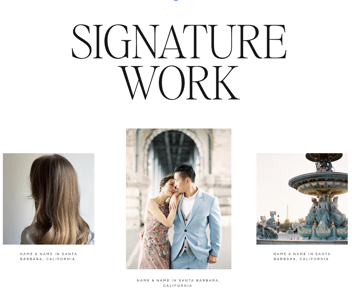
2. Eclectic galleries create an inconsistent aesthetic.
The problem: Galleries featuring images from a number of different events or projects. Even if your aesthetic is consistent, your events probably varied to some extent, and this could make the overall aesthetic of your gallery muddled.
It’s hard to prove to your clients that you can effectively capture their vision if the galleries they’re looking at contain images that have an inconsistent feel because they’re from different events.
The fix: Organize the galleries on your website by client or project instead of by type. For instance, instead of having one big gallery called Engagements, include three smaller galleries of three different engagement sessions.
This keeps the feel of your galleries consistent while highlighting the range of your work.
You may find this blog post helpful if you are using a Showit website: How to Create & Edit Galleries in Showit

Related Post: How to Make Your Work Look Great on Your Website
3. There’s no text on the homepage (only images).
The problem: A picture might be worth a thousand words… but it doesn’t mean Google (or website visitors) don’t need a little extra help understanding what you do and who are your ideal clients.
There are a few reasons why you should consider including text on your homepage. First, it’s a great opportunity to include your brand position statement (or value proposition). Make it clear what you do and who you serve.
The second reason is that it makes it easier for search engines to understand the content on your website. You probably want your homepage to rank for your primary keywords, so try incorporating those in headings and throughout the text.
The fix: The more valuable content that you can include on your homepage, the better. We recommend at least including your brand positioning statement and a section about you and your business.
At the very least, those areas will make what you do more clear to both search engines and visitors on your website.
Related: 10 Common Homepage Mistakes to Avoid
4. Contact form complexity is hurting conversion.
The problem: Contact forms that feature any questions beyond what is absolutely necessary to respond intelligently to the prospect can hurt conversion.
In general, the more questions you ask, the less likely someone will complete your contact form. While there is value in qualifying your inquiries by asking certain questions, don’t go overboard.
If you’re a photographer, something like How important are the photos on your wedding day? *might* be an appropriate qualifying question (but I wouldn’t put it on a contact form). If you’re including questions like How much do you want to work with me? … you won’t get nearly as many inquiries.
The fix: Only include questions that will help you determine if you can take the project and what information to send over. We try to limit our contact forms to 3-5 questions, and not every question requires a response.
Related Post: 7 Tips for a Contact Page that Drives Inquiries
5. Your pages don’t have a name.
The problem: When someone shares the homepage of your website, what appears in the thumbnail? Does it say something like “Home” with a description that’s just pulling the first few sentences of text?
It means you probably didn’t give your pages a title and meta description. Or it means that you named your homepage “Home.” Either way, there’s good reason to get descriptive.
Page titles give visitors an idea of what they’re viewing, or what they’re going to view (if they see something shared on a social media platform). Having a descriptive page title and compelling meta description make it more likely a visitor would click on your result in Google or on a shared post in Facebook.
And page titles are an important on-page SEO factor.
The fix: If you’re on Showit, you can set a page title and description using the SEO Settings on each page. Bonus: You can even include a share image that will appear any time that page is shared. And the easiest way to do this on WordPress is by using RankMath.
If you want to learn more about SEO optimization, take a look at our SEO Course. Not ready for a full course? Start here: 5 Steps to Improve SEO on Your Website.
Related: The Secret to Title Tags and Metadescriptions
6. There’s no photo of you, or there’s one that doesn’t match your brand.
The problem: The closer you work with your clients, the more important it is to have a picture of you (and your team) on your website. Even if you don’t work closely with your clients, we can’t think of a situation where making your brand more personable is a bad thing.
The other common mistake we see is including a headshot that doesn’t match your brand. If your website is all neutrals, be sure your headshot doesn’t include a green background and a lot of bold colors.
The fix: Getting professional headshots, brand photos, and (if applicable) pictures of your workspace is worth the investment. Make sure your photographer and/or stylist understands your brand before the shoot and takes images that fit with your overall aesthetic. You may find this blog post helpful: How to Elevate Your Brand.

Our Brand Images by Erica + Jon
7. Giving every element its own page.
The problem: Giving every element (testimonials, galleries, pricing information, service information) its own page creates too many thin-content pages on your website.
This problem is compounded when a business has multiple services and gives each service its own testimonials, gallery, information, etc. pages. Visitors then have to click on multiple pages to find content relevant to their service, and they may not visit the pages you want them to visit. This is especially true if, like 60% of web traffic, they’re visiting your site via a mobile device.
Additionally, search engines prioritize content-rich pages, and that’s hard to achieve when only including a single element on each page.
The fix: Think about the experience you want to provide your visitors. Should they have to search for multiple pages for a complete understanding of the service? Or should most of that information be made available on a single page. We recommend the latter.
Each service page should be designed like a sales page—because you are trying to sell your service. It should include a blend of details, kind words, social proof, examples of your work (galleries/portfolio), and a call-to-action.
8. Not including reviews, testimonials, and features.
The problem: Reading reviews is a part of the purchasing process for many people. And when reviews are missing, it leads people to wonder whether it’s a tried-and-true product or service.
Think about the last time you bought something from Amazon. You probably looked at the reviews—even if the product was cheap. Now, imagine you were buying something that was thousands of dollars. The reviews are going to count for something.
The fix: Ask (happy) past clients for testimonials you can use on your website. If you’re just getting started, consider doing a few free projects in exchange for a testimonial and some feedback. We outline this process here: How to Get Your First 5 Design Clients.
Related: 5 Ways to Incorporate Social Proof
9. It’s about you, and not the client you’re serving.
The problem: Because the wedding and creative industries tend to be relational, there’s a tendency to create websites that are overly personal. As a result, websites that are all about the business owner are created, instead of a website where the visitor can visualize themselves experiencing whatever transformation your service offers.
To be clear, personal is okay. But always ask how the personal elements build your brand. Arbitrary lists of your favorite things should be left off of your website.
The fix: The transformation that you offer your clients should be the focus of your website. You’re there to help them along the way. Double-check your about page—is it all about you, or is it about your client? Even the stuff about you should be there to build your brand and point back to your ideal client.
Related: The About Page – Do This, Not That
10. Mobile design is an afterthought.
The problem: What works well on a desktop sometimes doesn’t work well on mobile. And for most of us, the majority of our traffic comes on mobile devices.
We recommend people start with their mobile design, and then build their desktop versions. This ensures that the mobile version isn’t an afterthought.
At the very least, the mobile version of your website should go through the same amount of testing that a desktop version is given.
The fix: Treat your mobile design as a separate website because it has a different set of limitations. Sometimes the design elements (such as background videos) don’t work as well. Replace it with a different element that conveys the same idea.
A Tip for Designing Your Own Website
Just because you’ve decided to design your own website doesn’t mean you need to start from scratch. Most website platforms—like Showit—have professionally designed website templates that provide a good starting point. Premium templates created by professional designers should eliminate many of the problems we listed above, but we’ve seen a few good free ones around, too.
Wrap Up
If you’re looking for a jumpstart on your website, you may want to look at our website designs. We value personal customization, but also understand the importance of having a foundation that is professionally designed and strategically optimized.
As you design, when in doubt, remember that less is more. Fewer but more carefully chosen words, fewer but more intentional images, and fewer but more robust pages will go a long way toward enhancing your client experience through your website.
If you have any questions while designing your website, please reach out! You can always send us an email, type your question in the comments below, or send us a note on Instagram. We’d love to hear from you!

VIEW THE COMMENTS
Add A Comment