Everyone wants a unique website that feels like them, attracts ideal clients, and illustrates an amazing brand. But figuring out what to put on your website? That’s where the overwhelm starts. What should I include on my about page? What makes it fun? What should I say on my details page? Do I need extra content in the sidebar of my blog? The overwhelm is real, and so is the temptation to see what leaders in the industry and your peers have on their sites. The problem is that the more time you spend looking at those sites, the easier it is to accidentally create something that is a little too close to what was once your inspiration.
There are certainly best practices when it comes to creating a website or a brand. Placing your navigation at the bottom of the page or not including your logo near the top of the page? Not a good idea. Using a small palm tree as the icon portion of your logo above a serif font? Also not a good idea.
It’s okay to be inspired by someone else’s brand or website, but there is a fine line between imitation and inspiration.
So how to you make sure you’re only drawing inspiration from someone or something and not imitating?
1. Look outside of the industry
When I’m creating a new brand or website, I don’t look at the websites or brands of other creatives because when you look at something long enough, it’s super easy to create something too close to the source of your inspiration. I do look at other design work for inspiration, but it’s normally package design, editorial design or branding ideas from other industries.
When I was working on our newest Palm Shop Design, a shop, I looked at J. Crew, Kate Spade and other major retailers for inspiration and best practices. These types of brands have hundreds of thousands, if not millions, of dollars to spend reaching what works best on a website. There are some creatives I know who have amazing shop designs, but I didn’t look to them because 1) I didn’t want to copy and 2) they don’t have the budget that major brands have to figure out what works best.
When we begin working with a new design client, I always ask to see their Pinterest Board, but I’m normally more interested to see their home design and outfit pins than actual design work. The way they dress and the way they dream of decorating their home often says much more about who they are than the logo design they’ve added to their board.
2. Take a Step Back.
Go for a walk, go visit an antique store, read a book. Focus on something else for a while. Some of my best design work has come when I wasn’t directly thinking about a project. Inspiration can come from unusual places. Pieces of Laura and Rachel’s brand came from vintage sailboat diagrams I created for my own home. I’ve worked on logo designs that were inspired by the vintage canning labels I saw in antique stores. The colors for our photography brand came from photos we took while traveling and spending time on the beach.
Taking a step back, and not looking at “typical” sources of inspiration also helps you forget it – which is a really good thing. Memory isn’t perfect and the more time you spend away from that source, the more likely you’ll change it and make it your own – because you’ll never remember it perfectly.
3. Borrow ideas, not actual elements
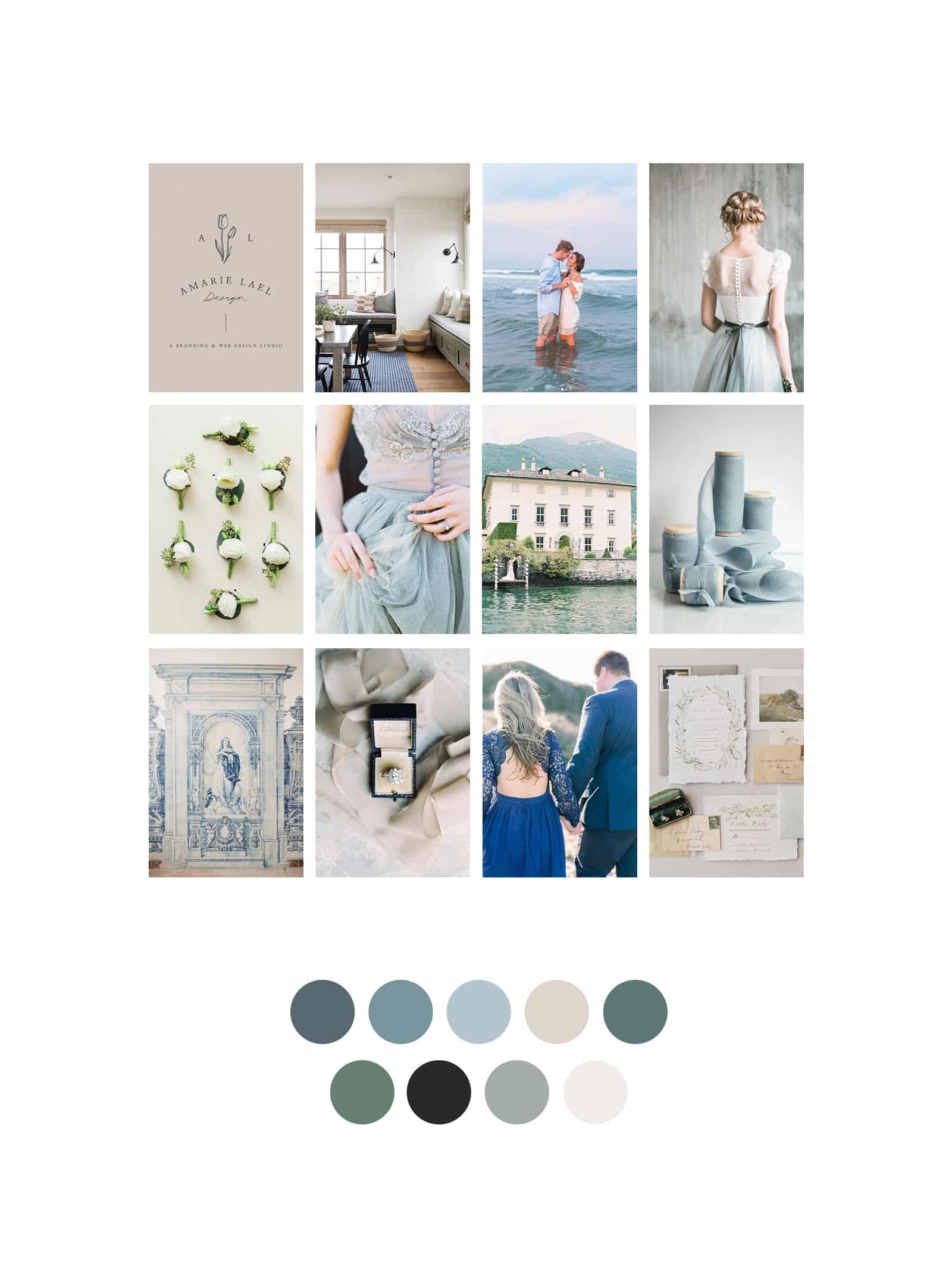
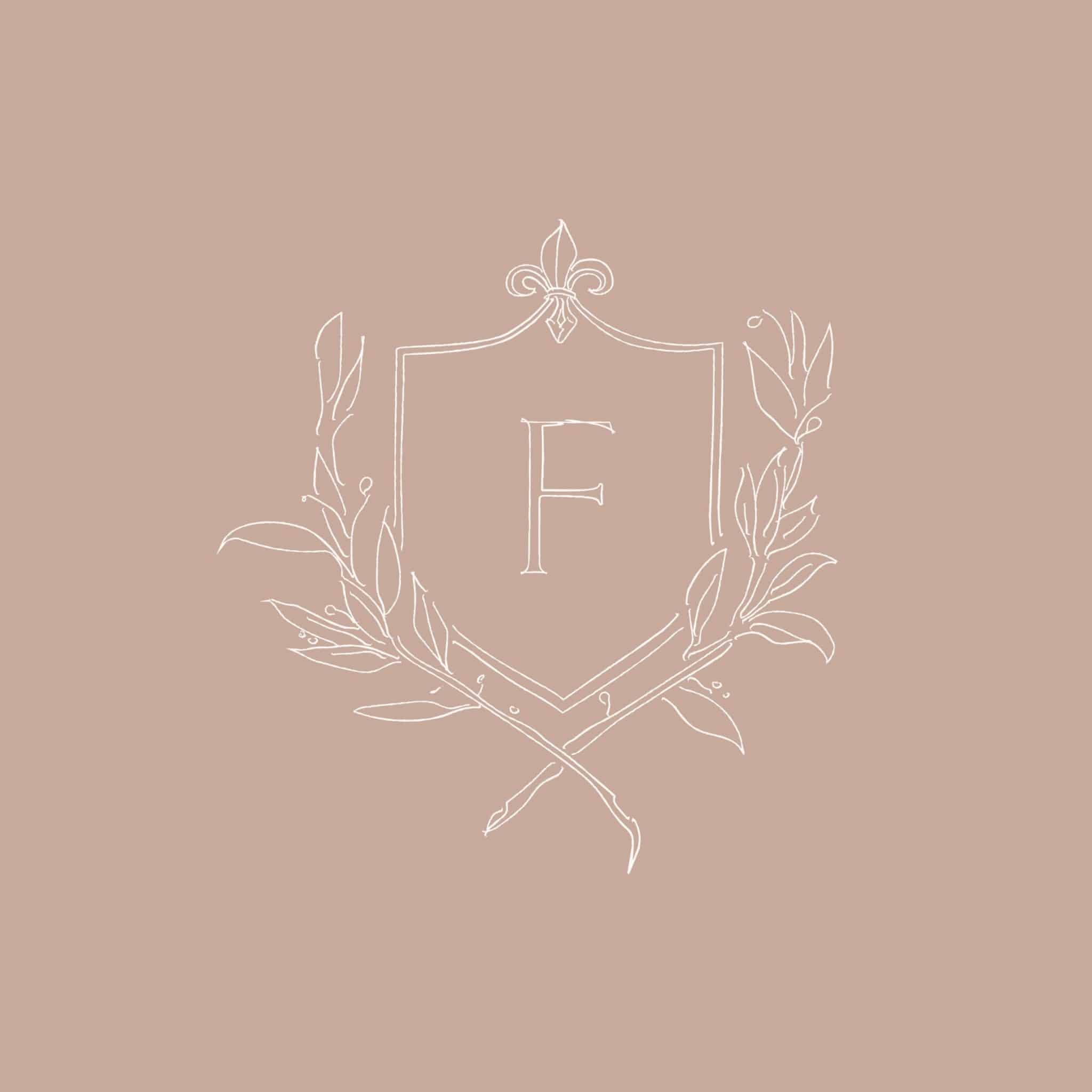
It’s okay to be inspired by the neutral color palette or aesthetic you see in someone else’s brand. But if you’re going to use a neutral color palette, make it your own. Facibeni doesn’t own using a crest in their logo just like I don’t own using a Palm Tree – but their crest and my palm tree were intentionally chosen and re-worked many, many times in order to come up with something unique.
4. Look to the Past
Drawing inspiration from vintage posters, typography, architecture, old print pieces, and hand-drawn designs are a great way to keep your work unique. I’m working on a brand that draws some elements from the art-deco time period. Not in a way that most people would ever realize, but the color palette, font style and a few extra pieces of the brand have a simplified art-deco feel.
5. Steal Like An Artist
If you’re drawing inspiration from the navigation layout of one site, the color palette of an African dress, the typography of a vintage canning label you found on Pinterest and the editorial layout of a German newspaper, your work is naturally going to be different from the site you drew inspiration from. Borrow best practices, not actual design elements.
Author Austin Kleon, Steal Like An Artist, phrased it this way:
“Don’t just steal the style, steal the thinking behind the style. You don’t want to look like your heroes, you want to see like your heroes. The reason to copy your heroes and their style is so that you might somehow get a glimpse into their minds. That’s what you really want — to internalize their way of looking at the world. If you just mimic the surface of somebody’s work without understanding where they are coming from, your work will never be anything more than a knockoff.”
You can only ever be the best version of yourself! If you focus on finding unique sources of inspiration, you’ll end up with something truly unique (that maybe other people use as their own source of inspiration!).


VIEW THE COMMENTS
Add A Comment