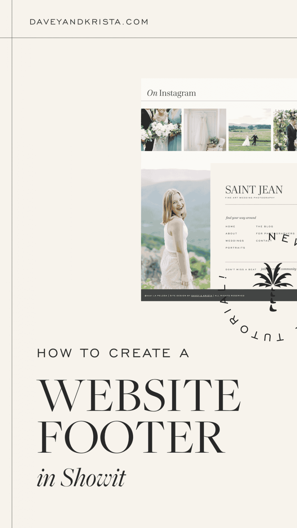
Website footers are prime real estate on a website. Not only do they appear on every page of a website, they’re the very last element people see before either clicking to another page or clicking off of your site.
Maximize that space to keep people moving through your site and increase conversion by making sure that you have the right elements in place.
5 Elements We Include in Every Website Footer
- Navigation – We like to repeat the navigation from the header so that when people scroll to the bottom, they can keep exploring. Depending on how large the site is, we might also use the footer navigation to include a few extra pages that are important but didn’t fit in the top level navigation.
- Social Media Links – The footer is a great place to add social media links. It’s generally repeated on every page so it’s likely that people will find those links. While sometimes we add links to the header of a site, we’ve found that that isn’t ideal because those links take people away from your site. And we all know how easy it is to pop over to Instagram or Facebook for something and then see you have a notification and get sucked into the platform. By adding those links to the footer of your site, you help ensure that people stay on your site longer.
- Legal Details – It’s ideal to display your site copyright, privacy policy, terms and conditions and site credit on every page. Most often, these are displayed at the very bottom of your website pages. Adding those details to the footer file helps ensure that they aren’t forgotten.
- Lead magnet – The footer can be a great place to add a lead magnet to help grow your mailing list. While we often see people add general mailing list sign ups to their footer, we’ve found these to be pretty low converting if they aren’t paired with some sort of incentive. Use this as a spot to highlight a free download or special offer.
- Back to the top button – If you know that your pages are going to be longer, the footer is a great place to add a “back to the top” button.
Showit Website Footer Tutorial
[add youtube video]

VIEW THE COMMENTS
Add A Comment