For many of us (myself included), writing doesn’t come easily. Oh, how I wish that words could flow from my brain to the page as cohesively and poetically as some of my favorite authors.
When it comes to websites, the About page is often one of the most difficult to pull together. Why? Because it can be challenging to write about yourself in a way that interests and engages others. If you want to dig into our approach for About pages, I recommend this article: The About Page: Do This, Not That.
But if you just want a little visual inspiration, we’ve pulled together a roundup of some of our favorite, creative approaches to About pages.

Episode 115: About Page Dos and Don'ts
The Quiz
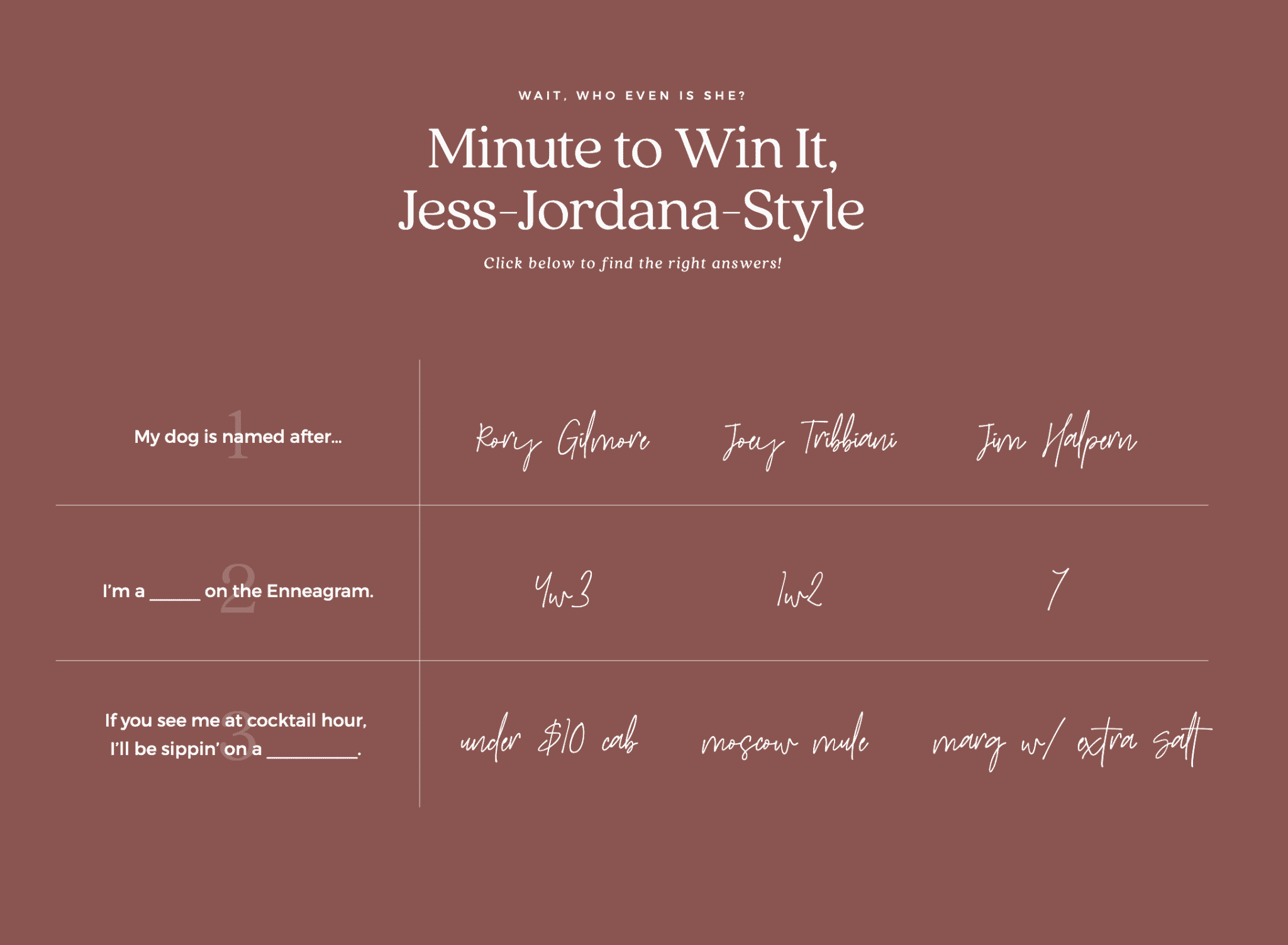
We’re big fans of Jessica Jordana’s Minute to Win It quiz. Jess is a copywriter (a wicked talented one at that!) and instead of listing random facts about herself on her About page, she opted for a fun, quick click-through quiz that lets site visitors know she’s really into Friends, the Enneagram, and margaritas and Moscow Mules. Her page is copy heavy (in the best way) and this quiz is a nice way to break up the text and engage the visitor as they scroll.
The Unique Detail
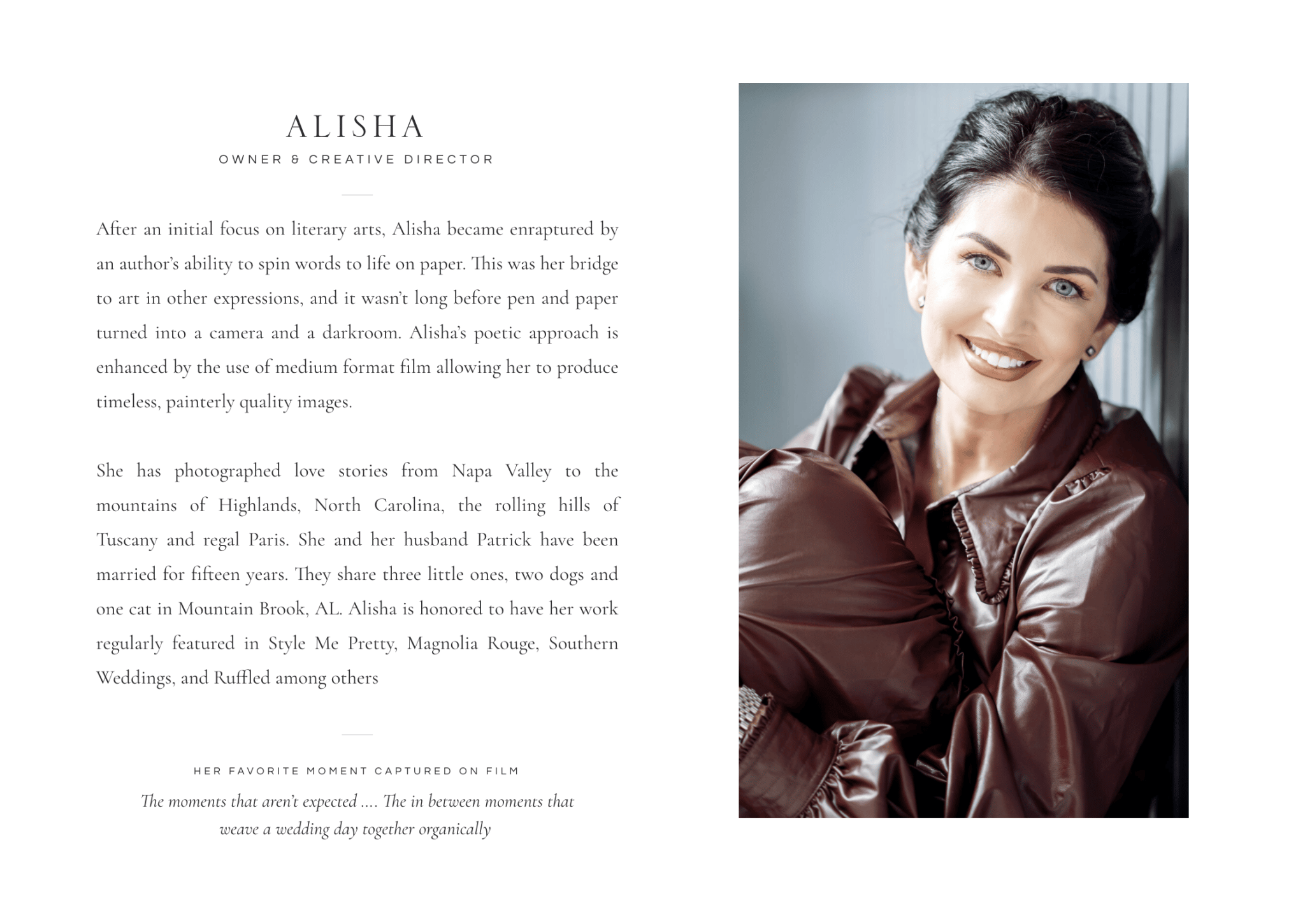
We love the way photographer & educator Alisha Crossley shares her favorite moment captured on film on her About page. Not only does it highlight her talent at capturing intimate moments, it also shows that both Alisha and her team pay attention moments unfolding around them on wedding days. This tiny detail at the end of each bio adds a small touch of something unexpected to an otherwise classic design (just like Alisha’s brand & work!)
The Roundup
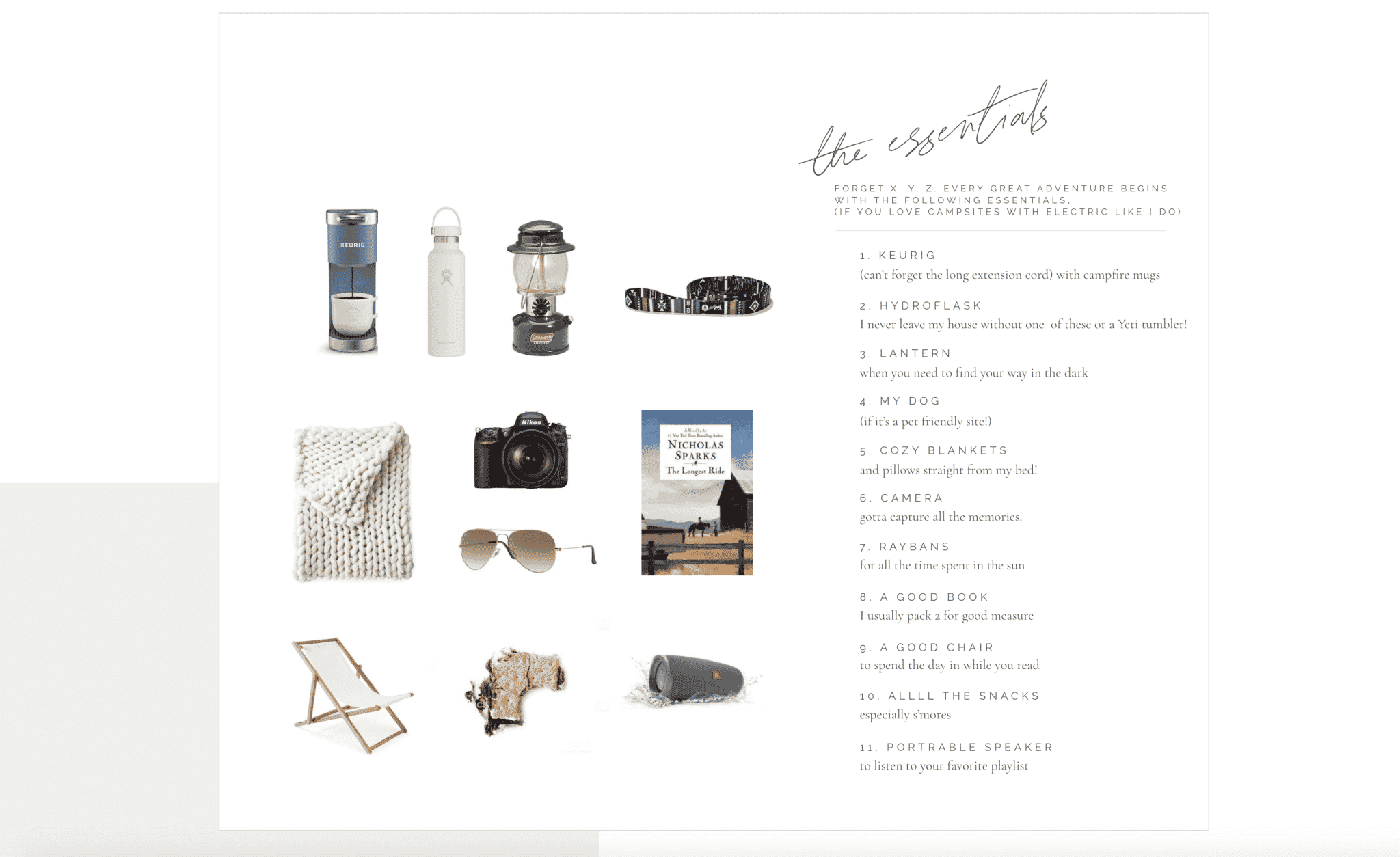
Jessica Husted is a photographer who is always up for an adventure. She loves shooting elopements – especially when they take place in National Parks. We brought that unique aspect of her brand into her custom website design by including a roundup of Jessica’s packing essentials. It’s a fun way to communicate her brand and her desire for more National Park elopements without being over the top.
Links to Personal Posts
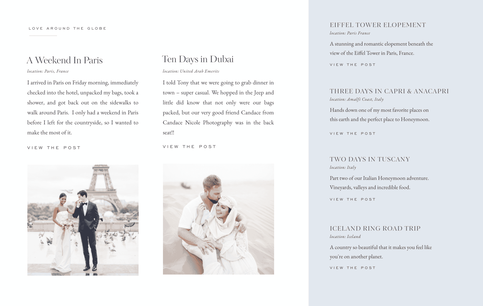
The team behind Costola Photography is well known for their travels around the world. Their About page highlights blog posts from a few of their favorite adventures and subtly communicates that their team is available for weddings worldwide.
Personal Icons
Maybe it’s because Alex is a member of our team, but we’re partial to the adorable icons on his photography website. If you’ve met Alex or seen images of his home, within about five minutes you’ll know that Alex is a HUGE plant lover. A few on-brand icons can keep a page engaging as site visitors scroll through long blocks of text.

Creative Headshots
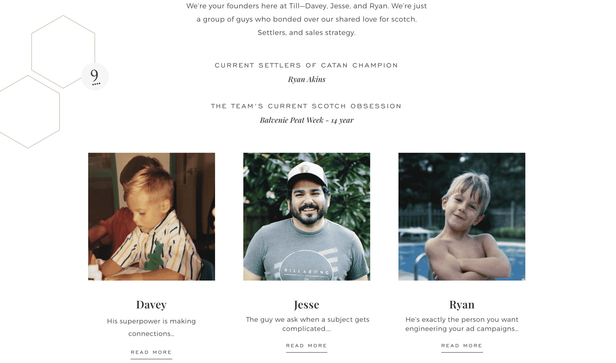
There are a lot of things to love about Till’s about page (Settlers of Catan graphics, engaging copy written with their ideal client’s pain points in mind, a strong call to action at the bottom), but their headshots are definitely my favorite part. Since the Till team has grown quickly and much of their growth has taken place during COVID, they haven’t had a chance to all get together for headshots. Instead of making their mis-matched headshots obvious, the team leaned into their lack of unity by using photos from their childhood. When you hover over one of the images, their present-day photo appears.
The Sales About Page
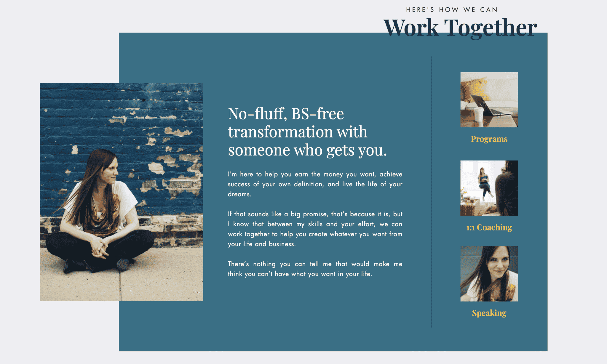
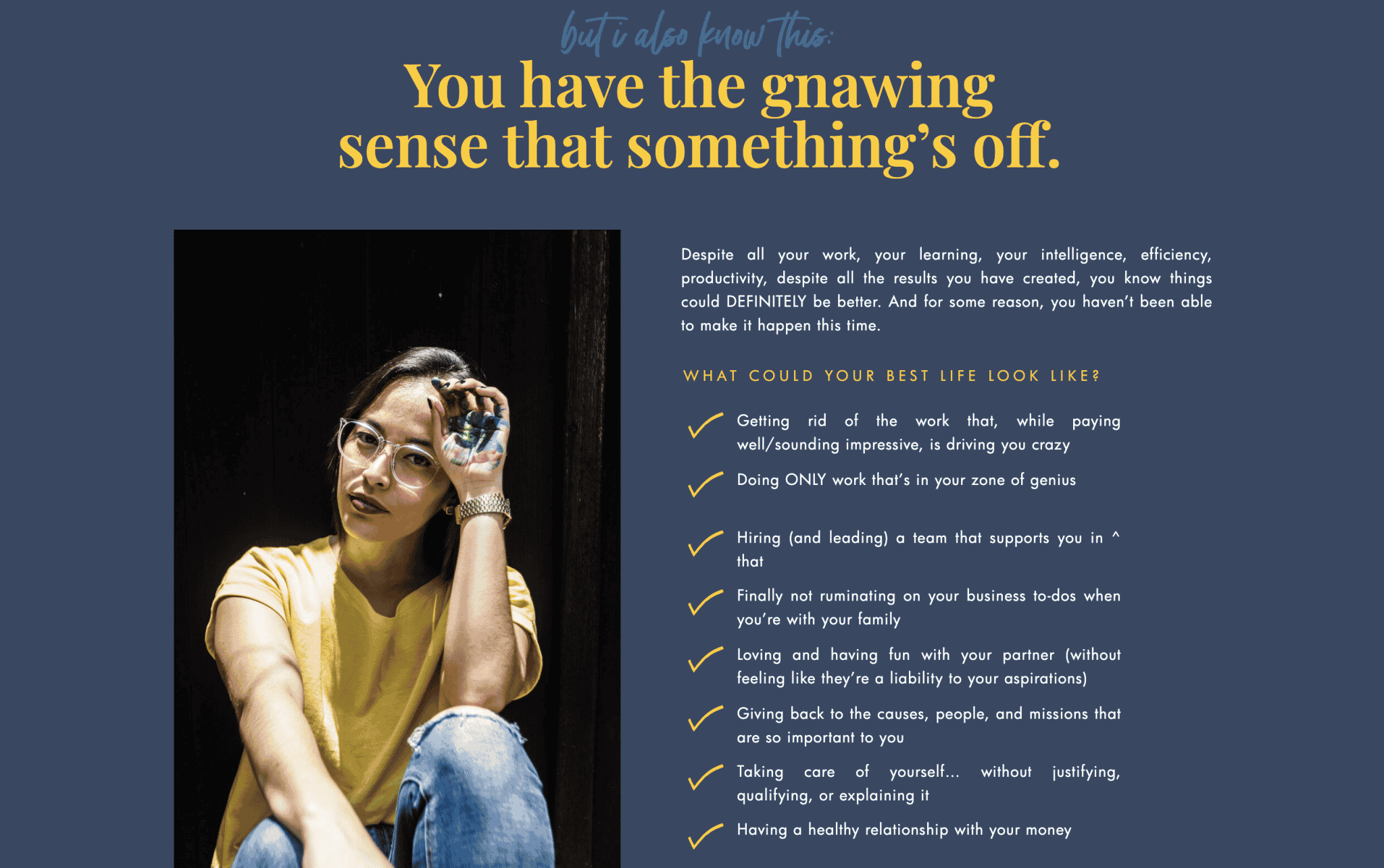
Mindset coach Jessica Eley uses her About page to help sell her services. She pulled in canvases from the sales page in her Barcelona template and very clearly spelled out how her services benefit her clients “I help go-getters and high-achievers (like you) reach their big goals without feeling shitty in the process.” You’ll only find the briefest mention of Jessica’s life on this page because she knows that at the end of the day, people visiting her site considering hiring her, are more interested in how she can help them than how she takes her coffee.
Video & GIFs
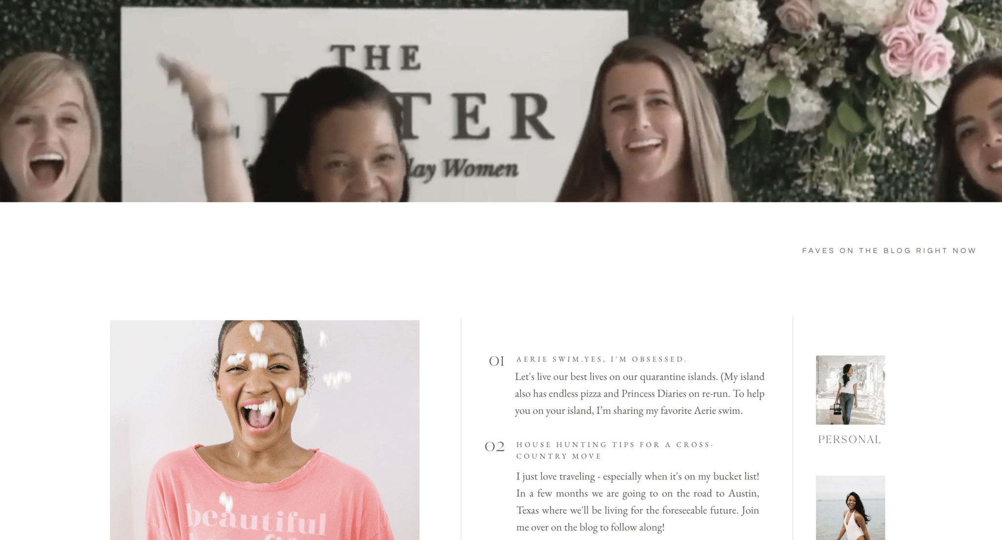
We’re big fans of the way Lauren Taylor uses video and Gifs throughout her site to keep the pages engaging. As you scroll through the pages, videos highlight Lauren’s life and the ways you can work with her (she’s a model!)
Beliefs
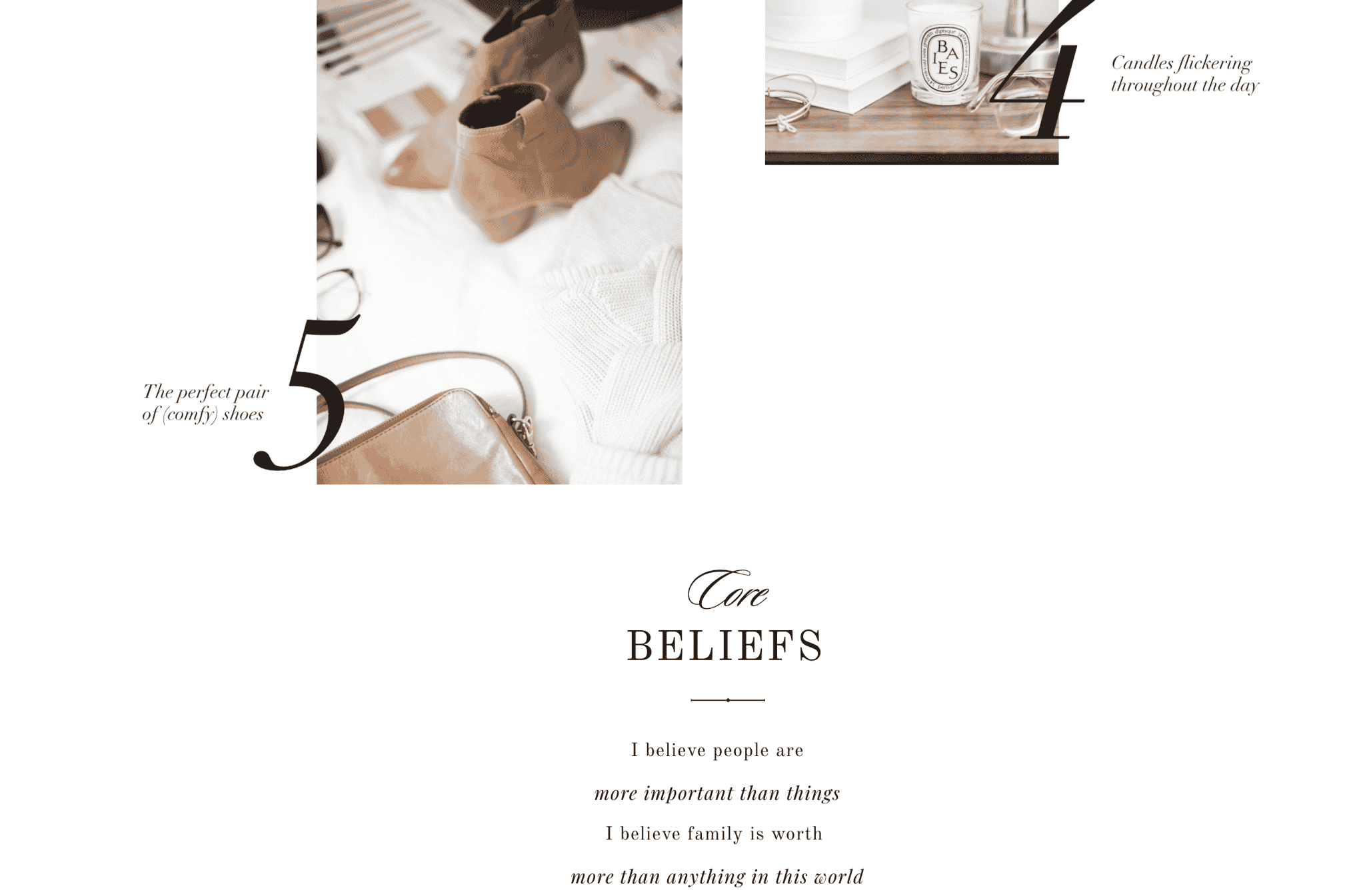
If you’re going to list a few details about your life, we recommend keeping them engaging and on-brand. Photographer Aura Elizabeth does this well by using our Whitehaven design to highlight her love of her family, relaxation, comfort and her values. With just a few images and short blurbs of text, Aura communicates that she’s a down to earth wife & mama who who takes beautiful images.
We hope you find this post inspirational! If you enjoyed it, feel free to leave a comment below or send an email to support@daveyandkrista.com. And if you’re looking to give your own About page refresh, head over to the shop and check our our done-for-you designs!
Save it for later…




VIEW THE COMMENTS
Add A Comment