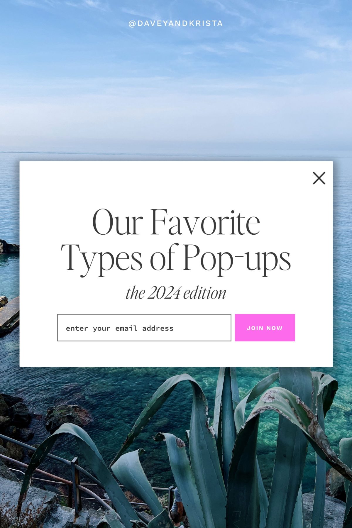
Pop-ups. Either you love them or you hate them. Personally, I love pop-ups. But I recognize mine is not the most popular opinion.
Pop-ups are usually deemed obtrusive, unwelcome, and gimmicky. Are they? It all depends on how you use them. In this blogpost, we’ll walk you through what pop-ups are and how they can be utilized as an excellent tool for your business.
Table of Contents
Let’s dive in…
What are pop-up modals?
First things first, what are pop-up modals? As you scroll through a website, often a small window or banner will appear on your screen promoting a message, hence the term “pop-up.”
The main purpose of a pop-up is to capture the viewer’s attention and prompt an action. This action can be anything from a newsletter sign-up to a promo code opportunity. Marketers often use pop-ups for advertising and generating leads. Note, you may have heard pop-ups referred to as interstitials, dialogs, or modals.
Special Offer: Want to add stunning, intelligent pop-ups and forms to your website? Use the code DAVEYANDKRISTA for a 14-day free trial of Sumo Pro and 50% off your membership.
Benefits of using Pop-up Modals on Your Website
Pop-up modals are versatile tools in web design, and if used properly they can enhance your user experience and website functionality. Here are 10 reasons you may want to consider using pop-up modals on your website:
- Lead Generation: Building a mailing list and nurturing leads is crucial in online marketing today. Pop-ups provide a stress-free, convenient way for visitors to share their email addresses or contact information, in exchange for newsletters, updates, or exclusive content.
- Promotions and Discounts: If you’re looking to offer special deals, discounts, or coupon codes, pop-ups are a creative way to do it! Pop-ups are particularly effective for e-commerce sites looking to boost sales or clear inventory.
- User Feedback Collection: Getting someone to write a review or share feedback can be an uphill climb. But a smooth pop-up will increase the likelihood of user engagement. If you’re looking to gather feedback from users about their website experience so you can improve your website’s usability and content, pop-ups are the way to go.
- Important Announcements: If you need to communicate important messages or updates, such as changes in terms and conditions, privacy policy updates, or critical announcements relevant to the user base, a pop-up will ensure your message isn’t skimmed or buried.
- Social Media Engagement: Pop-Ups can encourage visitors to follow or share content on social media platforms, thereby increasing your website’s social media presence and engagement. Design a creative pop-up and watch your social account soar!
- Event Registration or Webinar Sign-ups: Have an upcoming event or webinar? Make the process seamless and convenient by prompting users to register for upcoming events, webinars, or workshops directly through the website.
- Age Verification: While we’ve never used this for Davey & Krista, some websites host age-restricted content (think: wineries, breweries, etc.), requiring pop-up modals to verify the age of the visitors in compliance with legal requirements.
- Exit-Intent Offers: If a user is about to leave your site, you may want to share a last-minute offer or a reminder to complete their purchase or subscription. The best way to display this reminder? A pop-up…shocking, I know.
- Content Gating: Pop-ups are helpful for creatives who want to provide exclusive or premium content in exchange for user information or a subscription. This is often encouraged in content marketing strategies. Hint: The more eye catching your pop-up AND the more substantial your content, the higher your likelihood of a successful, long term exchange.
- User Guidance or Assistance: Do you offer help or guidance through live chat support, FAQs, or tutorials? These types of pop-ups are wonderful for enhancing user experience and support.
Each of these uses serves a specific strategic purpose, contributing to user engagement, lead conversion, sales enhancement, or regulatory compliance, making pop-up modals a valuable asset in web design and digital marketing strategies. Yes, if overused or used improperly, pop-ups can be a nuisance. But if they are stewarded well, the positives far outweigh the negatives.
My 9 Favorite Type of Pop-ups We’ve Used on our Website
Krista and I have implemented a number of Pop-up modals on our website across the years. Here are the ones we’ve found beneficial for our business and helpful for growing connection with our audience:
- Content Upgrade – This kind of pop-up teases the user with content, but requires the user to share their email to receive the full content or to access the upgrade. This is also called a “content extension.” This is the most common type of opt-in we use on our site. You might have seen us offer our brand questionnaire or SEO content outline or Brand Anatomy Guide in exchange for an email address.
- Yes/No campaigns – This pop-up engages the user with a question, asking if they’d like to be redirected to a related offer or page. We don’t use this pop-up type as much anymore.
- Click Activated – When Krista and I want to provide additional information to users, we often utilize this pop-up. Incorporating the wording “click here if you’re interested in x” or “click here for the technical specifications” gives us an opportunity to share more details without having to use up more space on the page.
- Social Proof pop-ups – This type of pop-up is particularly common on e-commerce websites. Usually the text will read something to the extent of “Sally G. just purchased x too!” The purpose of this pop-up is to provide social proof. We’ve experimented with this type of thing in the past, especially during large promotions or launches.
- Exit Intent – We utilize this pop-up when a user is about to exit a page. It’s a friendly reminder to finish the task at hand before leaving. This is one of our favorite types of pop-ups to use during the checkout process to prevent visitors from abandoning a checkout.
- Welcome Mat – This is a full-page pop-up that appears as soon as you land on a page. Krista and I don’t use Welcome Mat pop-ups quite as often, but they usually provide a higher than average conversion rate due to the amount of people that see them.
- Sticky Bar – This is a small bar on the top or bottom of your website that moves with the page as the user scrolls. There’s a good chance you see one on our website now. Our New Year Sale is currently happening, and our Sticky Bar pop-up makes the promo code conveniently available for any users who want to save 25%.
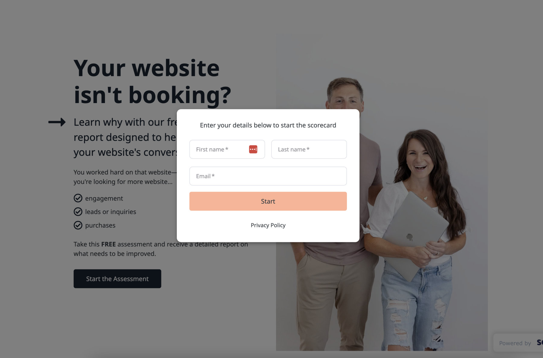
- Scroll box – Scroll Box pop-ups are similar to Sticky Bar popups, but rather than a bar it’s usually a box in the bottom corner of a page. This is particularly useful if you want to highlight an amazing testimonial. Scroll box is also an efficient pop-up for engaging quizzes, like our Website Conversion Assessment Quiz.
- Live Chat – We’ve found that adding live chat functionality to our website has helped increase our shop’s conversion rate. People often have simple questions prior to purchasing a template, and a chat-box makes it easy for us to answer those questions.
Our Favorite Tools for Pop-ups
Pop-ups + Forms
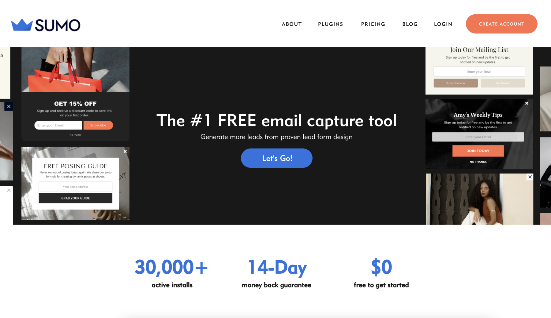
Sumo: This is our new go-to tool! Sumo allows us to create intelligent forms and pop-ups that deliver the right message to right people. Of course, I’m a bit bias as I’ve recently become Sumo’s CEO.
Special Offer: Want to add stunning, intelligent pop-ups and forms to your website? Use the code DAVEYANDKRISTA for a 14-day free trial of Sumo Pro and 50% off your membership.

Convertbox: This used to be our go-to tool and it’s nice that it’s a one-time payment; however, it seems like the team has stopped developing it. Plus, we’ve had more and more stability issues with ThriveCart and Convertbox (owned by the same company) since new ownership took over.
Live Chat
Crisp Chat: We love this tool for live chat–It is efficient and reliable. While there are less expensive options, we’ve found Crisp Chat to be worth every penny.
Intercom: I use Intercom on another website I manage, but it’s far more expensive than a tool like Crisp. If you’re looking for a full-featured tool, Intercom is hard to beat, but be prepared to pay a premium.
Online Quizzes
ScoreApp: ScoreApp is an excellent resource for creating quizzes. We’ve found it’s easier to use than something like Interact, and creates professional, eye-catching quizzes.

Typeform: We’re big fans of Typeform’s intuitive interface, but have found that we prefer a specialty tool like ScoreApp for creating online quizzes. Typeform continues to be one of our go-to tools for things like surveys.
How to Measure the Success of a Pop-Up
Measuring the success of a pop-up is essential to making sure you use them well. The formula is simple, (and yes, we’re going to do a bit of math here!)…
# people who take your desired action / # people who see the pop-up = Your Conversion Rate
Conversion rates for pop-ups vary based on a few factors such as the length of the form and the incentive. For instance, free downloads typically see higher conversion rates than pop-ups promoting webinar registrations. Typically those things that require less investment in time and/or money see higher conversion rates.
Some pop-ups are for awareness, so it’s harder to measure whether they’re “working” (ex: a banner at the top of a page letting people know about a sale).
It is also important to note, conversion rates will differ based on what action you’re trying to get users to take. If it’s simply to download a freebie, we hope to see higher conversion rates. If we’re asking users to register for a webinar or purchase something, the conversion rates will be lower because what we’re asking requires an investment of either more time or money.
Follow Pop-up Best Practices and Stay Compliant
Contrary to Barbossa’a take on rules in Pirates of the Caribbean, pop-up and form rules are NOT “more like guidelines.” There are a number of rules regarding collecting data using pop-ups, and these rules vary from state to state and country to country. It is best to reach out to a lawyer who specializes in data privacy if you have a question or concern.
You may also want to explore Google’s guidelines regarding using pop-up modals on your website.
Conclusion
Pop-up modals provide vast opportunities for your business. These versatile web design tools can enhance your user experience and website functionality, but only if they are used properly. Misuse or abuse pop-ups and you’ll add to the sea of websites that make pop-ups feel obtrusive, unwelcome, and gimmicky. Utilize them with caution and creativity, and maybe we can redeem pop-up’s good name.


VIEW THE COMMENTS
Add A Comment