


For years, neutral colors ruled all aspects of design, including website color palettes. Then, in 2023, vibrant, playful colors broke through the muted trend.
This past year, we settled into a softer scene — color that is present but more grounded and soothing.
As we look to 2025, I anticipate tranquil color palettes will continue. But rather than cool palettes, it appears there will be an emphasis on warmth.
Color experts predict warm, comforting colors will step into the forefront with honeyed neutrals, serene blues and greens, and ruby reds.
While it is still quite early, here is the impact we believe 2025 color trends will have on web design color palettes.
Read on for our take!
Table of Contents
Why Warmer Color Palettes are Ruling in 2025
The resurgence of warm colors is most likely a result of people desiring inviting, hospitable spaces – we embraced softer pastels last year and are now settling into a cozier scene. The color is still calming, but rather than aloof cool tones, we are inviting warmer hues – a melding of comfort and creativity.
Fashion and design are still pulling many elements from nature, including ocean blues, forest greens, and earthy tones. However, the palettes in this upcoming year may more closely resemble the canyons of Arizona before the pines of Oregon.
Top color experts have asserted that palettes creating a grounded atmosphere, a welcoming retreat from chaos, will greet us in the year ahead.
Veranda quoted Little Greene’s creative director Ruth Mottershead, “There is a greater need to surround ourselves with comforting, soothing colors that are not only easy to live with but provide warmth and serenity within our living environments.”
We believe this statement captures 2025 palettes perfectly.
Perhaps this points to a deeper longing for hospitality and warmth in the midst of political, economic, and social uncertainty.
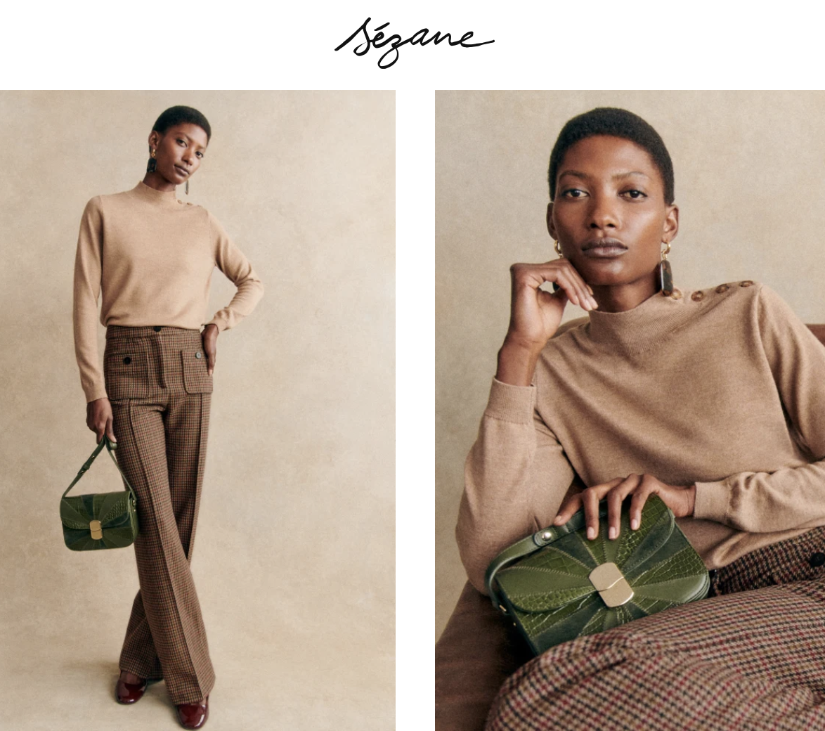
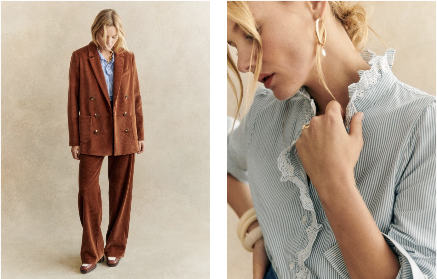
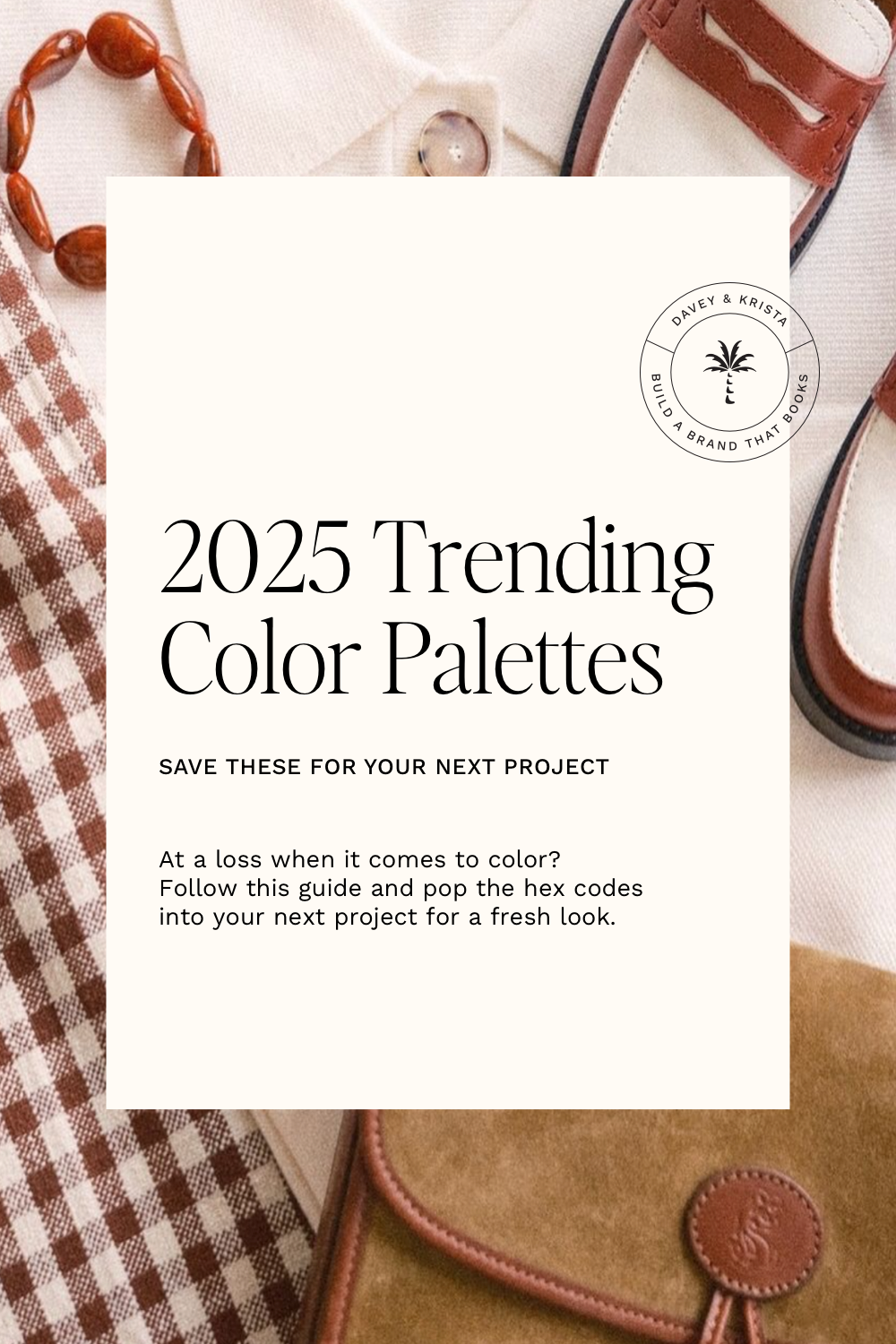
Classic brands like Sézane are already beginning to embrace warmer, inviting colors.
And when we look at interior design stylists like Louis Roe, we see rich browns and reds at the scene’s forefront.
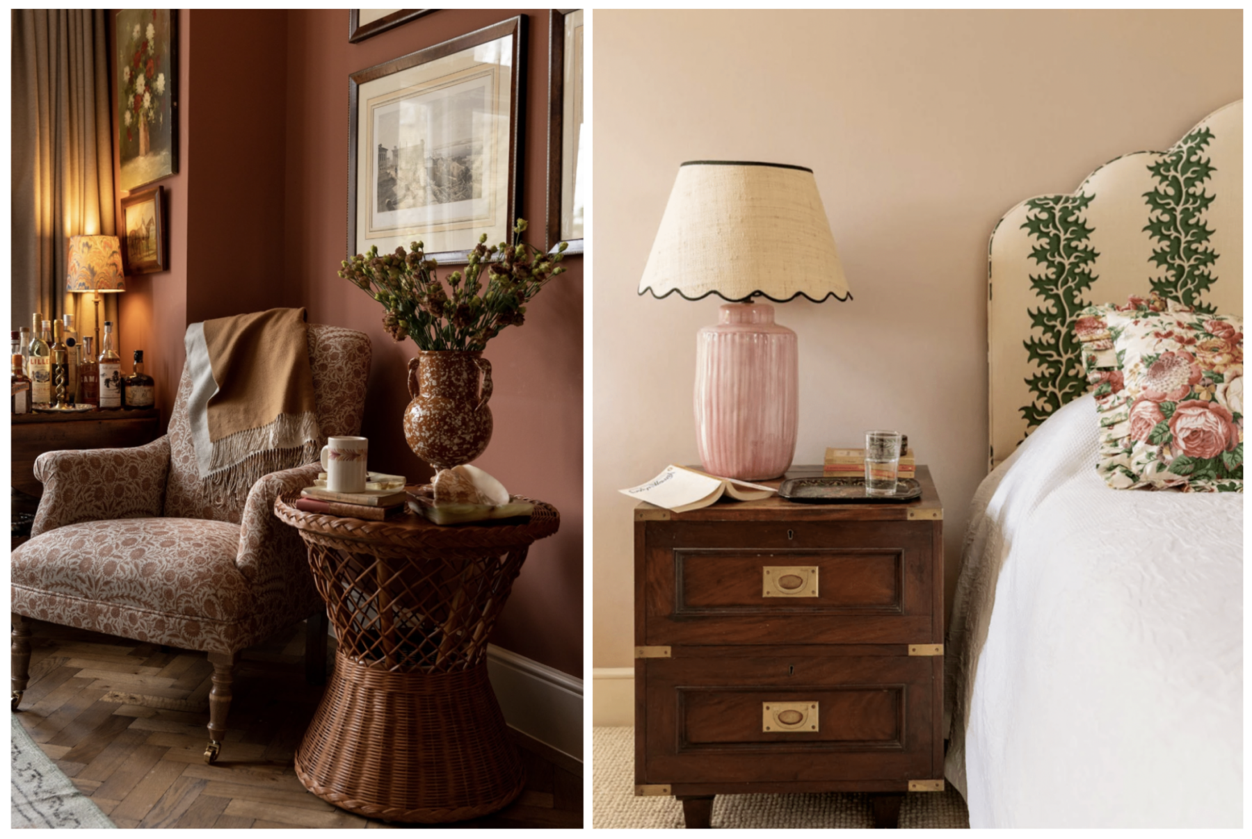
Photos courtesy of Front Roe
Why Color Matters in Design
Color is one of the most important elements of design. Different colors evoke different emotions and feelings. Blue is associated with feelings of peace and serenity. Yellow and orange are energizing. Green feels fresh and organic.
We’ve also learned to associate particular colors with brands. Have you ever asked someone wearing a red shirt in Target for advice on finding a particular item? Or maybe you were the one wearing red in Target…
While I don’t think that you need to look into the psychology behind every color you choose for your brand, I do think it’s important to pay attention to the overall feelings your color palette exhibits. For example, the vibrant purple on the left (see below) feels much more energizing, whereas the lavender on the right is more calming. Both of these colors are from the same hue, but the one on the left is from a brighter end of the spectrum.
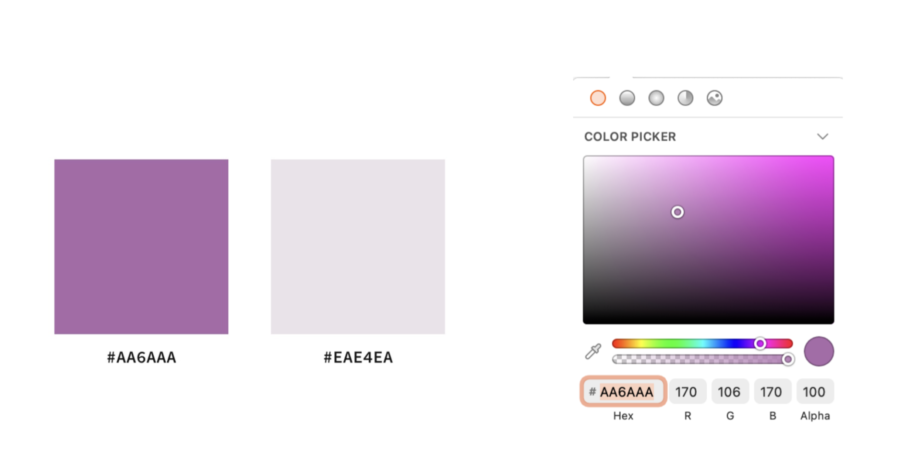
This is the vibrant purple we used in the example above. To create the lighter lavender tone, we moved the dropper to the left (adding more gray) and up (adding more white). If you’ve never generated a color palette for your brand, this video walks you through the exact process we use for the brands we create.
Related: Choose the Perfect Colors for Your Brand
Should you update your color palette to match current trends?
There isn’t an easy answer to this question. It might be a good idea to update your existing brand color palette if your current palette isn’t attracting your ideal client.
Businesses looking to attract younger audiences would likely see the most benefit from a modern color palette. Think senior portrait photographers, clothing boutiques, and influencers.
It’s also possible to experiment with trending 2025 colors without overhauling your entire brand. Test them out in a few places on your website or social media.
Another idea is to experiment with milder variations of these warmer tones. Warmer does not necessarily mean reds, pinks, and oranges. Rather, you can have warmer versions of blues, greens, etc. The undertones change rather than the color.
For example, look at this palette – the primary colors are blue and green, and the accent color is lavender. But notice how they have yellow undertones, especially the neutral and accent color. It adds a bit of friendliness to the overall feel of the palette.
If you’re a newborn portrait photographer looking to appeal to trendier clients, a tranquil and warm color palette like this might work well for your brand.
Each year, several different companies release a “color of the year,” and we’ve found they provide an excellent resource for website color palettes.
Pantone Fashion Week 2025 Color Report
While Pantone has not released its 2025 Color of the Year, it has announced its color report for New York and London 2025 Spring and Summer Fashion Weeks.
The London Fashion Week Report debuted a fresh color palette that feels energetic and optimistic. Pantone’s Executive Director Leatrice Eiseman stated the colors “inspire a new feeling of liberation.”
The New York Fashion Week color palette for 2025 also debuted earthy bright tones with a harmonious warmth. In their report, Pantone described the colors as “rooted yet dynamic, reflecting our desire for authenticity and the spirit of joyful individualism and optimism.”
Both of these palettes offer bold tones that can be used as the primary and neutral colors on your website.
Behr Color of the Year: Rumors
Behr’s color of the year is Rumors, a deep ruby shade that brings “warmth and rich allure” to any palette.
We saw the “Unexpected Red Theory” take off this past year – a fashion and interior design trend that suggests adding a pop of red will enhance any design or palette. So, it is no surprise that Behr chose a romantic red for its 2025 color.
You can use Rumors as a primary color or an accent to a more neutral color palette.
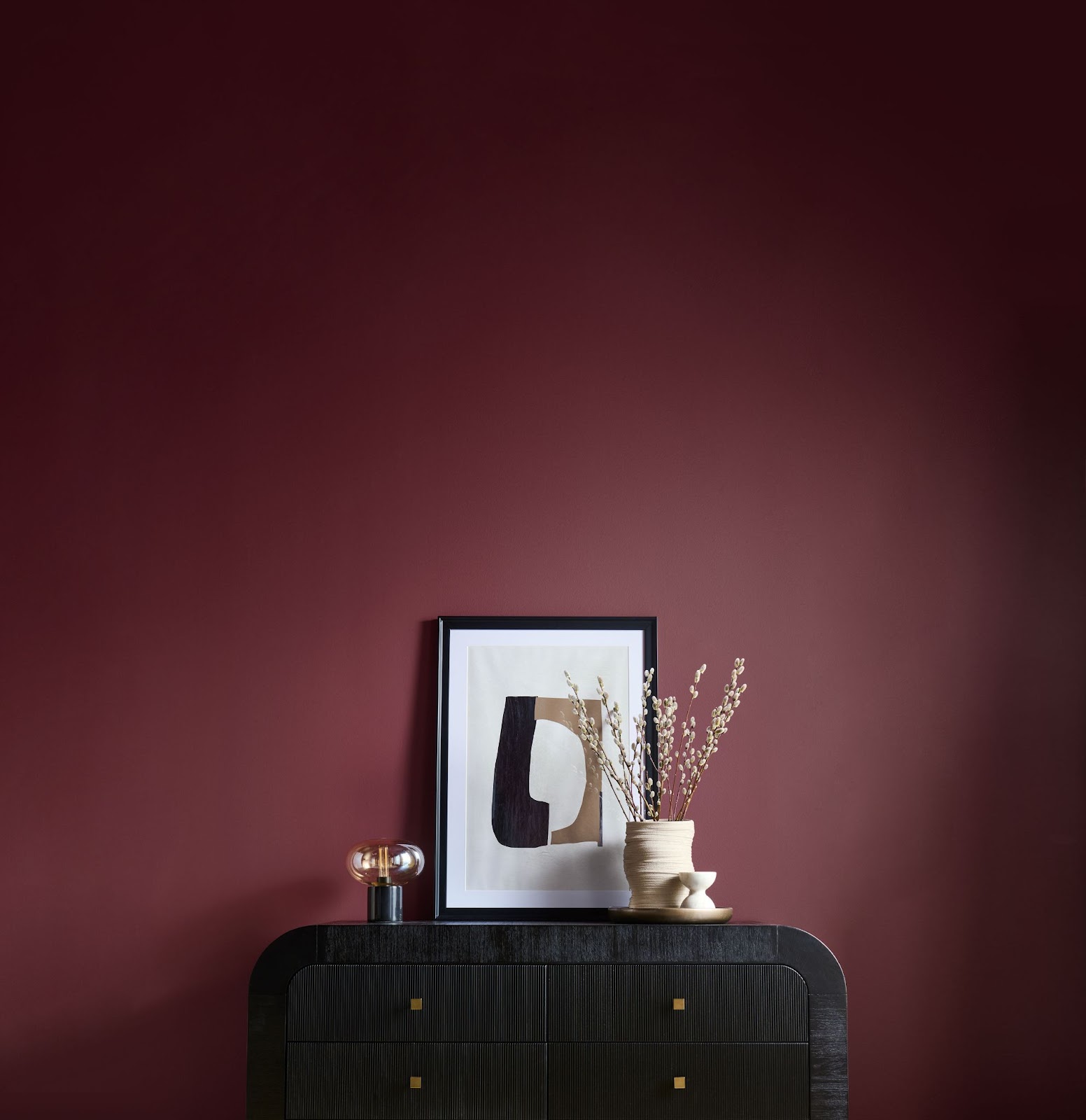
Photos courtesy of Behr
Valspar’s Color of the Year: Encore
Valspar describes their 2025 color of the year, Encore, as “an anchoring shade that embodies constancy and confidence to let you create a joyful respite from the ebbs and flows of life.”
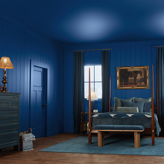
Photo courtesy of Valspar
It has warmer undertones than Valspar’s 2024 green-gray blue, bringing a more joyful appeal.
Benjamin Moore’s 2025 Color of the Year: Cinnamon Slate
Benjamin Moore’s Cinnamon Slate is described as a “delicate mix of heathered plum and velvety brown” and boasts the ability to bring “smooth familiarity to any design.”
It is calming, warm, and a bit moodier than Behr’s color of the year.
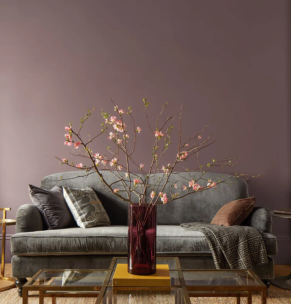
Photo courtesy of Benjamin Moore
Dutch Boy 2025 Color of the Year: Mapped Blue
According to their site, Dutch Boy’s color of the year was chosen in response to “growing consumer interest in spaces that promote well-being and longevity.”
Mapped Blue is a soft blue with slight yellow undertones, designed to bring a feeling of sanctuary to any space.
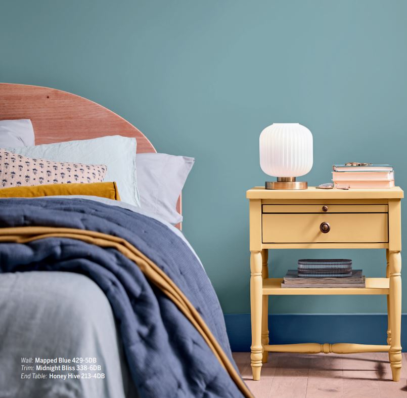
Photo courtesy of The Nordroom
Sherwin-Williams 2025 Color of the Year: Quietude
Sherwin-Williams’ Quietude is tranquil and calming, designed to infuse peacefulness into any space. According to their website, this 2025 Color of the Year “finds its power in its transcendent tranquility.” Sherwin-Williams continues, “A soft sage with a whisper of blue influence, Quietude is an emerging color for enduring design and soothes any space inside or out.”
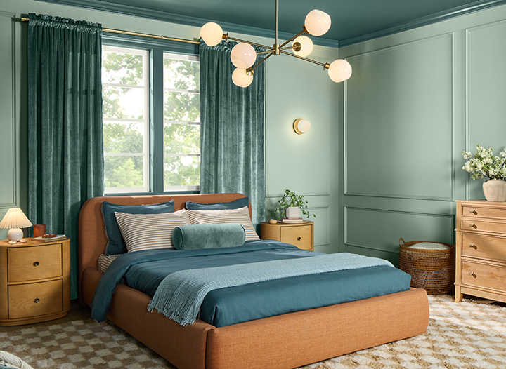
Photo Courtesy of Sherwin Williams
Sherwin-Williams recommends pairing Quietude with warmer tones like Spiced Cider, which is a muted orange, and Convivial Yellow, which is a buttery lemon. Both of these colors are part of the palette Sherwin-Williams introduces with its 2025 Color of the Year.
Notice how, once again, the warmer tones are at play.
A color palette will set the tone for your website and show your personality, but it can be hard to find the palette that best fits your content.
If you’re looking for a place to start, check out these 17 color palettes to inspire your website.
17 Fresh Color Palettes for Your Website in 2025
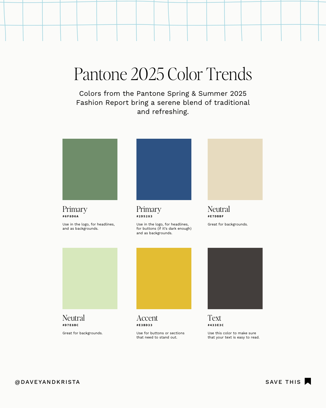
PANTONE COLOR PALETTE
This palette highlights the Pantone Spring & Summer 2024 Fashion Reports for London and New York Fashion Week. With refreshing greens and blues, this palette brings an elevated touch to the traditional.
If you are a creative who likes bold pops of color but want a sophisticated feel, this may be the perfect palette for you.
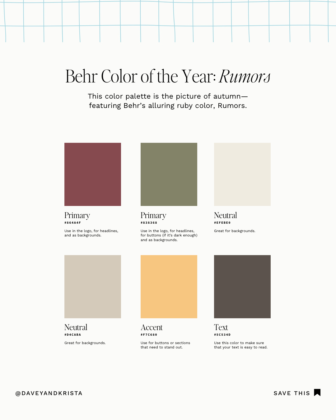
BEHR COLOR PALETTE
Behr’s color of the year, Rumors, is an alluring ruby red, adding depth to the other tones in this palette. Try using Rumors in your logo, for headlines and buttons, or (sparingly) for backgrounds. The lighter neutrals would look great for backgrounds, and the buttery yellow could be fun for buttons.
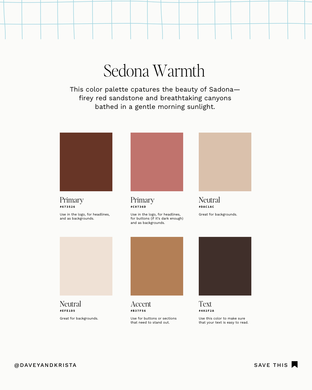
SEDONA WARMTH COLOR PALETTE
This palette is a wonderful opportunity for business owners who want their website to have an added touch of hospitality. The primary colors are rich and moody, but they do not give an aloof or distant feel. Instead, the rosy warmth invites viewers to learn more. The accent color of this palette is also not bright or jarring – it simply adds another layer of warmth.
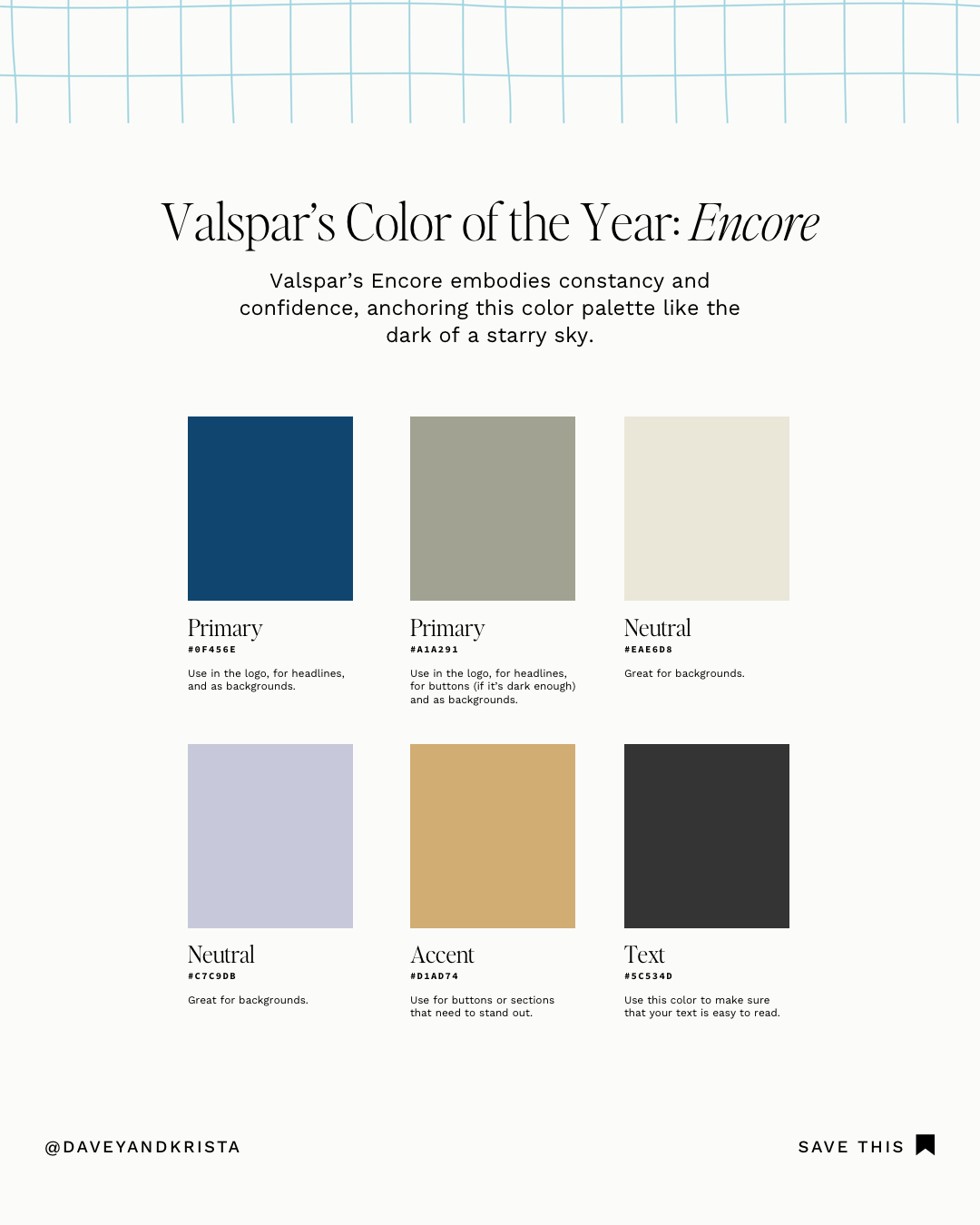
VALSPAR COLOR PALETTE
This color palette incorporates Valspar’s Encore. We paired this starry blue with a soft mossy green for the primary colors in the palette and then offset them with two light neutrals. A mustard yellow stands out as an accent for buttons or headlines.
If I were going to implement this palette, I would ground it with a lot of white to keep the colors from feeling too strong.
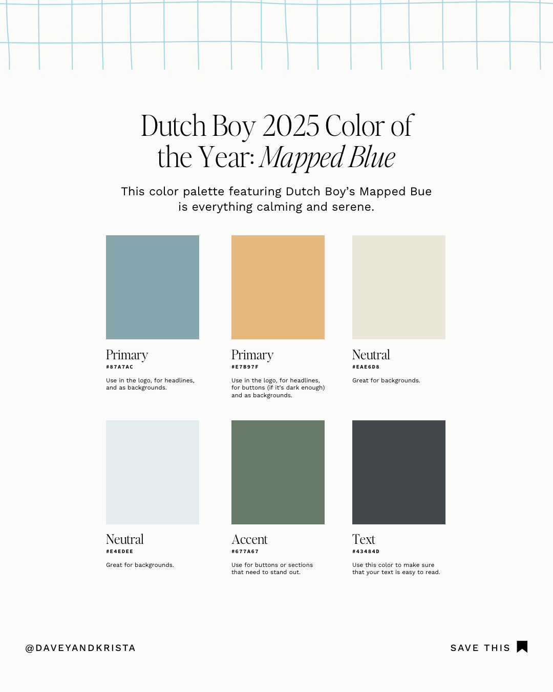
DUTCH BOY COLOR PALETTE
With its calming blue and golden yellow, this palette feels very serene to me. The neutrals are creamy and soft, and the accent color adds richness to the rest of the palette. The tones are still warm but with a lighter touch.
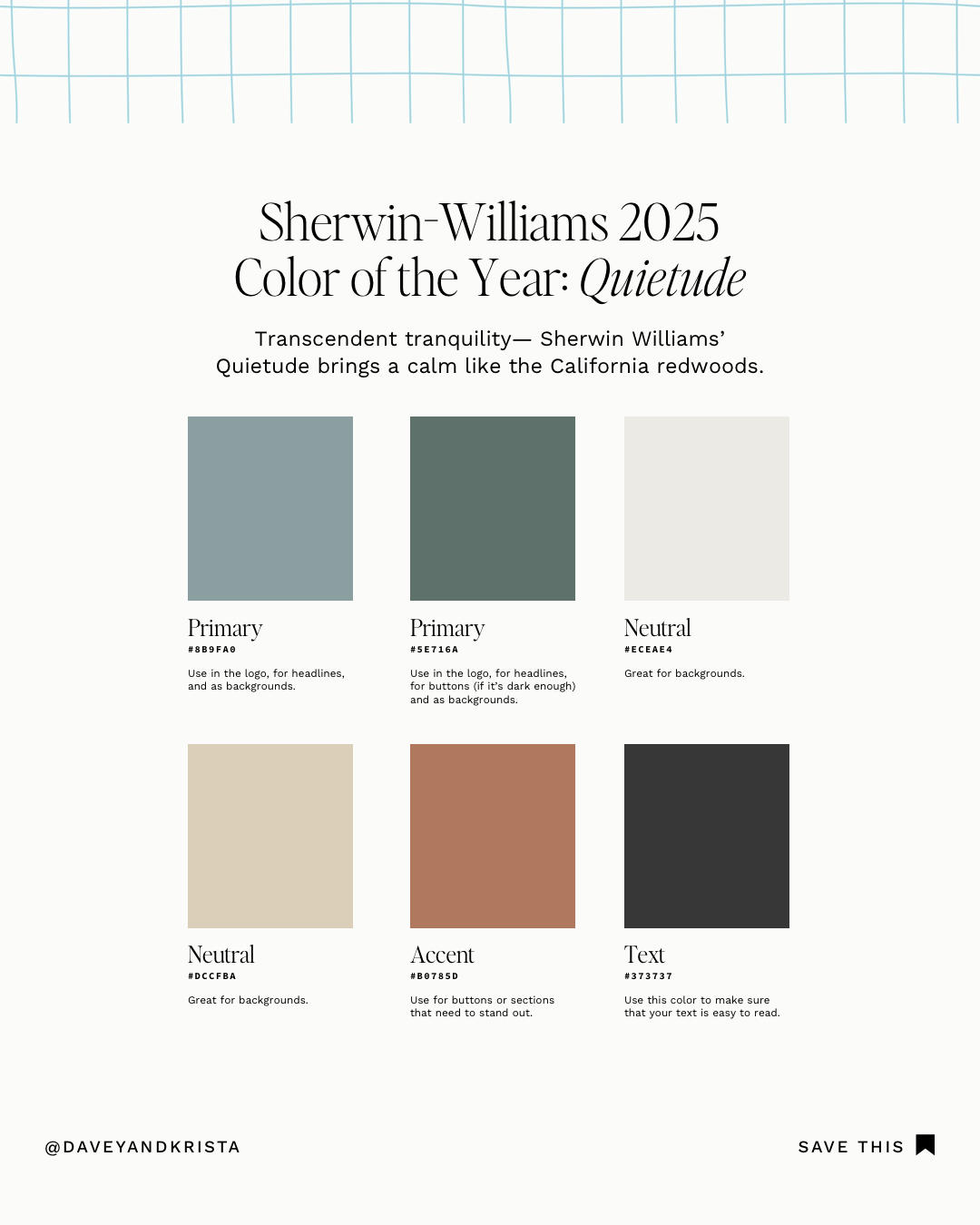
SHERWIN WILLIAMS COLOR PALETTE
This color palette is a perfect example of the blues and greens we anticipate in the upcoming year. The primary colors are calming shades of grays, blues, and greens. But rather than pairing these colors with cool neutrals, they are paired with honey-colored creams. The accent color leans further into this warmth with its soft bronze.

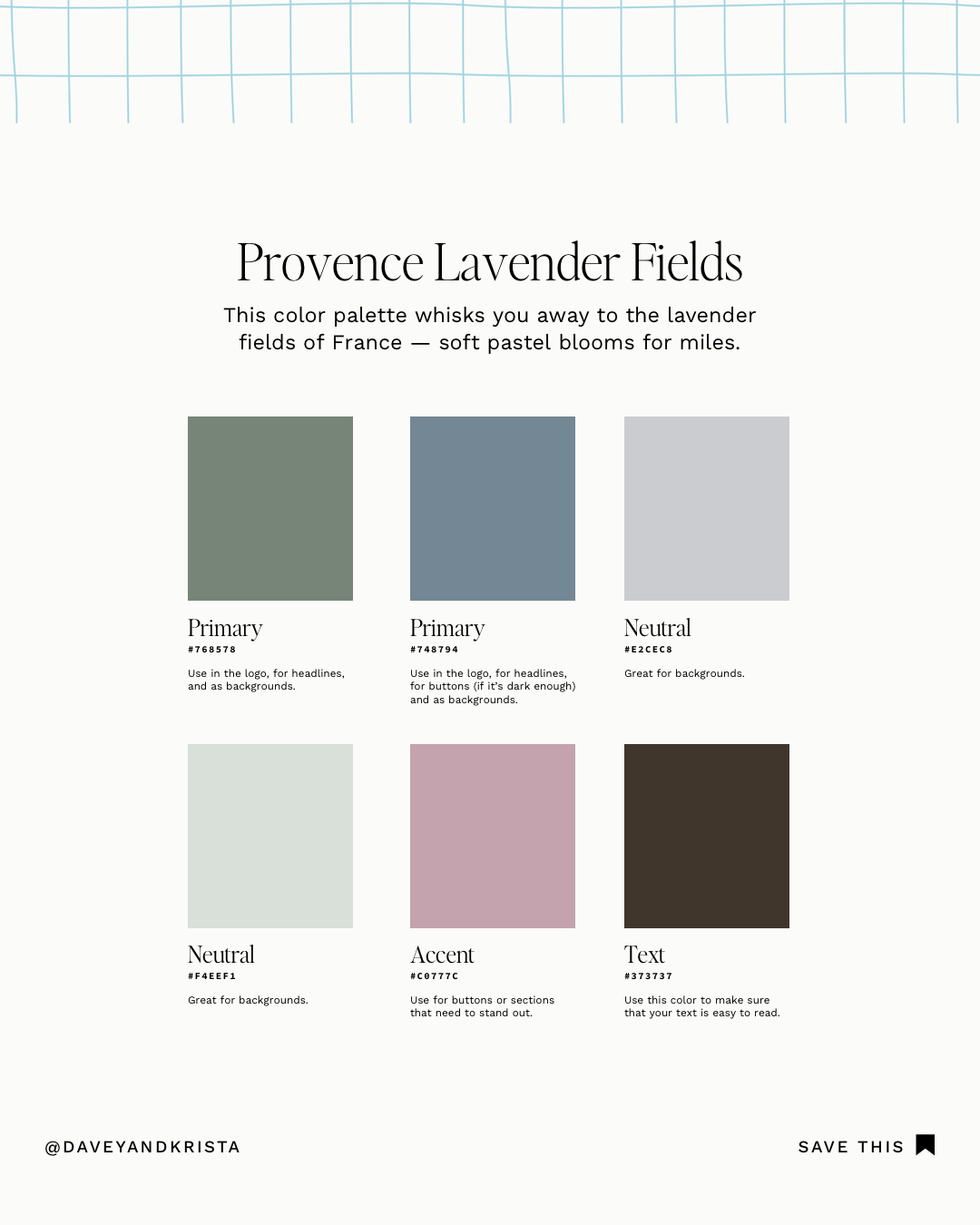
LAVENDER FIELDS COLOR PALETTE
This palette would be great for anyone working in the newborn or child space (such as newborn photographers or pediatric sleep coaches). While the colors are reminiscent of a nursery, they incorporate the sweet purples and soft greens of nature. Notice how the accent color adds a pop of color while still being tranquil.
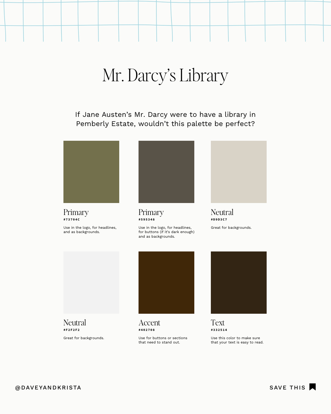
MR. DARCY’S LIBRARY COLOR PALETTE
Maybe it’s because I have read so many Jane Austen books lately, but this color palette is exactly how I envision Mr. Darcy’s library at Pemberley Estate. The primary colors are earthy and inviting, pairing beautifully with the chocolatey brown accent color. The tones are moody and rich, lifted by soft creams.
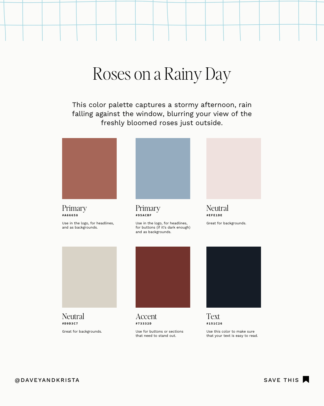
ROSES ON A RAINY DAY COLOR PALETTE
This color palette demonstrates one of many ways to incorporate a cool blue into a warm palette. The primary color is fiery rust brown, but it is balanced by the soft blush neutral.
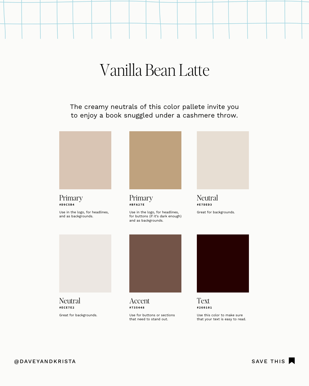
VANILLA BEAN LATTE COLOR PALETTE
I like to think of this color palette as an update to the cooler neutrals that dominated the last few years. The colors are sophisticated and effortlessly chic. If this color palette jives with your brand and you’re looking to implement it on a website, I would choose one of the neutral colors as the “base” background color instead of white. Take a look at how we did this in our Cannon Beach design.
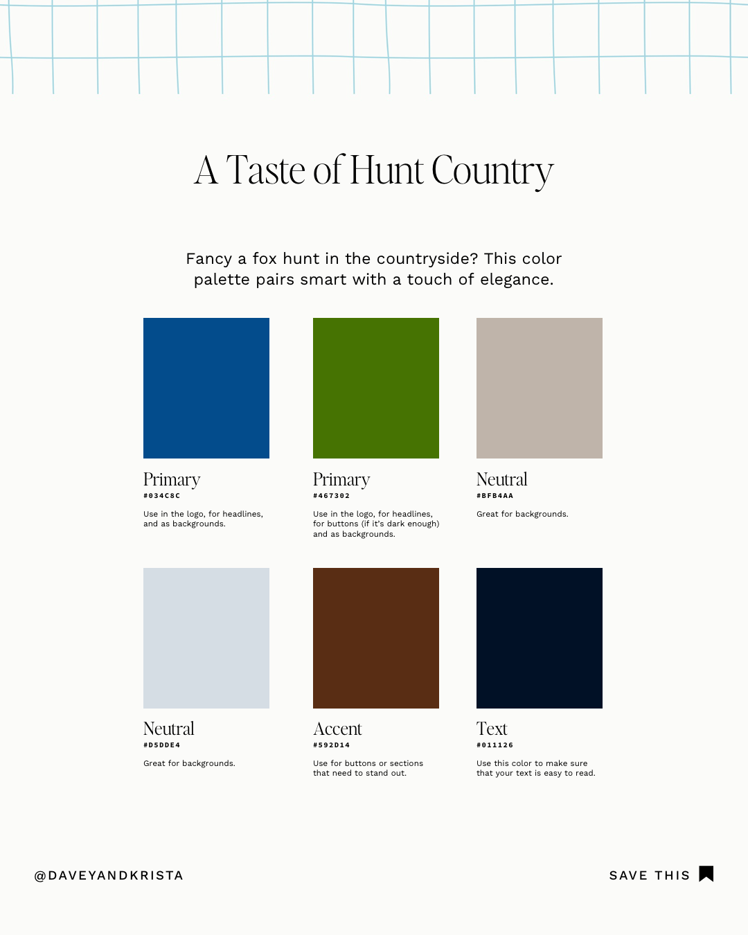
TASTE OF HUNT COUNTRY COLOR PALETTE
The sapphire blue of this color palette steals the show. If you’re looking for a unique way to incorporate blue into your website, try this fresh palette. It inverses the primary and accent colors–making the latter more subtle.
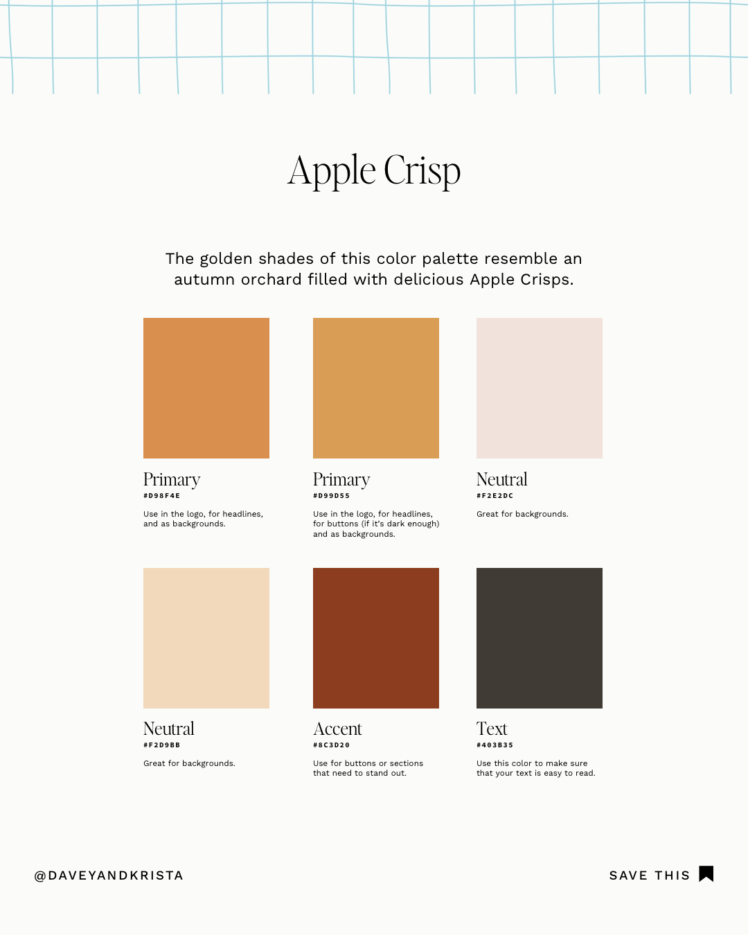
APPLE CRISP COLOR PALETTE
This color palette is perfect for anyone who wants their brand to feel like sophisticated sunshine– the refined golden hues exude “the spirit of joyful individualism and optimism” Pantone anticipates for the year ahead.
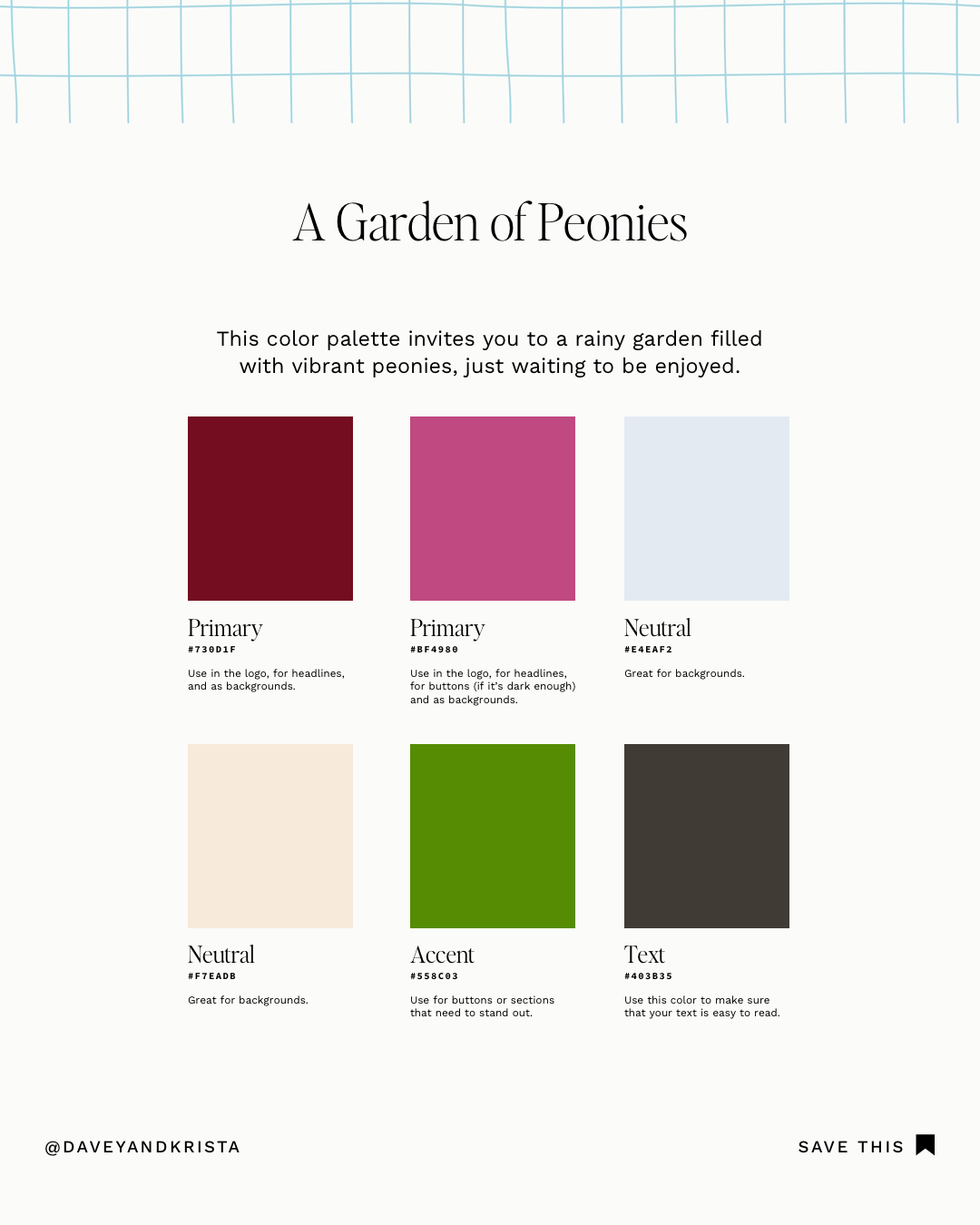
GARDEN OF PEONIES COLOR PALETTE
The bold raspberry, fresh green, and deep mahogany of this color palette play to perfection. If you love jewel tones but want an exciting twist, try playing around with this arrangement.
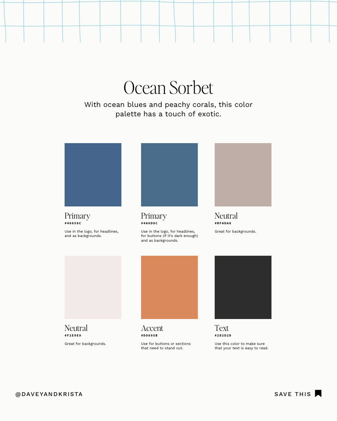
OCEAN SORBET COLOR PALETTE
This color palette is energetic and fun. We love how the complementary colors play off each other, creating an accent that stands out.
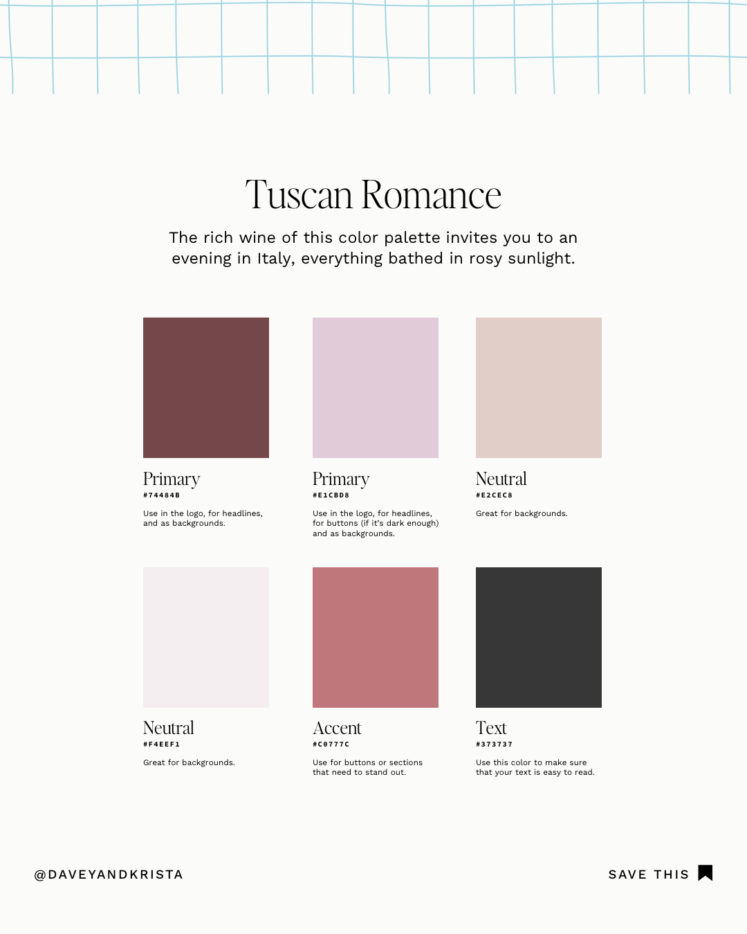
TUSCAN ROMANCE COLOR PALETTE
With its rich berry tones, this color palette feels elegant and feminine. We added a few brighter pinks and a rosy accent color to lift the overall feel. The result? A perfect blend of sultry and playful.
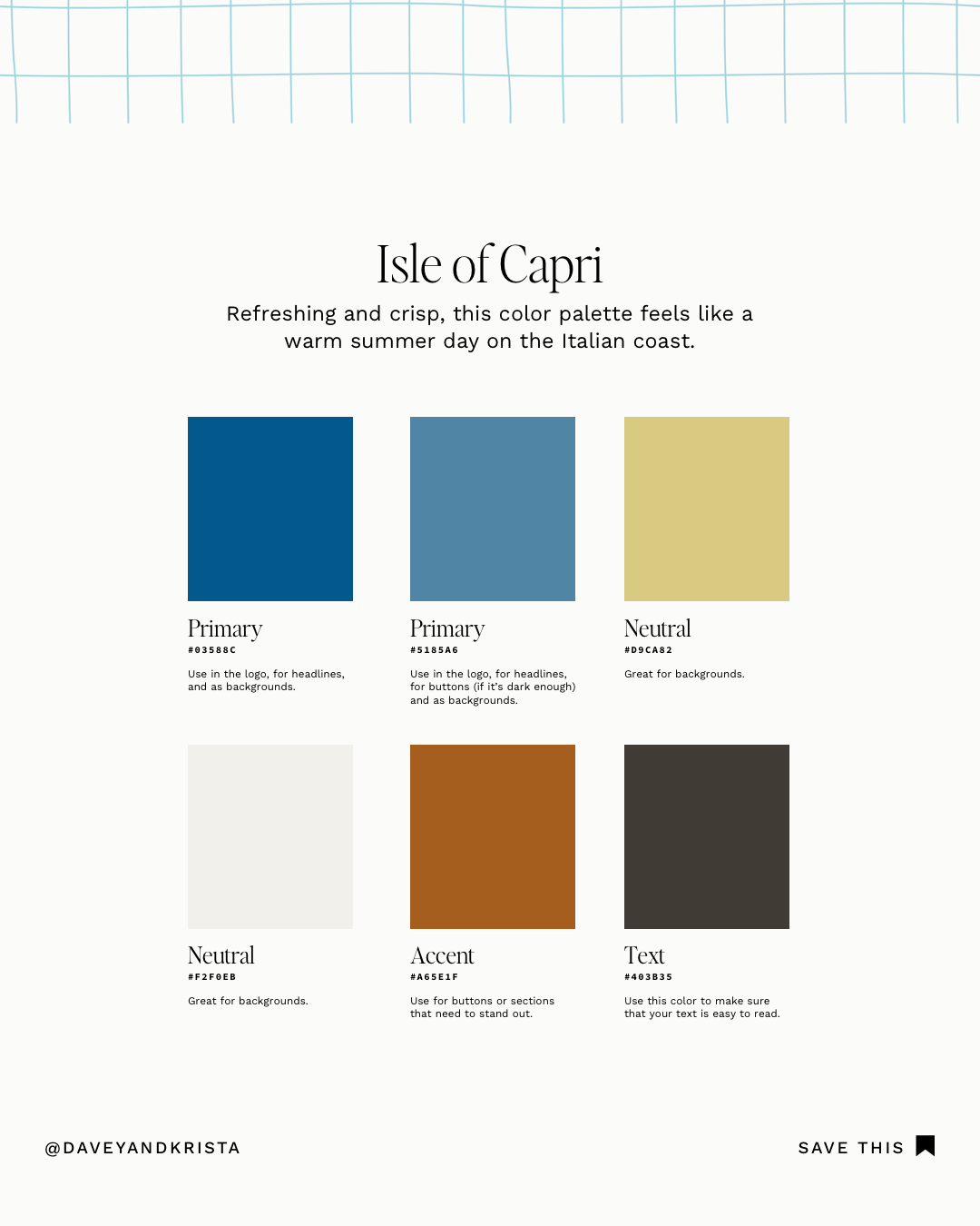
ISLE OF CAPRI COLOR PALETTE
This color palette is refreshing and fun, reminding us of the retro feel of Vacation sunscreen. Notice how the neutral and accent colors warm the overall feel.
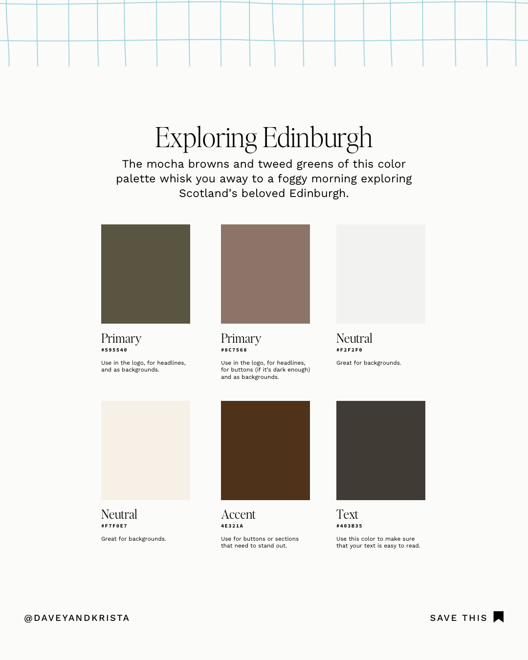
EXPLORING EDINBURGH COLOR PALETTE
With its various brown tones and rich green, this palette feels very musky. We added a milky white for the neutral and paired it with a chocolatey accent. You may recognize the primary shade from the Sézane clutch featured above.
How to Implement a Color Palette on Your Showit Website
If you’re looking to try one of these color palettes on your Showit website (or you’re new to Showit) be sure to check out the video below. We’ll walk you through the very easy process of updating the colors on your website.
If you’re testing out one of these color palettes in your next project, include a link in the comments below. We would love to see how you bring these to life in your brand!


VIEW THE COMMENTS
Add A Comment