


I’ll be honest—I have a bit of a love-hate relationship with color trends.
On one hand, I love discovering fresh color palettes that make websites feel current and polished. There’s something exciting about seeing a color combination that just works—one that feels both modern and timeless at the same time.
On the other hand? I never want you to feel like you have to chase trends just because everyone else is using a certain shade of green this year.
Here’s what I believe: your brand colors should feel like you—timeless, authentic, and strategic. But it’s also smart to know what color combinations are resonating right now, especially if you’re designing website templates or refreshing your brand.
So think of this less as “here’s what you must use in 2026” and more as “here are some beautiful color palettes worth considering for your next website project.” These combinations create visual interest, work beautifully on screen, and are sophisticated enough to still look gorgeous a year from now.
What About Pantone’s Color of the Year?
Each year, Pantone announces a Color of the Year—a shade they believe captures the mood and direction of culture, design, and creativity. For 2026, Pantone chose Cloud Dancer, a soft, airy white with a touch of warmth that feels like a blank canvas full of potential.
You’ll start to see this color pop up everywhere—from fashion runways to packaging design to social media graphics. In web design, Cloud Dancer is the kind of neutral that can instantly elevate a layout, soften bold palettes, and give your site a high-end, editorial feel.
If you’re designing website templates or updating your own brand visuals, think about using Cloud Dancer:
- As a background neutral to help vibrant colors stand out
- Paired with rich earth tones for contrast and sophistication
- In minimalist palettes where simplicity is key
It’s versatile, calming, and timeless—a designer’s dream.
What’s Trending in 2026 Shades
If there’s one thing that paint brands, trend forecasters, and design worlds agree on for 2026, it’s this: we’re moving toward colors that feel grounded, natural, and calming.
Paint brands like Sherwin-Williams have chosen warm, earthy neutrals like Universal Khaki, while Behr selected Hidden Gem (a smoky jade), and Valspar picked Warm Eucalyptus. The pattern is clear—2026 is about warm neutrals, earthy greens, and color trends that bring a sense of calm and connection to nature.
This shift makes sense when you think about it—there’s something grounding about colors that feel like they belong in the natural world. Shades that make a website feel welcoming and inviting instead of harsh or cold.
For website design, this trend is a gift. These colors are easy on the eyes, they photograph beautifully, and they create emotional connections without overwhelming your visitors.
Let’s break down how to actually use these trending colors in three practical palettes.
5 Color Palettes You Can Use Right Now
Palette 1: Warm Neutral Luxe

Colors:
- Cloud Dancer: #efeeea
- Mocha Brown: #7A5E4B
- Oxblood Accent: #5E1F23
- Warm Brass Highlight: #B89A70
The secret to this palette? It makes conversion feel effortless. That oxblood color has been proven to grab attention better than bright red without triggering the “salesy” alarm in people’s brains. When you pair it with soft cream backgrounds, your buttons actually get clicked because they stand out without screaming.
Best for: Service-based businesses where trust matters more than hype—coaches, photographers, consultants.
Palette 2: Playful Optimism

Colors:
- Butter Yellow: #F9E8A8
- Berry Red: #941e2c
- Slate Blue-Grey: #596B7A
- Cloud Dancer: #efeeea
Here’s what most people get wrong about bold colors: they use them everywhere and wonder why their site feels overwhelming. This palette works because the slate grey does the heavy lifting for readability while the yellow and red create strategic moments of energy. Your visitors get excited in the right places—not exhausted by page two.
Best for: Anyone who needs to stand out in a crowded market—creative entrepreneurs, event planners, bold personal brands.
Palette 3: Muted Earth + Botanical

Colors:
- Sage Green: #8A9C8B
- Terracotta Clay: #C86F58
- Cloud Dancer: #efeeea
- Deep Charcoal: #3A3A3A
There’s actual psychology behind why this palette works for wellness brands. Sage green literally slows people’s heart rate. When someone lands on your site stressed and searching for help, these colors create the emotional experience your copy is promising. The terracotta adds just enough warmth to keep it from feeling clinical.
Best for: Therapists, wellness professionals, anyone creating a sanctuary-type experience.

Soft Contrast + Earthy Warmth
Colors:
- Blue Slate: #496A81
- Cinnamon Wood: #B86F52
- Cloud Dancer: #EFEFEA
- Desert Sand: #EBBEAA
This palette is cozy but polished. Blue Slate brings calm and trust, while Cinnamon Wood adds just enough warmth to feel friendly without losing elegance. The creamy white of Cloud Dancer gives it all room to breathe, and Desert Sand adds a quiet, grounded femininity.
The magic? These tones have a slightly vintage, editorial feel—perfect for brand storytelling that’s both refined and emotionally resonant. It feels like a warm latte on a linen tablecloth, and who doesn’t want that vibe on their site?
Best for: Creative entrepreneurs who want to feel trustworthy and artful—think photographers, stylists, boutique agencies, or brand designers.

Fresh, Light & Balanced
Colors:
- Almond Cream: #F3DEC7
- Wisteria: #7699D4
- Cloud Dancer: #EFEFEA
- Muted Teal: #7FA986
This color combo is all about soft sophistication with a fresh twist. Almond Cream and Cloud Dancer lay a peaceful foundation, while Wisteria brings in that pop of unexpected color that still feels serene. Muted Teal grounds the palette with a subtle nod to nature—without skewing too earthy.
Why it works: These shades photograph beautifully and translate effortlessly from desktop to mobile. If you’re using this for a template, your call-to-action buttons will naturally draw attention without being too bold.
Best for: Brands that want to feel calm but not boring—like online educators, lifestyle bloggers, and high-end wellness brands.
How to Pick the Right Palette for Your Brand

Here’s the thing about color trends: they’re useful as inspiration, but they shouldn’t override what makes sense for your brand.
If you’re designing a website template, think about who you’re designing for. What do they need to communicate? What feeling should their site create? A bold, playful palette might be perfect for a creative entrepreneur but completely wrong for a therapist.
And if you’re choosing colors for your own brand? Start with how you want people to feel when they visit your site. Colors create emotion before words ever get a chance to.
These three palettes give you options—one luxe and grounded, one bold and energetic, one calm and earthy. Pick the direction that resonates with your brand personality, then make it your own.
Testing Your Color Palette in Showit
One of the things I love about working in Showit is how easy it is to test color palettes. You can drop these hex codes directly into your design, see how they work together, and adjust on the fly.
A quick tip: start with your largest elements first—backgrounds and hero sections. Get those feeling right before you worry about buttons and small details. And always test your text contrast, especially on mobile. A color can look gorgeous but if people can’t read your text, it’s not working.
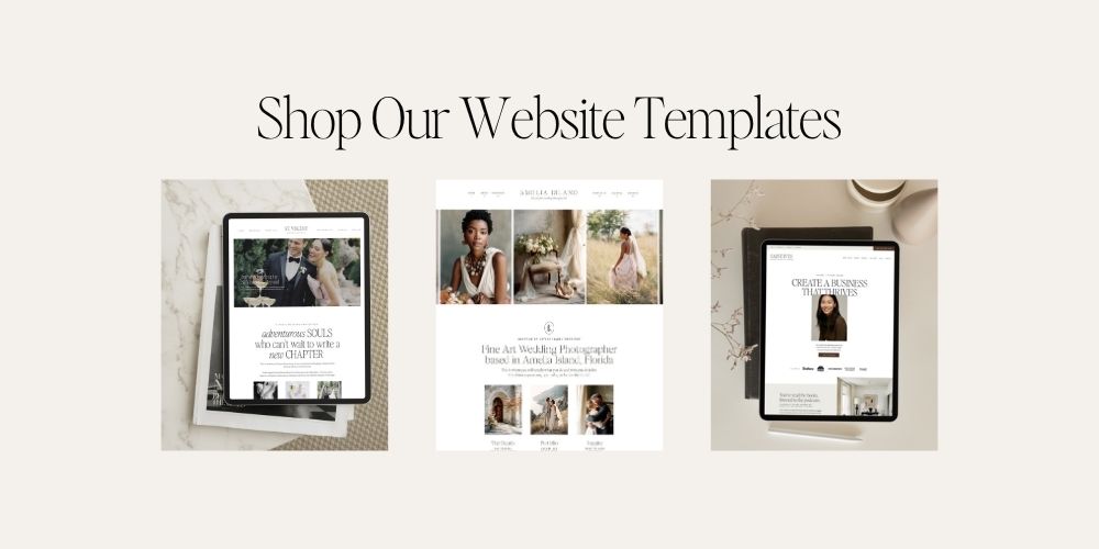
Need some inspiration for how to put these palettes into practice? Check out our Showit website templates—you’ll see how we use color strategically to create sites that are both beautiful and high-converting.
Final Thoughts
Color is one of the most powerful tools in your website design toolkit. It creates mood, guides attention, and communicates your brand personality before a single word is read.
These 2026 predictions aren’t about following rules—they’re about giving you a starting point. A jumping-off place for your next website project or brand refresh.
The trend toward warm, natural, grounded colors is growing, and these are the kinds of palettes that age well—they feel timeless even as specific shades come and go.
Take what resonates. Adjust what doesn’t. And remember that the best color palette is the one that makes your brand feel like home.
Which palette are you drawn to? I’d love to know—drop a comment below and tell me which one you’re considering for your next project.

Want to know the secret to choosing brand colors that actually help you book clients? Read our guide on how to choose brand colors that convert.
Love these palettes? Shop Showit website templates designed to bring them to life.

Krista is the co-founder of Davey & Krista, a creative studio known for high-converting Showit website templates crafted for photographers, creatives, and entrepreneurs. With over 15 years of branding and marketing experience, she helps business owners launch stunning websites without the tech overwhelm. Krista also teaches designers how to turn their creative skills into a thriving business—through templates, courses, and behind-the-scenes strategy. When she’s not designing, you’ll find her chasing sunshine, color palettes, and gluten-free pizza.
Explore website templates and free resources at daveyandkrista.com.


VIEW THE COMMENTS
Add A Comment