Should I show my prices on my websites?
It’s one of the most frequently asked questions we receive when building a website or creating a brand.
As with all brand related questions, it’s ultimately about client experience. What do you want your ideal customer to experience when they first see your pricing?
Regardless of what decision you make, the way you present your prices to prospects should have a positive impact on client experience. This is one of the main reasons we suggest clients don’t present their full pricing on their websites.

Never Show All Your Pricing on Your Website
Listing your full pricing has the potential to make the experience feel more transactional—comparable to the experience of looking at a menu in a fast food restaurant. There’s no human component, and it requires minimal interaction with the brand.
When someone interacts with full pricing prior to any human interaction (even if it’s only email), it makes it more about the transaction than the experience. This cheapens the brand. People are willing to pay more for an experience; not a transaction.
Your website and other brand touch-points prior to booking should be seen as an opportunity to show off the experience you provide for your clients. It should be used as an opportunity to educate people about what they should be looking for in a photographer or planner.
<<Related Post: The Super Simple Guide to Pricing for Photographers>>
We’ve had experiences where people have changed their budgets in order to work with us after having talked to us. Had we listed our pricing on our website, there’s a chance they would have never reached out.
Of course, we want to be transparent with our pricing. That’s why after someone inquires, we send a link to a “hidden” pricing page, so that someone can review our collections before deciding whether to book a discovery call. When someone books a call, we take the time to thoroughly review the collections, answer questions, and share about our client experience.
Related: Check out our Add-on Pricing Page (available for Showit and WordPress)
How to Show Your Prices on Your Website
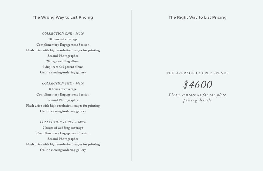
We advise people who want to put prices on their website to only show their ‘average’ prices. So instead of saying “collections begin at $2500” or listing your entire price sheet, you would say “the average couple spends $3300”. When you list the “starting at” price, potential clients set that number as their “anchor.” And most likely, that number is only a fraction of what the total experience with you should be.
Eventually when they do see your full pricing, anything above that number sounds expensive because it’s not what they were expecting. You’re a lot more likely to book the collections you want booked when you list your average price. This provides you with the opportunity to share the full prices in a way that contributes to the experience.
*Note: The prices listed below are only examples!

Where to Put Your ‘Average’ Price on Your Website
Again, think about the experience you want to create for your clients. When a prospect lands on your website, do you want them to see the price first? No, because it makes it about the price rather than experience.
It makes more sense to put the ‘Average’ price on your contact page. It’s the page someone clicks on only after they decided they want to learn more. Wherever you put it, make sure people are given a glimpse of the experience prior to seeing the price.
The Case Against Showing Your Prices on Your Website
We have never listed the ‘Starting at’ prices or ‘Average Prices’ on our websites because we want the entire focus to be on the experience.
Does this result in a number of unqualified leads? Yes—but we’d rather have more leads than less. As we mentioned earlier, we do occasionally end up booking clients whom after engaging with our website, browsing our collection collection guide, and meeting with us decide to book us even though they initially believed we were out of their budget.
Even leads that don’t have the budget are an opportunity. Take the time to refer another business that might be a better fit. They’ll appreciate and hopefully remember that. Maybe they’ll recommend you to a friend or family member who has the budget to book you. (And you’ll build great vendor relationships, too!).
Related: How to Send Pricing using your Website
The ‘Right’ Answer
The ‘right’ answer is whichever approach creates the best client experience for your those engaging with your brand. Both approaches have been used successfully by different businesses.
How do you present your prices to clients?
Interested in more resources like this? Check out this article about 5 common pricing mistakes.
VIEW THE COMMENTS
Add A Comment