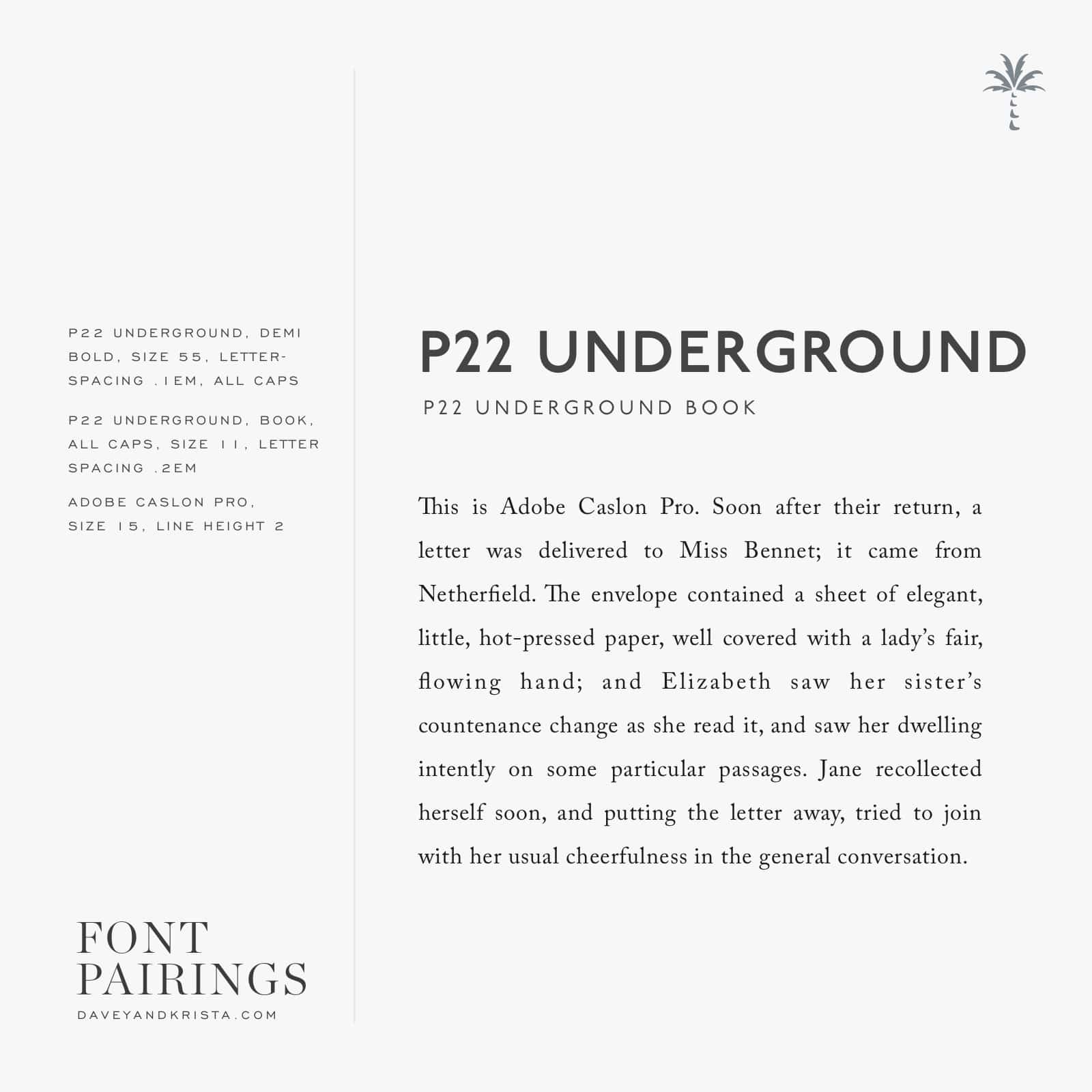
I’ve been giving a lot of love to classic serifs lately so today I’m sharing a sans serif with a more modern feel. Meet P22 Underground.
Even though P22 feels contemporary, it’s actually a variation of an old font that was designed for the London Underground in 1916. Give anything enough time and it’s cool again. Well, except maybe those jelly sandals from the 90s. I hope they never make their way back into style again.
The bolder versions look great for headlines – especially when typed in all caps and even though I’m showing a serif for the body copy here, the book version of P22 would also look great for body copy.
If you have an Adobe Creative Cloud subscription, you can head here and here to turn both fonts on for use on your computer. You can grab the web version of P22 Underground here and the web version of Adobe Caslon Pro here.

VIEW THE COMMENTS
Add A Comment