Thanks for reading!
Interested in having us design a high converting website for you? Click here. Or check out our stunning line of easy-to-customize brand + website templates.

Font Pairings: P22 Underground + Adobe Caslon Pro

Build Your Website & Brand

filed in

A Modern Font Combination

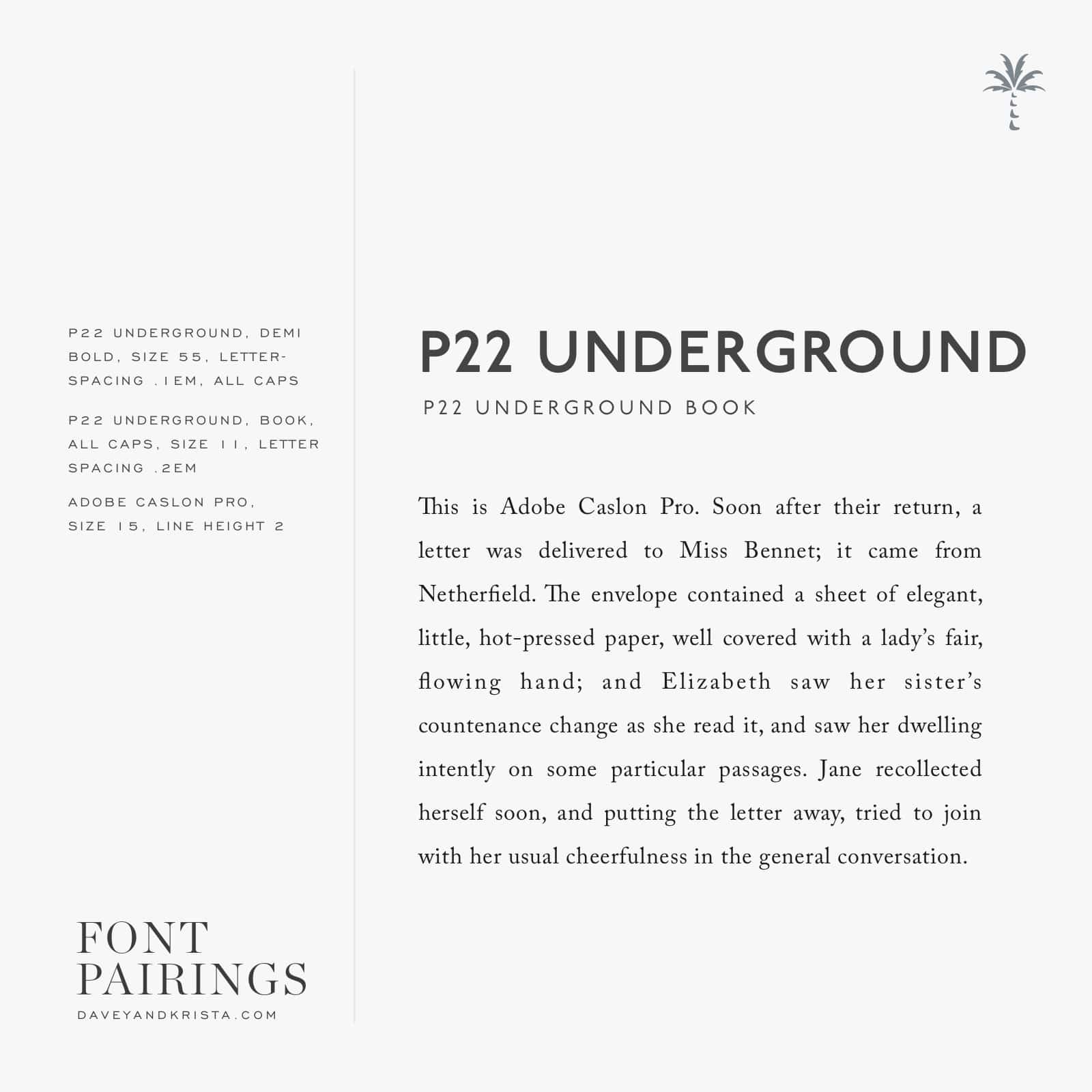
I’ve been giving a lot of love to classic serifs lately so today I’m sharing a sans serif with a more modern feel. Meet P22 Underground.

Even though P22 feels contemporary, it’s actually a variation of an old font that was designed for the London Underground in 1916. Give anything enough time and it’s cool again. Well, except maybe those jelly sandals from the 90s. I hope they never make their way back into style again.

The bolder versions look great for headlines – especially when typed in all caps and even though I’m showing a serif for the body copy here, the book version of P22 would also look great for body copy.

If you have an Adobe Creative Cloud subscription, you can head here and here to turn both fonts on for use on your computer. You can grab the web version of P22 Underground here and the web version of Adobe Caslon Pro here.

P22 Underground (sans serif) and Adobe Caslon pro come together for a contemporary combination | Via Davey & Krista | Typography Tips

Pin It

SHARE THIS POst

Leave a Reply

Your email address will not be published. Required fields are marked *

  1. haha to the jelly sandals! My girls wear them, but they are probably better for girls and not adults.

  2. Kelli says:

    This makes me want to reread P&P!

  3. Erin Caracci says:

    This is the perfect font pairing for my website redesign! thank you for sharing.

Your website should be bringing in clients while you sleep. If it isn't, it's probably missing a clear strategy — and this free guide shows you exactly where to start.

 THE FREE GUIDE

7 Website Fixes That Turn Visitors Into Paying Clients

    FREE GUIDE

    FREE GUIDE

    Meet Davey & Krista

    We've spent 15+ years designing brands and websites for creative businesses — and paying close attention to what actually works.

    Every template we've built is informed by real client projects, real conversion data, and a deep understanding of what makes someone go from browsing to booking. We don't just design for beautiful. We design for what happens after someone lands on your page.

    That's why our templates don't just come with files. They come with the guidance to use them — writing prompts, launch checklists, and systems that take you from purchase to published.

    We also teach. Our designer courses are where we train the next generation of designers, and DesignEdit is our newsletter for working creatives who want to stay ahead of AI. All of it comes from the same place: the belief that good design should make your business feel lighter, not harder.

    we're Davey & Krista 

    GET TO KNOW US

    SEND ME MY GUIDE

    Your website should be bringing in clients while you sleep. If it isn't, it's probably missing a clear strategy — and this free guide shows you exactly where to start.

    grab the free guide

    DESIGNERS - GRAB YOUR FREE GUIDE