


Table of Contents
Most wedding stationery websites are beautiful. Far fewer of them actually sell.
There’s a real difference between a site that looks good and one that’s built to move a couple from curious to committed without a single awkward conversation about price.
The wedding stationery websites that do this well have strategy baked into every section, even the ones that feel purely visual.
To walk through what that actually looks like, we’ll reference a few specific examples from one of our own Showit template, Bellagio, which was built around this exact strategy for stationery designers who want a site that does the selling for them.
The Homepage Sets Expectations Before You Scroll Once
The moment someone lands on a strong wedding stationery website, they should know two things almost instantly: what kind of business this is, and whether they can afford it.
A homepage hero that clearly names the type of work, custom invitation design for couples investing in something fully bespoke, and gently signals that this isn’t a budget or templated option, does enormous work in just a sentence or two.
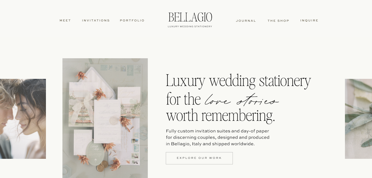
It tells a couple this isn’t a quick online order, and it filters out anyone who isn’t ready for that level of investment before they ever click into the portfolio.
This is one of the most overlooked things great wedding stationery websites do well. They position the offer in the very first scroll, instead of making a couple dig for it.
Press and Social Proof Appear Before You Ask for Anything
Right under the hero section is where a lot of premium wedding stationery websites place their press logos and any awards the designer has earned.
That placement is intentional. Before a couple has scrolled far enough to see a single price or read a single testimonial, they’ve already absorbed third-party validation.
For wedding stationery websites operating at this price point, that kind of trust-building has to happen early, because couples shopping for custom stationery are doing real due diligence, and external validation moves faster than anything you could say about yourself.
A “Heirloom” Style Section Sells a Feeling, Not a Feature List
One of the most strategic sections you’ll find on a high-converting wedding stationery website isn’t about paper weight or printing methods at all.
It’s language built around the feeling of the process: the care that goes into selecting materials, the intention behind every typographic choice, the sense that every piece in a suite belongs to the same considered story.
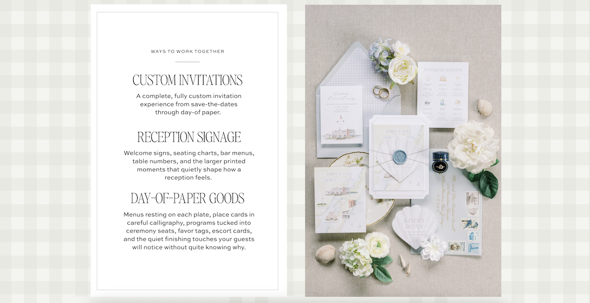
That’s not a features list. It’s an emotional anchor.
Couples investing $5K or more in stationery aren’t just buying paper goods. They’re buying the feeling of having something considered, intentional, and entirely theirs. The wedding stationery websites that book at this level understand that the emotional sell has to happen before the logical sell ever starts.
The Designer’s Bio Builds Trust Through Specificity
A generic “I’m so passionate about design” bio gets skipped over. A bio full of specific, sensory detail does not.
Think about the difference between a vague claim of passion and a bio that mentions the actual physical space someone works in, the kinds of weddings and venues they’ve designed for, or a small detail about how they got started. That kind of specificity is what makes a bio believable.
Concrete, sensory detail makes a couple feel like they actually know the designer before they’ve ever spoken. That trust is a huge part of what allows someone to commit to a five-figure purchase from a stranger on the internet, and it’s exactly why the strongest wedding stationery websites never settle for a generic founder story.
A Meet-the-Team Section Signals a Real, Established Studio
Introducing a studio manager, a lead calligrapher, or any other team member alongside the designer herself does something powerful for premium wedding stationery websites.
It signals that this isn’t a one-person operation working out of a spare bedroom with an uncertain future. It’s an established studio with infrastructure, which matters enormously to a couple about to hand over a large deposit.
People want to know their order will be handled with the kind of operational care that a real team provides, even if that team is small.
The Invitations Page Removes Every Ounce of Guesswork
This is usually the page doing the heaviest lifting on the entire site, and it’s worth building with real intention.
A strong version of this page opens with a full process walkthrough: inquiry, discovery call, proposal, design, approval, production, delivery, each step explained in plain language with a clear sense of what happens and when.
Couples shopping for custom stationery are often doing this for the first time in their lives. They don’t know what’s normal. Removing that uncertainty is one of the most underrated things wedding stationery websites can do.
It also helps to include a flat-lay style illustration of exactly what’s included in a suite: the invitation, the RSVP card, the envelope, the details card. Seeing the pieces laid out visually answers the question “what am I actually getting” far more effectively than a paragraph of text ever could.
Some of the best examples take this even further with a built-in order timeline that tells a couple exactly when to place their order and when to mail their invitations based on their wedding month.
It’s genuinely useful, and it also happens to be the kind of structured, specific content that tends to perform well in Google’s featured snippets, which means a page like this is working just as hard for SEO as it is for conversion. Few wedding stationery websites bother to build a tool this practical directly into a sales page, and that’s exactly why it stands out when it’s there.
Investment Language Sets the Tone Without Scaring Anyone Off
A dedicated investment section with starting price language built directly into the page is one of the simplest, highest-leverage additions a stationer can make.
Couples who aren’t a fit for the price point self-select out before they ever reach the inquiry form, which saves everyone time.
For wedding stationery websites operating at this level, naming a starting investment isn’t a risk. It’s a filter, and a confident one. It signals that the designer knows exactly what their work is worth, which is reassuring to the couples who are the right fit.
The FAQ Section Pre-Answers the Questions That Stall Inquiries
A strong FAQ covers exactly the questions that tend to sit in a couple’s mind right before they decide whether to reach out: how many revisions are included, how far in advance to order, whether international shipping is available, whether rush orders are possible.
Answering these upfront does something subtle but important. It removes the small hesitations that quietly stall an inquiry from ever being sent.
The couple who would have closed the tab to “think about it” instead finds their question already answered, and the inquiry goes out instead. This is a detail that separates well-built wedding stationery websites from ones that simply hope a couple will fill in the blanks themselves.
The Portfolio Tells a Story Instead of Just Showing a Product
Rather than a flat image grid, the strongest wedding stationery websites present each portfolio piece with context: the couple’s names, the venue, a short description of the wedding itself.
Even a single line naming the location and season of a wedding tells a richer story than a thumbnail ever could on its own.
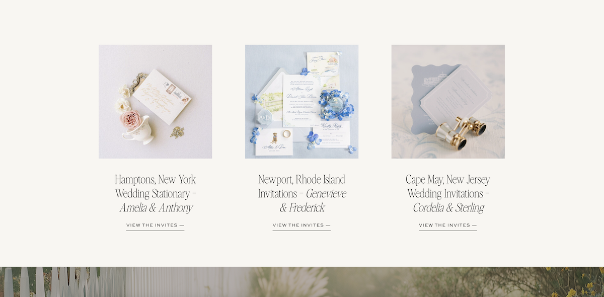
This case-study format keeps people scrolling longer, which matters for engagement, and it also gives search engines more relevant context to index, which matters for the kind of organic traffic that brings in qualified leads. The best wedding stationery websites treat their portfolio as a story collection, not a product catalog.
Testimonials Describe Outcomes, Not Just Feelings
Generic testimonials (“she was amazing to work with”) don’t move the needle the way specific ones do.
A testimonial that mentions guests asking about the invitations before they’d even RSVP’d, or a couple describing the stationery as one of the best decisions they made for their wedding, does far more conversion work.
These tell a prospective couple exactly what they stand to gain, in language that feels real because it came from someone in their exact position not long ago. This is one of the small details that separates the wedding stationery websites people remember from the ones they scroll past.
A Lead Magnet Captures the Couples Who Aren’t Ready Yet
Not every visitor is ready to inquire on their first visit. A simple free download, something like a worksheet that helps couples figure out exactly how many of each stationery piece to order, offered through a pop-up and a dedicated landing page, is a smart way to capture that traffic.
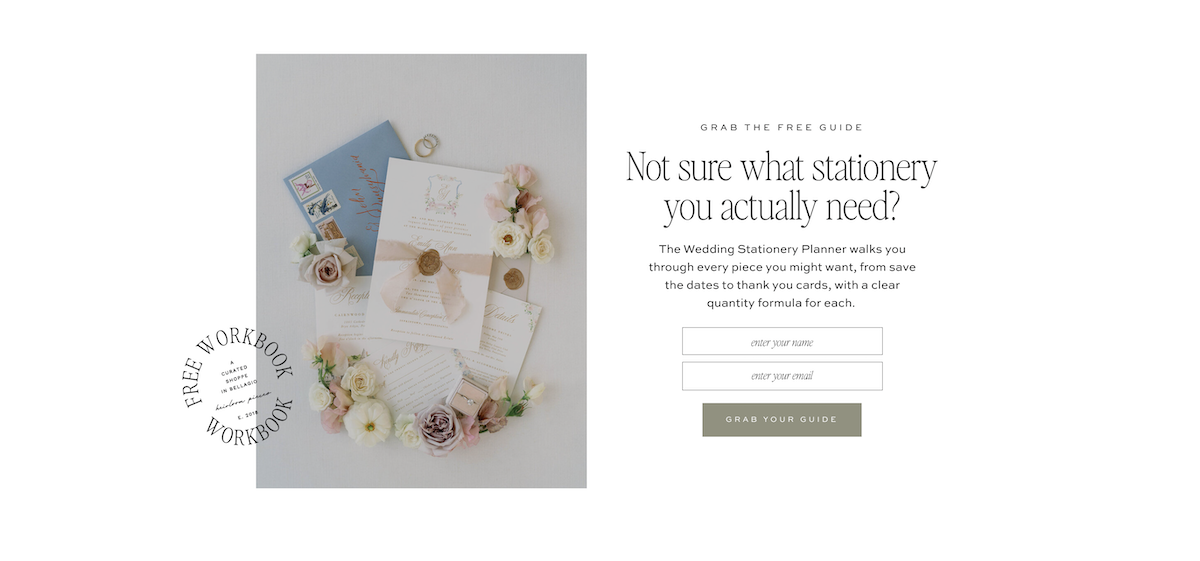
This matters for wedding stationery websites because it gives the undecided visitor a reason to stay connected. A couple who isn’t ready to commit can still join an email list, which keeps the studio in front of them until they are ready.
What This Adds Up To
None of these elements are flashy on their own. A press strip. A specific bio. An order timeline. A well-placed lead magnet.
But stacked together, they form a site that does real strategic work at every single scroll, guiding a couple from curiosity to confidence without ever feeling like a sales pitch.
That’s the real difference between wedding stationery websites that simply look beautiful and the ones that consistently book $5K and up.
If you’re building or rebuilding your own and want to see this strategy already built into the structure, Bellagio is one option worth exploring!
FAQs: Wedding Stationery Websites
What makes a wedding stationery website convert better than others?
A combination of clear positioning, early social proof, a detailed process walkthrough, and investment language that filters for the right couples. The wedding stationery websites that book consistently treat every section as a piece of the sales conversation, not just a visual showcase.
Should I list pricing on my wedding stationery website?
At minimum, include a starting investment range. It filters out couples who aren’t a fit before they reach your inquiry form, and it signals confidence in your pricing. Most premium wedding stationery websites include at least general investment language somewhere on the Invitations or Pricing page.
What should be included on the Invitations page of a stationery website?
A full process walkthrough, a breakdown of what’s included in a typical suite, an FAQ section, and ideally a timeline tool that helps couples know when to order and when to mail. This page tends to do the most conversion work on the entire site.
How important are testimonials on a wedding stationery website?
Extremely important, but only when they’re specific. A testimonial describing a real outcome, like guests asking who designed the suite, carries far more weight than a generic compliment. The best wedding stationery websites curate testimonials the same way they curate portfolio work.
What’s the best way to capture leads who aren’t ready to inquire yet?
A simple, genuinely useful lead magnet, like a planning worksheet or ordering guide, offered through a landing page or pop-up. It keeps undecided couples connected through your email list until they’re ready to reach out.

Krista is the co-founder of Davey & Krista, a creative studio known for high-converting Showit website templates crafted for photographers, creatives, and entrepreneurs. With over 15 years of branding and marketing experience, she helps business owners launch stunning websites without the tech overwhelm. Krista also teaches designers how to turn their creative skills into a thriving business—through templates, courses, and behind-the-scenes strategy. When she’s not designing, you’ll find her chasing sunshine, color palettes, and gluten-free pizza.
Explore website templates and free resources at daveyandkrista.com.


VIEW THE COMMENTS
Add A Comment