When it comes to website design, every element plays a crucial role in creating a visually appealing website that engages your ideal client & causes them to convert. This might be a hot take, but as type nerds, we’d argue that fonts are one of the most important, if not the most important, design choice you can make for your website.
The right fonts can make or break the aesthetic of a website, improve readability, and even lead to higher conversions.
Our Best of Google Fonts post has been so popular, that we’re following it up with this Best of Website Fonts post. We’re diving into a few trending fonts for websites and sharing the best ways to use these fonts on your website.
In researching this post, we came across quite a few similar types of font roundup posts for websites. And while we saved a few ideas to our Pinboards, the vast majority of fonts were so unique that we would NEVER recommend them for most of our clients. Because really, how many wedding photographers or business coaches need a retro script? Few. Very few.
What should I look for in a website font?
While we’re going to share some fun fonts below, it’s important to make sure that you’re choosing a font that works with your overall brand and is easy to read at the size it appears. For example, while Astralaga is seriously pretty, the thin serifs on the letters are best for larger-sized fonts (like headlines). The thick-to-thin strokes on the letters are pretty drastic and it would be pretty challenging to read at a smaller size.
And, although we think this font would be perfect if you tell us that your ideal client has a pile of Serena and Lily catalogs stacked on her desk for inspiration, we wouldn’t recommend using this font if you tell us your ideal client could put Macklemore to shame with her thrift store purchases.

Here's why.
How can I use these fonts on my website?
Unlike Google fonts (which are built in to Showit and Elementor), you’ll need to purchase the web licenses for these fonts and upload them to your website.
18 Trending Fonts for your Website in 2024
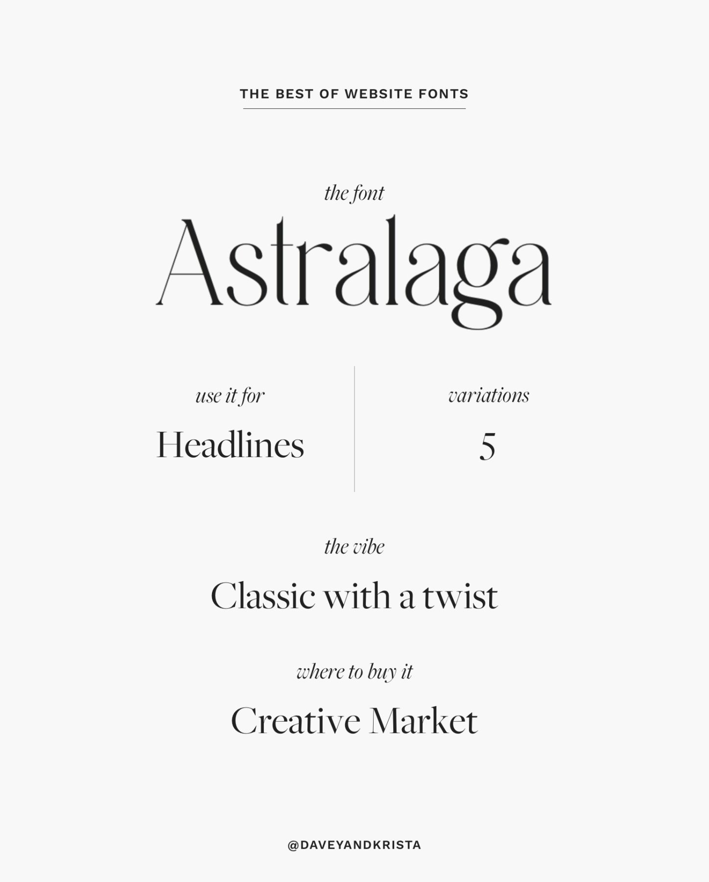
Astralaga
We’re loving this classic serif for website headlines. The drastic thick-to-thin lines in the characters make it feel high-end and elegant. The serifs and some of the strokes on the characters contain a few unique starting points – giving this classic serif a unique look. We recommend using this font for headlines on websites that want to feel elevated in a unique way.
Try using it in our Amelia Island, Elba Island or Positano designs.
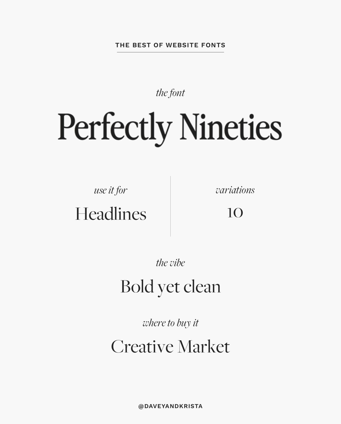
Perfectly Nineties
When it comes to font design, we’re pretty sure that Jen Wagner can do no wrong. We’re loving her Perfectly Nineties family and it’s wide variety of weights and styles. We still don’t know if we’d recommend using this for body copy (unless you make your copy a bit larger), but we love this retro (are the 90’s retro now?) serif for headlines and subheadings.
Try using it in our Barcelona or Cape Town designs.
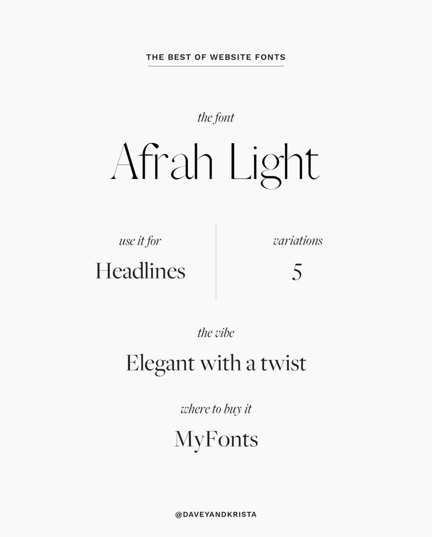
Afrah
Afrah is another lovely serif font available in quite a few weights. We’re partial to the Light version, but if you need something thinner check out the Thin variation. It’s also available in a few additional thicker weights. This might be the font for your brand if your dream vacation includes croissants with a view of the Eiffel Tower. We recommend using this font for headlines.
It pairs well with Amelia Island and Elba Island.
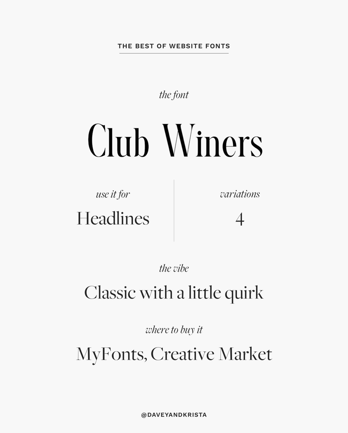
Club Winers
Sophisticated. Rich. Luxurious. This font lives up to its wine club inspired name. Use it for headlines and try pairing it with a clean sans serif like Work Sans for body copy.
We think it would look great in our Cape Town, Palm Springs or Barcelona designs.
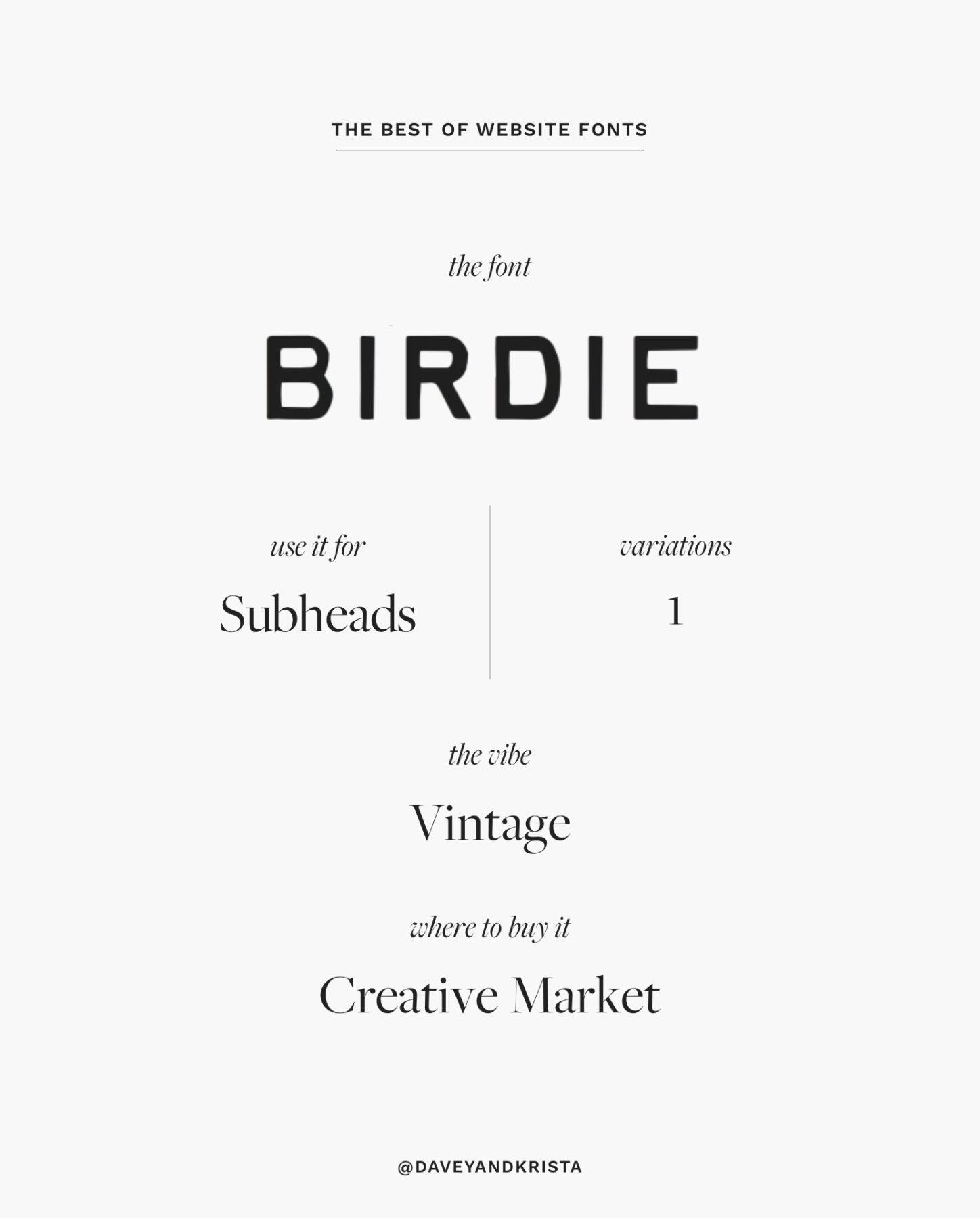
Birdie
Birdie is a fun retro font that would add personality to subheads. It’s characters are clean with a slight typewriter-esque variation. It’s only available in all caps so it wouldn’t work well for body copy and we’re not sure we would use it at larger sizes for primary headlines, but we love it for accent text.
Try using it in our Cape Town or Barcelona designs.
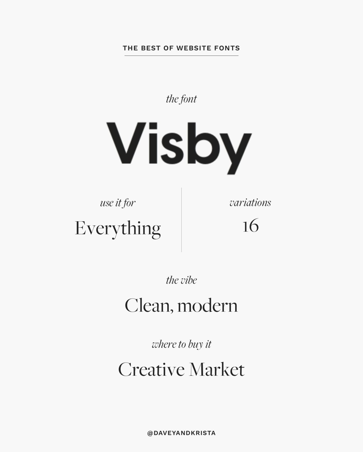
Visby CF Geometric
Sans serif fonts are having a moment in 2024 and Visby CF is perfectly on trend. It reminds us of an updated Futura. With 16 variations it’s robust enough to work for larger headlines as well as smaller body copy. If you’re going to use Visby for body copy, we recommend the Medium or Regular weights. Try the lighter styles for larger headlines or up your headline impact with one of the bolder versions.
Try Visby with our Cape Town, Palm Springs or Hermosa designs.
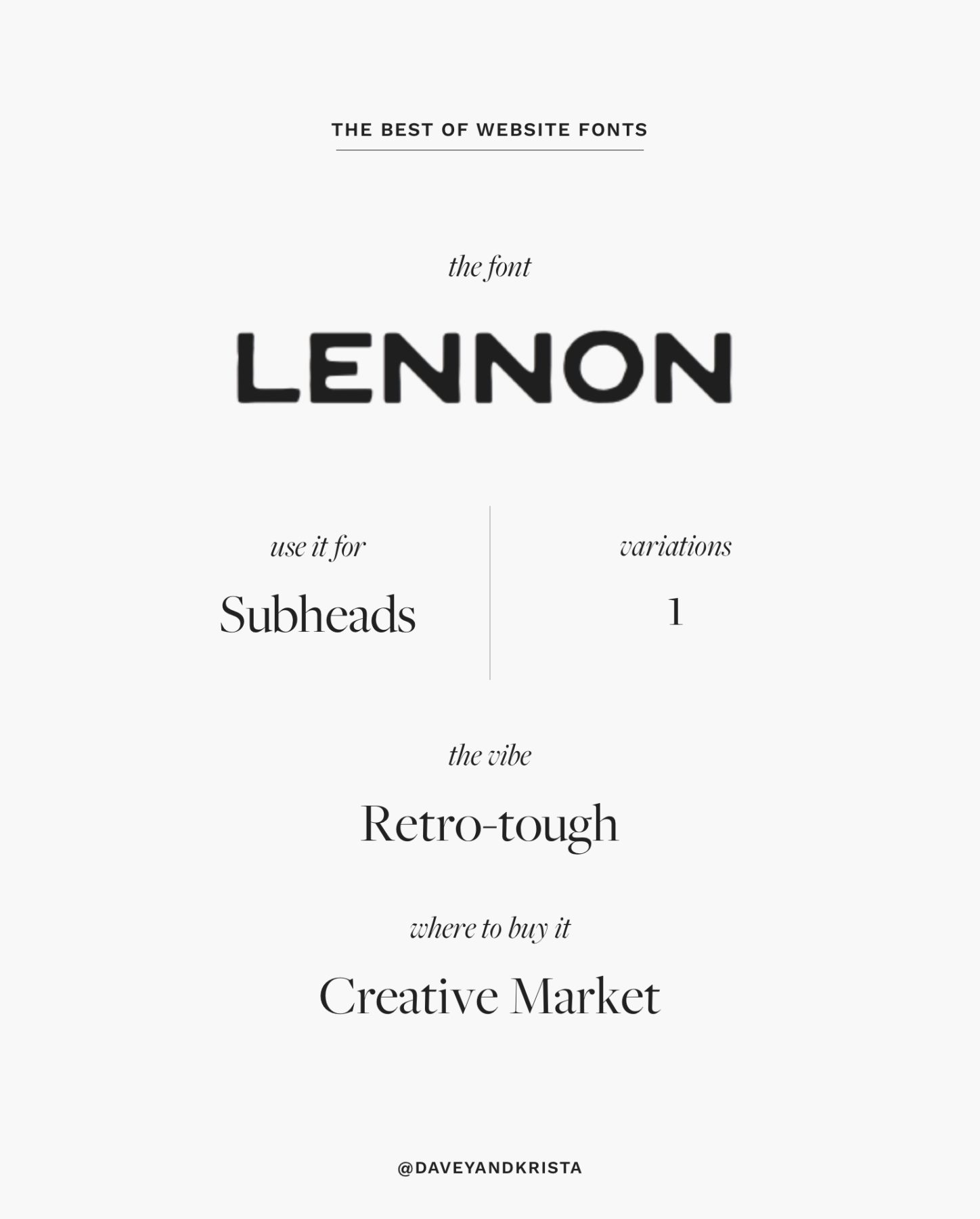
Lennon
Like Birdie, Lennon is a retro-inspired sans-serif font. With round edges, imperfect strokes and a thicker weight, it works well for subheads. Keep in mind that it’s only available in all-caps lettering.
Try using it with our Cape Town, Palm Springs or Hermosa designs.
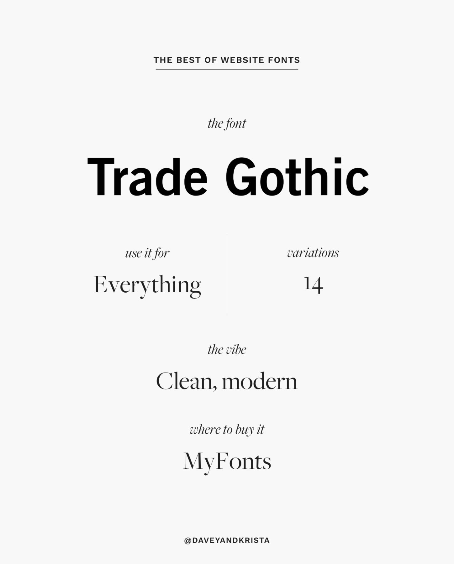
Trade Gothic
Trade Gothic is a retro-inspired sans serif that is clean, but not quite as clean as other fonts in this genre. Although in our opinion, the lack of continuity is what adds to its charm. This font is available in 14 variations – making it great for everything from body copy to headlines.
Try using it in our Positano design for a cleaner look or our Cape Town template.
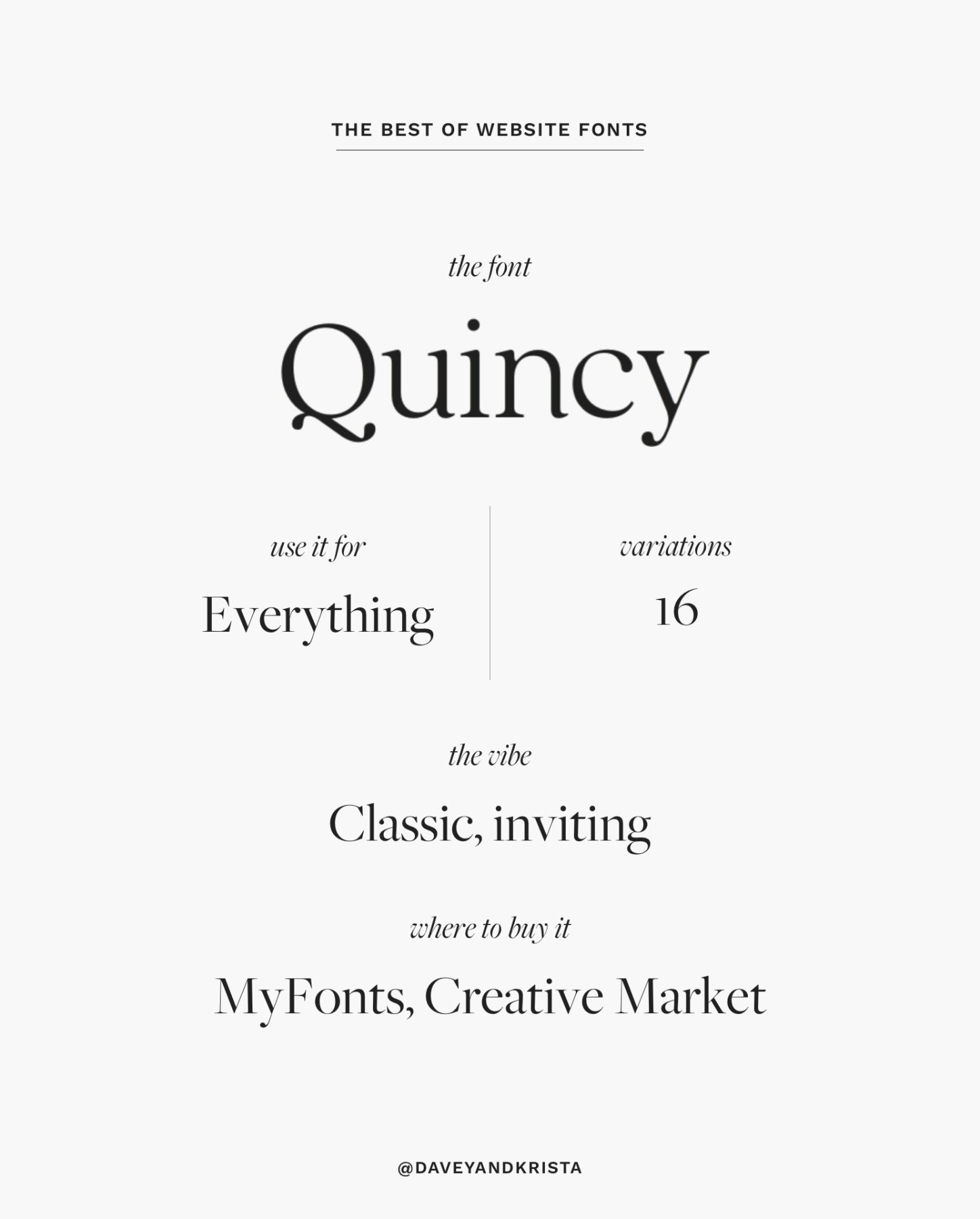
Quincy
Quincy is warm, inviting and diverse enough to work for headlines, subheads and body copy. It feels like a fresh take on a classic serif like Garamond or Times New Roman.
Try it with our East Hampton, Positano or Magens Bay designs.
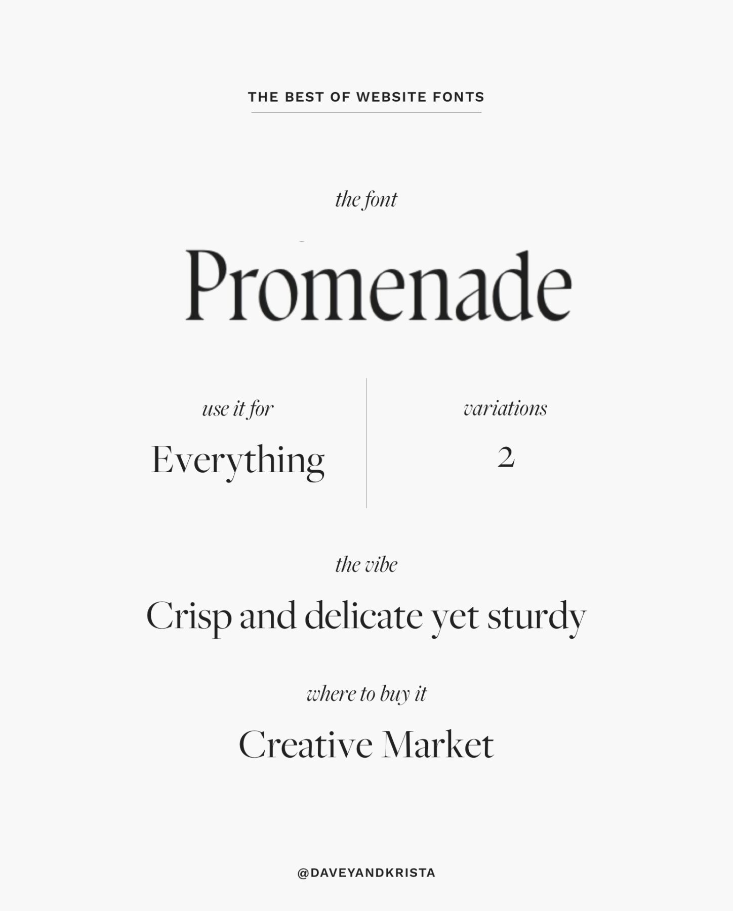
Promenade
This crisp yet study serif from Jen Wagner is inspired by the strokes in calligraphy. Calligraphy had a moment a few years ago, and personally we think that the calligraphic scripts so often used on websites should be replaced with updated calligraphy like Promenade. Try using this gorgeous serif for headlines like we did for our Taylor Swift demo site.
Use with: Cape Town, Magens Bay, Palm Springs.
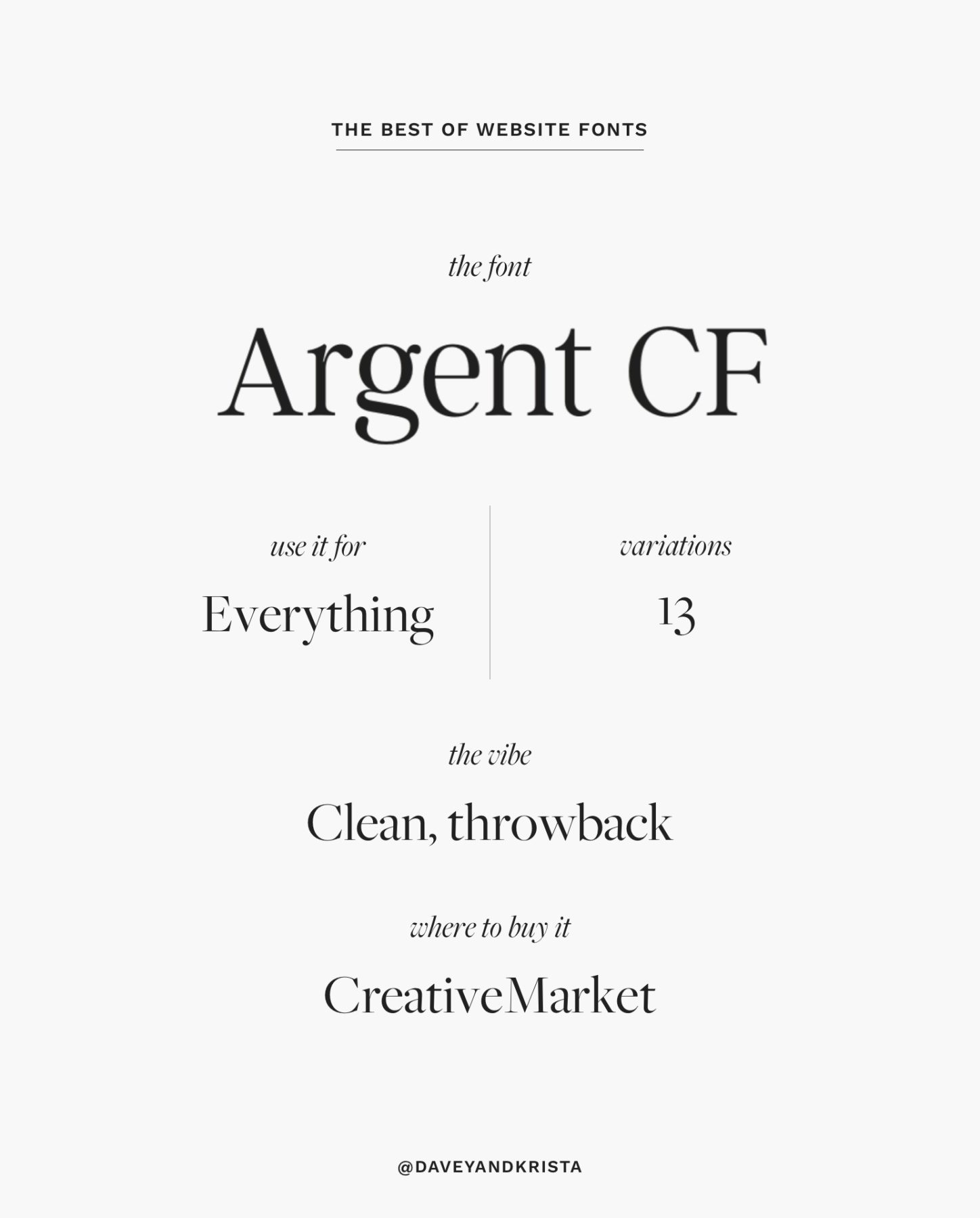
Argent
Can you tell we have a thing for serifs yet? Unlike some of the fonts we’ve shared above, Argent is versatile enough to work for both headlines and body. It comes in a variety of weights and styles and we think that if used sparingly, you could get away with using it for body copy at a larger size. We probably wouldn’t go this route, but you could if you fall in love with Argent.
Try it with Magens Bay, Palm Springs or St Jean.
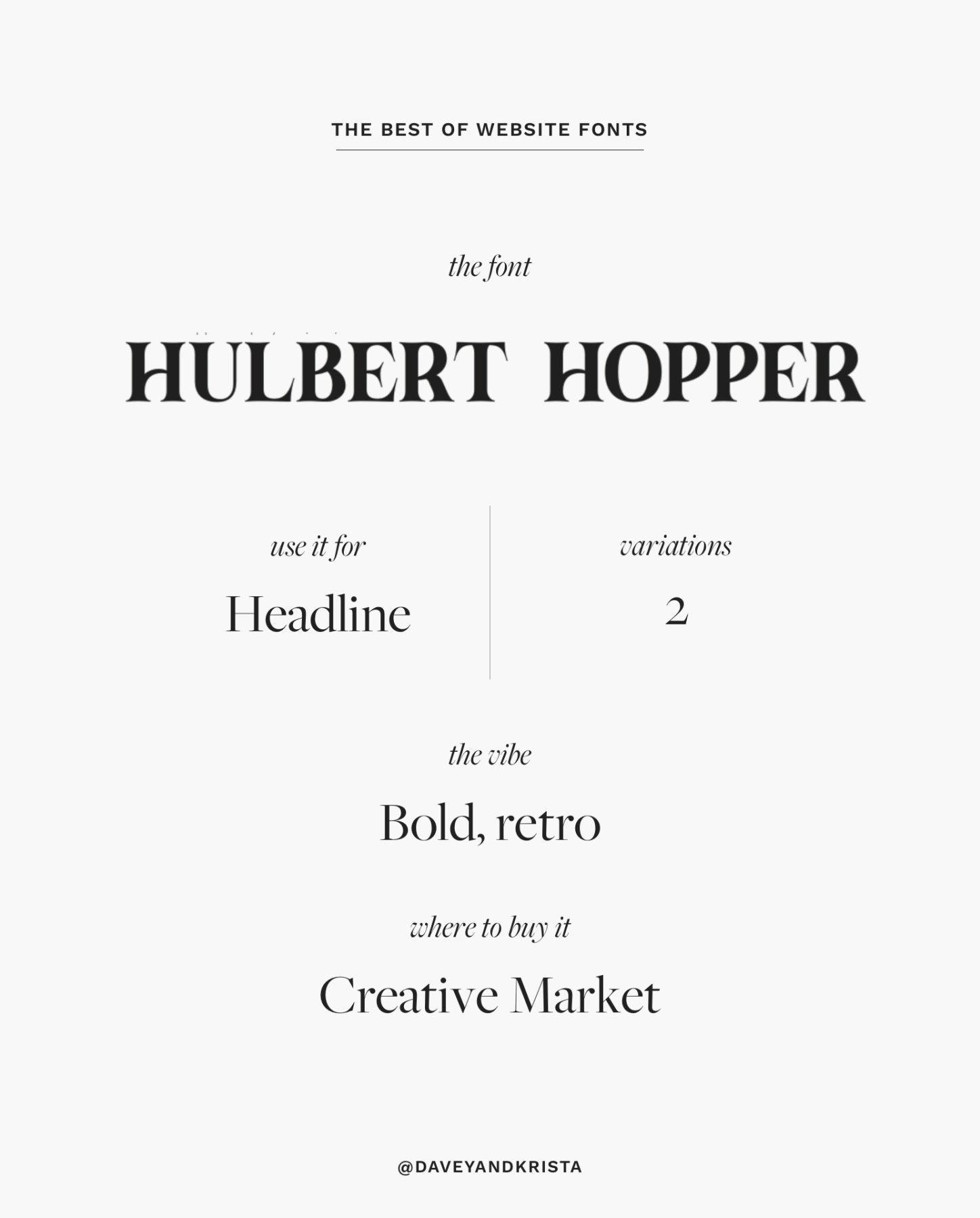
Hulbert Hopper
This chunky display font isn’t for everyone, but we like it’s vibe and we thought we’d throw it into the mix. Throwback fonts are having a moment in 2024 and Hulbert Hopper is right there with them. It’s only available in all caps so save this font for headlines.
Try it with our Cape Town, Palm Springs or Magens Bay designs.
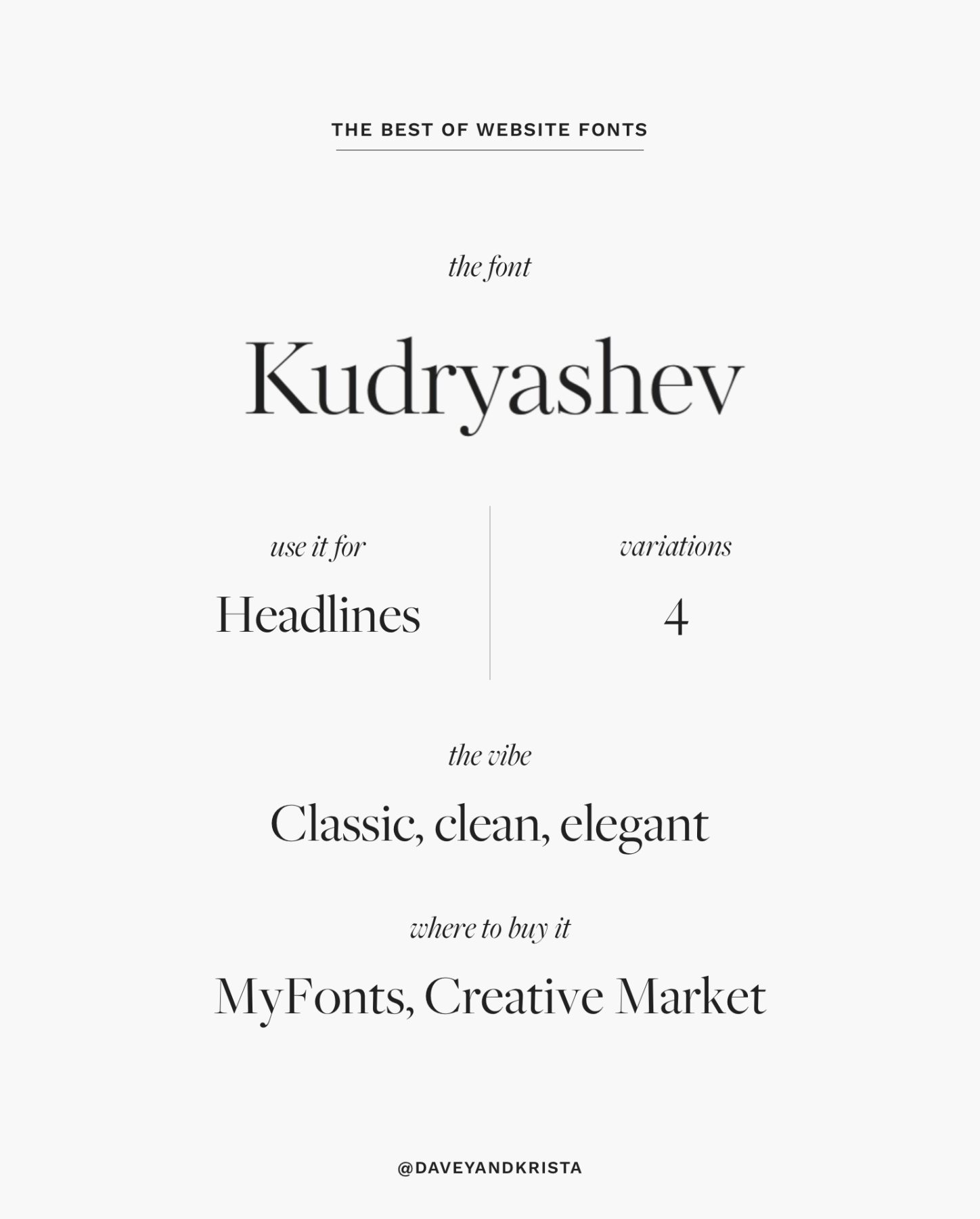
Kudryashev
We’ve had a font crush on Kudryashev for a while and used in a few projects, but we think it’s just as cool in 2024
as it was a few years ago when it initially came on the font-scene. This elegant font is light, high-end and full of contrast. It’s perfect for headlines and accent text.
Use it with Positano, Elba Island or Amelia Island.
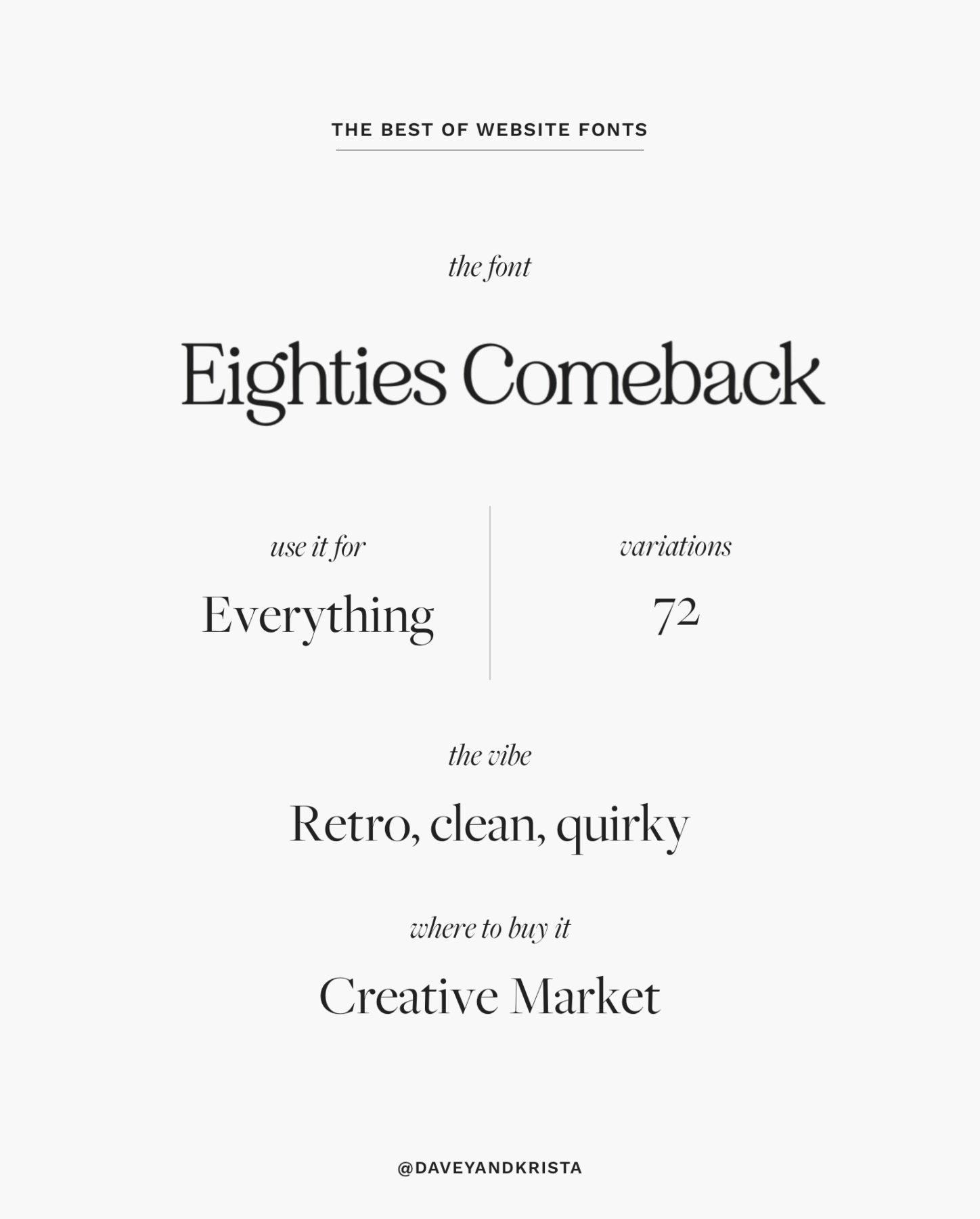
Eighties Comeback
90s trends might be coming back hard (right, Taylor?), but we’ll always have a thing for the 80s. Maybe it’s because most of our team was born in the 80s. Eighties Comeback is available in a whopping 72 fonts. That means it’s diverse enough for everything from body copy to accent text to headlines (although it wouldn’t be our first choice for body copy).
Try it with our Cape Town, Palm Springs or Amelia Island designs.
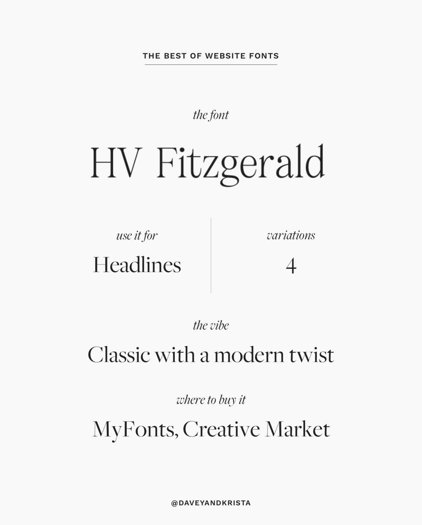
HV Fitzgerald
This classic font with a modern twist is available in two weights (bold + regular) with italic versions of each. Whenever we search for fonts, we always try to find versions that include at least an italic version (we think italics are important on a site!) The font creator says it’s great for both headlines + body copy, but we think it’s a little too delicate to hold up well at a smaller size (such as body copy).
Try it with our Elba Island, Amelia Island or Positano designs.
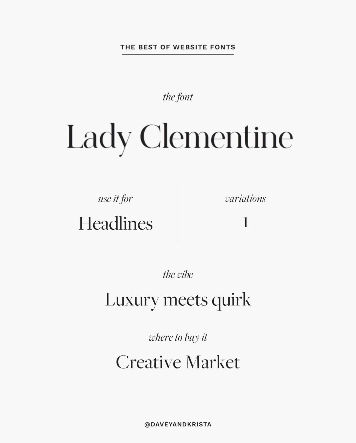
Lady Clementine
Lady Clementine has quite a bit of personality, but we like that she feels like an updated (less common) take on Didot. Use her for headlines and skip the overdone calligraphy font she comes with. Some of the characters include a unique little serif that adds a bit of quirk to this luxurious font.
Pairs well with: Barcelona, Marco Island or Cape Town.
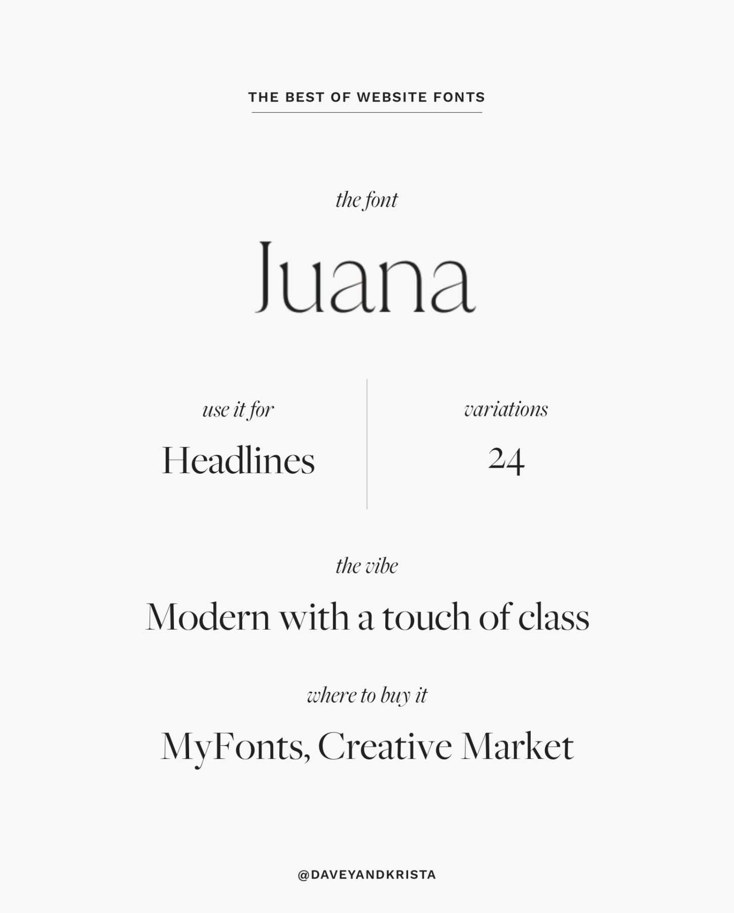
Juana
Juana is a fun font that comes in a variety of styles (24 to be exact). We’re digging both the ultralight and the bolder versions (depending on the look of your brand). While they say you can use it for body copy, we think it’s a little hard to read in their examples. We’d recommend opting for a clean body copy like Work Sans.
Try it with Elba Island (light version) or Barcelona (heavier weight).
And that’s it! Have other fonts you’re loving on your website this year? Leave a comment below. We love learning about new fonts to try in our designs!


