It’s crucial to choose the right fonts for your website. Here’s what we think are the 16 best free Google fonts of 2024…
One of the most important elements of website design is choosing the right fonts.
While it might seem inconsequential, the right fonts can elevate the overall aesthetic of a website and user experience of a website. Here are just a few of the reasons choosing the right fonts is a crucial task:
Fonts can impact website readability. Choose a font that is easy to read and be sure to use appropriate types of font throughout your website. Using a script for blocks of text makes it difficult for readers to consume the content on your website.
Fonts can elevate a website and brand’s aesthetics. The right font choices can take your website to the next level. Just take a look at companies like Chanel and Dior. Such simple font choices—yet, they appeal to a luxury level market.
Fonts can help increase website conversion. Making wise font choices in key areas of your website can highlight important information, draw attention to the call-to-action, and ultimately make it easier for someone to consume your content.
But choosing fonts can be an overwhelming task. There are thousands of fonts available across the web, many cost money, and there are licensing considerations. You don’t want to pay hundreds of dollars to use a font only to find out that your license to use it is very limiting!
That’s one of the reasons we always come back to Google fonts.
Related: 18 Trending Fonts for Websites in 2024
Why use Google fonts?
Google fonts are:
- Free. Google fonts are free to use.
- Readily available in popular apps like Showit, Elementor, and Canva (three of our favorite!). This makes them that much easier to use when working in your favorite apps.
- Easy-to-download and use. See the above point.
- Will increase website speed page load times (when compared to many other font options).
- Available for commercial use.
- Easy to modify.
- High quality.
- Part of a library with plenty of options. There are hundreds of Google fonts from which to choose no matter your style, brand, or need.
Google fonts are the solution to many website font problems. We’ve recently made the decision to use predominantly Google fonts in our Showit and WordPress website templates because they’re just so darn easy to use—and there’s a font for every aesthetic out there!
What should I look for in a Google font?
When choosing a Google font for your website, it’s key to understand the purpose of that font: For which part of your website design are you choosing a font? Is it for an accent? Are you choosing something that will make up most of the text on your website? Does it elevate or diminish your brand?
It’s important to keep in mind the things we discussed at the outset of the article: readability, conversion, and brand.
If you worked with a brand designer, they likely put together a list of fonts for your brand. If no Google fonts are on that list, they’ll likely know a Google font or two that can be used as an alternative.
If you did not work with a brand designer check out one of the fonts below. Our design team chose a few of their favorites + listed out some great complimentary fonts. You might consider replacing your current site fonts with one of these sets.
How should I use Google fonts on my website?
We’ve written more extensively about how to use fonts on your websites in other articles. However, we recommend that people generally follow these guidelines when choosing and using Google fonts on their website:
Don’t use more than 3 different types of fonts on your website. Using too many fonts creates a disjointed look, diminishes your brand, and ultimately can leave a visitor disoriented.
Use script fonts sparingly. Script fonts can provide an elevated look to a design, but keep in mind that they are harder to read. Feel free to use them as accents, but try not to put too much important text in scripts.
Follow other font best practices to get the most out of your font choices. It doesn’t matter what font you choose if it’s so small on your website that people strain to read it. Be sure that in addition to intentionally choosing the best Google font for your website, you also pay attention to font size and color so that the font on your website is readable.
The 16 Best Free Google Fonts for your Website in 2024
Here are a few of our favorite Google fonts that we’re loving for website designs in 2024:
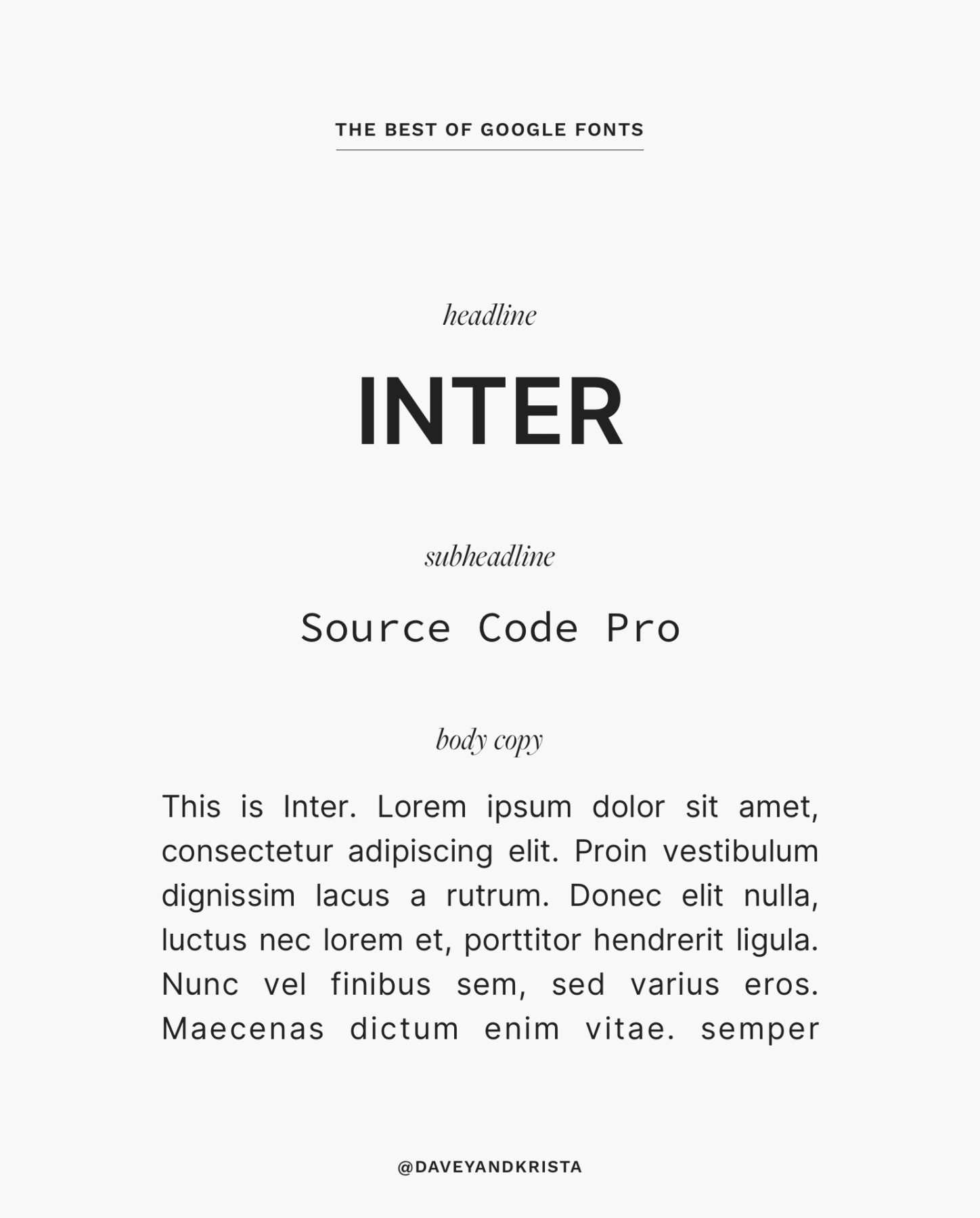
Inter
Inter is a modern font that is perfect for a bold, minimalist aesthetic. This is your perfect font if you’re looking for a chic, Parisian feel, and it would look wonderful in our Marseille design.
Pair it with a clean sans serif for the body copy and subheadlines – such as Source Code Pro.
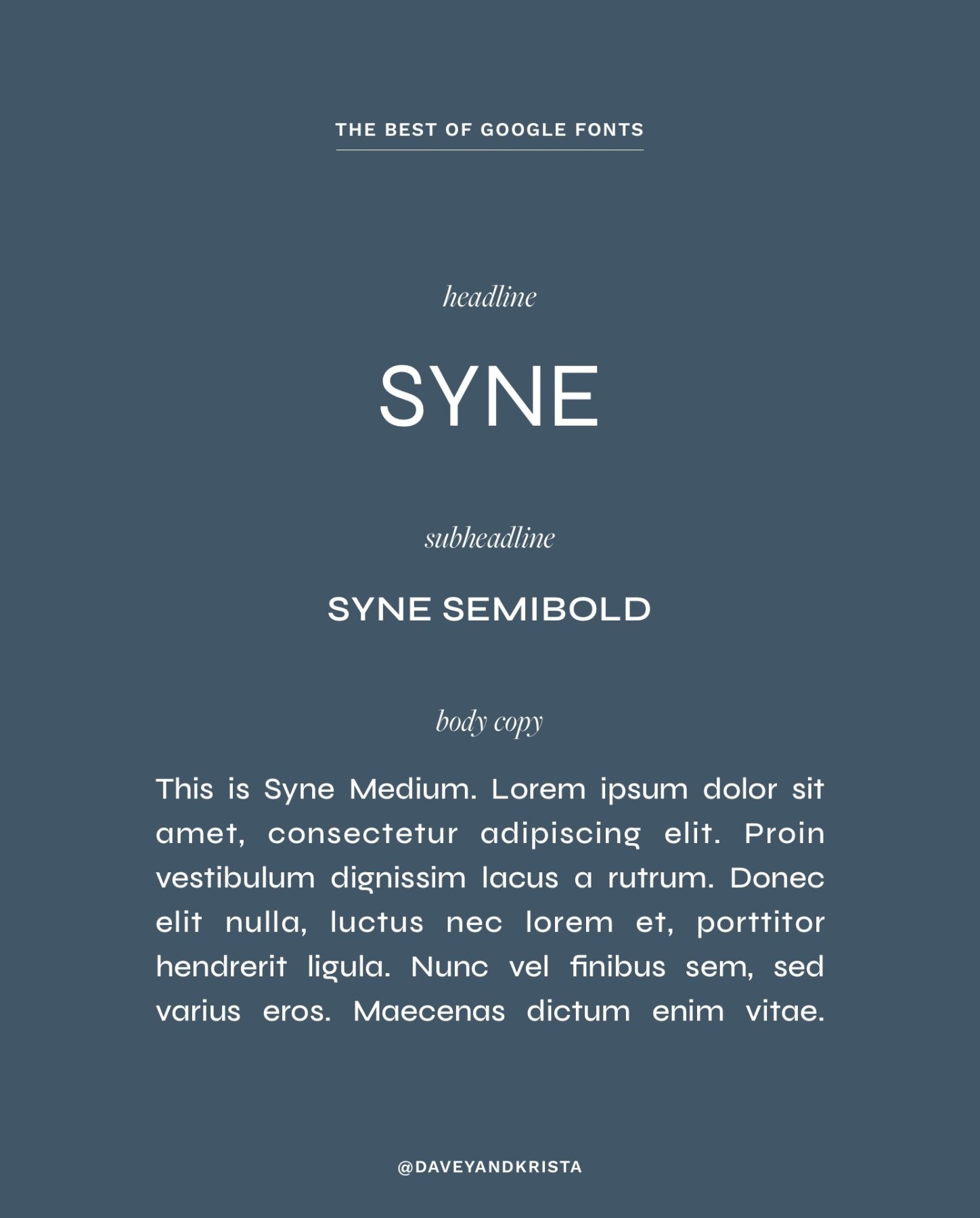
Syne
Syne is a delicate font with streamlined, modern lines. We love how simple this font is—easy to read but eye-catching. Add this font collection to our Barcelona design, and you’ll be boasting “Hello, New York City champagne” vibes.
Did you see this font in semi-bold and medium? There’s no need to look for your subheadline and body copy; they just arrived on your doorstep.
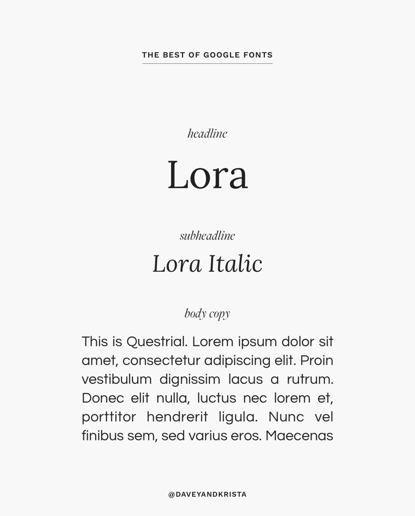
Lora
Lora boasts the perfect pairing of feminine and traditional. The serif elevates this font and gives it a playful feel, especially in the italic version. If you use Lora in our Positano design, let us know. It would look delightful!
Pair this font with the italicized version of Lora for a cohesive elegant feel.
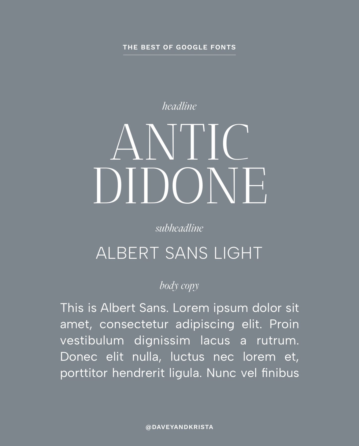
Antic Didone
Antic Didone is an elegant font that is great for headlines and subheadlines. First designed for newspaper and magazine headlines, the large x-height in the characters makes it easy to read – especially on the web. Its thin weight and ornate serifs make it feel elegant in a modern way. However those thin lines also make it too light to use for body copy or small text. It would look great used as a logo for a beauty brand, fashion blog or contemporary photography site (think: dark and moody vs. light and airy). I could see it looking great in our Elba Island or Cannon Beach designs.
Pair it with a clean sans serif like Albert Sans.
Download the font »
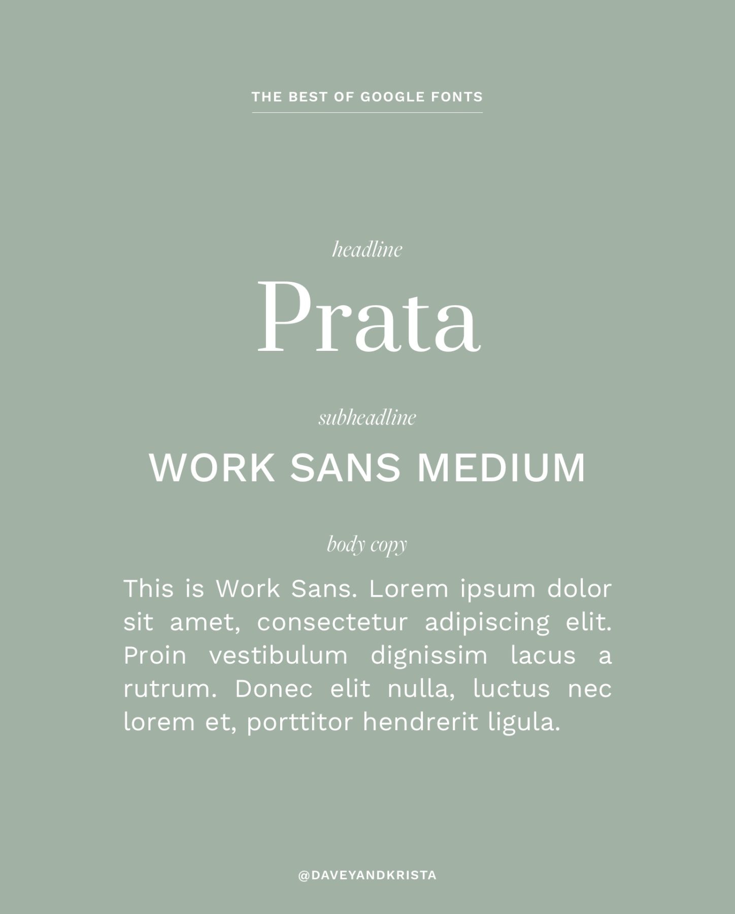
Prata
If you’re looking for a good alternate to something like Playfair Display, check out Prata. It has a similar feel but it’s not quite as common. Prata has a lot of variation between the parts of the letters so be careful not to use it at smaller sizes. Prata works great for headlines but it becomes challenging to read when used for body copy. Prata would look great in our La Pelosa or East Hampton designs.
Pair it with a clean sans serif for the body copy and subheadlines – such as Work Sans.
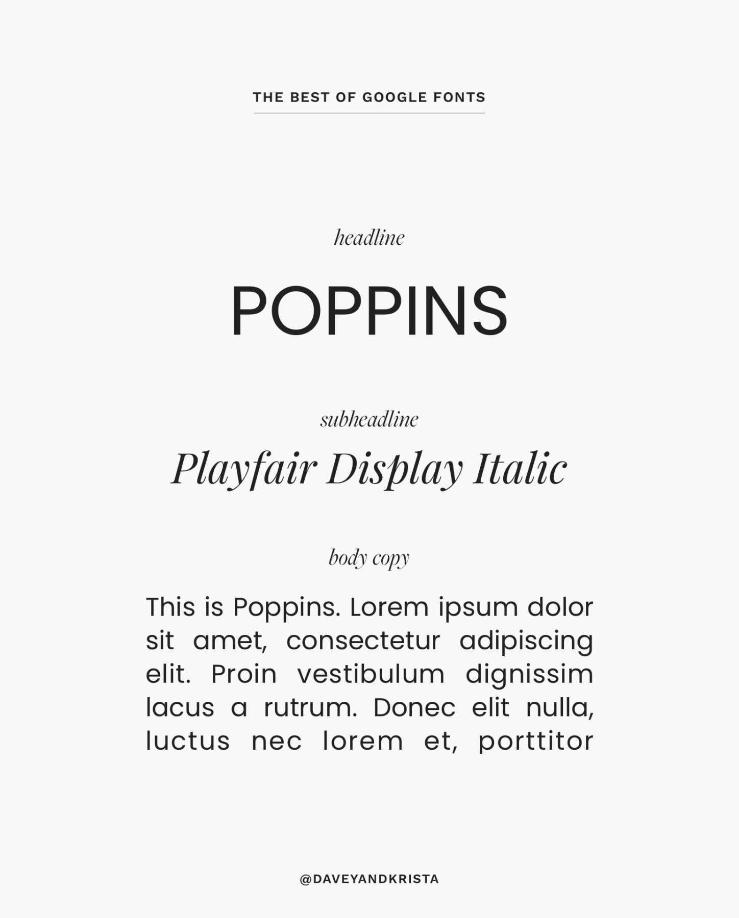
Poppins
Sans serif fonts are having a moment in 2024. If you’re looking for a clean font that is easy to read, Poppins is a great choice. It comes in a variety of weights and variations (bold, italic). It works great for both headlines and body copy. It would look great in our Cape Town or Marco Island designs.
Pair it with an accent font such as Playfair Display Italic.
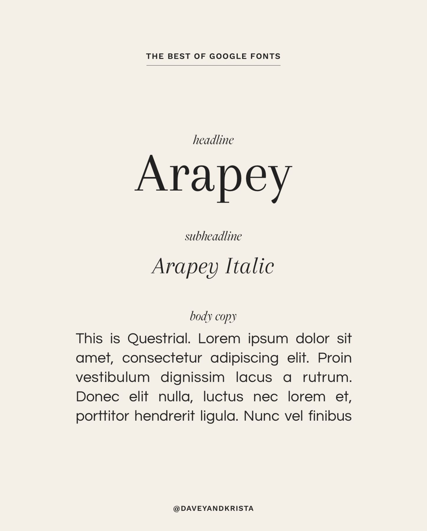
Arapey
Arapey is a modern font that is similar to Bodoni. The thin lines help elevate the font and give it a distinguished look. It also has an italic version. Due to the thinner weight, I’d limit this font to headline use. Arapey would look great in our Elba Island or Magens Bay designs.
Pair Arapey with a clean sans serif like Questrial or Raleway.
Download Font »
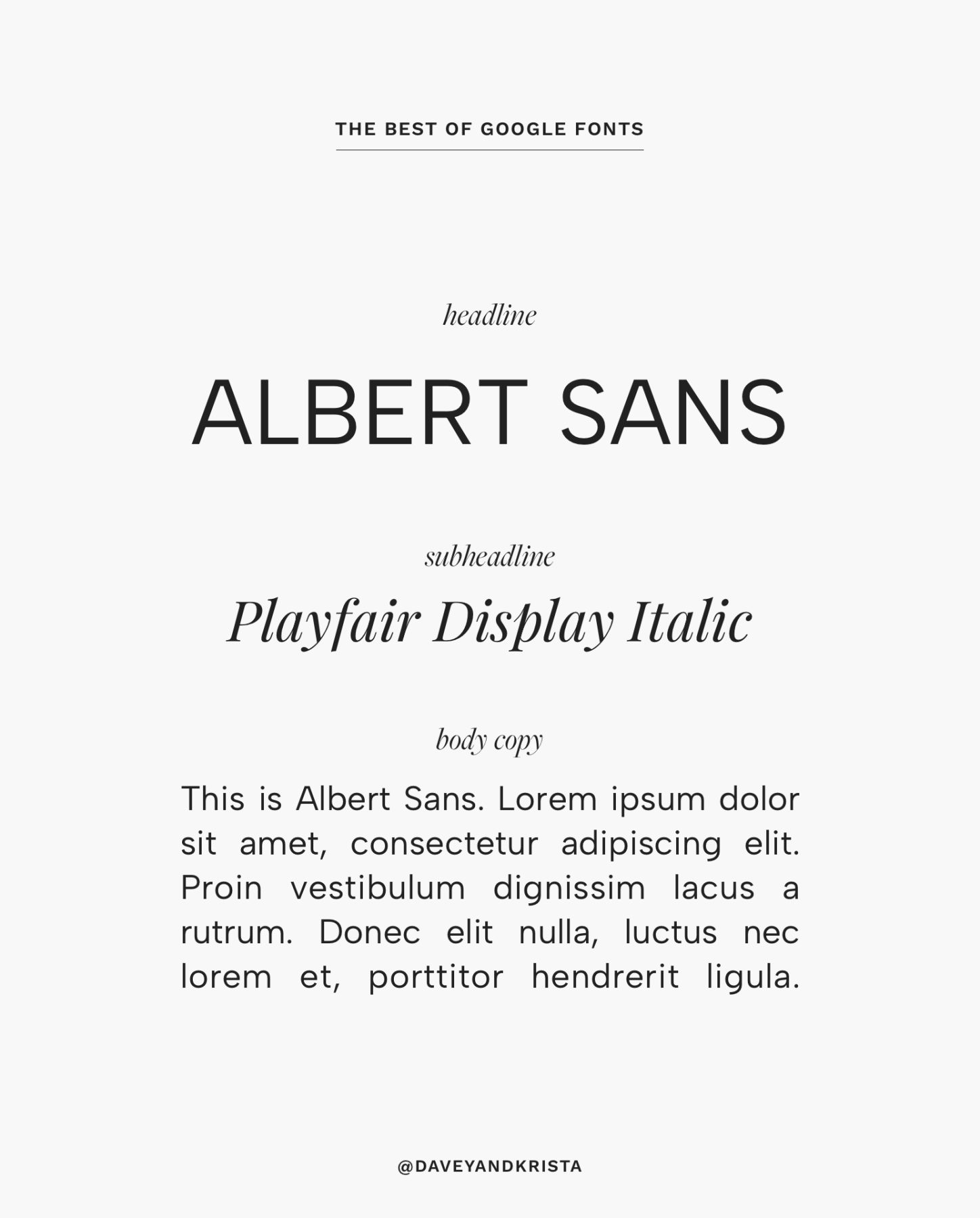
Albert Sans
Another sans serif font we’re loving is Albert Sans. This modern, geometric font is inspired by the type-characteristics of early 20th Scandinavian architects and designers. If you’re looking for something clean and easy to read, Albert Sans might be perfect for your next project! The font includes a variety of weights and styles. It also supports more than 200 languages. Albert would look great in our Positano or Cape Town designs.
Pair Albert Sans with the italic version of Playfair Display.
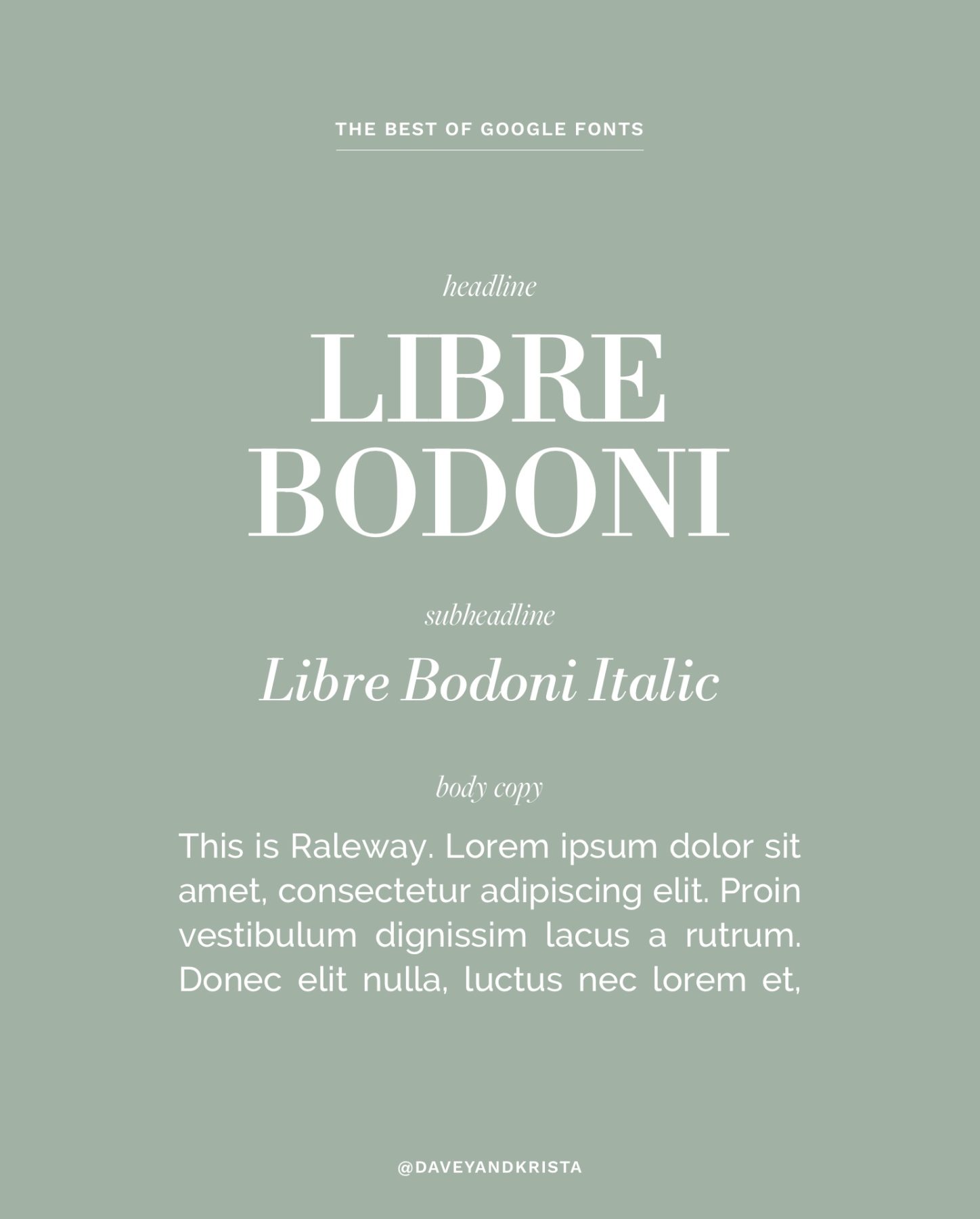
Libre Bodoni
Bodoni has long been a popular font – but in order to use it on the web, you typically need special licensing. That’s one of the reasons why we love this version on Google Fonts. It’s adapted for the web today and it’s editorial style makes it perfect for anything related to luxury, fashion or style. While I would limit use to headlines, it is available in several different styles and weights. It would look great used in the regular style for main headlines, italic for subheadlines and bold for accents. Try Libre Bodoni with our Whitehaven or Iona designs.
Offset this playful font with a clean sans serif like Raleway.
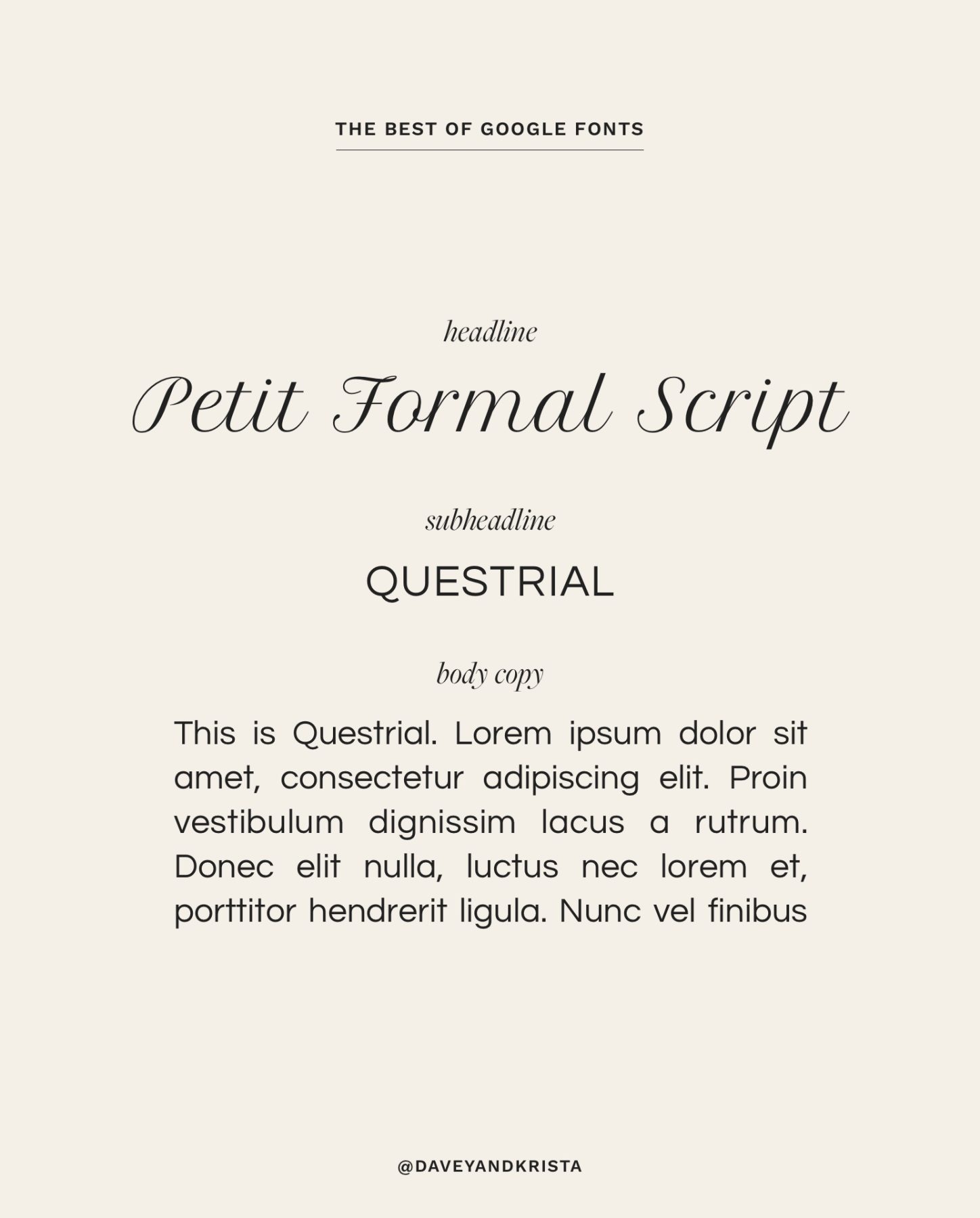
Petit Formal Script
Google Fonts is still a bit limited when it comes to scripts, but I figured I’d throw one into this mix. Our team is particularly fond of Petit Formal Script (we used it in Elba Island!). This elegant font was created with the web in mind – which means that unlike other scripts, it’s still readable at small sizes. We recommend only using this script for headlines and accents – and to do so sparingly. It’s very easy to overdo it when it comes to script fonts. Petit Formal is loaded in our Elba Island design but we also think it would be lovely used in Positano.
Try Petit Formal Script with a clean sans serif like Questrial.
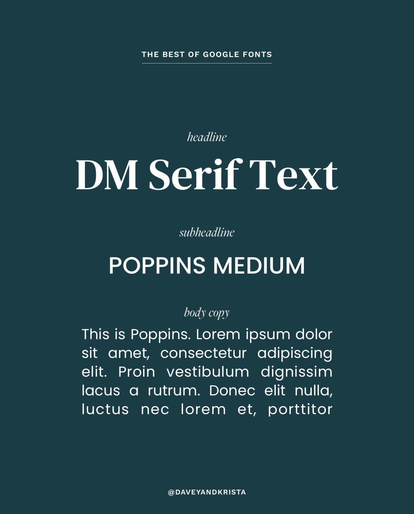
DM Serif Text
If you’re looking for a font that feels contemporary and fun, try DM Serif Text. With it’s drastic thick to thin strokes, DM Serif Text is great for headlines. Be wary of using it for smaller text or body copy. The thin serifs on the edges of the characters could make it feel too busy and thus challenging to read.
Pair it with a clean sans serif like Poppins, Questrial or Raleway.
Download the font »
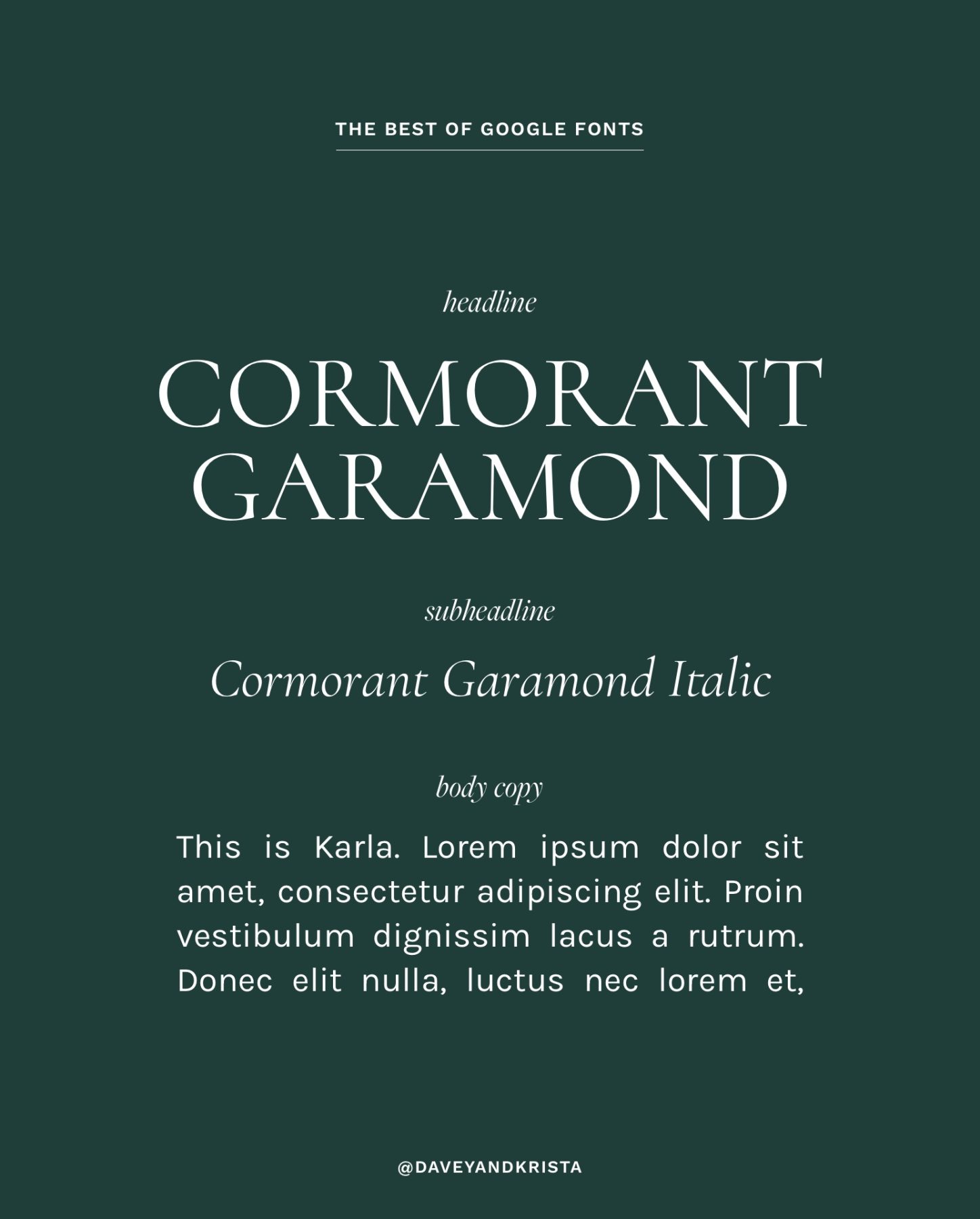
Cormorant Garamond
I almost didn’t include Cormorant Garamond in this list because it’s a very popular Google font (I’ve used it quite a bit in designs), but if this post is really a round up of the best Google fonts, Cormorant should be included. With it’s classic serifs, Cormorant is beautiful at just about any size. It comes in a variety of styles (italic, bold, etc) and it looks great on a website (Check out Positano for an example).
I love using Cormorant for body copy, but if you’re looking for something slightly easier to read, check out Karla.
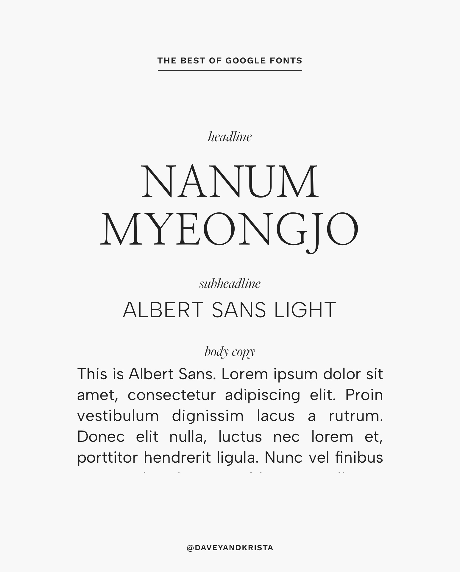
Nanum Myeongjo
Nanum Myeongjo is another classic font with a similar feel to Cormorant Garamond. It’s a thinner font that looks beautiful as a headline or body copy. It doesn’t include an italic version, but it does include a bold version. It looks beautiful on screens and since it was originally created for Korean, it’s available for a variety of languages. Nanum Myeongjo would look beautiful in our Positano, East Hampton, Elba Island or La Pelosa designs.
Pair it with a clean font like Albert Sans for a classic but modern look.
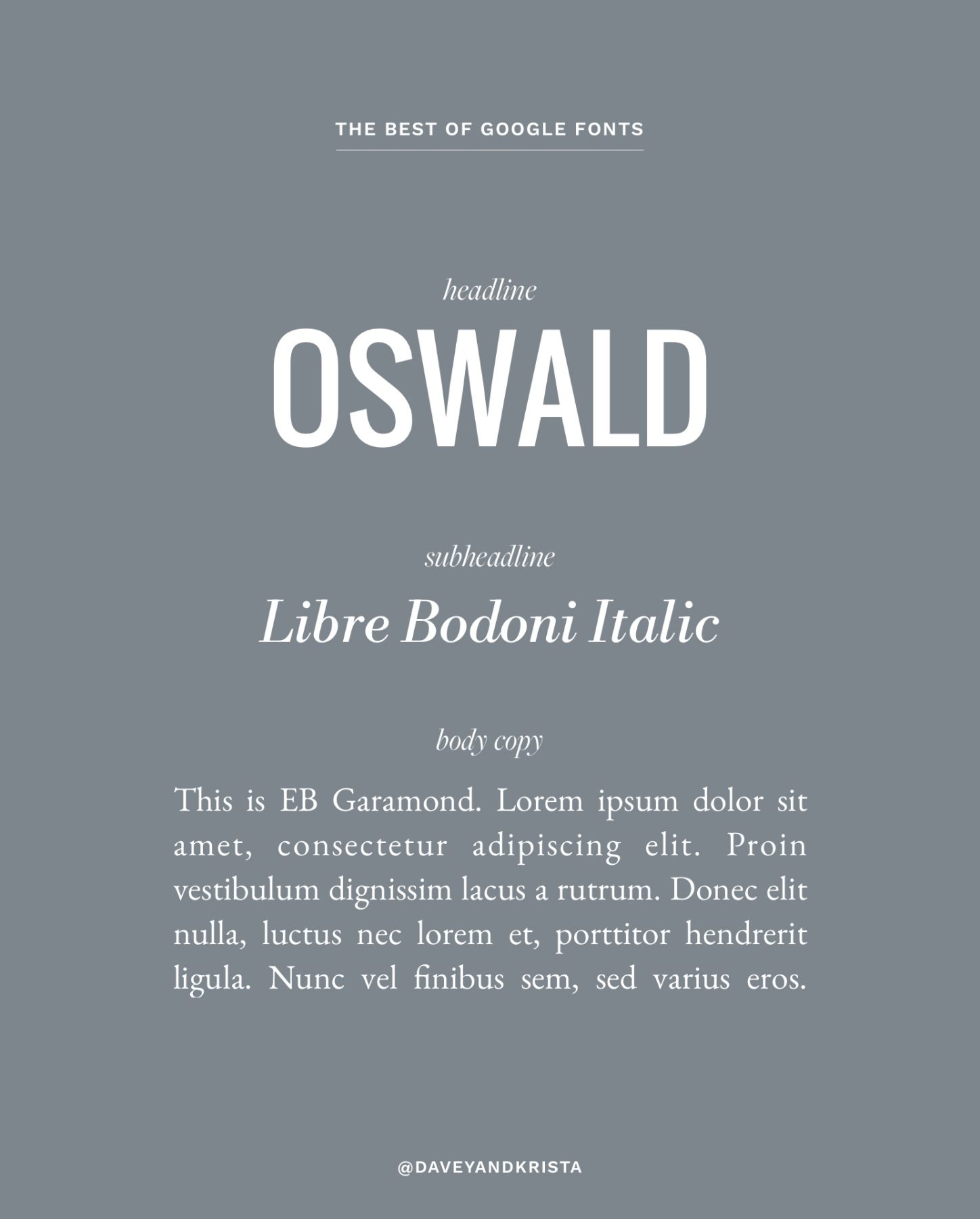
Oswald
Most of the fonts I’ve included in this post are either sans serifs or serifs – and could be used for either headlines or body copy. Oswald is a bit different. It’s thick, condensed style means it will only work for headlines and short areas of text (no more than a few words). The tall letters make it challenging to read in large blocks so if you’re going to use a font like Oswald (or a similar one), do so sparingly.
Pair Oswald with a font that is easy to read – like EB Garamond.
Download the font »
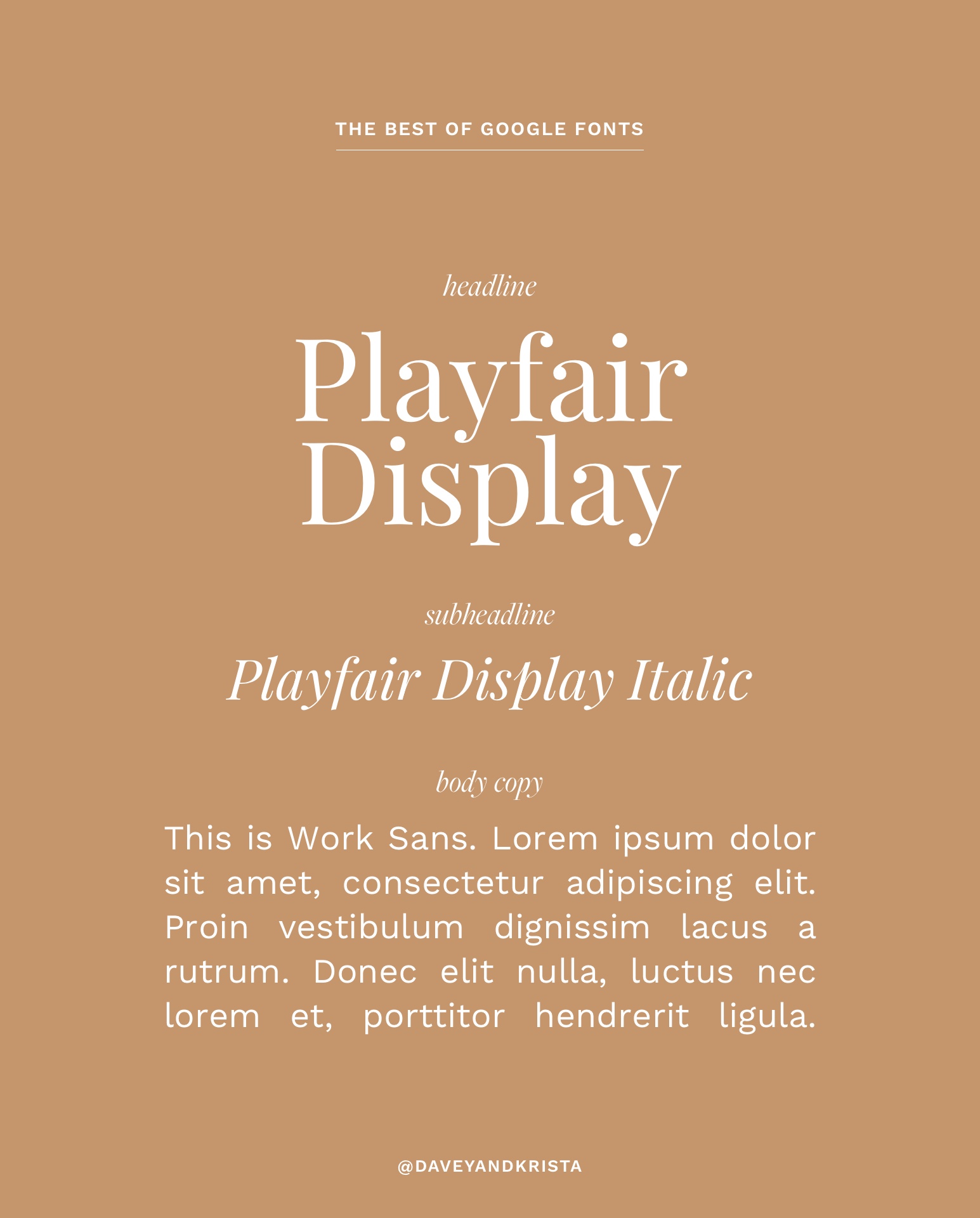
Playfair Display
Playfair Display is a popular font – but for a good reason. It’s bold yet classic and it looks great when used for headlines. I love using both the normal version as well as the italic version. It would be challenging to read in large blocks unless the font is pretty large, so I’d avoid using it for body copy, but it does hold up well at smaller sizes when used sparingly. We used it in our Cape Town design.
Pair it with something clean like Work Sans, Montserrat or Questrial.
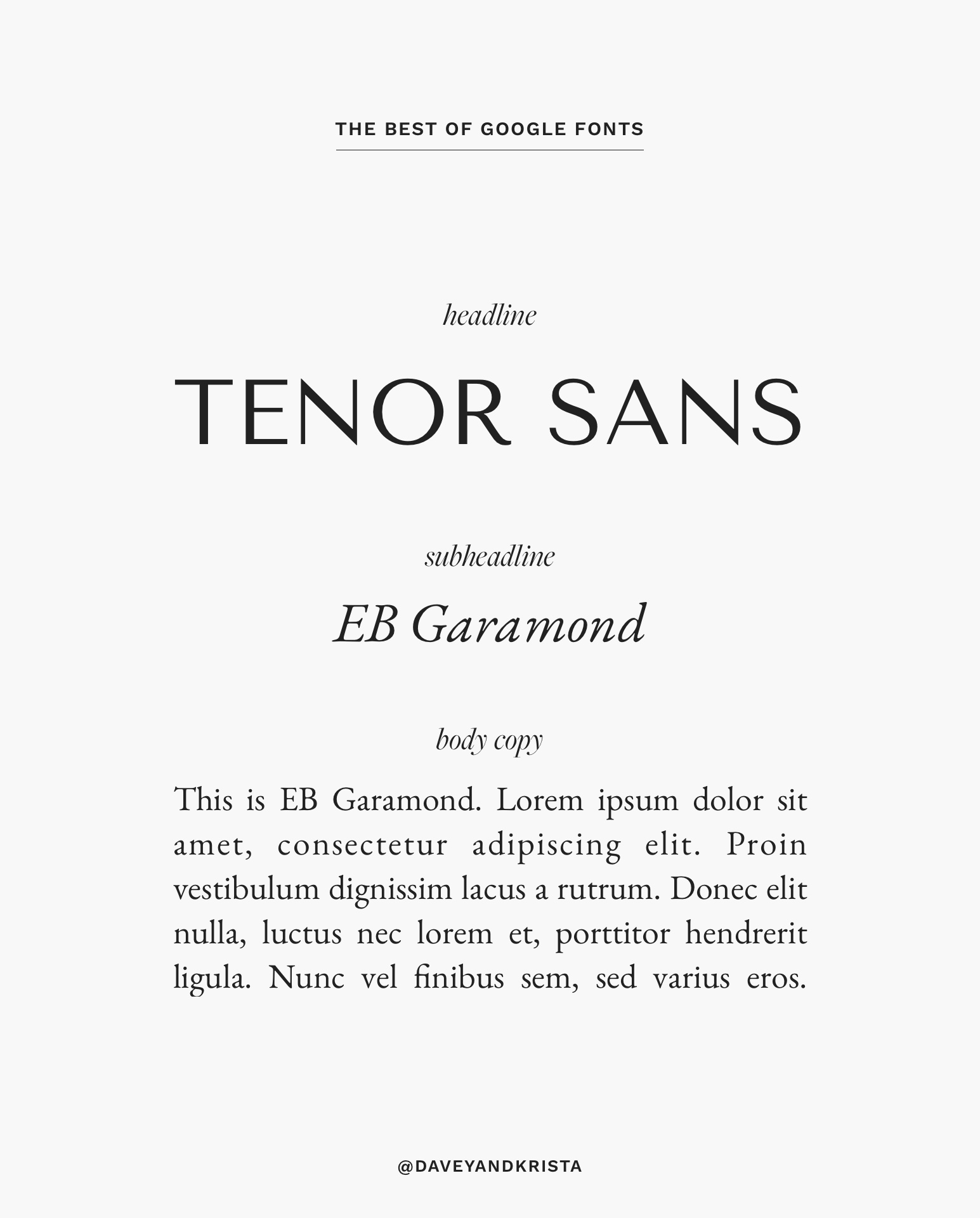
Tenor Sans
Like Oswald, Tenor Sans falls into the category of “display font”. It has the ability to add a lot of personality to a site, but the unique design means that it’s best used for headlines. Skip using Tenor Sans for body copy and instead opt for something that is easier to read in large blocks (such as EB Garamond).
Those are what we believe to be the best free Google fonts for websites in 2024. Want to nominate another for the list? Let us know in the comments and we’ll review it. We’re always on the lookout for new fonts.


VIEW THE COMMENTS
Add A Comment