


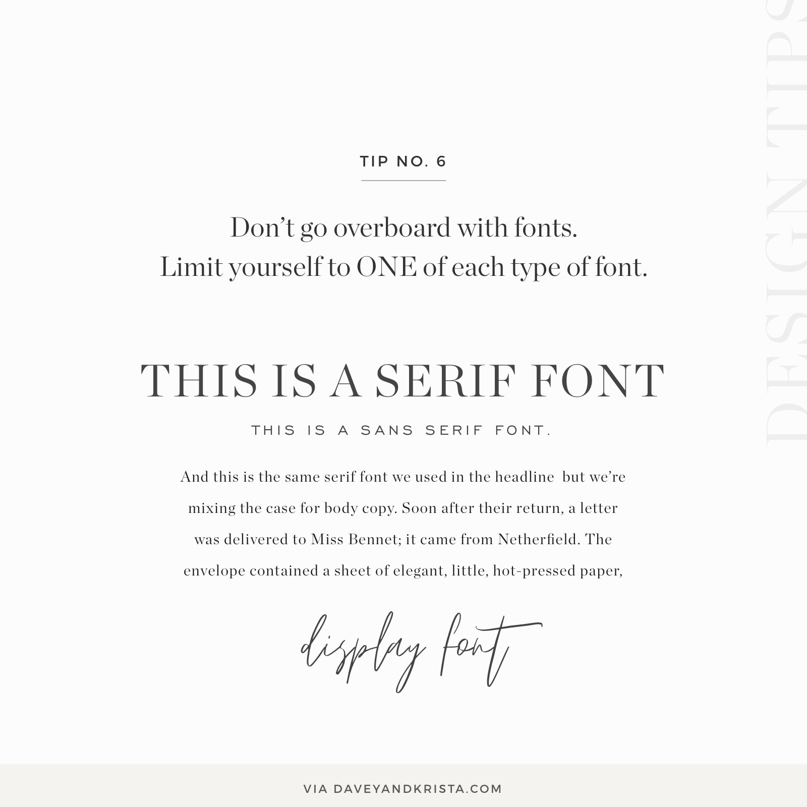
Nothing adds clutter to a website like overdoing it on fonts. I’ve signed in to work on Showit websites before where my client had 20+ fonts in use on their website. What most people don’t realize is that each font adds another unique “feel” to the site. As a general rule of thumb, we recommend choosing one of each type of font.
So that means, pick one serif, one sans serif and one display font (scripts or more unique fonts).
If you’re not sure what those types are, serif fonts are the ones with the little “feet” on the ends of each letter (Times New Roman, EB Garamond, Georgia, etc). Meanwhile, sans serifs are cleaner and lack those “feet” (Arial, Helvetica, Proxima Nova). Display fonts could be scripts or fonts that are so unique they don’t fall within the typical serif or sans serif groupings. Scripts, extended fonts (like Bebas) and handwriting fonts all fall within this category.
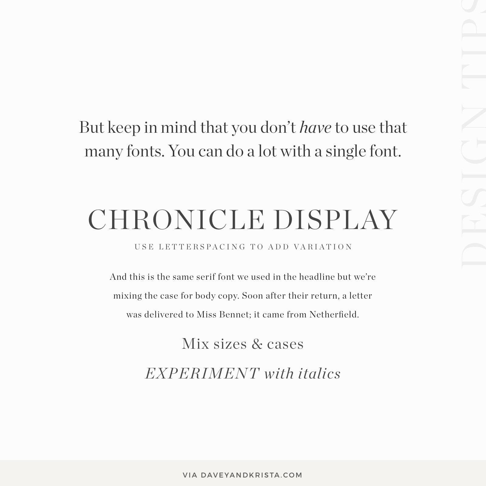
But keep in mind that you don’t have to use that many fonts. As you can see in the image below you can do a lot with a single font by varying cases, letterspacing, line height and italics.
For more design tips, visit this category of the site »

Krista is the co-founder of Davey & Krista, a creative studio known for high-converting Showit website templates crafted for photographers, creatives, and entrepreneurs. With over 15 years of branding and marketing experience, she helps business owners launch stunning websites without the tech overwhelm. Krista also teaches designers how to turn their creative skills into a thriving business—through templates, courses, and behind-the-scenes strategy. When she’s not designing, you’ll find her chasing sunshine, color palettes, and gluten-free pizza.
Explore website templates and free resources at daveyandkrista.com.


VIEW THE COMMENTS
Add A Comment