One of the most common questions people ask us about our design work is which fonts we’re using. With thousands of options to choose from, finding fonts that work well together and communicate the look and feel of your brand is tough!
So we’re going to start sharing a few of our favorite font pairings and point you in the direction of the sources.
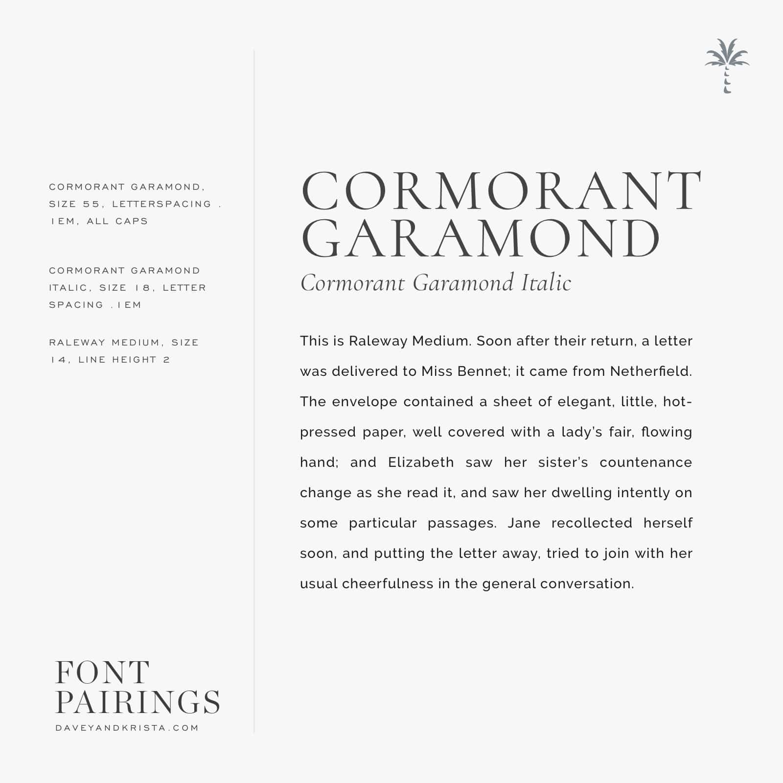
Today we’re sharing one of our favorite combinations, Cormorant Garamond and Raleway. Both fonts are free through Google fonts to both download and use on your website. If you’re using Showit or WordPress + Elementor, both of these fonts are built into their libraries so no downloading and font converting required!
In this combination, Cormorant Garamond keeps the headlines elegant and upscale while Raleway keeps the body copy easy to read and a little more casual. We love using Cormorant for larger headlines because the sharper “feet” in the letters look great scaled up. Not all fonts are well drawn enough to look great at larger sizes, but personally we think Cormorant is!
If you like this look but want it to feel even more elegant, try setting your body copy at Cormorant Garamond size 16!

VIEW THE COMMENTS
Add A Comment