How do you like our fresh look?
While it’s normal for us to give our website a bit of an update each year, this update was massive and has been months in the making.
To say we’re excited to start closing out this project would be an understatement. Krista and Alex, one of our designers, are especially excited to have this thing launched as it’s been an almost daily project for them since late last year.
I’ve always felt that there are so many updates that happen ‘behind-the-scenes’ during a website redesign. Things that most people might never see or understand unless they were told. This post is meant to provide some insight into those things. While I wish it was comprehensive, it doesn’t quite cover everything that I’d like to share (even at over 2,000 words).
We started with our own branding questionnaire.
We started this process by taking another look at our brand using our branding questionnaire. This is something we do almost every year, but this year’s answers led us to make bigger changes.
You can actually download five of our favorite questions from our branding questionnaire if you’re interested in completing it.
Here’s a summary from Krista on why she felt we needed to give our brand a refresh:
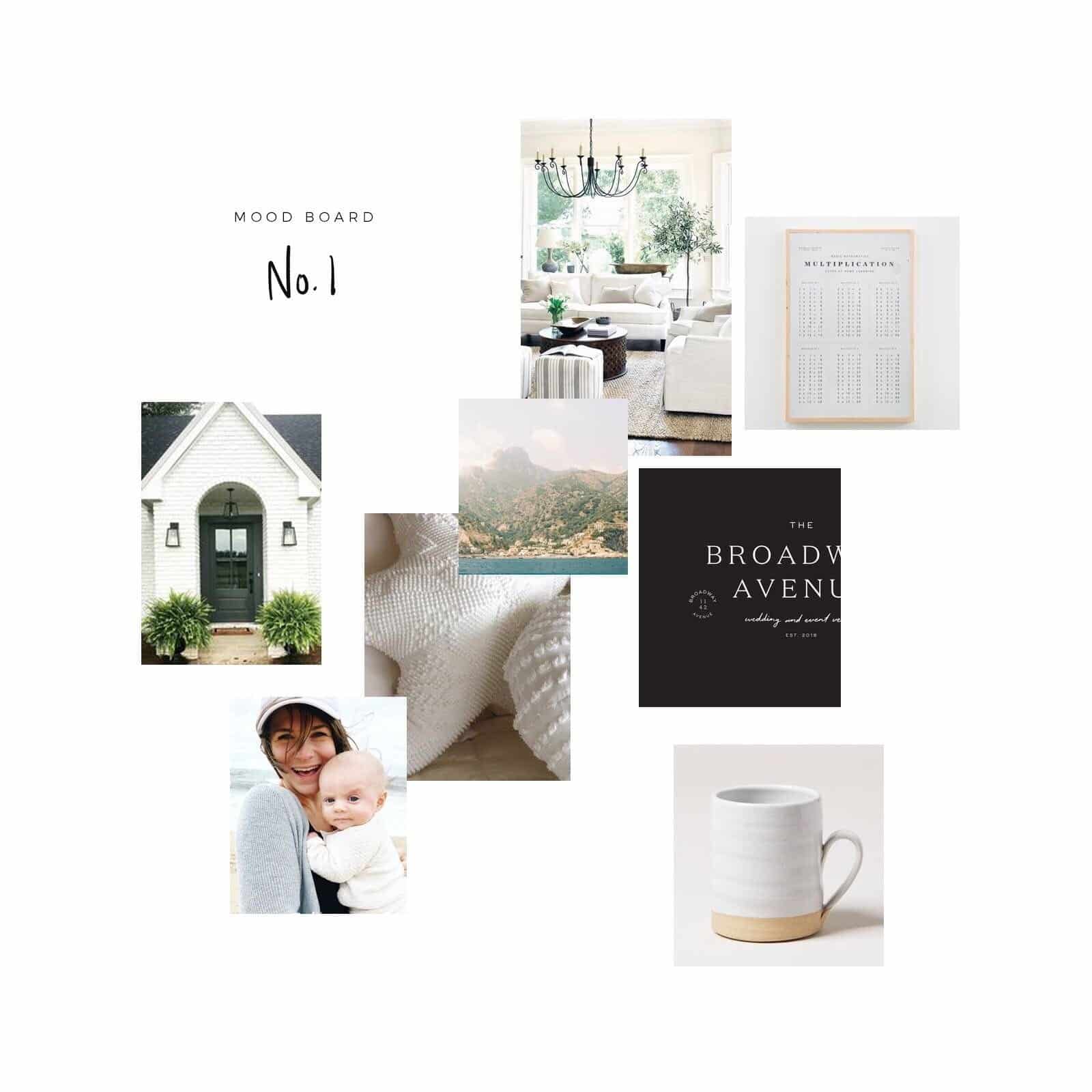
When we started working on this update to our brand and website, I had originally planned to change a lot less. I was happy with our general colors, typography and of our course, our palm tree.
We actually had a lot of the website designed and built and we were working on loading content when I realized I just didn’t love our fonts and colors any longer. When creating graphics for social media, I found myself sticking to just a few colors in our color palette and I had been experimenting with different fonts. Every time I looked at our Instagram feed – which contained our bright brand colors, I just didn’t love it. It didn’t feel like a feed that I would be personally drawn to.
Our old color palette had a lot of colors in it because originally we felt that we need them for buttons and accents on our site, but in reality, I didn’t like all those colors. If you look at our home or our wardrobes, you’ll notice we’re drawn to neutrals, dusty blues and a few greens.
As I started to realize that I wasn’t inspired by my own brand, I realized that it’s possible our target client isn’t inspired either. So we set about the task of removing colors, changing fonts and “growing up” our brand.
Our new brand feels more elegant and a lot more us and it’s something that I’m proud to share in our Instagram feed!
I’m going to have her on the podcast soon to discuss some tips for tackling a rebrand. Be on the lookout for that.
Why did you redesign your website?
Davey & Krista has evolved a lot over the past 18 months.
Our revenue used to be driven primarily by the services we offered to clients on a 1:1 basis. Now almost half of our revenue is made up of sales from The Palm Shop, where we sell Showit and WordPress website designs along with other resources that help creatives run their businesses.
When we first launched The Palm Shop, we were using a cart solution that only allowed customers to purchase one product at a time because we only sold full Showit website templates (no add-ons like our pricing, album, wedding, or engagement pages). Since no one needed to purchase more than one full website, that wasn’t an issue.
We’ve since added a number of resources that can be bought in addition to our full website designs. Increasingly people would reach out asking how to add more than one item to the cart at a time. We not only wanted to provide a more seamless checkout for our clients, but we became worried that we were losing sales since people couldn’t add more than one product to their cart.
Not only are there changes in The Palm Shop, but our services have changed, too.
While we used to provide digital marketing services such as SEO in addition to branding and website design, we’re now focusing mostly on branding and website design. We still offer SEO services for our branding and design clients, and we will continue to offer and support our SEO course.
The decision to eliminate SEO and digital marketing as standalone services was a difficult one to make. Ultimately a few things led to this decision:
First , I started a digital marketing agency, Till Agency, with two friends of mine. This business will solely focus on digital marketing channels such as Facebook Ads, and will provide me my marketing fix. You all should check it out (right now we are only offering Facebook Ads services, but will be expanding in late 2019).
There’s also so much to SEO beyond ‘on-page optimization.’ Some of it, such as link-building, I just don’t want to do for people. Website design or structure can also be a big piece of the puzzle. Some people who came to us weren’t willing to address the design of their website, which would make me feel like I couldn’t really help them.
Making SEO a service that we only offer to people who use one of our templates or hire us for custom work solves a lot of those issues. It allows us to add some serious extra attention and value to our branding and web design clients, too.
And honestly it feels good to cut things out. It’s like that feeling you get after cleaning the clutter out of your house. We feel lighter and have more mental energy to devote to services like branding and website design, or extra time to continue building out resources in The Palm Shop.
It’s kind of like pruning a plant: We’re cutting away aspects of our business to make room for growth.
A New Focus on E-Commerce
I spent quite a bit of time looking at the pages people were visiting on our website and which of those pages led to conversions.
Unsurprisingly many of our most popular pages were shop pages. While our old shop did the job, there was definite room for optimization.
One of the most obvious issues was the amount of clicks required to get from any page on our website to a product page. It required up to four clicks to get to a given product page on our old website, which is way too many for a focal point of our business.
Our new website eliminates that issue by removing the hamburger menu, reducing the amount of items in the top-level navigation, and making it easy to go directly to products or product categories using a mega-menu.
We chose WooCommerce as our e-commerce platform since there are a lot of available extensions for it and it’s part of the WordPress ecosystem. We briefly considered Shopify—which I think is another great e-commerce platform—but we decided on WooCommerce since we’re so comfortable with WordPress.
As I’ve already mentioned, WooCommerce gives us true e-commerce cart functionality where customers can add more than one item to their carts, which was one of the biggest improvements we wanted to make.
In addition to that we made all sorts of user experience enhancements such as the addition of breadcrumbs, including the ‘cart icon’ in the top right corner of the site, providing different filtering options, allowing users to visit the site demo from the shop collection page (instead of having to click into a product), and improvements to page loading times.
The switch to WooCommerce also provides more promotional options. You may have noticed fun tools like a spinning wheel that appears on our website that gives visitors an opportunity to try their luck for a discount. It dynamically integrates with WooCommerce so we don’t have to manage coupons manually.
What content management system (CMS) did you choose?
This iteration of our website took so long to develop due to the big change in our website structure and the decision to switch from Showit to WordPress (using Elementor).
We still love Showit. We’re Showit Design Partners, most of the websites we design for clients are Showit websites and we expect that to continue to be the case.
But we decided to switch platforms because…
- Our focus on e-commerce: Showit is not an e-commerce platform, and I’d imagine they’d be the first to admit that. While there are ways to create online shops on Showit (we’ve built a bunch), Showit wasn’t built to be a solution for e-commerce websites. If we were going to keep our shop on Showit, we would likely have to create a bunch of workarounds for things we natively get with our current set-up, and we’d need to be okay with the fact that the integration between Showit and our e-commerce solution might break and they don’t have any real responsibility to fix it.
- This doesn’t mean they wouldn’t—they just don’t have to (see this Showit help document) We don’t mind the technical aspects of managing a website.Heck we actually enjoy it We appreciate being able to test different server configurations, install our own caching and CDN solutions, and have control over every inch of our website. That probably isn’t true for most people, which is why solutions like Showit are so great.
Ultimately we decided that if we wanted to build a true e-commerce website, we should choose an e-commerce platform and a CMS that allows us to take advantage of it to its fullest extent.
Optimization and Testing
We’re the kind of people that like testing. This shift back to WordPress and hosting our own website gives us ample opportunity for testing whatever our hearts desire.
One of our focuses will be around website speed. I won’t go into too much detail because we’ll be sharing more about our speed optimization efforts in other posts. But we’ve already taken a few steps to hopefully improve the user experience in this area such implementing caching tools and a CDN (content delivery network), which has already reduced load time significantly.
We’ll also be able to do more in the way of A/B testing different pages to see what kind of offers resonate more with people.
One goal for this iteration of our website is that we continue to optimize it on an ongoing basis.
Are you ready for a website redesign?
We think it’s important to set time aside each year to revisit your website even if it’s just updating images, copy, portfolio pieces, and updating outdated posts.
But eventually you might find you’re in need of more than a refresh. Here are a few good questions to ask yourself when deciding on whether to redesign your website:
1. Is my website doing it’s job?
For many of us, the “job” is capturing inquiries or selling products. If you’re website is doing what it’s designed to do, you really need to take some time to consider whether you want to bite off a website design project. After all, there’s no need to fix something that’s not broken.
2. Does my website reflect the experience I provide my clients?
This is both a question of aesthetics ( how it looks and makes a visitor feel ) and function ( how it works ).
As Krista mentioned about our brand, she got to a point where she was no longer using certain brand elements because they no longer reflected us. That’s reason enough to revisit a brand. We often find that when people update their brands, they often want to revisit their website. That was the case for us.
And sometimes a website just needs to be redesigned because it was built with old technology and acts wonky. We often have people come to us who have less-than-stellar mobile versions of their website who know how important mobile usability is now.
In our case, we needed our website to better serve our online shop customers while reflecting our renewed focus on branding and website design.
If you are ready for brand or website design, we’d be happy to chat with you about whether we’re a good fit. Just reach out to us using the form on our contact page .
