


Table of Contents
Your homepage grabs attention. Your about page builds connection. But your service page? That’s where someone decides whether to take the next step—or bounce.
If your service page feels like an afterthought, you’re losing dream clients who were this close to booking.
A high-converting service page doesn’t just list what you offer. It walks someone through why they need it, how it works, and what happens when they say yes.
Let me show you the eight things every service page design needs to turn curious visitors into clients.
1. Don’t Name It “Services”
Before we even get into service page design, here’s a quick win that most people miss: don’t name your page “Services.”
That tells Google nothing. And it doesn’t help your potential client understand what you actually do.
Instead, use a title that’s specific to your offer and your audience:
- “Custom Showit Website Design”
- “Branding for Wellness Coaches”
- “Amelia Island Wedding Photography”
This helps with SEO (especially local SEO), builds trust faster, and boosts conversions. People know exactly what they’re looking at, and search engines can actually rank your service page for the right terms.
Now, let’s get into the layout that makes that page convert.
2. Start With a Clear, Confident Headline
Your service page headline should tell people what you do, who it’s for, and hint at the result.
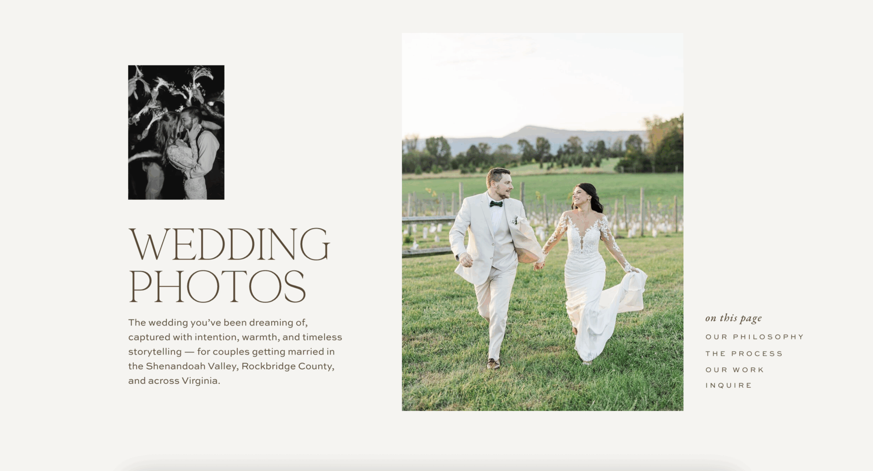
Elegant service page design for a wedding photography website featuring a romantic hero image, clear headline, and structured navigation that highlights philosophy, process, portfolio, and inquiry sections.
Don’t be vague. Don’t be clever. Be clear.
Users scan web pages quickly, spending most of their attention on headlines and the first few words of each section. Your headline needs to work hard.
Examples:
- “Custom Showit Websites for Creatives Who Are Ready to Scale”
- “Brand Strategy + Photography for Passionate Entrepreneurs”
- “Wedding Photography for Couples Who Want Timeless, Authentic Images”
Underneath your headline, add a short tagline and a call-to-action button.
Example: “Let’s build something beautiful and strategic.” [Get in Touch]
This sets the tone for your entire service page. You’re confident. You know what you do. And you’re ready to help.
3. Speak to Their Pain Points and Dreams
Before someone hires you, they’re experiencing something. Maybe they’re frustrated. Overwhelmed. Stuck. Unclear about their next step.
Your service page should reflect what they’re feeling before they find you—and show that your process was designed to fix exactly that.
This is what conversion experts call “entering the conversation already happening in your customer’s mind.” When you articulate their exact problem better than they can, they immediately trust you understand the solution.
Example: “You’ve been DIY-ing your website for months, but it still doesn’t feel quite right. You know your business deserves a professional online presence, but you’re not sure where to start or what’s actually worth investing in.”
Then transition to the dream state: “Imagine launching a website that books clients while you sleep. One that feels completely aligned with your brand and makes you excited to share it.”
When someone feels seen and understood, they keep reading.
4. Show Your Signature Process
People want to know what working with you actually looks like. A simple, high-level process reassures them that you’re organized, experienced, and thoughtful.
Break your process into 3-5 clear steps on your service page.
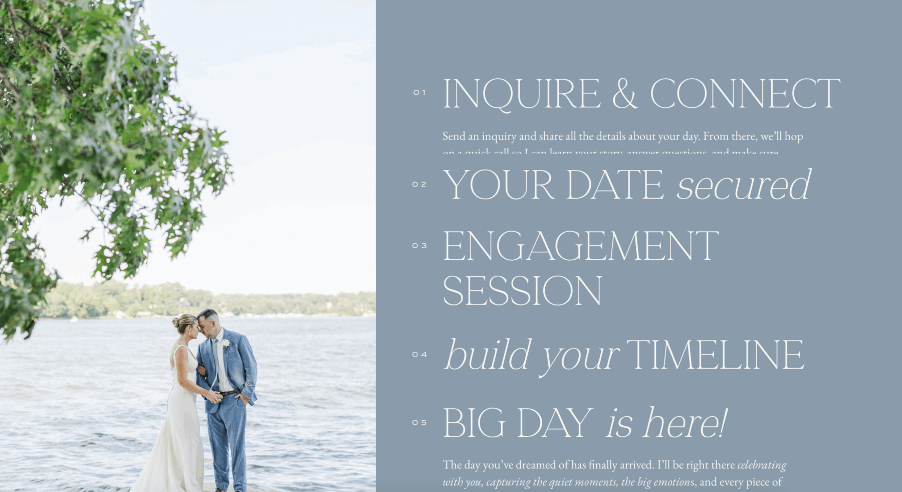
Example: Discover → We start with a strategy call to understand your business, audience, and goals. Design → I create a custom website tailored to your brand and built to convert.
Launch → We go live, and I walk you through how to manage and update your site.
Use icons or visuals in Showit to make this even more digestible. It doesn’t need to be complicated—it just needs to feel clear and doable.
Having a defined process also sets professional boundaries and manages client expectations from the start. It shows you’ve done this before and know exactly how to get them results.
5. Focus on Benefits, Not Just Deliverables
Here’s where most service pages go wrong: they list deliverables like a menu.
“5 pages, 2 rounds of revisions, logo files in PNG and SVG.”
That’s fine for a proposal, but it’s not what sells someone on your service page.
Features tell, but benefits sell. People don’t buy website pages—they buy what those pages will do for their business.
Instead, describe what they gain from the experience:
- A website that attracts your dream clients and converts them 24/7
- A brand that finally feels aligned with who you are and where you’re going
- The confidence to raise your rates because your online presence matches your expertise
- More time back in your week because you’re not constantly tweaking your DIY site
- A professional foundation that grows with your business
Benefits show the transformation. Deliverables show the checklist. People buy transformation.
Think about it this way: nobody wakes up wanting “5 custom web pages.” They wake up wanting more clients, more revenue, and less stress about their online presence. Speak to that.
6. Show Off Your Work (With Links to More)
Curate 2-3 project highlights on your service page that align with your current dream client.
For each one, include:
- A visual mockup or screenshot
- A one-line win or transformation (“This rebrand helped Sarah book out three months in advance”)
- Optional: A short client quote
Important: Link each preview to a full case study or project gallery. You want people to keep exploring, not just scroll past.
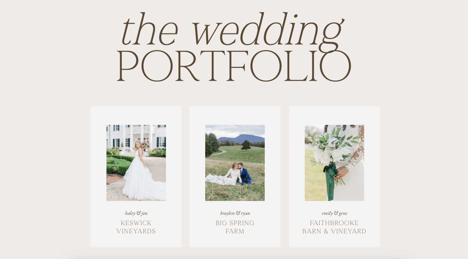
Your portfolio proves you can deliver. Make it easy for people to see more.
Think strategically about which projects you feature. If you want to attract wellness coaches, show wellness coach projects. If you’re pivoting to a new niche, feature work from that niche—even if it’s a smaller percentage of your overall portfolio.
The projects you showcase tell people who you’re for and what kind of work you create.
7. Use Powerful, Strategic Testimonials
Don’t just drop all your testimonials in one section at the bottom of your service page. Sprinkle them throughout.
Place them strategically:
- After you describe your process (to reinforce that it works)
- Near a call-to-action (to push people over the edge)
- Next to a benefit you’re highlighting (to prove it’s real)
Prioritize quotes that touch on:
- Before/after transformation
- How easy you were to work with
- ROI or the confidence boost they got
- Specific results they achieved
Example: “Working with Krista completely transformed how I show up online. I went from feeling embarrassed about my website to confidently sending people there—and booking clients because of it.”
Testimonials from people like your dream client are social proof that what you do actually works.
The best testimonials are specific. Instead of “She’s great to work with!” you want “Within two weeks of launching my new website, I booked three new clients at my new higher rates.”
8. Talk About Pricing Without the Menu
Your service page should feel like a conversation, not a pricing sheet.
You don’t need to list every package with every deliverable. That can actually overwhelm people and make them bounce.
Instead, give a range and set expectations:
Example: “The average client invests between $3,000–$6,000, depending on scope and timeline. Custom proposals are created after a discovery call so I can understand exactly what you need.”
Then add: “When you inquire, I’ll send over a detailed pricing and process guide that walks you through everything.”
You can link to your guide, a PDF, or send it through Dubsado where they’ll get more details. This keeps the page feeling approachable while still being transparent.
Addressing pricing on your service page—even if you don’t give exact numbers—removes a major barrier. People want to know if they’re even in the right ballpark before they reach out.
If you’re significantly outside someone’s budget, it’s better for both of you to know that upfront. And if your pricing aligns with their expectations, they’re more likely to inquire with serious intent.
Bonus: Add a Mini FAQ Section
A quick FAQ section at the end of your service page helps remove barriers before someone hesitates.
Example questions:
- “Do you offer payment plans?” (Yes, I offer payment plans for projects over $3,000.)
- “Do I need branding before I start a website project?” (Not necessarily—we can discuss what makes sense for you.)
- “When can we start?” (My calendar books 4-6 weeks out, but rush timelines are sometimes available.)
- “What platform do you design on?” (I specialize in Showit because of its design flexibility and ease of use for clients.)
- “Do you work with clients outside your area?” (Absolutely! Most of my projects are done remotely.)
This answers the questions people are already wondering, so they don’t have to reach out just to ask.
Think about the questions you get asked most often in discovery calls or inquiry forms. Those are the questions you should answer proactively on your service page.
Wrap It Up With a Warm, Clear Call to Action
At the end of your service page, invite them to take the next step. Don’t pressure them to “book now.” Just make it easy and welcoming.
CTA examples:
- “Think we’re a fit? Let’s talk.”
- “Click below to share your project details, and I’ll walk you through the next steps.”
- “Ready to start? Fill out my inquiry form and I’ll be in touch within 24 hours.”
Button options:
- [Let’s Work Together]
- [Start the Conversation]
- [Get in Touch]
Then add a final reassurance: “You don’t have to figure this all out alone. If you’re ready for a website that actually reflects your business and brings in dream clients, I’d love to help.”
Make sure your contact form or inquiry process is simple. The more fields you require, the fewer people will complete it. Ask for the essentials now—you can get details later.
Your Service Page Design Should Do the Selling for You
A high-converting service page isn’t about tricks or hacks. It’s about clarity, confidence, and showing people exactly how you can help them.
When your service page design is clear about what you do, who it’s for, how it works, and what they’ll gain, people don’t hesitate. They book.
Go through your service page right now and check:
- Is your page title specific and SEO-friendly?
- Does your headline clearly state what you do and who it’s for?
- Are you speaking to pain points and dreams, not just listing deliverables?
- Do you have a clear process laid out?
- Are benefits front and center?
- Is your work showcased with links to more?
- Are testimonials placed strategically throughout?
- Is pricing addressed without overwhelming?
- Is your CTA warm and clear?
- Does your FAQ section address common hesitations?
If you can say yes to all of these, your service page is working for you. If not, you know exactly what to fix.
Your service page is one of the hardest-working pages on your website. When it’s done well, it pre-qualifies leads, answers objections, builds trust, and moves people toward booking—all without you lifting a finger.
That’s the kind of page worth investing time into getting right.
FAQ
What is a service page design?
A service page design is a dedicated webpage that explains what you offer, who it’s for, and how potential clients can work with you. A well-structured service page design clearly communicates your process, highlights benefits, and guides visitors toward booking or inquiring.
Why is service page design important for conversions?
A strategic service page design helps turn website visitors into clients by clearly explaining your services, addressing pain points, and building trust. When done well, a service page design answers common questions and encourages visitors to take the next step.
What should be included in a high-converting service page design?
A high-converting service page design typically includes a clear headline, an overview of your service, benefits for the client, your process, portfolio examples, testimonials, pricing expectations, FAQs, and a strong call-to-action.
How can I improve my service page design for better results?
To improve your service page design, focus on clarity and structure. Use compelling headlines, speak directly to your audience’s needs, showcase real results, and make it easy for visitors to contact you or book your services.
Need help designing a service page that converts? Check out our Showit website templates—each one is built with high-converting layouts and strategic page structures that make it easy to showcase your services beautifully.

Krista is the co-founder of Davey & Krista, a creative studio known for high-converting Showit website templates crafted for photographers, creatives, and entrepreneurs. With over 15 years of branding and marketing experience, she helps business owners launch stunning websites without the tech overwhelm. Krista also teaches designers how to turn their creative skills into a thriving business—through templates, courses, and behind-the-scenes strategy. When she’s not designing, you’ll find her chasing sunshine, color palettes, and gluten-free pizza.
Explore website templates and free resources at daveyandkrista.com.


VIEW THE COMMENTS
Add A Comment