The following post is a summary of a recent podcast episode, which you can listen to use the podcast player below. For show notes and a list of resources we mention in the podcast/blog, scroll to the bottom of the page.
After looking though hundreds of sites that went live using our designs, we noticed that while many of them look SO GOOD… there were a few that just needed a little tweaking to take them from alright to STUNNING!
So earlier this summer, we started offering Designers Touch Sessions.
(If you’ve ever seen a woman walk over to her husband and adjust his tie a little bit so it sits a little bit straighter or watched the maid of honor fluff a bride’s dress just before she walks down the aisle so it lays perfectly while she walks, that’s the equivalent what these sessions are designed to do for your website.)
Basically, these are 90 minute sessions where our team jumps into a website and gets it to the next level.
(In June, we released a few spots and they sold out QUICKLY. We’ll likely open up a few more spots again soon. Learn more about DT Sessions + grab a waitlist spot.)
As our team was working on these site cleanups, we noticed a few common design mistakes on many of the sites. These mistakes aren’t necessarily awful, but they could inadvertently make it more difficult for visitors to buy/book/decide to work with you.
So, just what are these mistakes and how can you fix them?

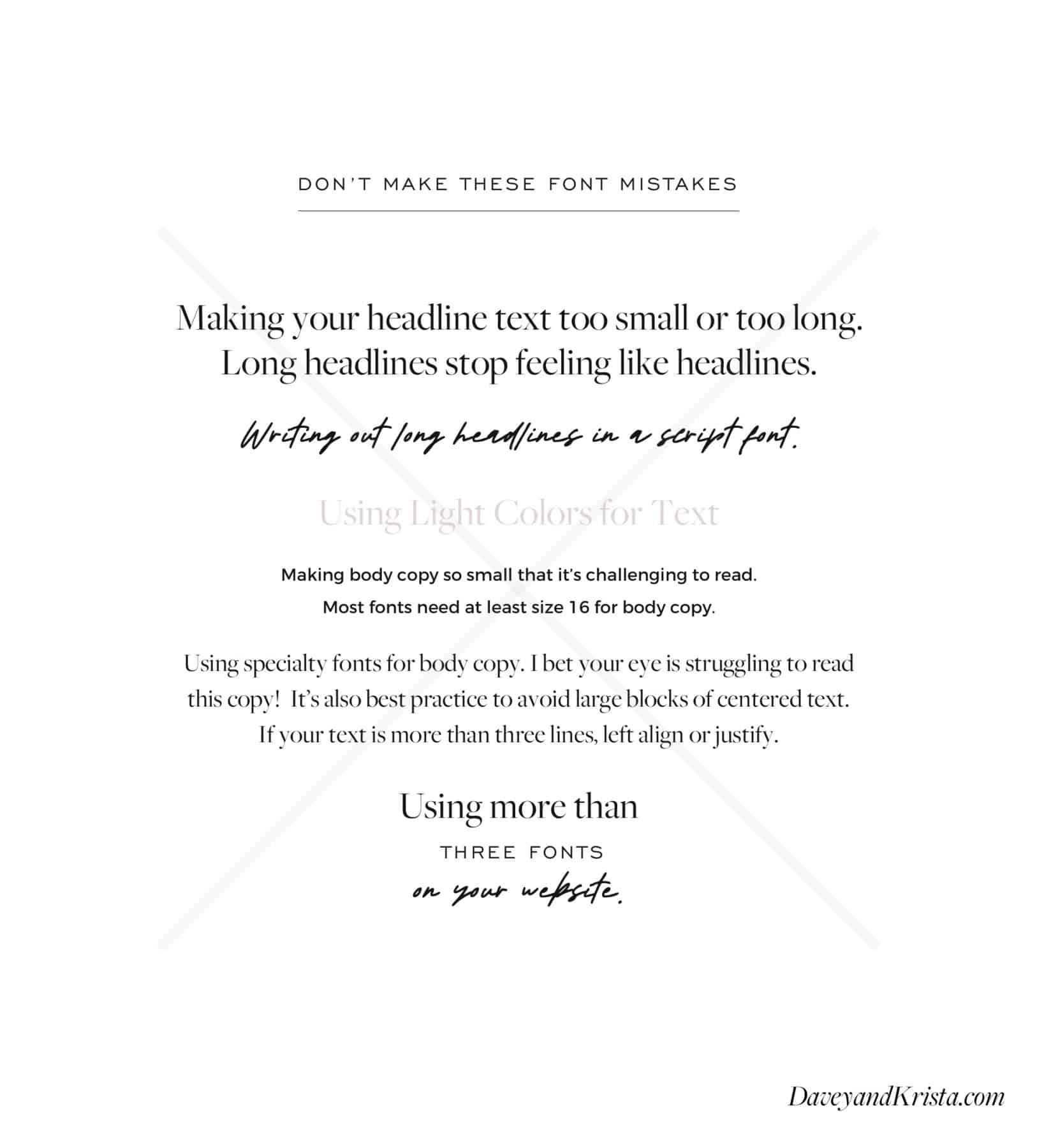
1. Keep Your Fonts Easy to Read
One of the great things about both Showit and WordPress/Elementor sites is that it’s very easy to load your own fonts and customize the design for your brand. But that said, it’s also easy to accidentally make the text more difficult to read if you don’t understand how fonts and colors work on the web.
And if visitors can’t read our understand your text, there’s a higher likelihood they’ll leave your site without taking the action you want them to take.
General tips for fonts:
- Keep headlines in a big font that has some impact
- Headlines should not be more that a few words
- Avoid script fonts for headlines unless it’s very large and only one or two words. Long bits of script are hard to read.
- Use darker font colors for text that needs to be read (and isn’t just decorative). Yellow fonts, light pink fonts, etc don’t have enough contrast against a white background for them to be easy to read. Especially on phones or older computers.
- Body copy text should not be too small (aim for at least a font size of 16 – although this might vary depending on which font you’re using as they all render a bit differently)
- Sans serif and clean serif fonts work best for body copy (Montserrat, EB Garamond, Questrial, Raleway, Cormorant, etc)
- Avoid using specialty fonts for body copy (fonts that are more unique such as Audrey)
- Avoid long sentences of text in a script. Scripts are best for short accents.
- Don’t center large blocks of text. This is harder for the eye to skim through. If you’re going to center text, make sure it’s less than three or four lines long.
- Limit your fonts to no more than three (one serif, one sans serif and one display font – such as a script!)

2. Don’t Make Your Website All About You
You win when you speak to the problems and pain points of your client, not when you share how many cups of coffee you drink. We’ve seen a lot of businesses attempt to connect with their ideal clients by sharing all sorts of little facts about their lives.
And while those snippets of your life are interesting and they can help you connect with your ideal client, that connection typically only comes after your client feels seen, heard and understood.
We all live in our own little worlds and most of the time, we’re thinking about our own needs, wants and desires. This is true of you and this is true of your client.
So if you’re trying to reach a couple in the early stages of wedding planning because you provide wedding photography, make sure the language your site uses speaks to that couple. They’re probably excited, overwhelmed, drowning in Pinterest boards of ideas, worried that they’re spending too much money, fearful that precious moments on their wedding day could be missed by their photographer.
And the more that you can empathize with how your ideal client is feeling, the more likely they’re going to work with you. Speak to their problems in a redemptive way. Show them how you can provide a solution.
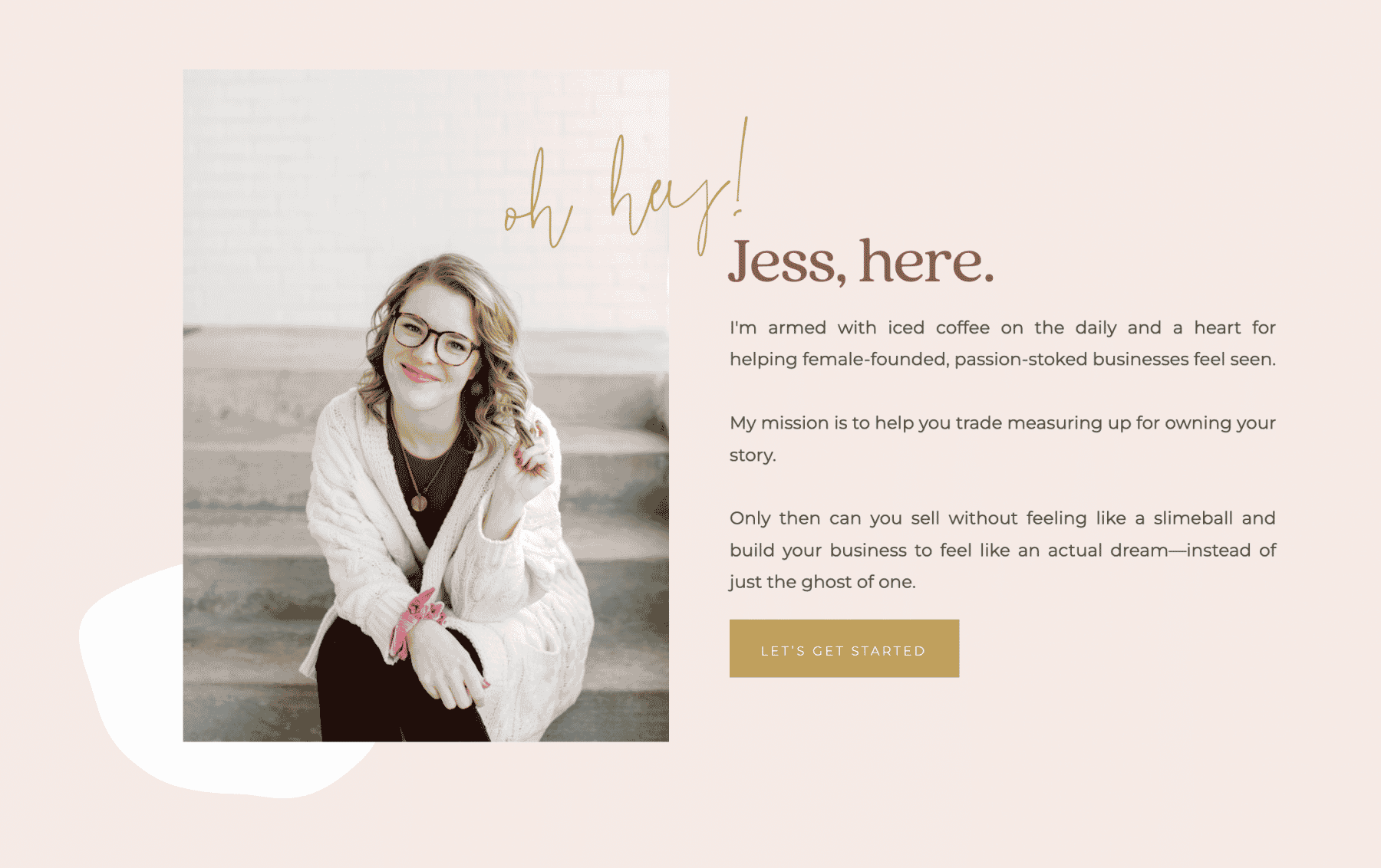
Take a look at copywriter Jess Jordana’s “bio” on her about page. She does mention a fun fact (her love of iced coffee), but the rest of the text is about how she helps small business owners. This copy was designed to connect with her ideal client. Everything in this copy helps her ideal clients envision Jess solving their copywriting needs.

We know that figuring out the right language to resonate with your ideal clients can be tricky. That’s one of the reasons why we find copywriters so invaluable. If you want to dive farther into how to make your copy more about your ideal client and less about you, check out Jess’ Promptlates (not sponsored – we just love them) or Donald Miller’s Building a Storybrand.
3. Don’t Skip the Social Proof
We’re willing to bet that the last time you ordered a new product on Amazon, one of the first things you did was scroll down to check out the reviews. The internet has been around long enough to know that there are a lot of products and services out there that just stink. And before we buy, we want to know that the thing we’re interested in spending money on has worked for other people. That it can actually do what it says it’s going to do.
And if we’re willing to put time into research and read through the testimonials about a $14.99 dishwasher part (me last night), how much more willing are your clients going to be when they’re researching your services (especially if your services cost thousands of dollars!)?
Sharing testimonials, getting reviews on platforms like Google, Facebook & The Knot, sharing places you or your work have been featured, showing before and after images, and other forms of social proof go a long way.
We’ve found that it’s best to avoid “testimonials” pages—rather, you should spread social proof throughout your website. That way as people read about what you offer, they’re constantly reminded that REAL people think it’s amazing to work with you.
Social proof is also an opportunity for someone to put into words how they use their product. Especially for people who sell physical products. There might be people out there using your product in a way that you never thought it could be used. And if they share on your website or on another platform about their use case, others might be inspired to use your product in a similar way.
For example, Davey is currently searching for a cattle brand iron for Farm Fed Box. Not because they actually want to brand their cows or themselves (Yellowstone anyone?), but because they would love to be able to brand their shipping boxes. The makers of most cattle brands probably haven’t thought about using a brand in that way, so we’ve been searching through product reviews to see if anyone else has had success using a brand on boxes.
You just never know what insight reviews may bring to your product or services!
If you’re pulling social proof from emails or an offsite listing (such as Google) to add to your website, make sure that you trim down long testimonials. While it’s wonderful that someone loved working with you so much that they wrote the War and Peace of testimonials, however, most people browsing your site won’t take the time to read that long block of text. Pull out the best one or two sentences and just use those.
If someone is really taking the time to research you, it’s likely they they’ll already be looking at your reviews on other sites.
4. Don’t Name Your Services Page “Services”
Be more specific. Not only will service specific page names be helpful for visitors trying to understand what you do, these page names also tell search engines what you do.
Think about this: if you provide equine photography (yes, that’s a thing!), how is Google going to know that your website is about equine photography? It’s going to read the text on your website. And one of the easiest ways that Google figures out what kind of content is on your website is by looking at the titles of your pages. If your services page is called “services”, that tells Google nothing. But if your services page is titled “Equine Photography,” Google is going to know that your content is about horse photography.
And so when someone searches for “equine photography,” it’s more likely that your page is going to come up higher in search results.
The same is true for your ideal client. Naming your services pages with very specific names helps clients understand exactly what you do. They may not always read all of the text on your website or really take the time to look at every image, but if they’re browsing through the pages on your site and they click on a menu item titled “Weddings,” they’re going to know that you offer services for weddings. Clarity wins.
You might be thinking whether this means each of your services pages should have its own page. Yes! Creating a new page for each service is going to help your pages rank higher in search results.
This might seem very small, but these little changes to your site can add up to big results when it comes to bookings, sales, and search engine rankings.
5. Don’t Skip Calls-to-Action at the Ends of Pages
We live in a scrolling world. Most likely, the majority of people who visit your website do so on a mobile device. They’re used to scrolling through long pages of content (endless scroll anyone?)
When they get to the bottom of your pages, make sure that you’ve given them somewhere to go next. Lead them to the next step of booking or hiring or learning more about your offerings.
So, for example, when someone gets to the bottom of your homepage, you could have a link to sign up for a free guide in exchange for their email address. Or maybe you funnel them to the different services pages that you offer. At the bottom of your services pages, you’re likely going to want them to go to your contact page.
The common theme that runs through all of these tips is to keep things clear and simple. If we keep things clear (and often that means simplifying), we’re going to have a better chance of engaging an ideal client.
The last time you walked into a physical store, chances are that a sales associate asked you what they can help you find. Your website should do the same. You want to connect your site visitors to the products or services they’re looking for as quickly as possible.
Find It Quickly (in the Episode)
2:00 – Designers Touch Sessions
7:45 – How to ensure your fonts are easy to read
10:05 – Don’t make your website all about you
13:07 – Don’t skip the social proof
16:20 – How to name your services pages
18:35 – Give visitors a place to go next
Resources Mentioned in the Episode
- Designers Touch Sessions
- Palm Tree Club (Startup Sessions)
- Jess’ Promptlates
- Donald Miller’s Building a Storybrand
- Top DIY Design Mistakes to Avoid

 Equine photographer here!! Just had to comment and say yes it definitely is a thing ? I love these tips! Thank you for sharing!


VIEW THE COMMENTS
Add A Comment