


Table of Contents
Where to Put an Email Opt-in on Your Website (Real Data)
Let me tell you about the form at the bottom of our website.
Back when our email list was just getting started, we had a few hundred subscribers. A respectable number for a wedding. A less respectable number for a business.
And like everyone, we had a little signup form in the footer. It sat at the bottom of every single page. It had a friendly headline. It asked very politely.
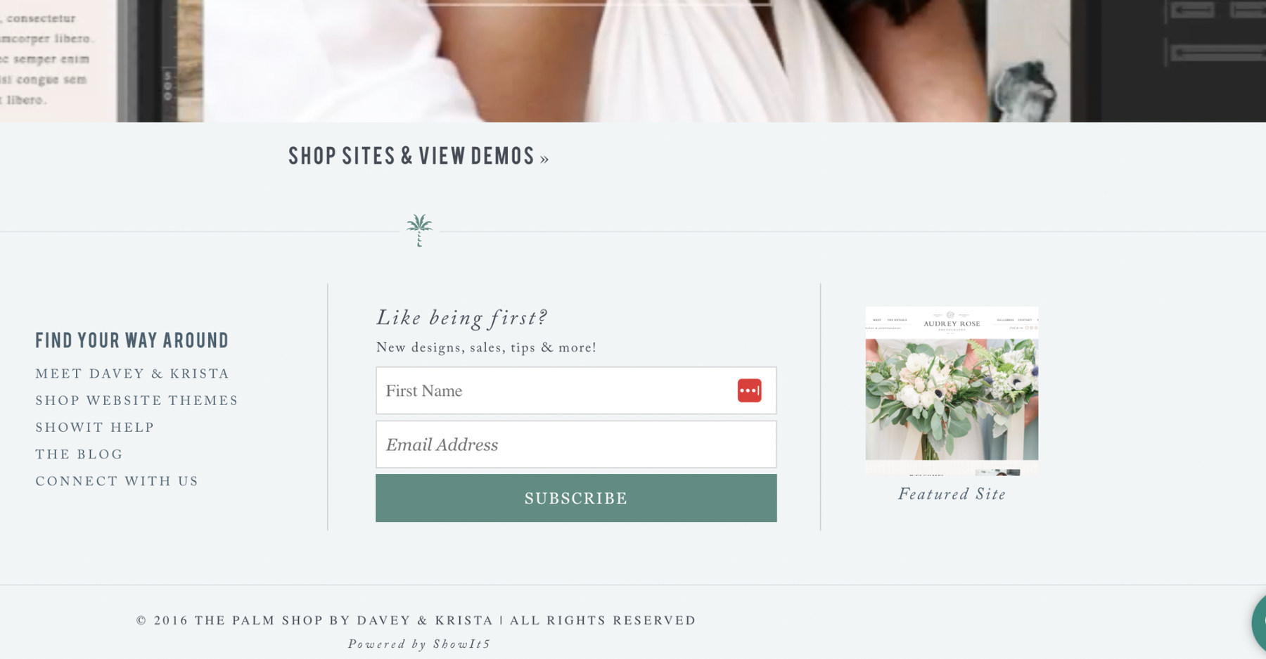
It was doing absolutely nothing.
Not “not much.” Nothing. It was the website equivalent of a tip jar at a self-checkout.
I had assumed it was working because it existed, which is a very comforting way to run a business and one I do not recommend.
So I changed tactics. Today our list is 44,000 people, and a single pop-up has brought in 16,447 of them. One pop-up. The footer form would like you to know it was also there.
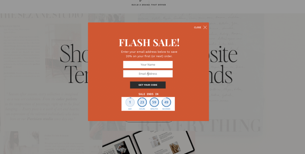
Here’s the short answer, plainly: put your email opt-in where people are already paying attention. That means a targeted pop-up on your highest-traffic pages, a dedicated landing page for your free guide, and an offer on the pages where people are close to buying.
Placement isn’t a small detail. It’s almost the whole game.
Let me show you where.
Why the Footer Form Fails
Almost everyone starts with a footer form. I did. It feels logical. It shows up on every page. It doesn’t interrupt anyone.
That last part is the problem.
The footer is the “well, I should get going” of a website. By the time someone scrolls all the way down there, they’ve already decided how they feel about you and they’re reaching for their coat. The few who notice a “join my newsletter” box on the way out are a very small, very motivated group. Lovely people. Not a growth strategy.
The footer form isn’t a list-building strategy. It’s a placeholder that feels like one.
I kept ours longer than I’d like to admit, because deleting it felt like giving up on it. In fairness to me, it had given up first.
The Conversion Ladder: What Actually Works
Here’s how the different placements stack up, and why the gaps between them are so big.
Embedded forms with no offer: about 0%. This is the footer form, the sidebar form, the “subscribe for updates” box tucked into a page somewhere. It’s asking someone to hand over their email address in exchange for updates, which is also what your phone offers right before it restarts during something important. Nobody is excited about updates.
A pop-up with a specific offer: about 1%. That sounds small until you do the math. If your site gets 2,000 visitors a month, 1% is 20 new subscribers every month, from a page you’re not touching. With a strong offer and good targeting, we’ve seen it get closer to 2 to 3%. That’s how one pop-up got to 16,447 for us: a high-traffic page, a specific offer, and the right moment.
A dedicated landing page for a genuinely useful guide or quiz: 1% and up, often a lot more. When someone deliberately goes to a page built around your freebie, the intent is already there. You’re not interrupting them. They came for this.
People aren’t stingy with their inbox. Everyone else is asking for it too. Give them a real reason and they’ll say yes.
Not All Subscribers Are Worth the Same
This is the part I find most interesting, because a subscriber is not a subscriber is not a subscriber.
Free download pages: about $2.44 per subscriber in eventual revenue. These people found you through search or a share, liked what they saw, and grabbed something free. They’re interested. They do buy. It just takes a while and a good email sequence to get them there.
Pages where people are close to buying: about $76 per subscriber. I’ve been looking at business numbers for fifteen years and this one still made me sit up. When someone opts in from your services page, your templates page, or your pricing page, they aren’t browsing. They’re in decision mode. The opt-in just gave them a lower-commitment way to stay close while they decide, and they convert faster and at a much higher rate.
Do that math and it gets a little dramatic. The opt-in on your shop page is worth roughly thirty times more per subscriber than the one on your freebie page.
That doesn’t mean skip the freebie page. It means please, friend, don’t skip the shop page.
What to Offer at Each Spot
“Subscribe for updates” converts at almost nothing. A specific, useful, right-now kind of offer converts at a real rate. Here’s how I match the offer to the spot.
On high-traffic blog posts: offer the natural next step from what they just read. If someone just finished your post on Showit SEO, offer an SEO checklist, not a wedding planning guide.
On your shop or services pages: offer something that helps them make the decision they’re already trying to make. A guide to choosing the right template. A pricing breakdown. A quiz that tells them which offer fits. Meet them where they are, which is standing in your shop holding two things and trying to pick one.
On a dedicated landing page: this is where your best freebie lives. One page, one job. No navigation, no distractions, nothing competing with the form.
For the pop-up, targeting matters as much as the offer. A pop-up that appears on every page the second someone arrives is the person who greets you at the front door with a clipboard. A pop-up that appears on your most-read posts about a related topic, after someone’s been reading a bit, is a friend saying “oh, you’d like this.”
Same pop-up, same offer, different timing.
BDOW! is the tool we use and recommend for this, because the targeting controls let you choose exactly which pages a pop-up shows up on and when. Use code DAVEYANDKRISTA for 50% off your first year.
What to Send After Someone Says Yes
Getting someone on your list is step one. What you send them that first week decides whether they stay, whether they open, and whether they ever buy.
Most people build the welcome sequence the way most of us approach the junk drawer: eventually, and with regret. It deserves better than that.
Build the welcome sequence before the traffic, not after.
A good one does three things: it delivers what you promised right away, it tells your story in a way that makes someone glad they signed up, and it gives them a reason to keep opening. We walk through the whole thing, from opt-in to first purchase, in our free class How to Get Your First 1,000 Email Subscribers.
For the email platform itself, we recommend Kit if you want powerful automation and segmentation, and Flodesk if you care most about beautiful emails and simplicity (our link gets you 25% off your first year). Both play nicely with Showit, and both are good choices depending on what your business needs.
The Setup I’d Use If I Were Starting Over
If I were back at a few hundred subscribers with a hardworking-looking footer form, here’s exactly what I’d do.
First, make one genuinely useful freebie. Not a PDF you threw together in a single afternoon. Something that solves a real problem your ideal client has right now. Spend most of your time here. Everything else is distribution.
Second, build a dedicated landing page for it. One page, one job. This is the link you share in emails, on social, and in your bio, and it’ll convert the highest percentage of the people who visit on purpose.
Third, add a targeted pop-up to your highest-traffic pages with a tool like BDOW!. Point it at content related to your freebie, and set it to appear after someone’s been reading for a bit, not the instant they land.
Fourth, put a relevant offer on your shop and services pages. This is your most valuable placement and the one most people skip.
Fifth, write your welcome sequence before you launch any of it. Three emails, minimum: deliver the thing, share your story and why you do this work, then make a soft offer or invite them further in.
And the footer form? Keep it if you like. It isn’t hurting anyone. It just isn’t helping anyone, either.
If you want to go deeper on all of this, including the welcome sequence, the freebies that work best for creative businesses, and how to turn subscribers into buyers, join the free class How to Get Your First 1,000 Email Subscribers. And if you’re reading this after October 13, BDOW! with code DAVEYANDKRISTA still gets you 50% off the tool behind most of what’s in this post.
FAQs
Do pop-ups hurt the user experience?
A pop-up that appears instantly on every page can feel intrusive. A well-timed pop-up on relevant pages, after someone has been reading for a moment, with a genuinely useful offer, converts well without hurting the experience. At Davey & Krista, one targeted pop-up has brought in 16,447 subscribers.
What converts better, a pop-up or an embedded form?
Pop-ups consistently outperform embedded forms. Embedded forms with no specific offer convert at nearly 0%, while a pop-up with a targeted offer converts at around 1% or higher. A dedicated landing page for a strong freebie can convert even higher because the visitor arrived on purpose.
Does a footer signup form work?
Usually not on its own. When the Davey & Krista list was a few hundred subscribers, the footer form was bringing in essentially no one. Moving to targeted pop-ups, landing pages, and offers on shop pages is what grew the list to 44,000.
How much is an email subscriber worth?
It depends on where they came from. At Davey & Krista, subscribers who opted in from free download pages are worth about $2.44 in eventual revenue, while subscribers who opted in from pages where they were close to buying are worth about $76.
What should I offer in exchange for an email address?
Something that solves a specific, real problem your ideal client has right now: a checklist, a guide, a quiz with personalized results, or a mini-course. The more specific and immediately useful it is, the better it converts.

Krista is the co-founder of Davey & Krista, a creative studio known for high-converting Showit website templates crafted for photographers, creatives, and entrepreneurs. With over 15 years of branding and marketing experience, she helps business owners launch stunning websites without the tech overwhelm. Krista also teaches designers how to turn their creative skills into a thriving business—through templates, courses, and behind-the-scenes strategy. When she’s not designing, you’ll find her chasing sunshine, color palettes, and gluten-free pizza.
Explore website templates and free resources at daveyandkrista.com.


VIEW THE COMMENTS
Add A Comment