


Our new website launches this week and so does a new series sharing design tips!
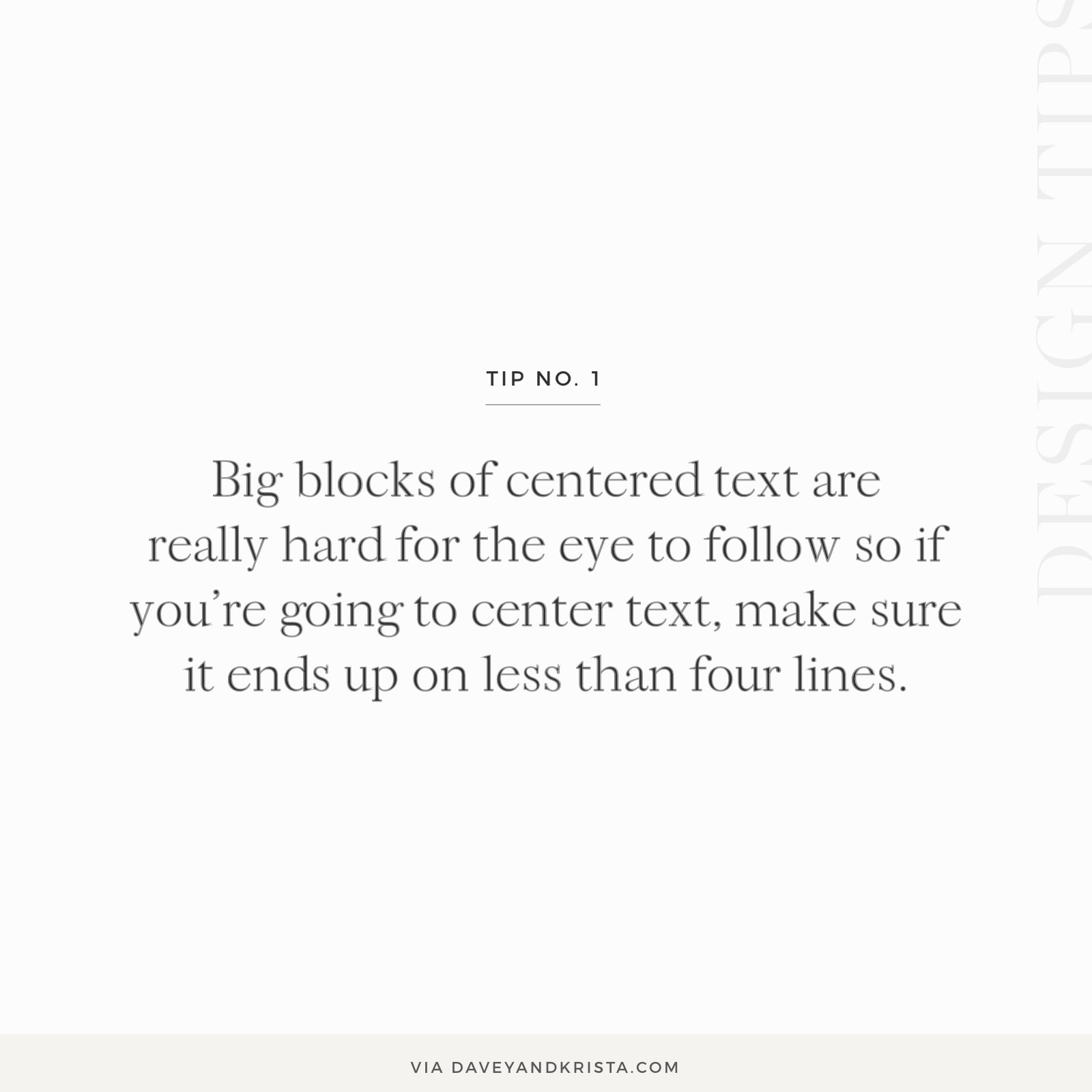
This week’s tip: If you’re going to center text, make sure it ends up on less than four lines because big blocks of centered text are really hard for the eye to follow.
Pay attention to the width of the lines (not too short or too long) as well as which words are left at the end of each line. Make sure the lines ‘break’ in a way that is both visually appealing and easy to read. Use a soft return (shift + enter at the same time) for lines to break before or after certain words.
See what I mean? If I were to just type out one big centered paragraph that went on for several lines without any paragraph breaks and without paying attention to where the lines break, it would be pretty hard to read. Long lines of type weren’t meant to be centered and neither were large paragraphs. There’s a reason why books and newspapers don’t center their text.
But if we start adding paragraph breaks, it get’s a bit easier.
Not that you want to do this for large amounts of text.
If you’re centering a paragraph because you like the look of things aligned in a column, try justifying your paragraph instead! It achieves a similar look but the text will be MUCH easier for the reader to scan through.
Do you have other design questions? Let us know in the comments 🙂

Krista is the co-founder of Davey & Krista, a creative studio known for high-converting Showit website templates crafted for photographers, creatives, and entrepreneurs. With over 15 years of branding and marketing experience, she helps business owners launch stunning websites without the tech overwhelm. Krista also teaches designers how to turn their creative skills into a thriving business—through templates, courses, and behind-the-scenes strategy. When she’s not designing, you’ll find her chasing sunshine, color palettes, and gluten-free pizza.
Explore website templates and free resources at daveyandkrista.com.


VIEW THE COMMENTS
Add A Comment