If you’re working on your website or brand but aren’t sure how to find the perfect colors, this post is for you. We’re going to walk you through the exact steps we use to generate color palettes for our clients plus share a few free online methods.
So what is a color palette?
A color palette is a group of colors that is used consistently throughout your brand. These are the colors that show up in your logo, on your website, in social media graphics, and in any collateral that is associated with your brand.
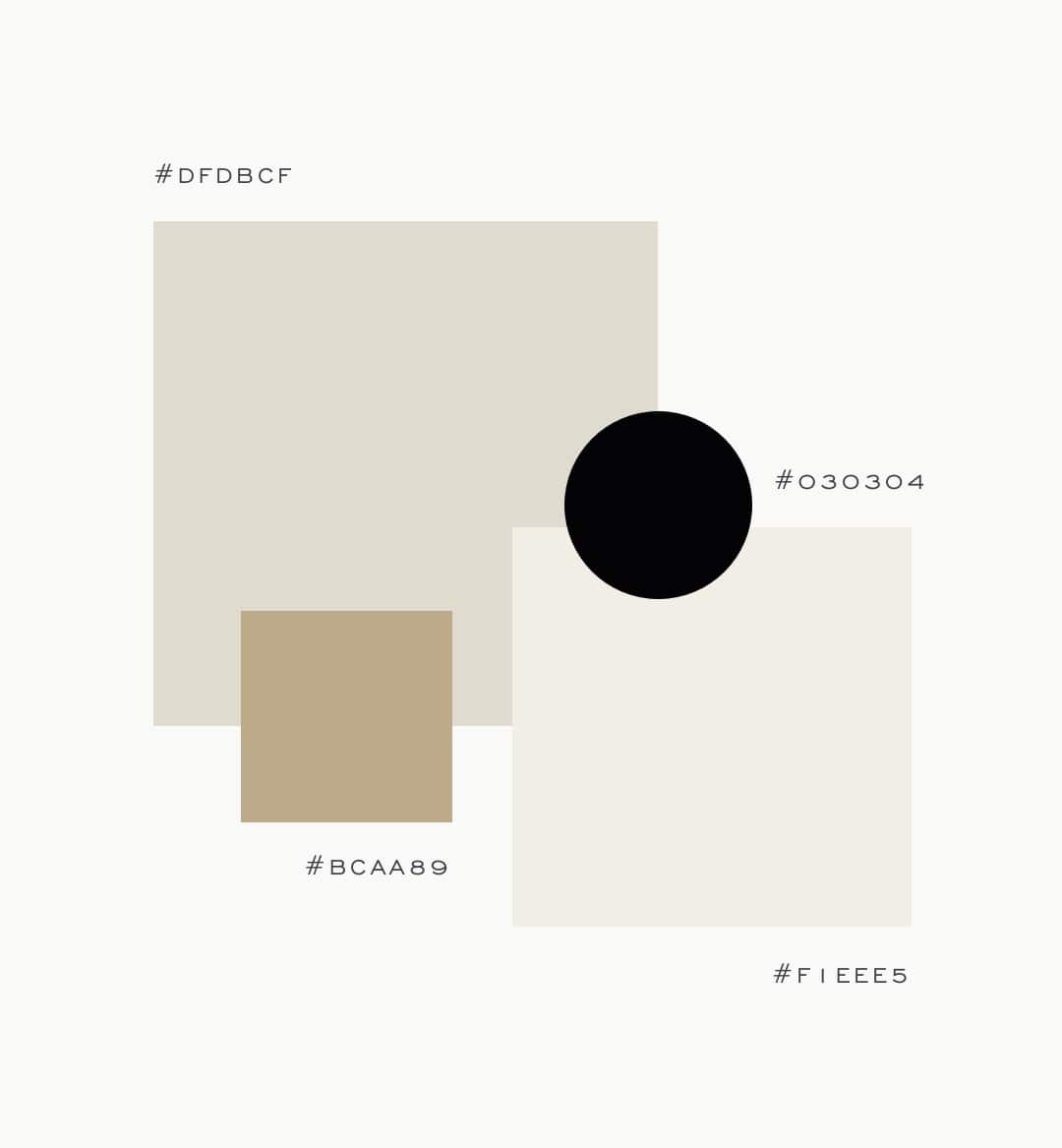
Color palettes help begin to set the overall aesthetic for a brand, and thus serve as an important aspect of a brand project.
So how do we come up with color palettes?
Method One: Start with a Mood Board
We start all of our projects with a mood board. This is one of our favorite methods. We ask all of our design clients to complete a branding questionnaire that tells us more about their business and the ideal client that they’re trying to reach.
We have another video about the specifics of creating a mood board, but for now it’s helpful to know that the mood board is created to start establishing a direction for the brand, and it’s usually based on…
- Our brand questionnaire
- And any conversations we’ve had with the client.
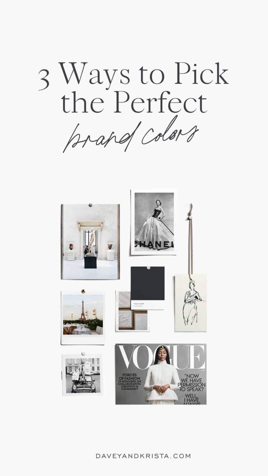
So for example, if someone tells us that their ideal client shops at high end boutiques that carry brands like Chanel, vacations in Paris and spends Sunday afternoon at the Met, we can start doing visual searches for those images.
Pinterest is a great way to gather images and often, when you have images gathered, you’ll notice color trends among the images.
One of our favorite search tips is to put in the name of a brand that our client mentioned + the word “email” in the search bar. Email designs often carry a lot more brand personality than a website and searching for emails is a great way to find color palettes & font palettes.
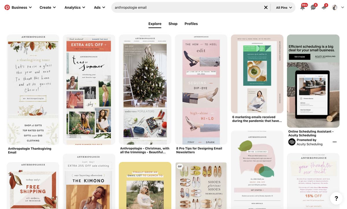
We try to avoid drawing inspiration from logos and the brands/websites/color palettes of our clients competitors. Homes, art, clothing and locations are all great visual resources and when you focus on drawing inspiration from these sources, you’ll often end up with a far more unique color palette.
Another trick is to click on an image that really represents the brand and explore similar images.
For this particular board, we’re seeing a lot of neutral colors mixed with black and white.
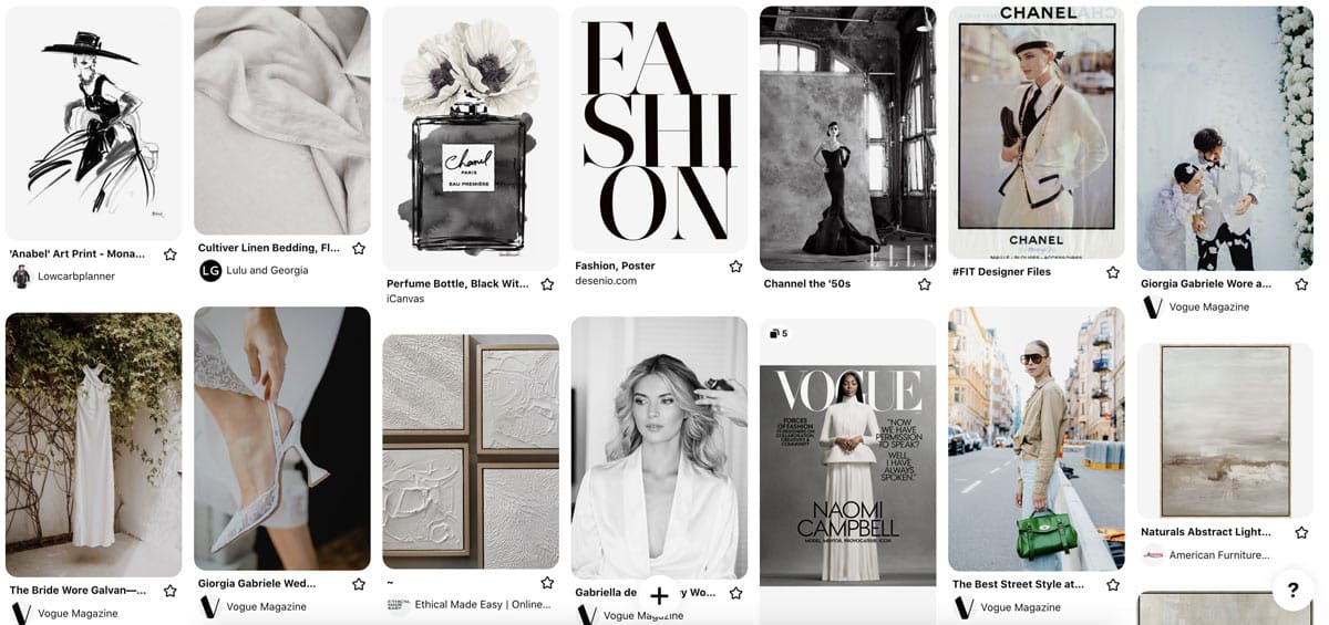
From here, we typically follow these steps to create a mood board.
Method Two: Auto-Generated Color Palettes
If you have at least one color to use as a starting point, you can also auto-generate color palettes a few different ways.
Personally, we like to use the Adobe Illustrator Color Guide. If you have Adobe Illustrator, add your color in a shape on a canvas.
Open the Color Guide palette and use the arrow to explore different types of color palettes based on your color. You can choose from options such as analogous, complementary, high contrast, monochromatic and a whole lot more.
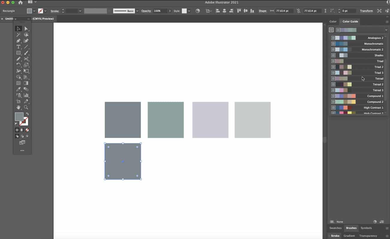
If you don’t have Adobe Illustrator, there are several online free color palette generators.
For example, on Coolors.co you can explore popular palettes or generate your own. The free, online app allows you to add in colors you love, lock them and then explore auto generating other colors.
If you adjust the shade of a color, the generator will automatically adjust the other colors in the palette (that aren’t locked) to coordinate. You can also adjust the method used to generate a color palette. They don’t have quite as many options as Illustrator, but this is still a great method for finding colors that work well together.
The app also allows you to test colors for color blindness, adjust the saturation, brightness and warmth collectively and a whole lot more.
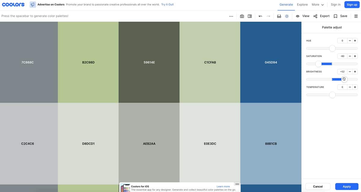
Adobe also has a color wheel that you can use to generate color palettes based on either a color you love or colors you find. With this generator, we like the way Adobe locks colors so that you know they’re in the same color family.
We recommend using these color generators as a base because just like when you generate a color palette from several images, you want to make sure you’re including a variety of colors.
A few other color palette generators:
- https://coolors.co
- https://color.adobe.com
- https://paletton.com
- http://colormind.io
Method Three: Generate a Color Palette from an Image
If you don’t have any colors but you have an image that really represents the brand you want to create, you can actually use an image to generate a base of colors. Coolors will let you eyedrop colors from individual images or generate a basic palette from an image.
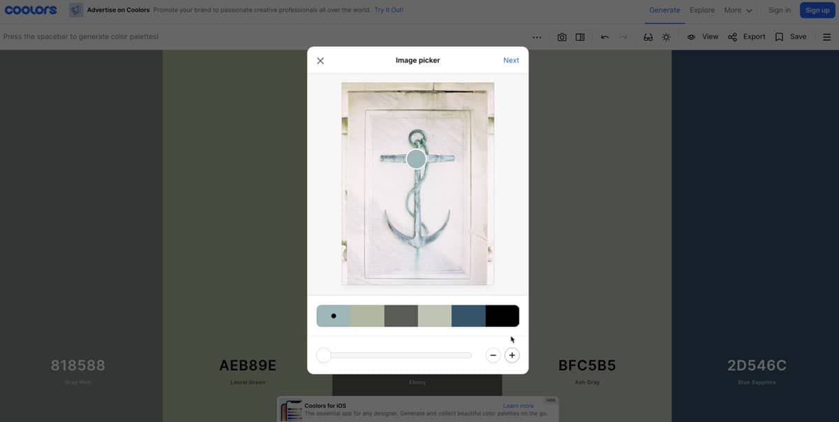
We also really love the Adobe online color palette generator. Just drag an image into the online editor and you’ll see an autogenerated color palette. It allows you to explore colorful palettes, muted palettes, deep, dark and bright palettes based on your image. You can also move the color points around to sample different parts of your image.
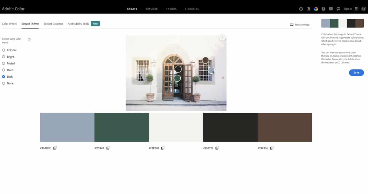
Canva has a simple color generator that you could check out and we’ll also link to a few others below.
We will say that generating color palettes from images is probably the most limited, but if you’re not sure where to begin, this can help you find a few colors you like.
Online Color Palette Generators from Images:
- https://coolors.co/image-picker
- https://color.adobe.com/create/image
- https://www.canva.com/colors/color-palette-generator
- https://icolorpalette.com/color-palette-from-images
And now you have at least the beginnings of a color palette. If you want a free template where you can create a brand aesthetic as well as directions for creating a mood board, head to our post: Defining a Brand Aesthetic.
And if you’re wondering where you go from here, check out our other brand videos like “how to create the perfect visual brand for your business.”
VIEW THE COMMENTS
Add A Comment