When it comes to creating a logo, a lot of new business owners tend to overthink things. They look at brands like Amazon with the arrow that not only represents their quick ship delivery service but also mimics a smile (indicating customer satisfaction,) and think that in order for their business to be successful, they need a clever logo.

And while we firmly believe good branding is important (we are a branding agency after all), we don’t believe that good brands, especially new brands, need overly complicated logos.
We’ve sent out hundreds of branding questionnaires to our clients over the last few years and if we made a list of many of the brands that inspire them, the majority would have incredibly simple logos.
Simple logos, but strong brands. We bet if we showed you Anthropologie’s Instagram feed and J. Crew’s feed side by side with the names blocked off, you could easily distinguish between the two.
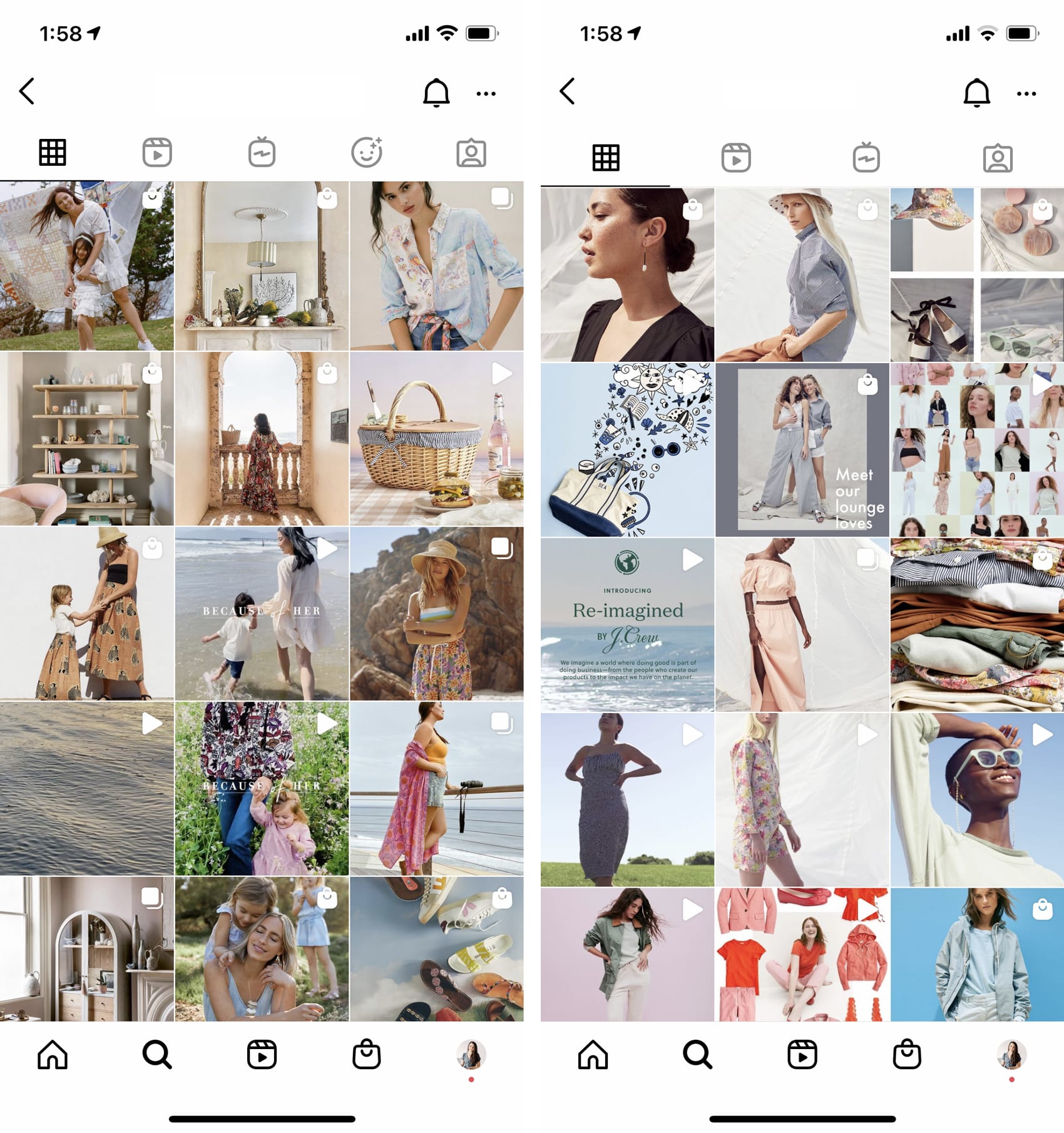
That’s because while a logo is important, a brand is a lot bigger than the visual component that displays your name.
If you’re just getting started or you’ve never had a logo, we’re going to walk you through creating a logo in Adobe Illustrator (our preferred method) and Canva Pro.
Note – We tried to create a logo using the free version of Canva but we don’t advise it as they don’t give you a vector version of the logo – which means it may not print clearly or show up quite as crisp on your website. Adobe Illustrator also offers a free 7 day trial if you don’t have the software so that is also a great place to start.
Before we begin, if you haven’t filled out our branding questionnaire or pulled together a mood board for yourself, now is a great time to do. The aesthetic activity should help you determine fonts that work well for your brand, but you can also check out a few of my favorite combinations and favorite script fonts.
For demo purposes, let’s pretend that this is the mood board for our business.

Based on the mood board, a clean serif font would likely work well for the brand. Something that feels a little like the J. Crew logo referenced above.
A few of our favorite (free) serif fonts from Google:
Creating a Simple Logo in Adobe Illustrator
-
- Open Adobe Illustrator and create a new document. Size doesn’t make a big difference here so we’ll create a 6×6 inch document for now.
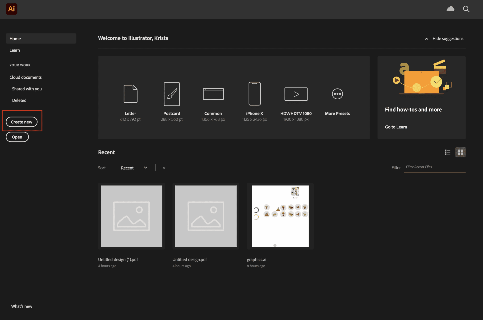
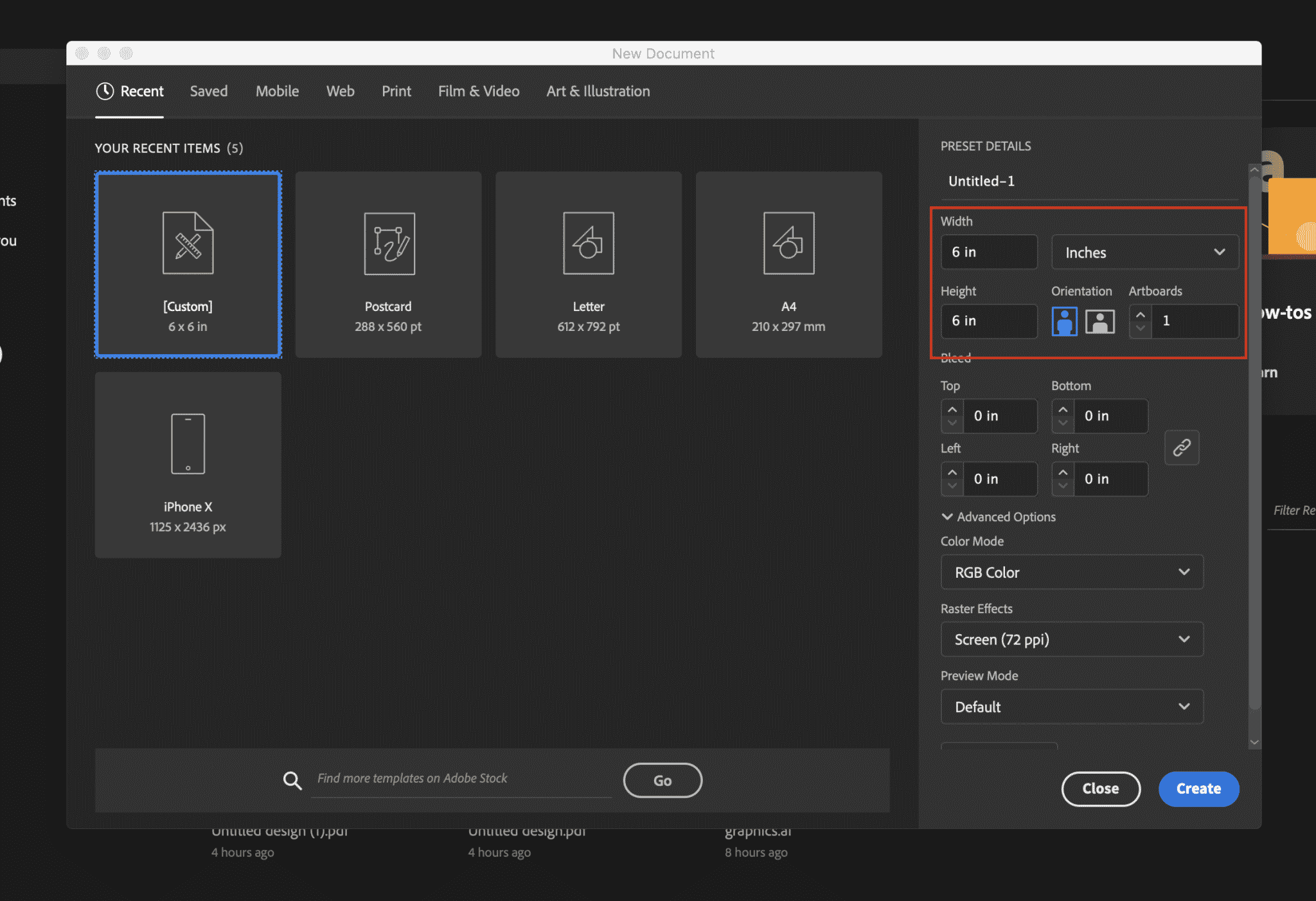
- Select the Type tool and add a textbox to the page.
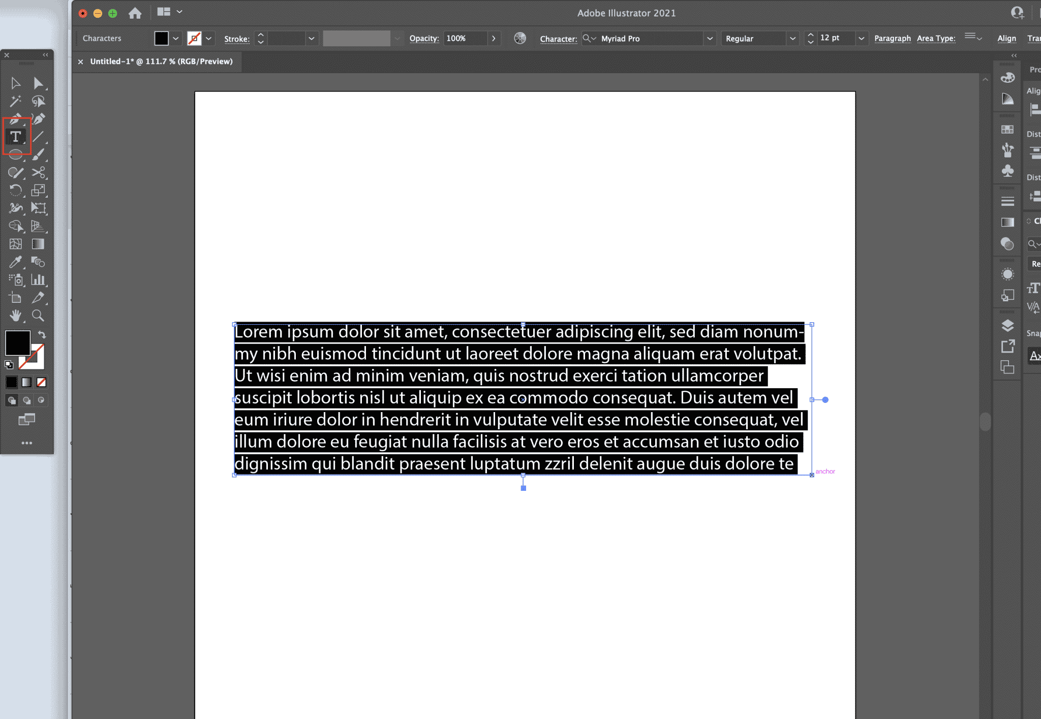
- Type your business name, select a font and center your text.
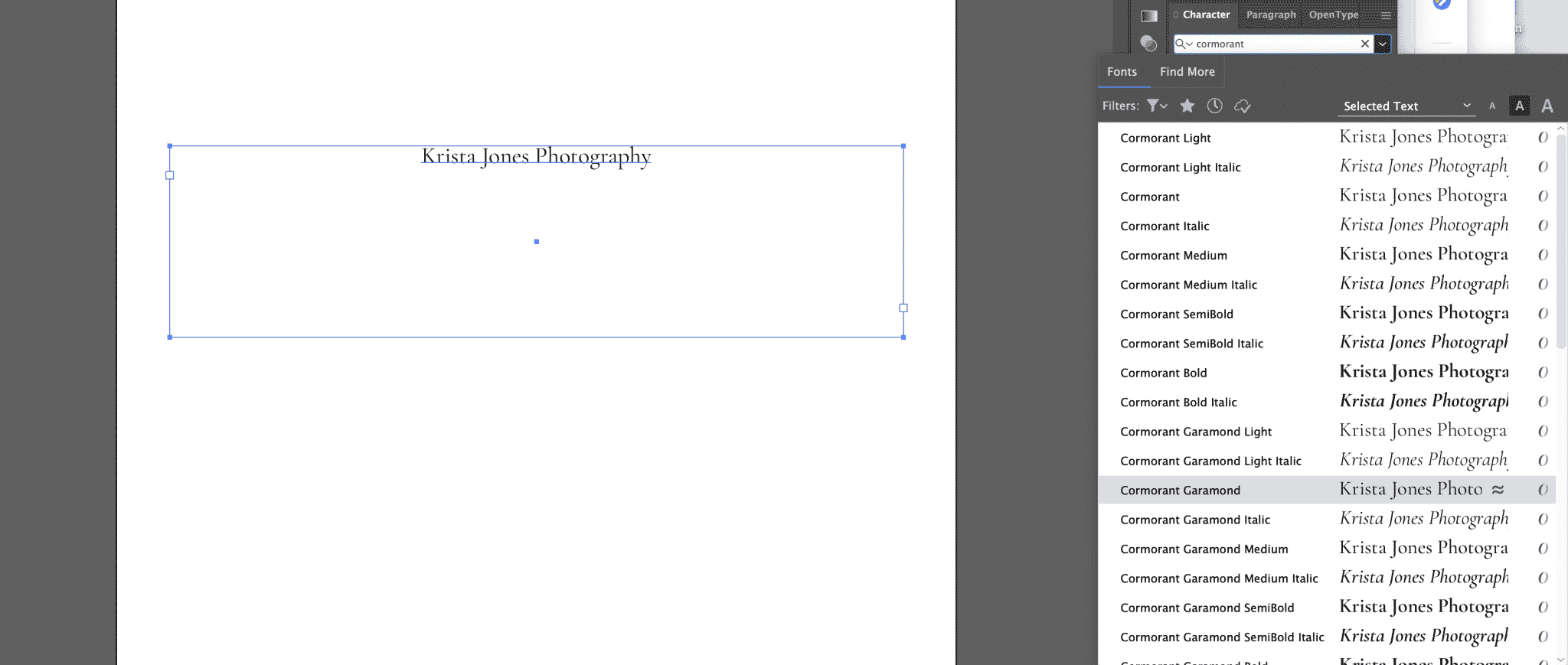 Select the
  icon in the Character palette and turn on “more options”.
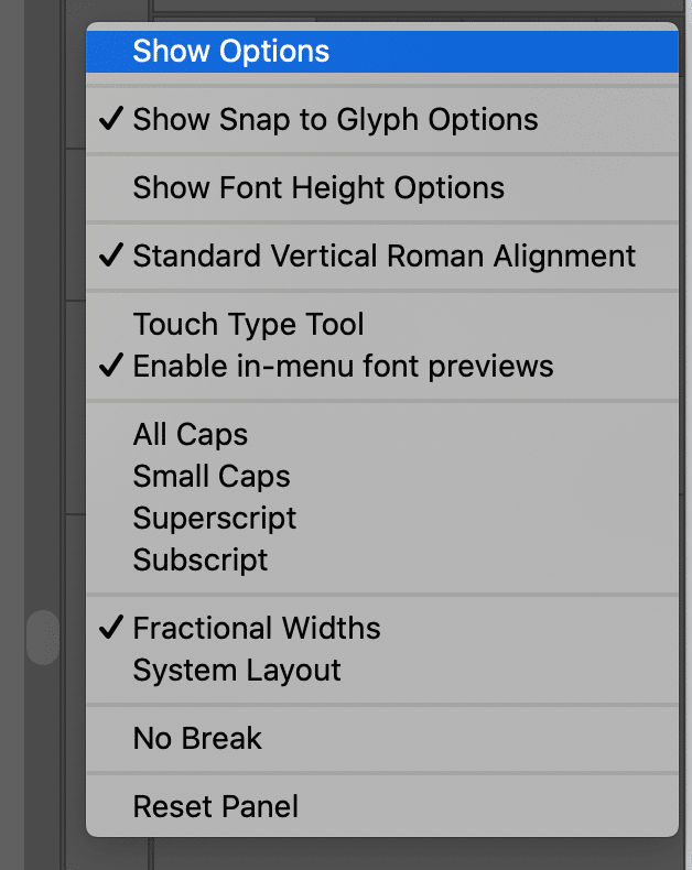
- From here, we can play with a few settings such as letter spacing, capitalization and more.
Check out my settings here:

While you’re creating it’s important to remember the overall feel that you would like your brand to have. Using all caps like I am in this example makes a logo feel more formal, high end and elegant whereas using lowercase or sentence case characters will give a logo a more casual look.In this logo, I increased the font size, adjusted the letter spacing to 75 and set the text to be all caps.
But personally I think that this text is too long and I don’t think that the word “photography” needs to be emphasized as much as my name.So I’m going to copy and paste the text box and adjust a few more settings:
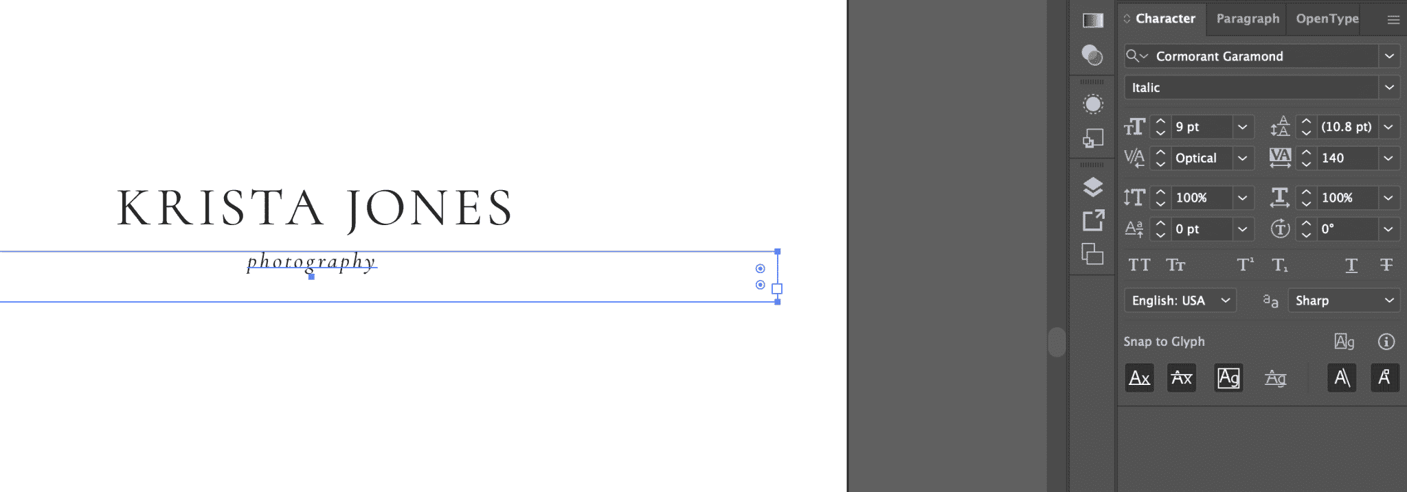
- I set the word “photography” on its own line, changed the characters to be all lowercase, made the text italic, reduced the font size and set the letter spacing to 140.
Similar settings may or may not work for your logo depending on the length of the words you’re adjusting, your font and other variables, so I would always focus on what looks good over copying my settings exactly.If you would like to add color or an icon or some sort to your logo, now is the time to do so, but for tutorial purposes I’m going to keep this logo very simple.
Once you’re happy with the look of your logo, it’s time to prep your file for export. The first thing we’re going to do is convert our text to outlines. This means that the text is no longer editable but it’s an important step if we want to create an SVG version of your logo and use it on your website.
Select your text and then go up to “Type” in the top menu and select “Create Outlines”.
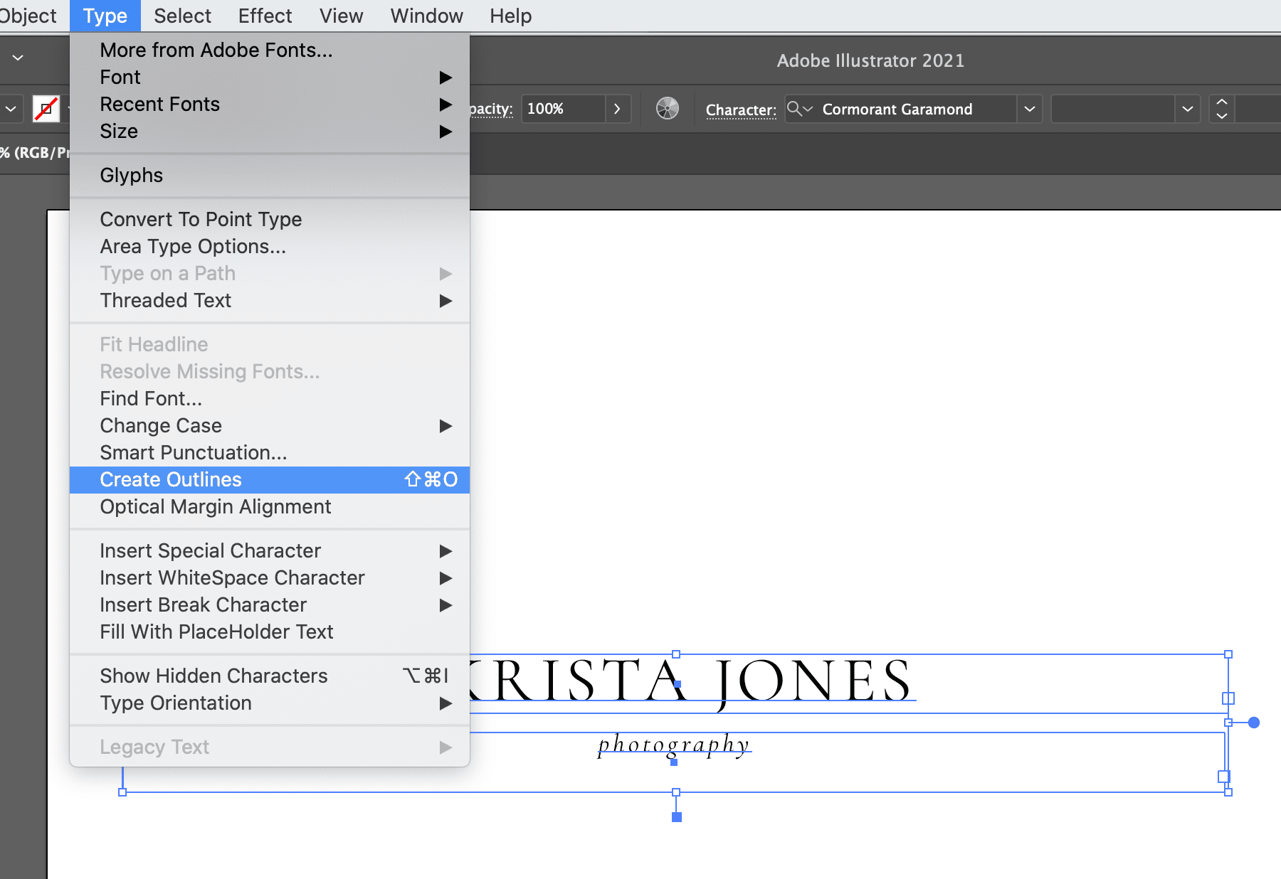 You’ll know this was successful when you click on your text but can no longer edit it.
 - Next we’re going to get rid of the extra space on our artboard by adjusting the size. Make sure you’re not clicked on anything on the canvas, and then select “Document Setup” at the top.
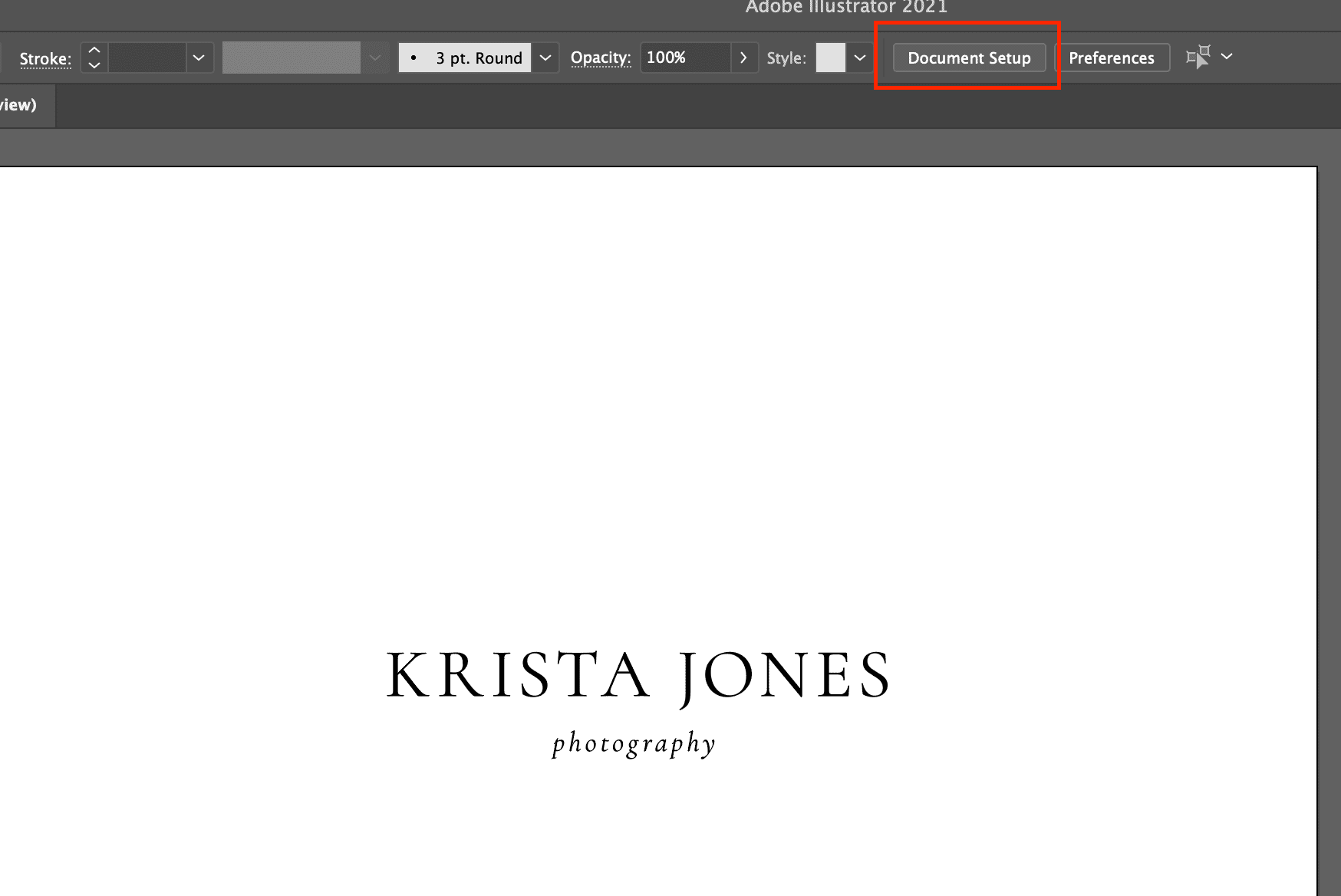 Select “edit artboards” from the module that pops up.
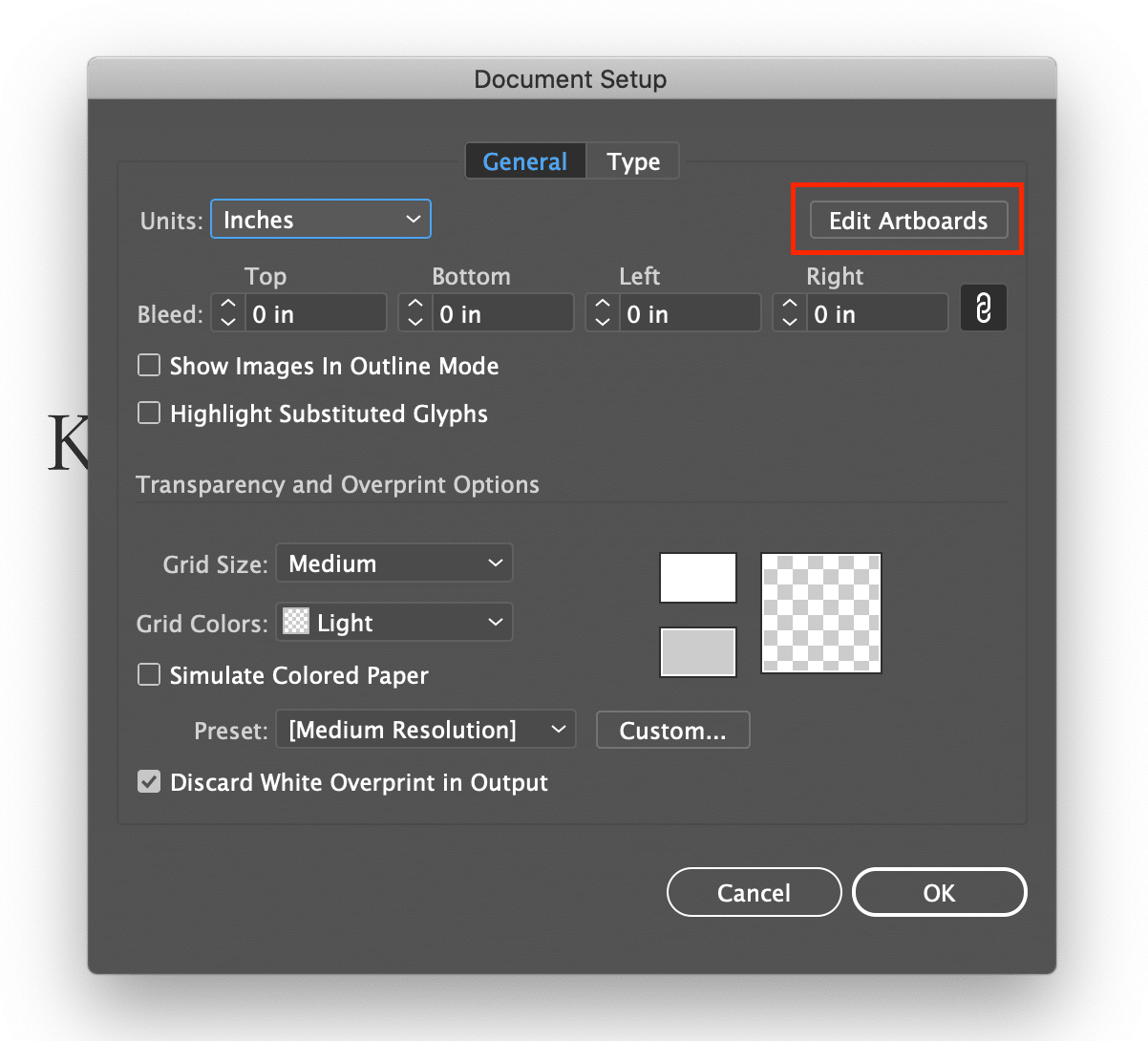
You should see that your artboard is now highlighted. From here you can move the sides of the artboard and get rid of all the extra white space in your doc.
If you skip this step, some of your files will export with all that extra space around the logo and they’re going to be very challenging to work with.
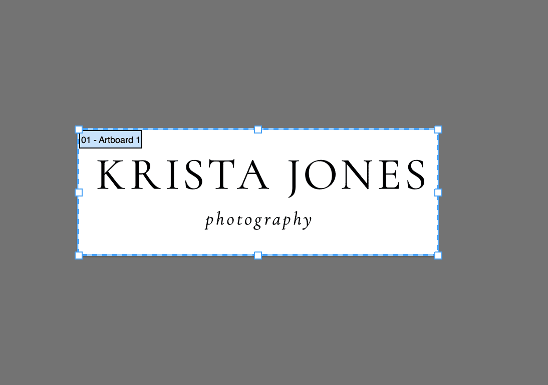
- And now we’re ready to export our files!
First, go to “File” in the top menu and select “Export for Screens”.
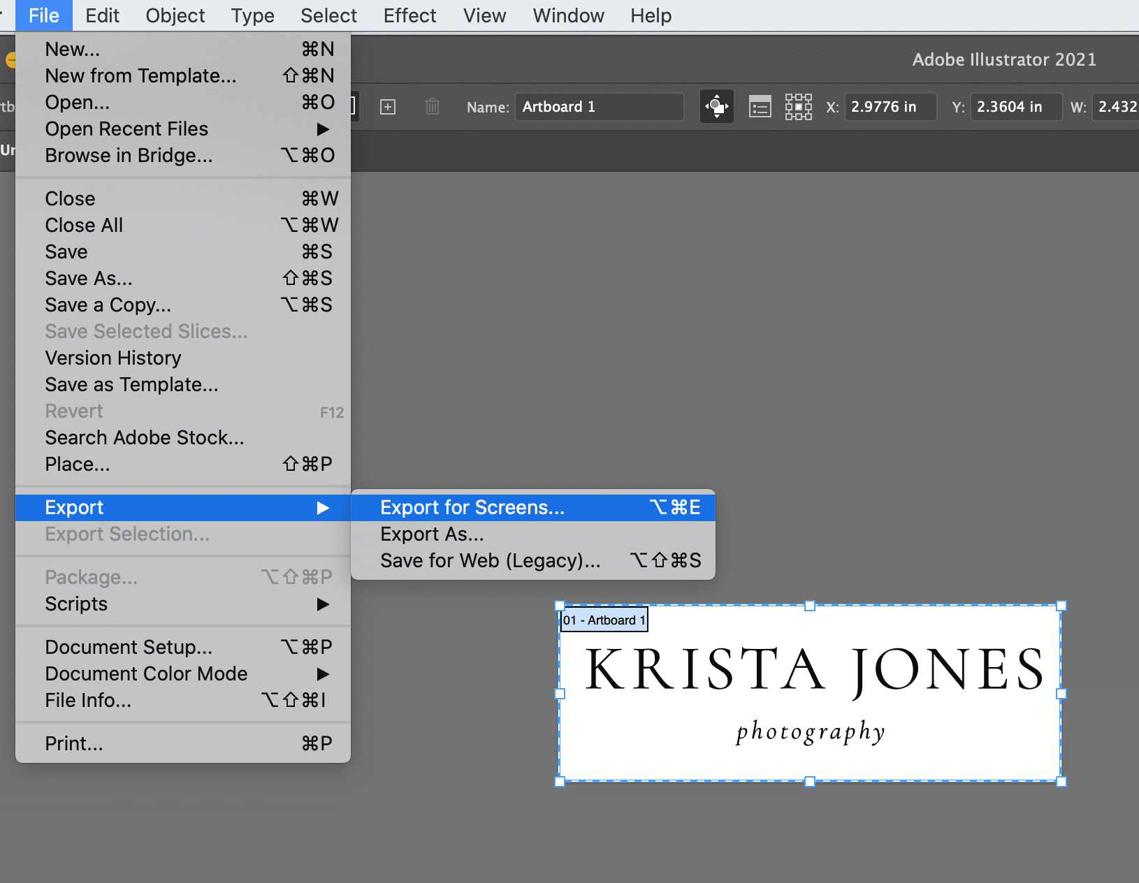
Make sure your artboard is selected, set up the folder where you want these files to go and then I recommend exporting at the following settings:PDF – This is good for print or for situations where you need a high resolution logo. PDFs retain the vector version of your file – which means they can be scaled up and down without losing quality. While you won’t be able to edit the text, you can adjust the colors and spacing in a PDF later.
JPG 100 at 10x scale – You can manually adjust the scale of the file being exported by typing in a number. When we export JPG files, we make them large because while you can scale a JPG file down without losing quality, you can’t scale it up later without increasing the pixelation. We always try to export JPG files at a large size. JPGs will automatically export with a white background (they can’t be transparent). They’re often used on the web although not as often as PNG files these days.
SVG – Like PDFs, SVG files are vector – which means that the elements in your file could be opened up in Illustrator again and adjusted. They can be used for print or the web. Personally, we like to use them on websites where possible because they will give you much more crisp files than a PNG or a JPG on a website – especially if your logo contains text. Not all website platforms will allow you to use an SVG file, but Showit will and WordPress/Elementor will if you add the file directly to the media library first. If you’re adding your logo to your website and have the option to use an SVG, that would always be our first choice.
PNG at 10 scale – Like with the JPG files, we want to export PNG files at a large size because they cannot be scaled later up without losing quality/resolution. Unlike with the JPG file, the background of this file will be transparent so it’s a great choice for websites that don’t support SVG files, email footers, etc.
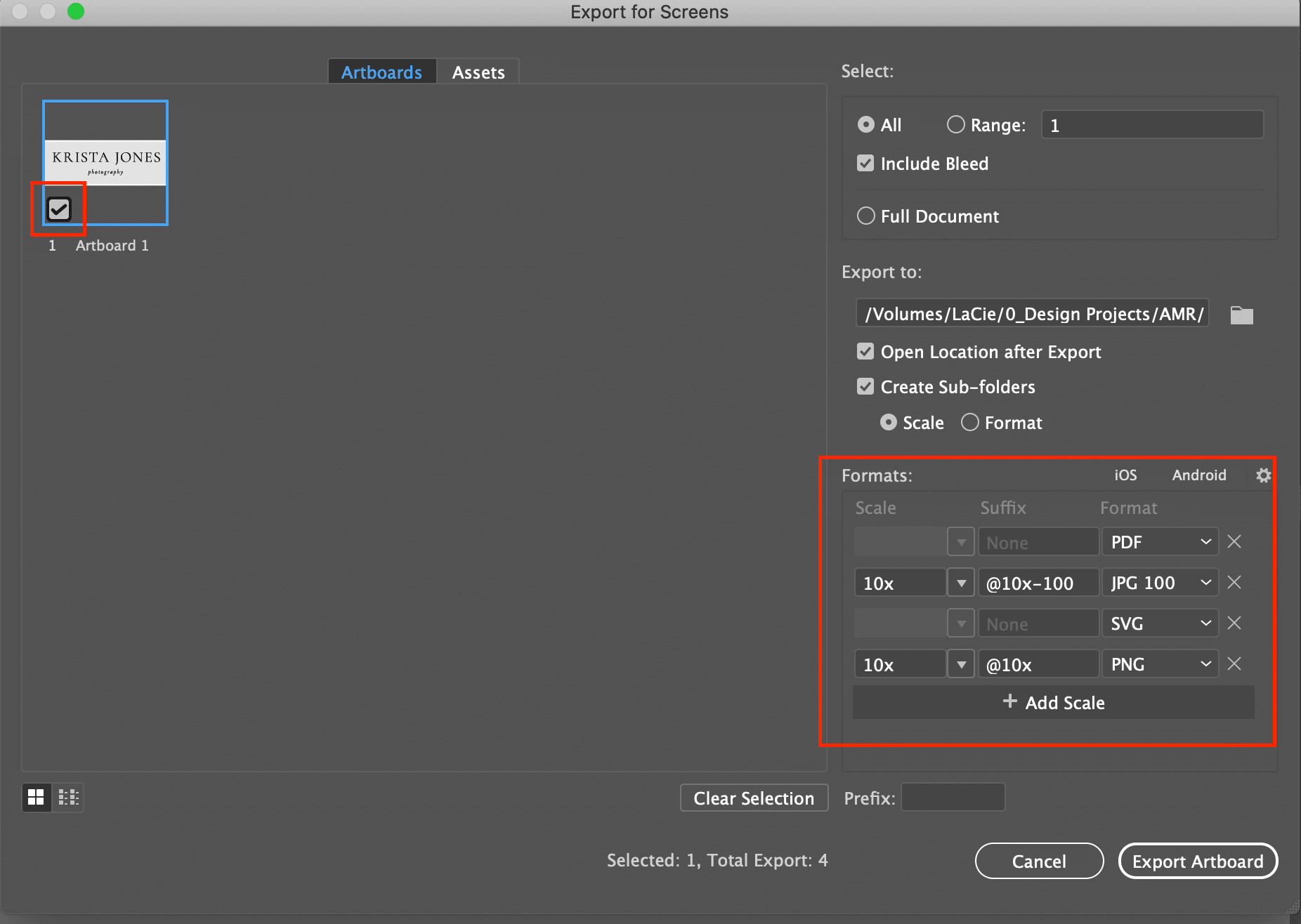 Once you’ve adjusted the file formats, hit export, navigate to the folder you selected or created and you should see a few folders with your various files inside. Congratulations – you’ve created your first logo!

- Open Adobe Illustrator and create a new document. Size doesn’t make a big difference here so we’ll create a 6×6 inch document for now.
Creating a Simple Logo in Canva Pro
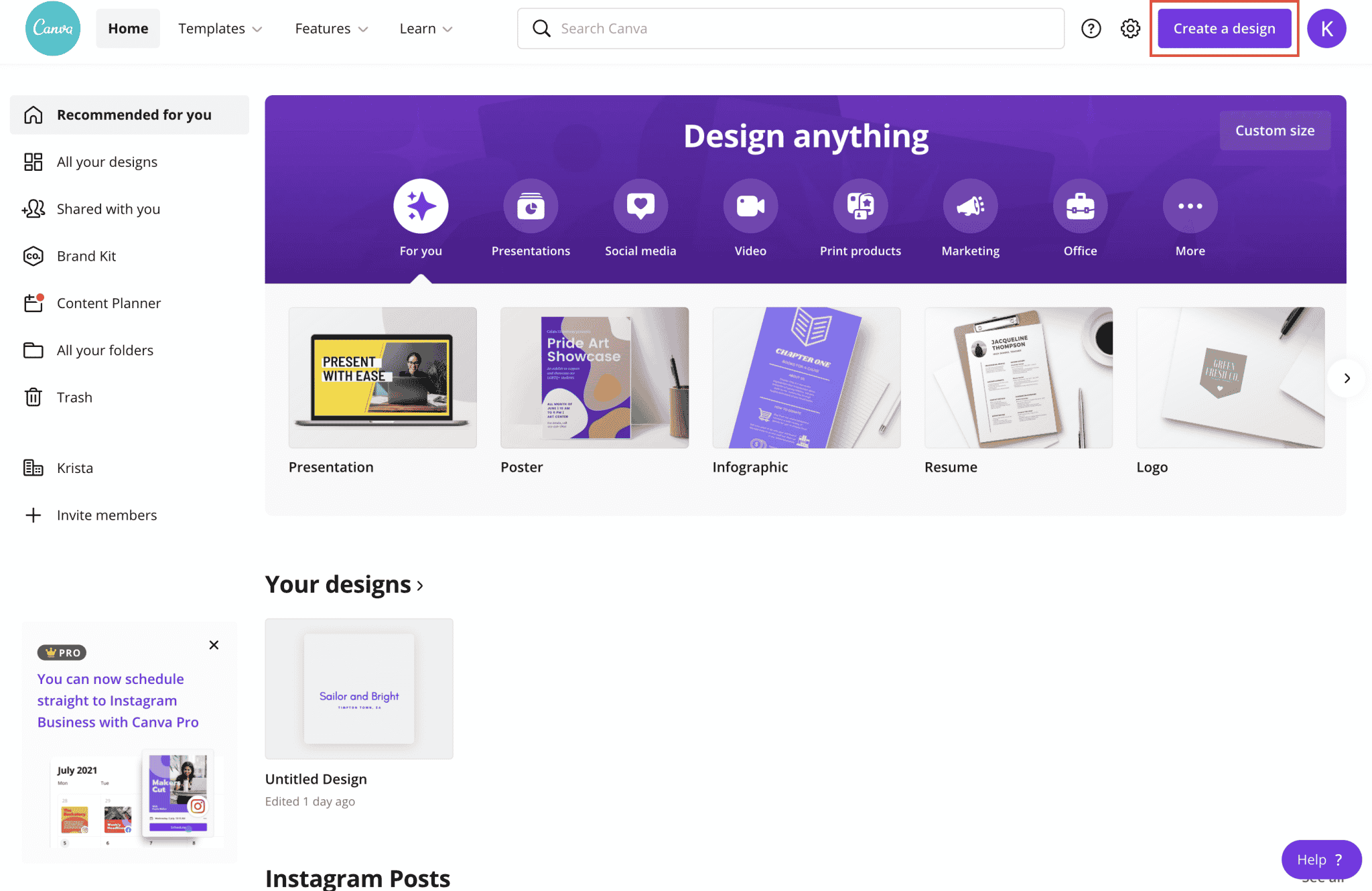
- Click “Create a Design” and navigate to “logo”.
- Select “text” from the left side and then “add a heading”.
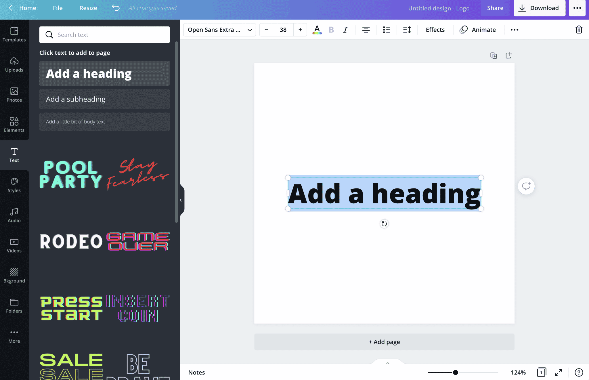
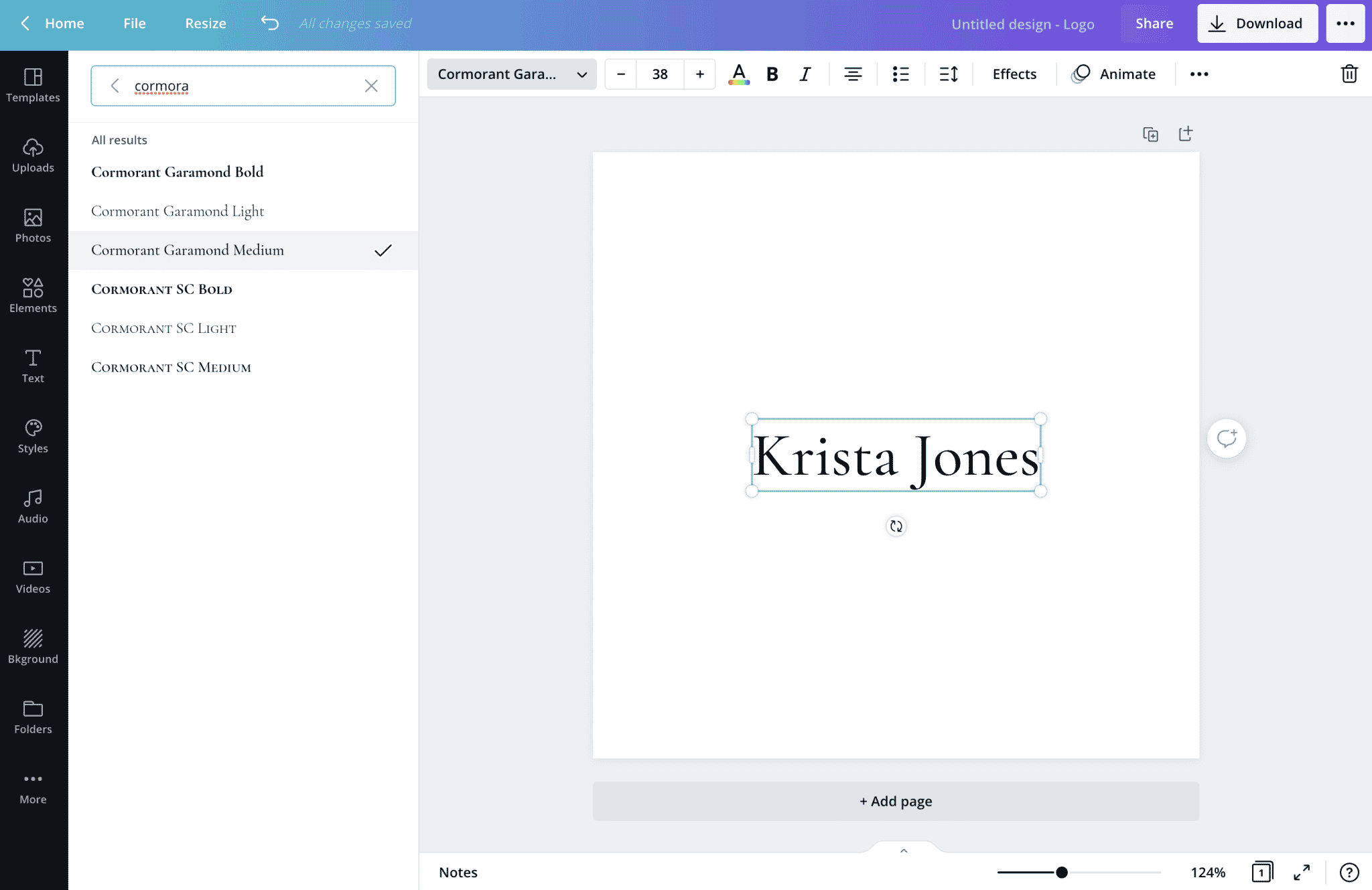
- Type your business name and in the upper left corner, select your font. In this demo, we’re going to use Adobe Illustrator.
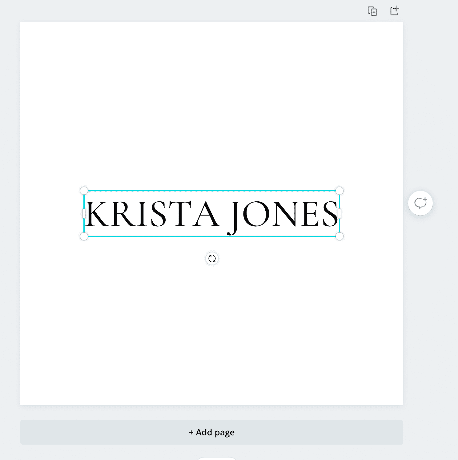
- Let’s go ahead and retype our name so that it appears in all-caps.While you’re creating it’s important to remember the overall feel that you would like your brand to have. Using all caps like I am in this example makes a logo feel more formal, high end and elegant whereas using lowercase or sentence case characters will give a logo a more casual look.
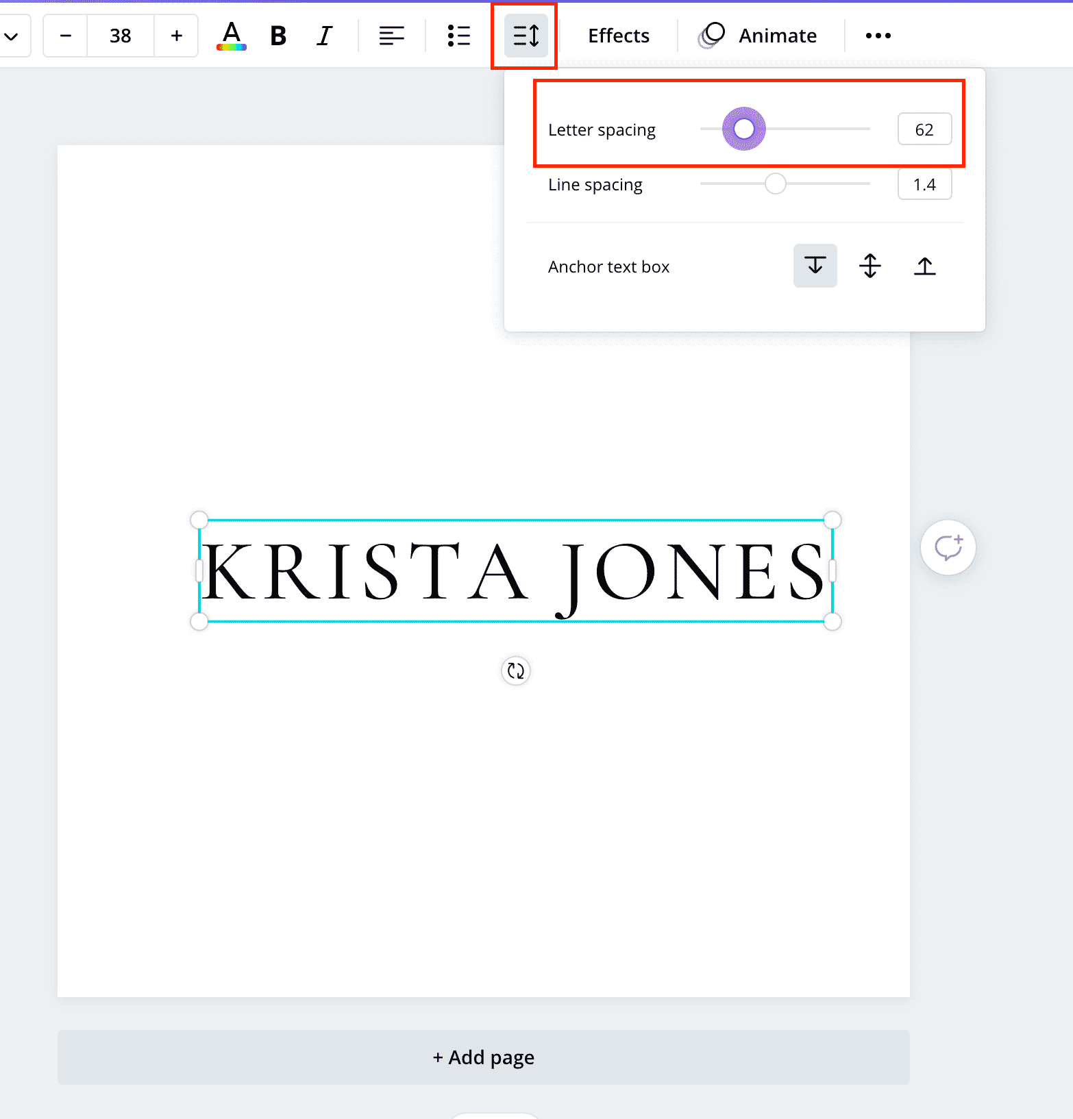
- Next we’ll select the “Spacing” button and increase the letter spacing a bit. We set ours to 62, but the exact amount that looks right for your logo may vary depending on your characters, your font and whether you’re using sentence case, lowercase or all caps.
- Next let’s duplicate our text box.
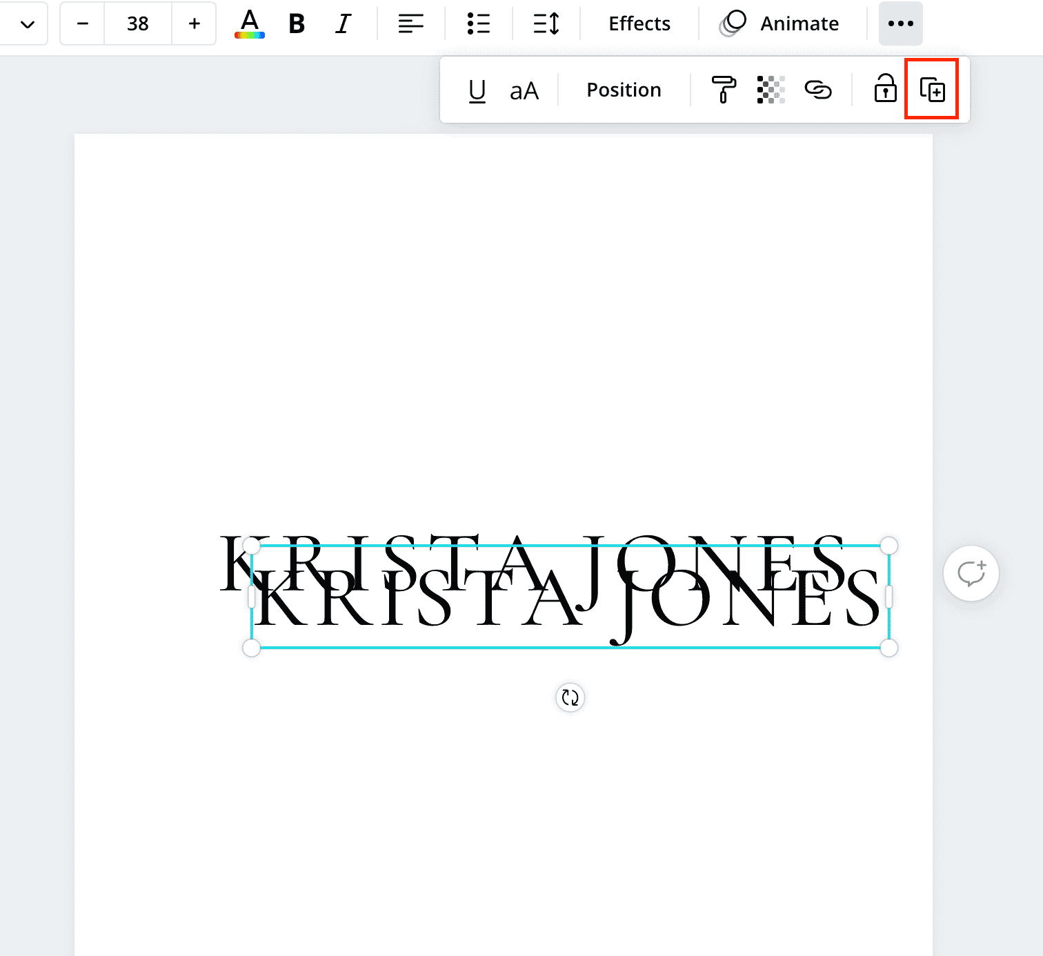
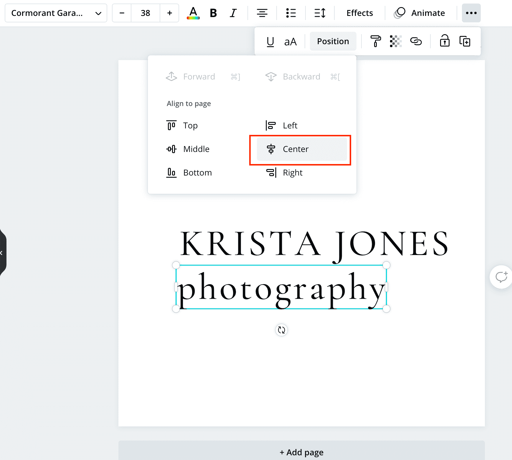
- We’ll type “photography” or a secondary word, center the text and then center it on the page.
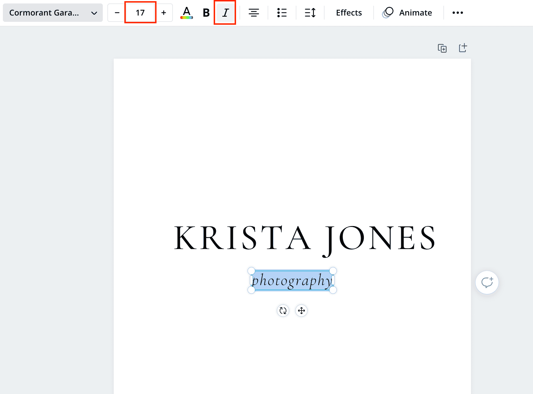
- We’re going to make our text smaller and italic, but feel free to experiment with using a complimentary font. If our main text were a serif (like in the example above,) it might be nice to use a sans serif font (such as Montserrat or Questrial).If you want to take your logo a step farther and adjust colors or add icons, now is the time to do so. But for demo purposes, we’re going to keep ours simple.
- Next we’re going to adjust our canvas size to make sure there isn’t too much extra white space in the doc. If we were to export our file right now, it would give us a file with a lot of white space around the text and it would be challenging to work with.
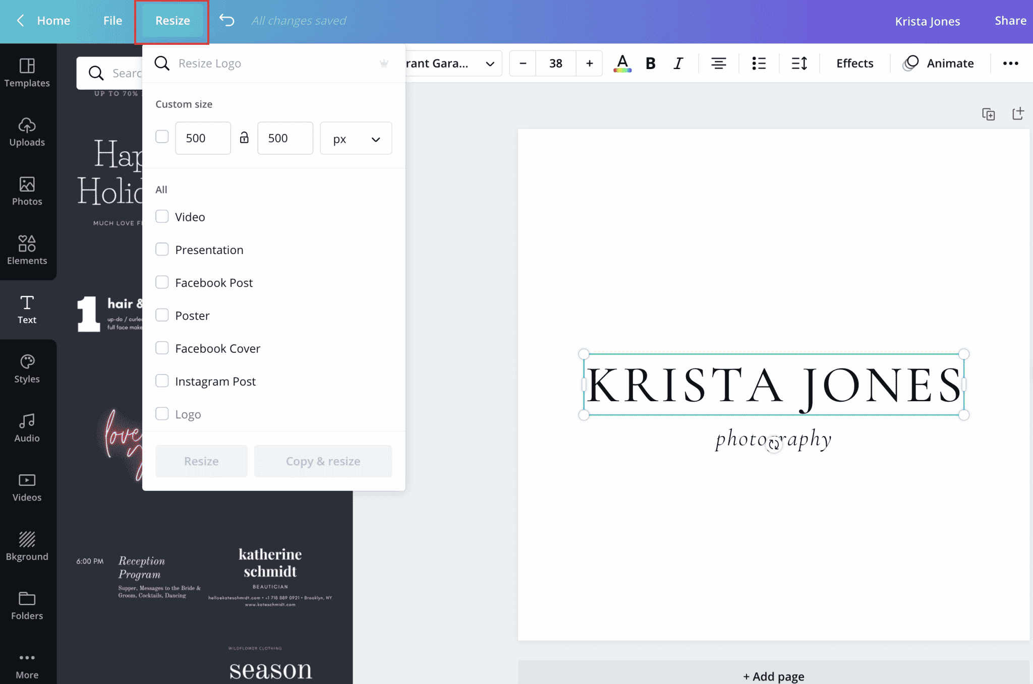 The size document that works best for your logo will vary on the style of your logo, but ours should work well at 500×200.When you’ve added your dimensions, click “Resize”.
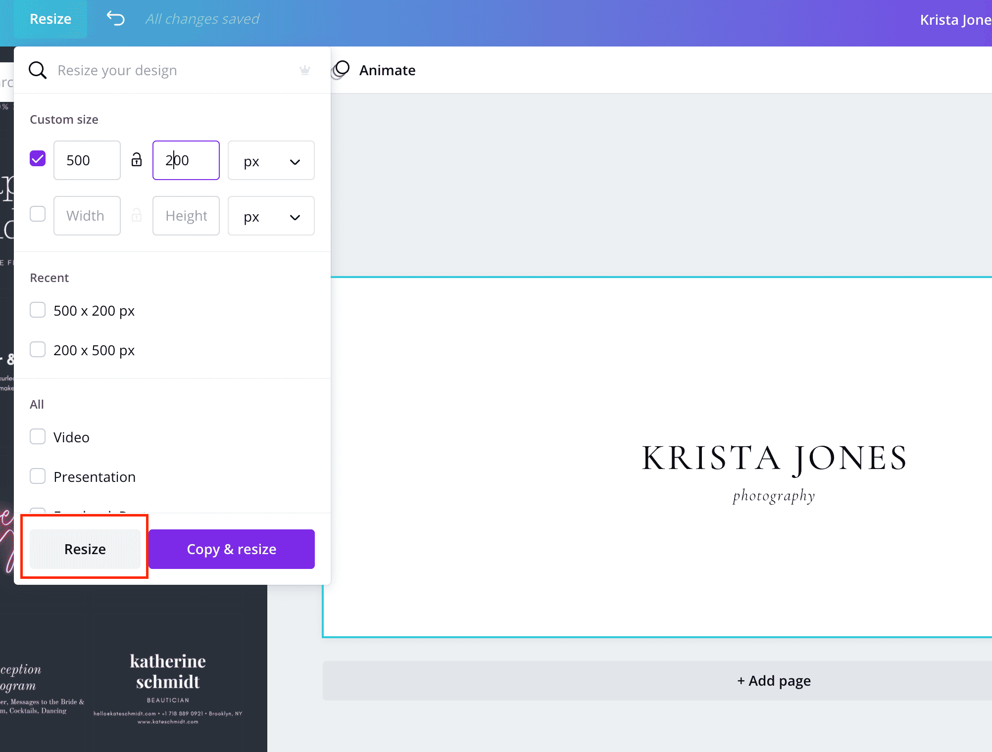
- Our logo still needs to fill the space better so we’re going to select both bits of text and drag it to a larger size from the corner.
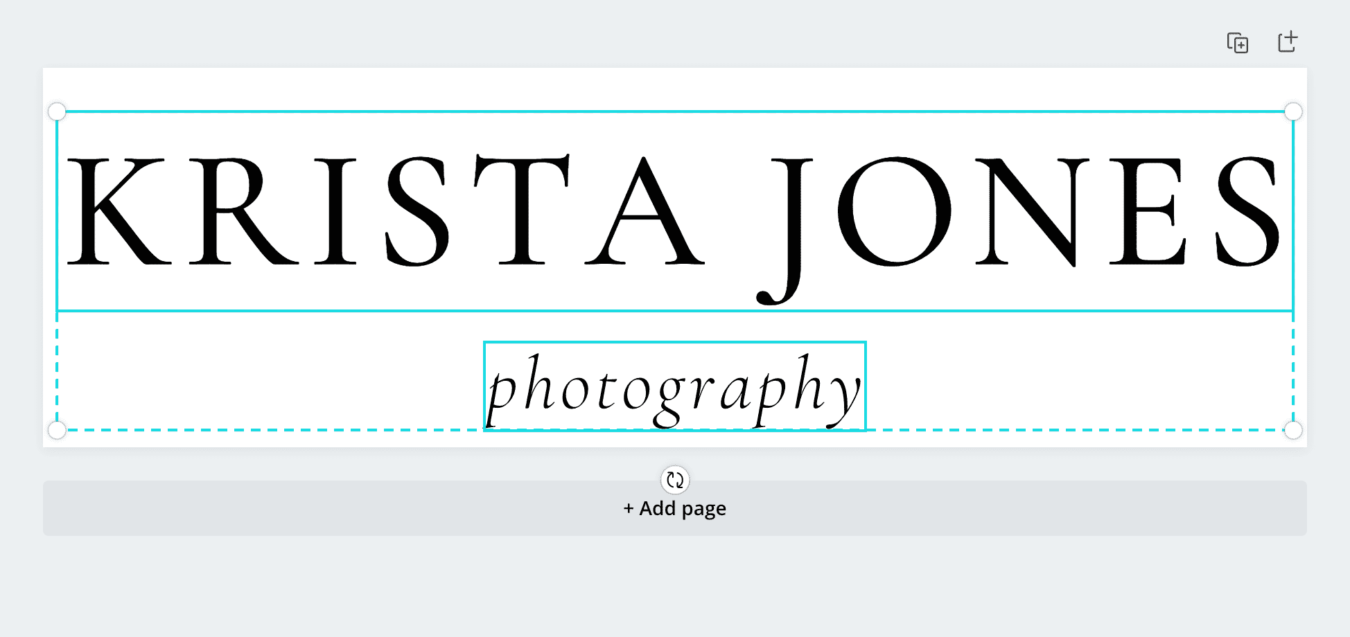
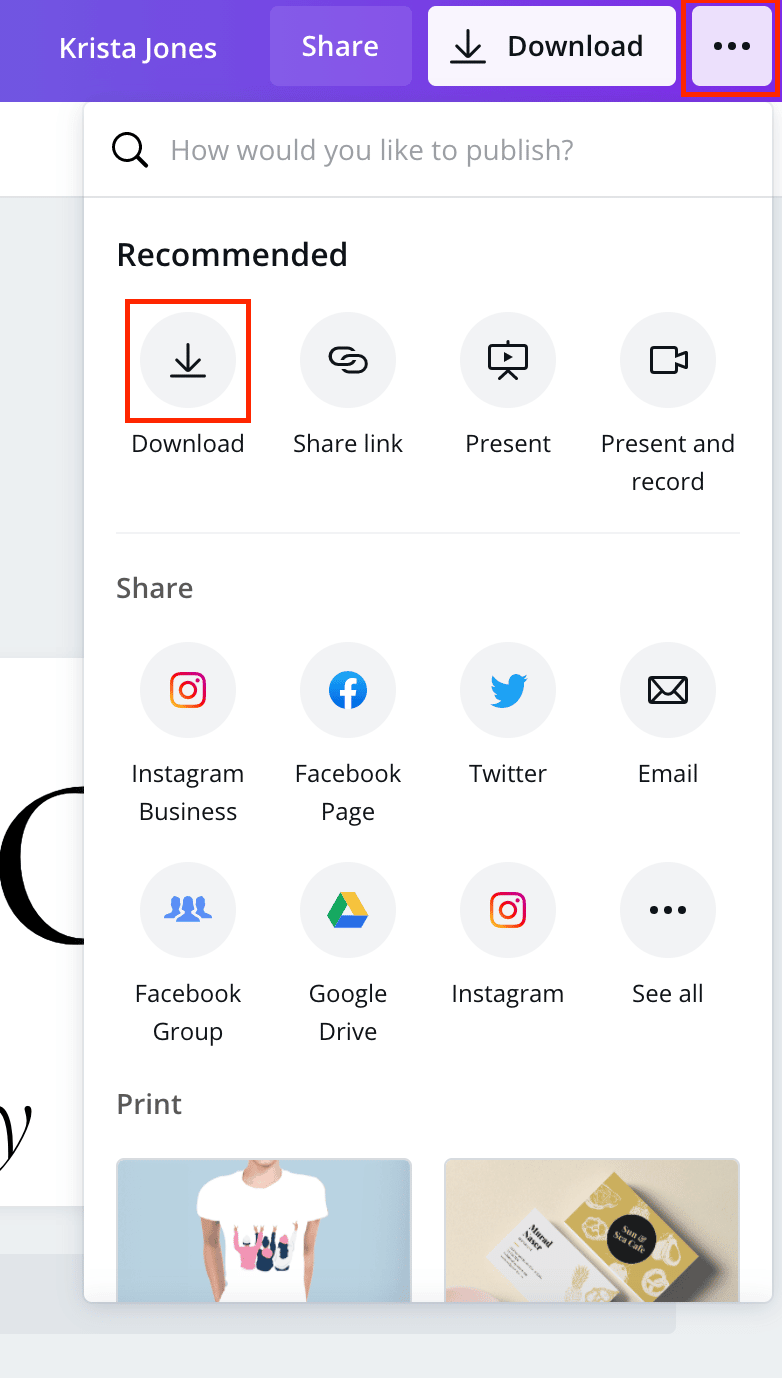
- Once the size is set, it’s time to export. Select the three dots from the upper right hand corner or click “Download”.
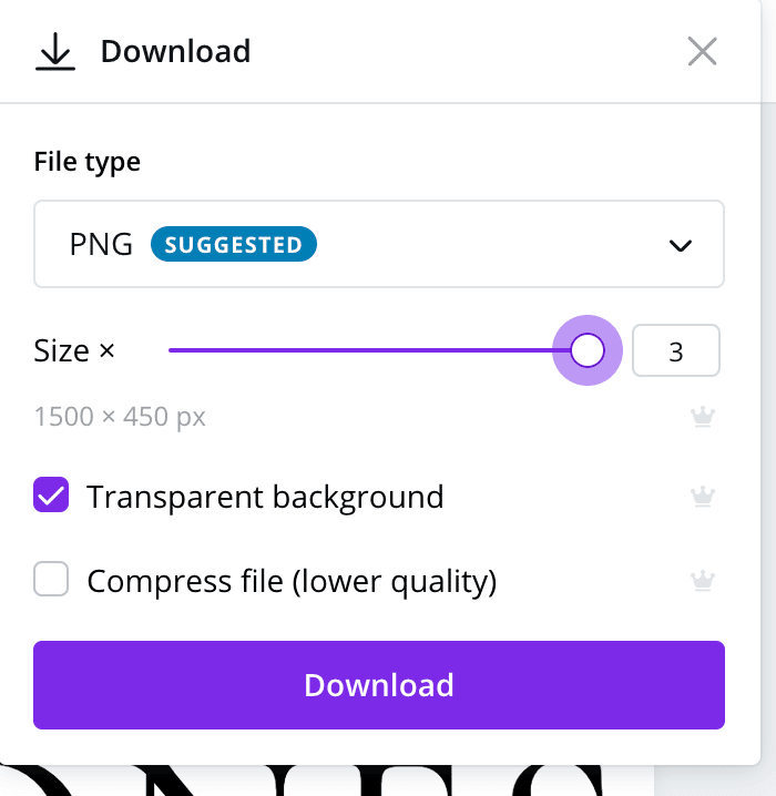
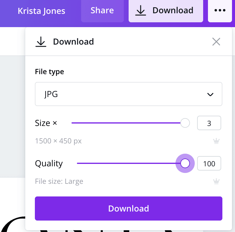
- We’re going to export your logo a few times with a few different settings to make sure you’re set for all situations.PNG, transparent at a larger size – We want to export PNG files at a large size because they cannot be scaled later up without losing quality/resolution. Unlike with JPG files, the background of this file will be transparent so it’s a great choice for websites that don’t support SVG files, email footers, etc.
JPG, at a larger size with the quality at 100 – When we export JPG files, we make them large because while you can scale a JPG file down without losing quality, you can’t scale it up later without increasing the pixelation. We always try to export JPG files at a large size. JPGs will automatically export with a white background (they can’t be transparent). They’re often used on the web although not as often as PNG files these days.
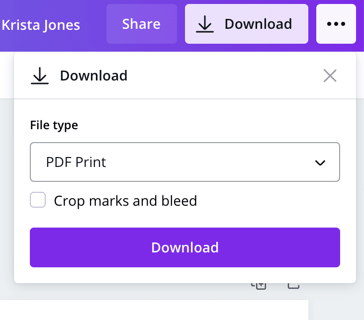
PDF – This is good for print or for situations where you need a high resolution logo. PDFs retain the vector version of your file – which means they can be scaled up and down without losing quality. While you won’t be able to edit the text, you can adjust the colors and spacing in a PDF later.
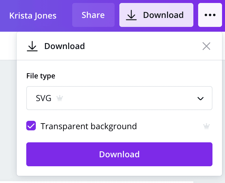
SVG (with transparency) – Like PDFs, SVG files are vector – which means that the elements in your file could be opened up in Illustrator again and adjusted. They can be used for print or the web. Personally, we like to use them on websites where possible because they will give you much more crisp files than a PNG or a JPG on a website – especially if your logo contains text. Not all website platforms will allow you to use an SVG file, but Showit will and WordPress/Elementor will if you add the file directly to the media library first. If you’re adding your logo to your website and have the option to use an SVG, that would always be our first choice.
- And that’s it! Once your files are exported, you can start using them on your website, business card, social media and more!
You can do a lot with a very simple logo and a vision for your brand, but if you want a little more hand-holding when it comes to branding, check out our semi custom and custom brands.
Questions? Feel free to leave a comment below!
VIEW THE COMMENTS
Add A Comment