


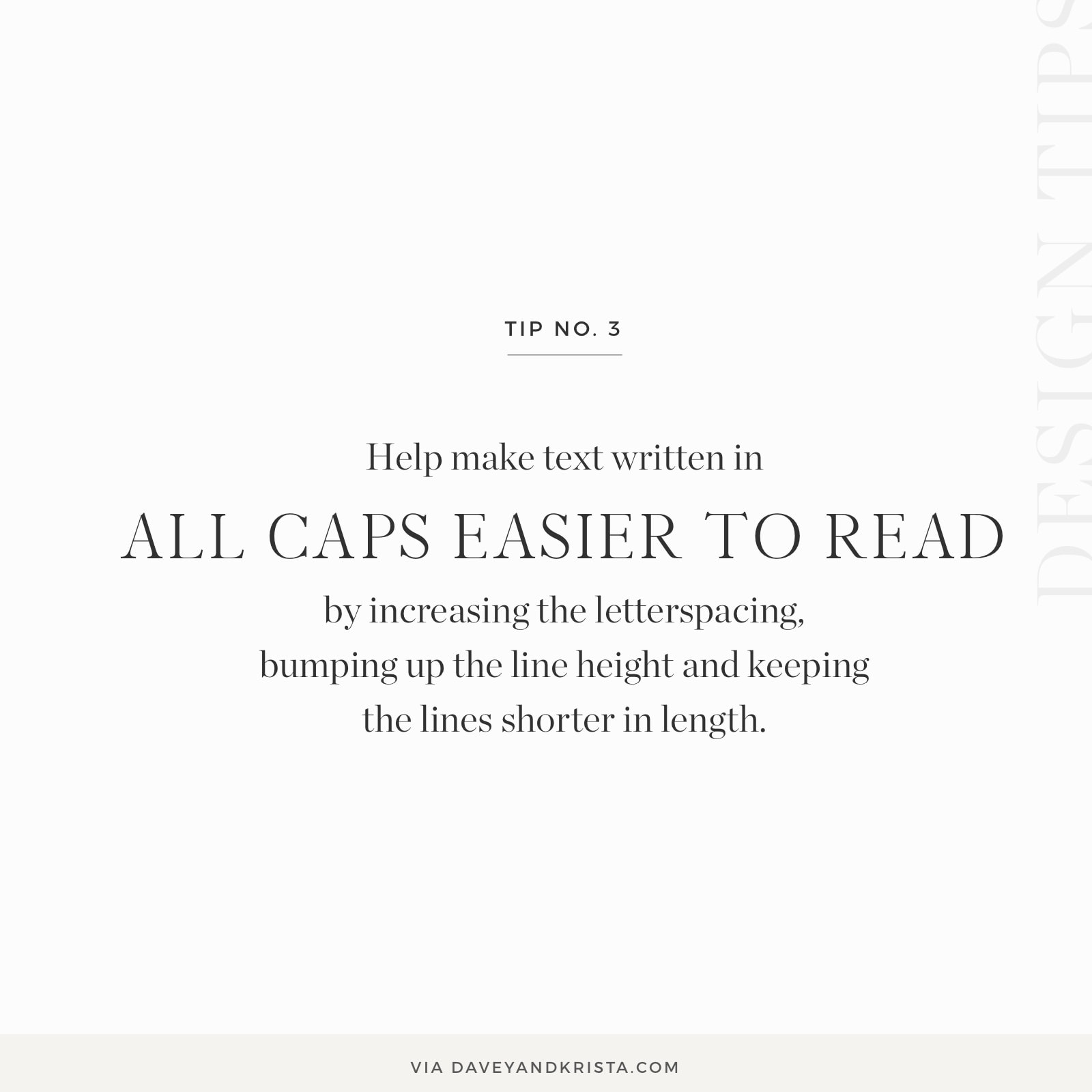
Text written in all caps can be difficult to read. We love the look for headlines and short bits of text as it can feel refined and elegant, but it’s easy to overdo it and make that text more difficult to read.
If you’re going to write text in all caps, it’s normally best to keep the text shorter (such as headlines and subheads). Writing entire paragraphs in all caps would be very hard for readers because the eye needs the white spaces and up and down strokes in lowercase letters in order to skim through words more quickly. Caps tend to be more blocky and without that white space, it’s harder for the reader to go through it quickly.
Increasing the size, letterspacing and line height of text written in all caps can go a long way towards making it more legible. It’s also helpful to keep any lines written in all caps shorter.

Krista is the co-founder of Davey & Krista, a creative studio known for high-converting Showit website templates crafted for photographers, creatives, and entrepreneurs. With over 15 years of branding and marketing experience, she helps business owners launch stunning websites without the tech overwhelm. Krista also teaches designers how to turn their creative skills into a thriving business—through templates, courses, and behind-the-scenes strategy. When she’s not designing, you’ll find her chasing sunshine, color palettes, and gluten-free pizza.
Explore website templates and free resources at daveyandkrista.com.


VIEW THE COMMENTS
Add A Comment