


Introduction
If you’ve ever had to select a font for any kind of text, you know there are a lot of options. A lot of options.
And for a good reason: Fonts are a part of the aesthetic of any digital or printed words, setting the tone and establishing the personality behind the copy that will ultimately be read by the target audience. Fonts convey a certain message, and selecting the right font is a big part of your branding efforts and creating the right user experience.
That’s why font is one of the many aspects you need to consider when designing your website. The right font can help elevate your brand, whereas making a mistake and choosing the wrong font can hinder it completely.
Don’t let that idea be intimidating though. We’ve compiled a few of our top tips for choosing the right fonts for your website, as well as our thoughts on the overall effect your font choices will have on your branding.
The Basics of Typography and Web Design
What is Typography?
You might have heard the term typography before and considered it synonymous with font. Although font is an important part of typography, the big-picture concept of typography is something more inclusive. It refers to all aspects of lettering, from the font itself to the size of the text, the spacing between letters, the spacing between lines, the length of each line of text, and even the color of the text.
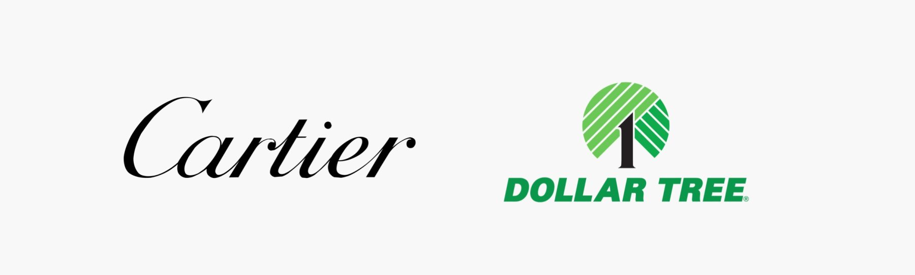
In short, when you look at text on a webpage or printed page, every aspect of those letters and how they are laid out has (ideally) been considered very carefully. This is because typography, like the color of your background or logo, conveys a specific message. Think of the chic script-like text used for the luxury jewelry brand Cartier. Simply by looking at the text, you can tell that it’s about elegance and sophistication. Compare this with the capitalized block letters that Dollar Tree uses, conveying simplicity and practicality that’s much more accessible to the average consumer. These two styles of typography couldn’t be more different, but they’re attractive to the target audience who would patronize their respective brands.
Core Elements of Typography
If you’re like most people, you probably use the terms typeface and font interchangeably, but there’s a subtle difference. Typeface refers to the actual shape of the letters; on the other hand, font describes the width and weight of those letters, which could vary from thick and bold to lightweight and italicized.
It’s also important to think about the highest and lowest points of your text. Most of your text will run along what’s known as the baseline, but parts of the letters could extend above or below this. A lowercase h or b, or even the dotted tip of a lowercase i or j, could go above the baseline, and these high points are known as ascenders.
In contrast, you have lowercase letters like g or p, with their parts that hang below the baseline, referred to as descenders. Your ascenders and descenders will determine how tall your actual typeface is, as well as how much space you might need to have between your lines for optimum readability.
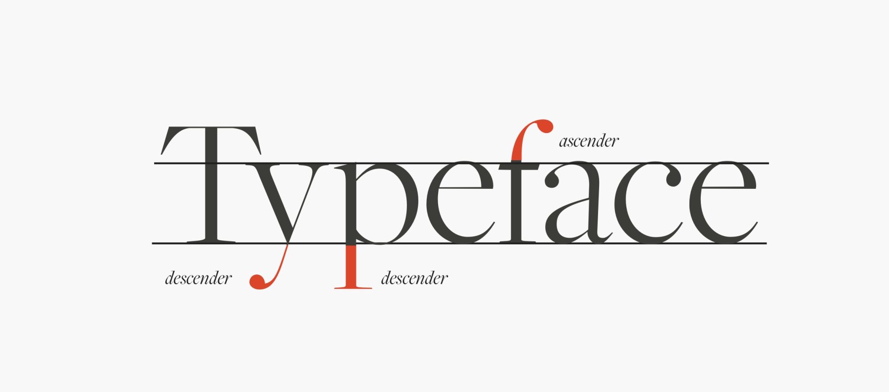
Then you need to consider whether you want a typeface that uses serifs or not. Serifs refer to the little end parts that extend off the strokes of letters. Sans-serif fonts don’t have these, giving them a cleaner, simpler appearance. Serif fonts tend to reflect a more classic aesthetic, and they’re easier to read when printed out on the page. Hence, many books will use serif fonts.
But sans-serif fonts tend to be more legible in many other places, such as signs or screens, which is why sans-serif fonts are often preferred by brands for marketing purposes and website body copy.
Factors to Consider When Choosing Fonts
Even the best copy on your website isn’t going to get the full effect you want it to if it’s written out in the wrong typeface and font. As with every other aspect of branding, you need to make an informed and careful choice.
Here’s what we tell people about choosing the best font:
Readability and Legibility
Probably the most important aspect of your font is readability. You want a font that people can sweep their eyes across and process the words without a lot of stopping and struggling. Size, space, and weight will all play a role in this readability factor, because some fonts might be easy to read at a regular weight with average space between the letters, but as soon as you give them a heavier weight and try to squeeze them together, they become muddied.
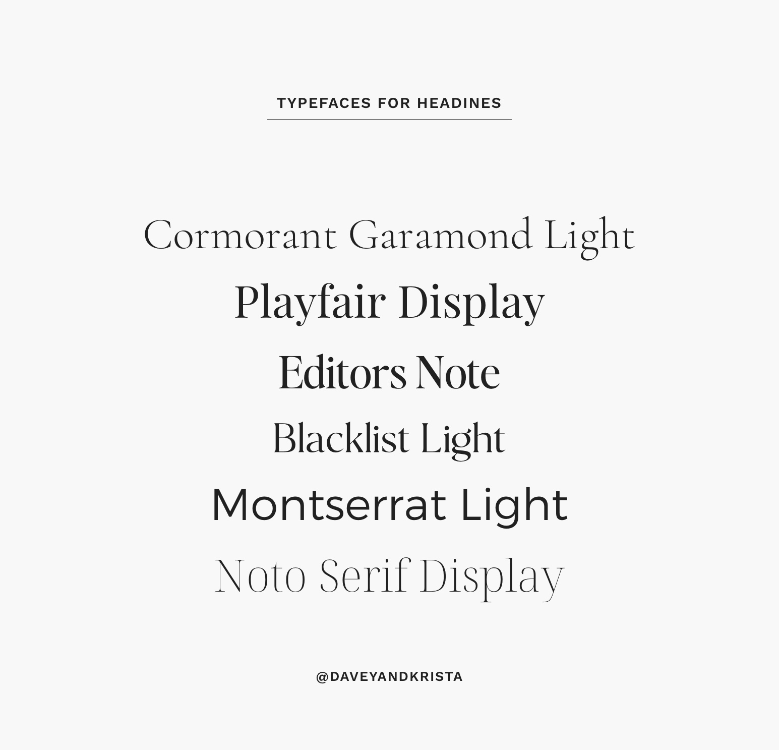
Different fonts will lend themselves to headers and body text. Think about it: A header is usually fewer words and a much larger size, whereas body text is smaller and can run line after line after line. Generally speaking, thinner fonts work better for headlines. Consider such typefaces as Cormorant Garamond, Playfair Display Light, Didot, and Montserrat Light.
For body text, strive for a typeface that has a little more weight, which will make the individual letters stand out and make it easier to read without too much eyestrain. Work Sans, Montserrat Medium, and EB Garamond are all great options for body text.
Brand Identity and Tone
After you consider the readability factor, the next thing you’ll focus on is the personality a font conveys. Remember what we said about Cartier and Dollar Tree? Now’s your chance to think about the personality you would ascribe to your own brand, and which typefaces might be a good option for conveying that.
Consider some of these personalities you might want to express, and the typefaces that could be effective choices:
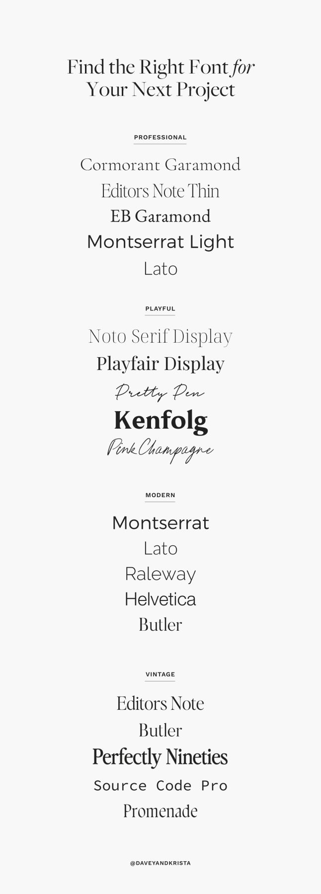
- Professional: For a professional tone, look at typefaces like Cormorant, Editor’s Note, EB Garamond, Montserrat, and Lato.
- Playful: Most script-style typefaces tend to be playful, such as Noto Serif, Playfair Display, Kenfolg, Pink Champagne and Pretty Pen.
- Modern: Modern typefaces will have some overlap with professional ones, including Montserrat and Lato. Other modern options are Raleway, Helvetica, Open Sans, and Butler.
- Vintage: Depending on the exact era of vintage you’re striving for, you might be inclined to choose Editor’s Note, Butler, or Perfectly Nineties. Some scripts will lend themselves to a vintage personality, but be careful to choose one that doesn’t look too contemporary.
Compatibility Across Devices and Browsers
Unfortunately, not every font works online. This is becoming increasingly less of an issue as more browsers become capable of displaying all fonts, but it’s still something you may want to keep in mind as you design your website. The last thing you would want is to launch a website with text that can’t be read from some browsers or on some devices. Using Google fonts is a safe bet, as they work on a variety of devices and load quickly.
You also want to make sure that any fonts you’re using to embed on your website are correctly licensed to you. Most font retailers will offer some kind of web licensing, but a best practice is to hold onto a copy of the license in case you run into any problems.
To ensure you don’t run into any problems, always look at the font from different browsers and platforms before you launch your site. At a minimum, check on your computer and your phone to see whether all fonts are rendering correctly. This minimizes the risk of somebody pulling up your website and being unable to read any of your text because their browser or device doesn’t recognize the font. When your fonts are exported correctly, this won’t be a problem, though some of the oldest browsers out there—such as those on government computers or devices at public libraries—might have trouble.
Popular Font Choices for Websites
All of this gives you so much to consider. You probably never expected you were going to have to think this much about font, did you?
Well, we can help narrow it down a little bit. Here are some of the popular font choices that many brands use for their websites, so you know they’re a safe bet.
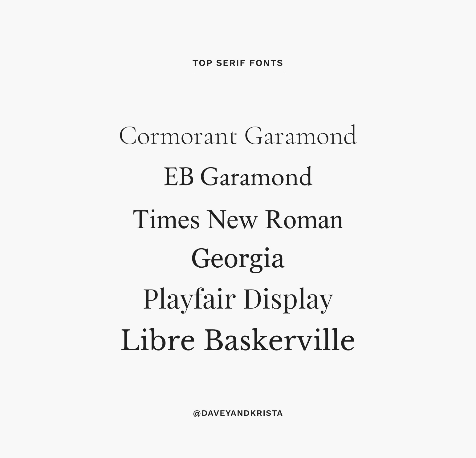
Top Serif Fonts
Consider fonts such as EB Garamond, Times New Roman, Georgia, Playfair Display, Libre Baskerville, and Cormorant Garamond. Because it’s always good to pair a serif font with sans-serif fonts (to use for headers, for example), consider a clean sans-serif like Montserrat or Questrial, or use our Positano design, which works especially well with Cormorant Garamond.
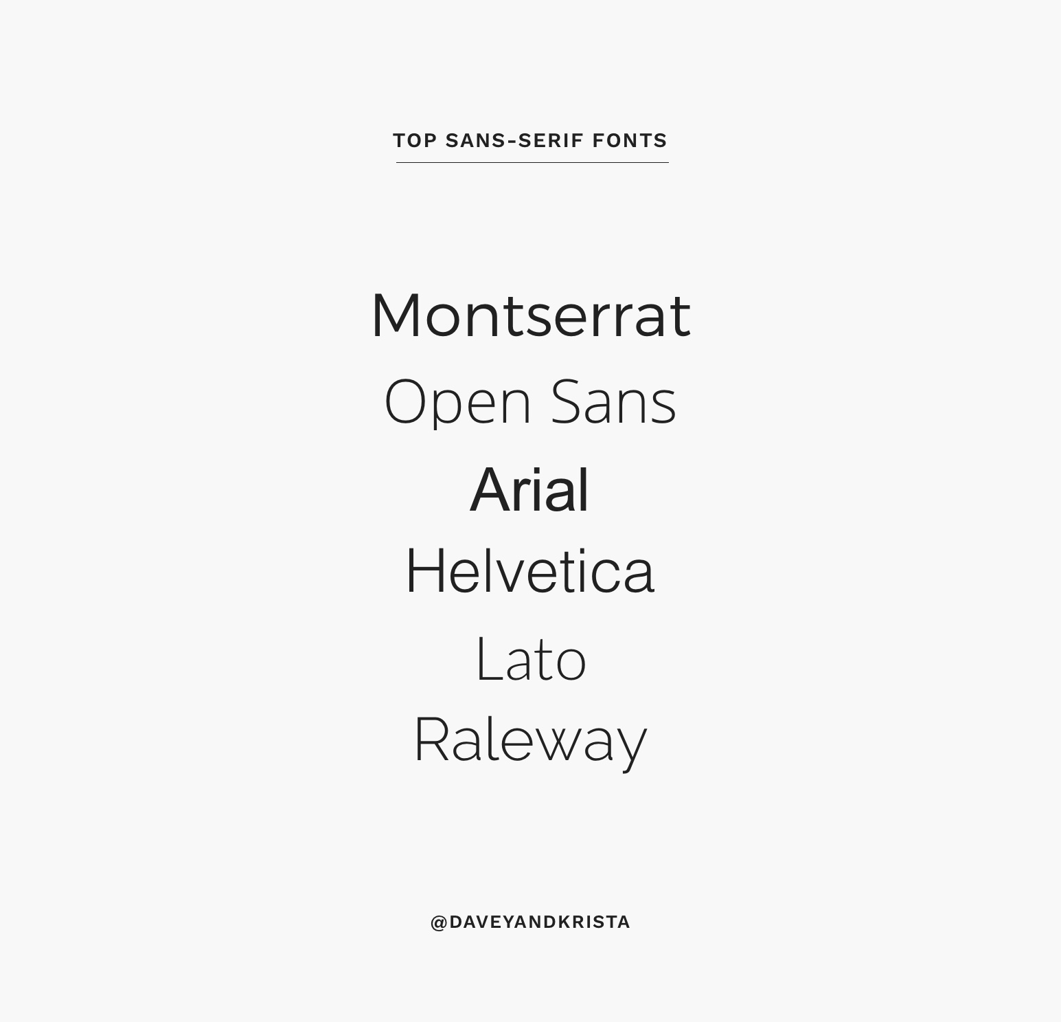
Top Sans-serif Fonts
Popular sans-serif fonts include Montserrat, Open Sans, Arial, Helvetica, Lato, and Raleway. Because sans-serif fonts are ideal choices for headers but may be tough for body text, you can pair these with a bolder serif font such as Playfair Display or our Cape Town design.
Unique Fonts for Brand Differentiation
Want something a little bit different? Standing out is great. Just remember that you never want to be so unusual that your text is hard to read. Our safe bets include just about anything from Jen Wagner Co. or Nicky Laatz. (We also have more detailed thoughts about choosing a good font here.)
Remember that the thinner your font is, the larger it will need to be displayed. Script fonts look nice, but they should be used sparingly—no more than a word or two. Finally, you can always play with letterspacing and line height to achieve the right legibility with certain fonts.
Font Pairing: The Art of Combining Fonts
Some things are great on their own, but they’re not a good combination with each other. That’s certainly the case with fonts. You need to make sure you’re being smart about the types of fonts you’re using together, or else the result could end up looking sloppy.
Principles of Effective Font Pairing
Font pairing is all about contrast and hierarchy. Fonts shouldn’t be too similar, just as you wouldn’t use similar shades of the same color. Stick to only two or three fonts so you can ensure cohesion, with one of them being serif and the other one being sans-serif. Your third font could be something you use for display text, such as a script font.
Font Pairing Tools and Resources
Want to see some fonts that look great together (along with an explanation of why they work so well, so you can apply that reasoning when you make your own choices)? We recently cultivated a lineup of our favorite free Google fonts and the best ways they paired together.
Implementing Fonts on Your Website
Got an idea of which fonts you want to use? Now it’s just a matter of implementation. When you’re building your website, you need a method of applying your chosen font to the copy you’re putting on the page. Here’s what to consider:
Using Web Fonts
A web font service like Google Fonts has a lot of benefit, mostly because this method is fast and the fonts are already built into platforms like Showit, Elementor, Canva, and others. You also know that these fonts will work on most devices. However, because these fonts are so common, you lose that uniqueness factor you may want for your brand.
If you decide to go with a custom font, there are ways to embed it into your website. We have a full tutorial where we show you here—check it out.
Licensing and Copyright Considerations
Finally, don’t lose sight of the fact that you need legal permission to use certain fonts. Even if you have license to a font for private use, you could be restricted from using it for commercial purposes. If you’re going with a font you purchased or that was custom designed for you, check the licensing before publishing anything.
Conclusion
Your message is about so much more than just the words you choose—it’s how those words are presented that can make a big impact as well. Being thoughtful about all aspects of typography makes a big difference in the overall user experience people have when they come to your website. This, in turn, influences your brand perception. Be conscious and thoughtful of the fonts you choose, even if that means taking a little bit of time or investing a little bit of money. Remember: The right font will elevate your website!
Further Reading and Resources
- Best Free Fonts for Websites
Best Fonts Websites
17 Beautiful Script Fonts for Websites
Design Tip: Limit Your Fonts

Davey is the co-founder of Davey & Krista, a creative studio known for high-converting Showit website templates crafted for photographers, creatives, and entrepreneurs. He helps businesses craft an answer to that question and then develops a strategy for communicating it. After years of running agencies that have managed millions in ad spend, he’s seen firsthand the power of effectively answering that question.
Explore website templates and free resources at daveyandkrista.com.


VIEW THE COMMENTS
Add A Comment