I used to have a thing for Comic Sans.
I see you cringing. It makes me cringe too.
To be fair, I was 14 when Comic Sans was my font of choice. And back then, aspiring designer that I was, I had no idea that fonts were created with a LOT of intentionality.
You see, even fonts like Comic Sans have their place. So while setting my essay on A Midsummer Night’s Dream in Comic Sans probably wasn’t the best choice, had I used it in a Comic Book design, it would have fit perfectly.
The same is true of all the fonts in the Unholy Font Trio (Papyrus, Trajan Pro and Comic Sans). Each has a unique place in design and when you understand the art of typography, you unlock the ability to express yourself visually as well as in written form.
Typography refers to all aspects of lettering from the font itself to the size of the text, the spacing between letters, the spacing between lines, the length of each line of text, and even the color of the text. If done well, typography will convey a powerful, visual story.
In our modern world of marketing and design, the ability to tell a story visually is a necessary skill. So let’s begin!
In this post, we will teach you the key typography tools so you are well-equipped when choosing the right type for your business.
Table of Contents
Core Elements of Typography
As we shared above, Typography is the big picture of all the lettering aspects combined. Typography is the masterpiece, and within this masterpiece, multiple elements like typeface, font, spacing, etc. work together to communicate a message.
Let’s dive into a few of these elements.
Typeface vs. Font
If you’re like most people, you probably use the terms typeface and font interchangeably, but there’s a difference.
Typeface refers to the actual shape of the letters.
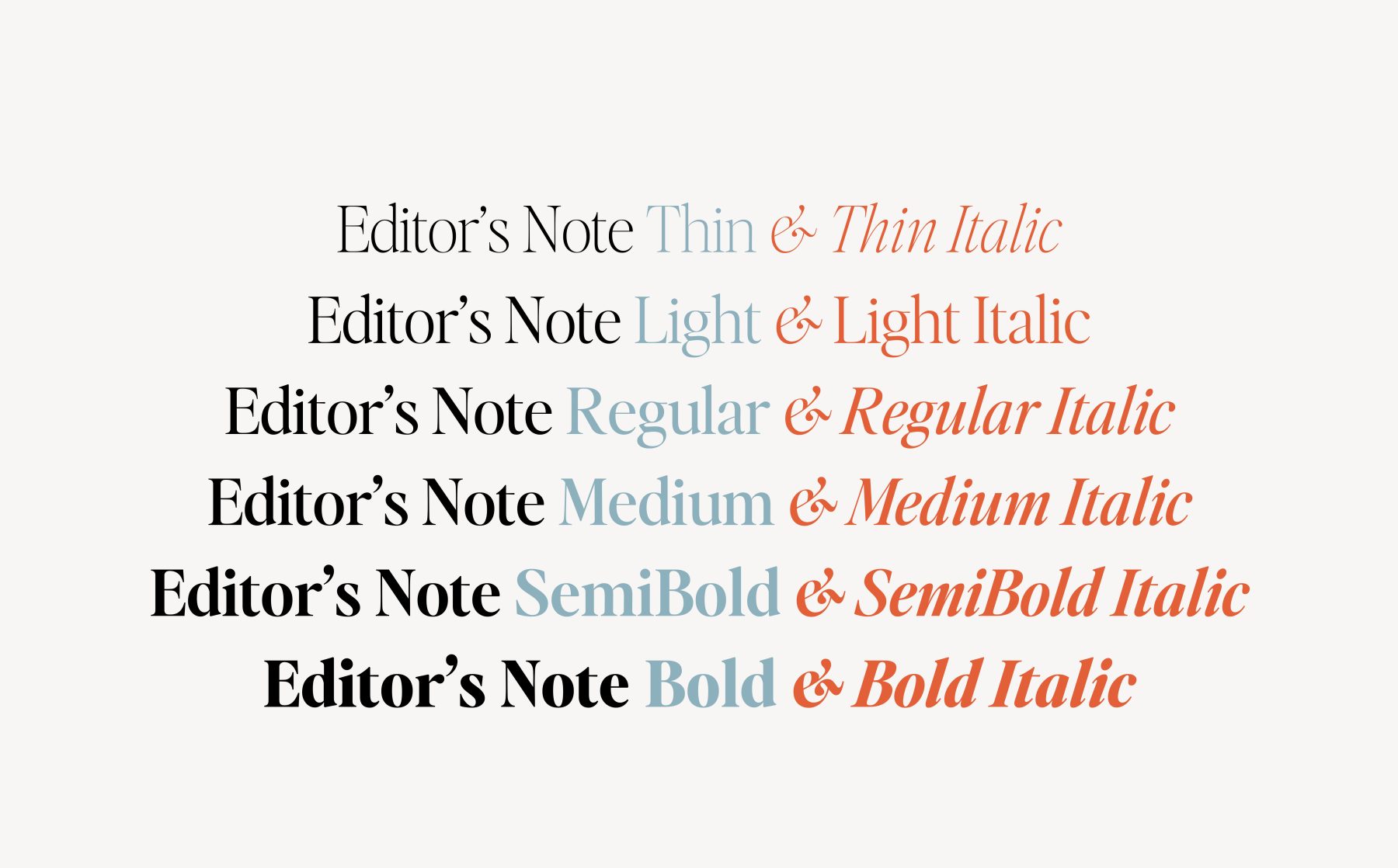
Font describes the width and weight of those letters, which could vary from thick and bold to lightweight and italicized.
For example, Calibri is a common typeface. But you’ll notice it comes in multiple fonts such as Calibri Italic, Calibri Bold, Calibri Semi-Bold, etc. This is how typeface and font are distinct from each other but work hand in hand.
Ascenders vs. Descenders
It’s also important to think about the highest and lowest points of your text. Most of your text will run along what’s known as the baseline, but parts of the letters could extend above or below this. A lowercase h or b, or even the dotted tip of a lowercase i or j, could go above the baseline. These high points are known as ascenders.
In contrast, you have lowercase letters like g or p, with their parts that hang below the baseline, referred to as descenders.
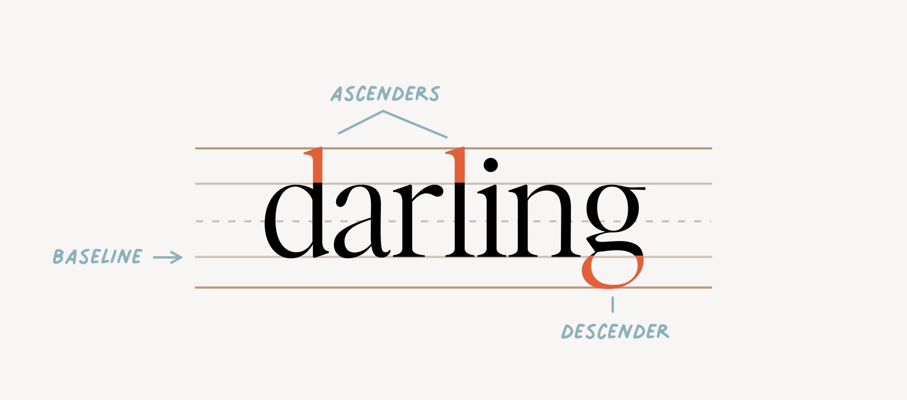
Your ascenders and descenders will determine how tall your actual typeface is, as well as how much space you need to have between your lines for optimum readability.
With these elements in mind, let’s take a look at the various types of fonts.
Types of Fonts
Serif Fonts
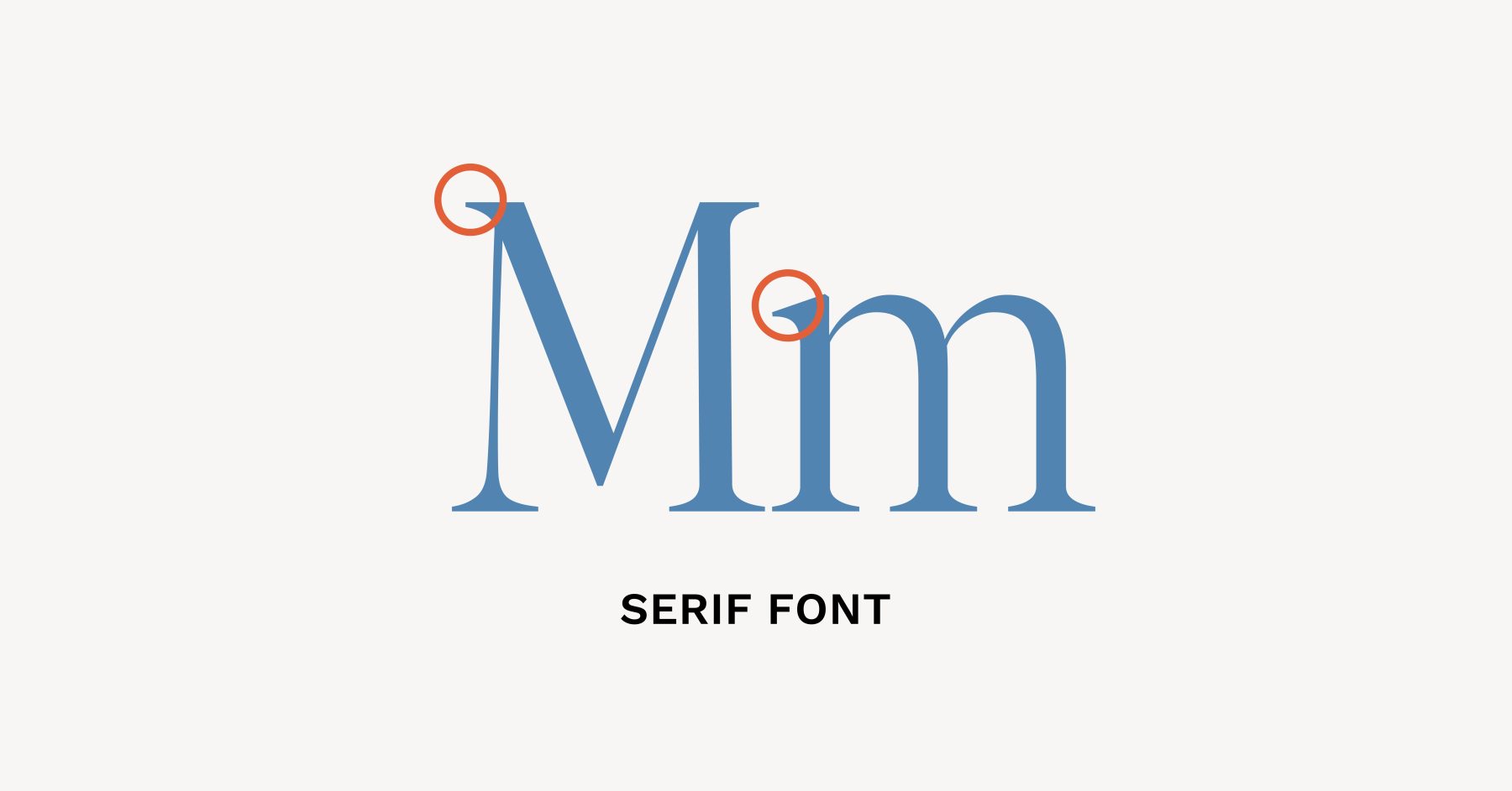
Serif fonts have little end parts that extend off the strokes of letters. These fonts tend to reflect a more classic aesthetic, and they’re easier to read when printed out on the page. Hence, many books will use serif fonts.
San Serif Fonts
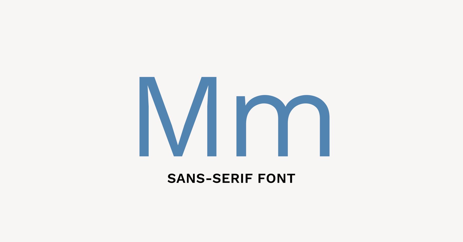
Sans-serif fonts do not have the end parts that extend off their strokes. This gives them a cleaner, simpler appearance which is why sans-serif fonts tend to be more legible in places such as signs or screens. Sans-serif fonts are often preferred by brands for marketing purposes and website body copy due to their streamlined readability.
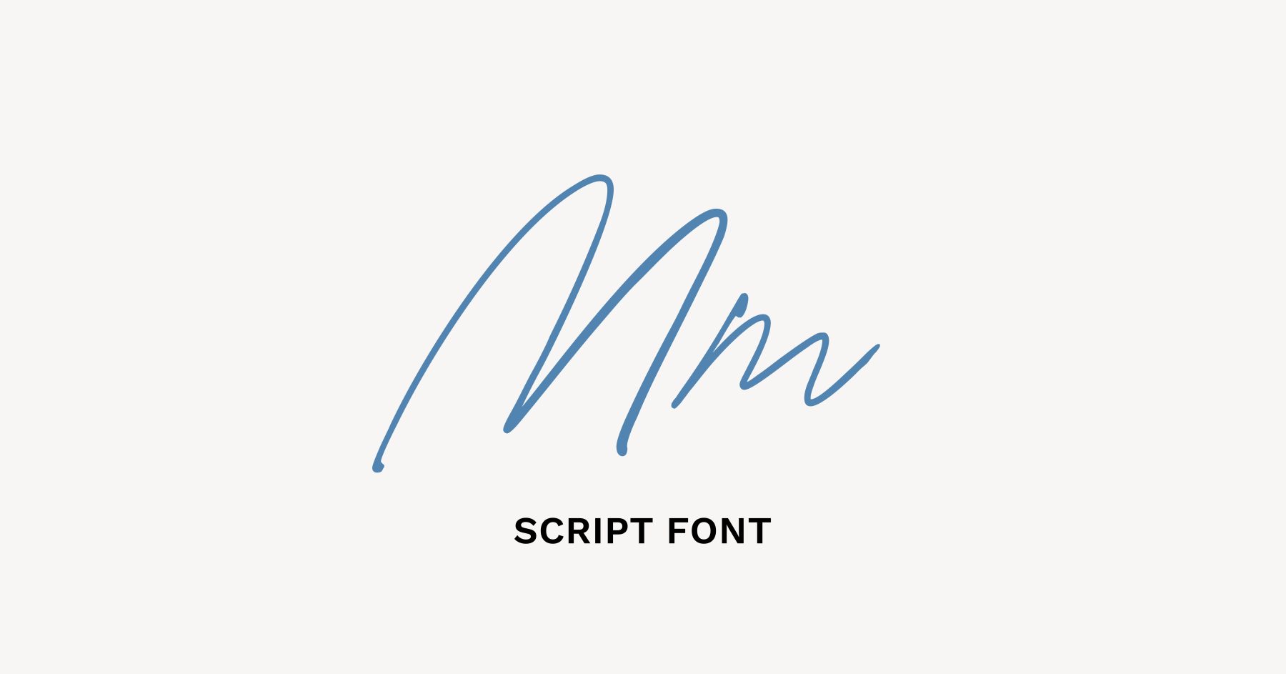
Script Fonts
Script fonts are the icing on the cake–a font that appears to be handwritten and adds a personal touch. Script fonts are usually incorporated sparingly for the accent text. To see some of our favorite script fonts, click this: The Best Script Fonts for Websites.
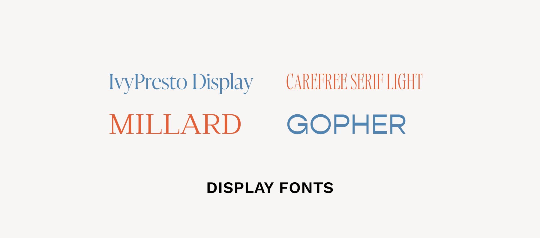
Display Fonts
Display fonts are used for your bold text, like headlines or titles. These fonts stand out and are often used to anchor the eye. Examples include: Milton, Stalinist, League Gothic and Sigmar.
Now that you understand these four categories of fonts, let’s discuss how to finetune text spacing for readability.
Fine Tuning the Spacing of Text
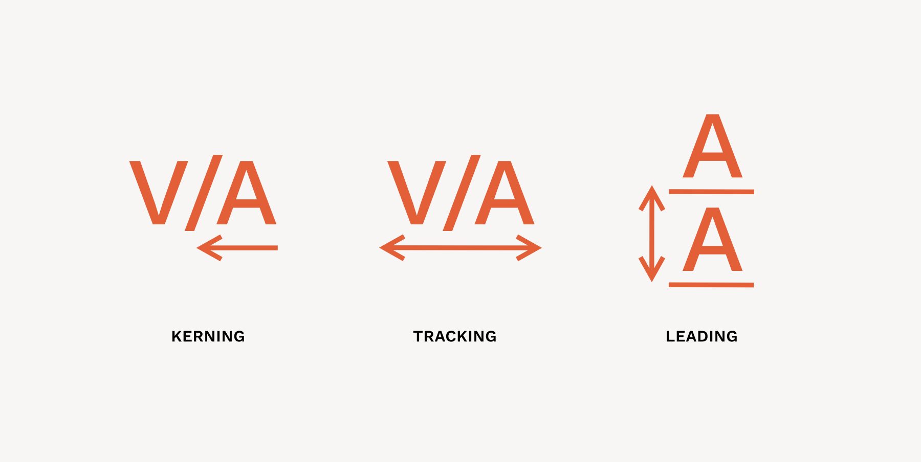
Kerning: Kerning refers to changing the space between individual letters to create a more appealing visual flow.
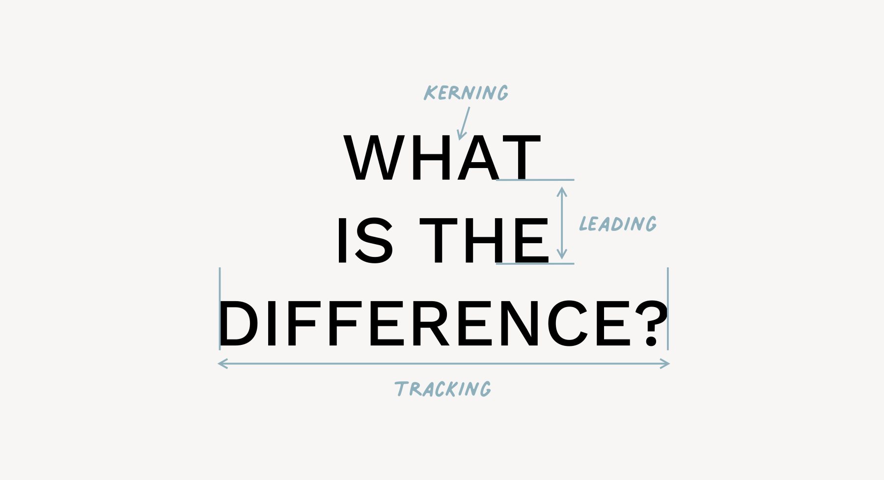
Tracking: Tracking is the process of adjusting horizontal letter spacing to create a tighter composition or more open composition.
Leading: Leading is the change of the vertical space between full lines of text.
Things to Consider When Choosing Fonts
Readability and Legibility
Probably the most important aspect of your font is readability. You want a font that people can sweep their eyes across and process the words without a lot of stopping and struggling. Size, space, and weight will all play a role in this readability factor because some fonts might be easy to read at a regular weight with average space between the letters, but as soon as you give them a heavier weight and try to squeeze them together, they become muddied.
Related: Avoid Orphans and Widows in Typography
Brand Identity and Tone
After you consider the readability factor, the next thing you’ll focus on is the personality a font conveys. Now’s your chance to think about the personality you would ascribe to your brand, and which typefaces might be a good option for conveying this.
Hierarchy and Contrast
Hierarchy refers to how all of the typography elements are laid out on the page, in order of most prominent to least prominent. Hierarchy adds organization and makes content easier to navigate and digest. Usually, hierarchy follows an order similar to Heading 1, Heading 2, Heading 3, and then Body Text.
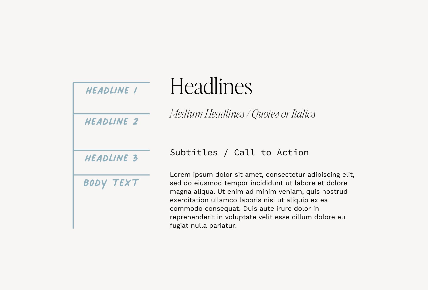
Contrast refers to the visual differences between text–size, color, weight, etc. Font pairing is all about contrast and hierarchy.
The goals of hierarchy and contrast are to ensure everything looks cohesive and professional to the eye.
One simple rule to ensure typography cohesion is to stick to only two or three fonts, with one of them being serif and the other one being sans-serif. Your third font could be something like a script font. If you’d like to learn more about font pairings read: The Ultimate Guide to Choosing Fonts for Your Website
Compatibility Across Devices and Browsers
Make sure the typeface you choose works well across various devices and browsers. This is becoming increasingly less of an issue as more browsers become capable of displaying all fonts, but it’s still something you may want to keep in mind as you design your website. Using Google fonts is a safe bet, as they work on a variety of devices and load quickly.
Related: The Best Free Google Fonts for 2024
Conclusion
Typography sets the tone and provides an opportunity to build trust. It paints a visual picture of who you are and what you provide, in other words, it influences your brand perception. Your message is about so much more than just the words you choose—it’s how those words are presented.
If after reading this post you’ve realized your presentation could use a professional eye, we’d love to help you. We provide both custom branding services and semi-custom branding services. Typography is our forte and we’ll meet you right where you are at.
Oh, and if you’re not already, you’ll want to be on our mailing list for helpful resources like this one. We always share designer secrets with our email list first!
VIEW THE COMMENTS
Add A Comment