We recently asked our Facebook and Instagram communities what the biggest holdup is when it comes to finishing their website. Outside of copywriting, the overwhelming majority of people told us that selecting images was holding them up.
This actually isn’t all that surprising: We frequently hear from photographers that we work that it’s hard to curate one’s own images!
So if you’re one of those people who has SO many images that you don’t know where to begin, or even if you don’t have many images but you still don’t know where to begin, this guide is for you!
Over the years, we’ve helped a lot of people narrow down images for their websites and we think the process can be simplified to a few steps.

1. Curate Your Portfolio
If you’ve been in business for a few years, especially if you’re a photographer, it’s likely that you have dozens of galleries.
In reality, you likely only need to highlight a few projects on your site. The rest of your work can go on social media, your blog or be shared in other ways.
Take a look at all of the projects/shoots/weddings you’ve done in the last year or two. Unless you have some really amazing stuff from years ago, it’s likely that your newer stuff is more on brand and more likely to attract your idea client, so start there.
Next, I want you to pick 6 projects per service that you offer.
If you’re a wedding photographer, choose six weddings. If you’re a newborn photographer, choose six newborn sessions. If you shoot both, choose six galleries for each. If you’re a business coach or you don’t need to highlight a portfolio, you can skip this step.
We can use images from other sessions or projects on the site, but these galleries are going to make up your portfolio.
Once you have those projects or galleries selected, you’ll want to narrow down the images within the gallery. Aim for 25-40 images per project to feature.
If you want to watch how Krista narrows down a portfolio, check out this video…
2. Selecting “filler” images
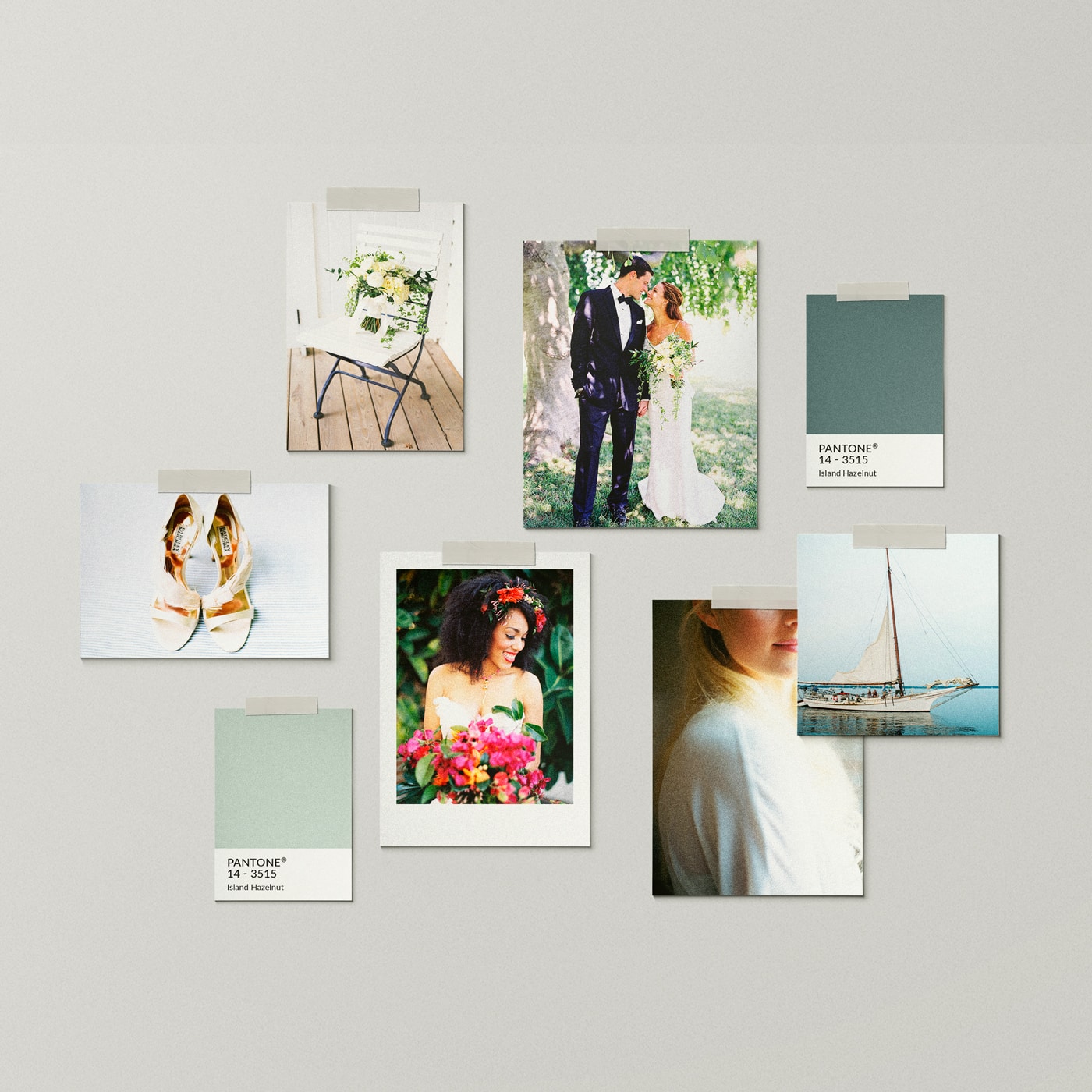
Regardless of the industry you’re in or the website design you choose, you’re also going to need some images to “fill in” the design. These images will appear on the homepage, next to pricing, on the contact page, etc. and help showcase your work or your brand.
If you’re using our St Jean design, outside of galleries (and links to galleries), blog posts and testimonials, only 40 other images are used. And several of those images could also be headshots or brand images.
That’s not bad right?
If you want to break things down even farther:
- Images for the hero spot (the first spot you see on the page): 3
- General filler images (portraits and details generally work best in these spots): 25
- Background type images (landscapes, close ups and details work best here): 5
- Headshots / brand images / photos of yourself (these can repeat between the pages too!): 6 if you want to use unique images for each spot, but that’s not necessary!
So what kinds of images do we typically use on a site? For a wedding professional, this is how things generally break down:
- Portraits: 75%
- Details: 10%
- Landscapes/extreme close ups: 5%
- Brand / headshot images: 10%
So what that means is that outside of your portfolio galleries, you really only need to gather around 100 other images to “fill” in your website. And if you’re not a photographer, those can be brand photos or stock images. Learn more about our favorite stock sources here.
If you watch the video below, you’ll see that Krista only grabs a few images from each gallery here. She leans towards portrait images with neutral backgrounds, close up detail shots and landscapes.
3. Keeping Images Organized
As you gather and download your images, I would put everything together in a parent folder. Within that parent folder, you might have the following structure:
- One with general images you can use throughout the website (the 100 images I mention above)
- One that contains another set of folders that will make up your portfolio. Each project / client will have a folder within this portfolio with the 25-40 images.
- Headshots / images of you
- Brand photos (images of you at work, images of your office, life, etc)
- Any stock photos you need for the site
4. Size Your Images
Once you’ve gathered your images, you’ll want to size them for your website. Improperly sized images are one of the biggest mistakes we see people make on a site. Not only will images that are too large load slowly and thus cause a bad experience for visiting sites, those large files make your site physically larger – which can hurt you when it comes to search engine rankings and website performance.
5. Placing Your Images on the Site
If you watch the video above where Krista teaches how she gathers 100 images to fill her website, you’ll see which images she actually uses on the site and why she makes those choices.
Often times, she’s choosing images based on colors, varying shots, and the “busyness” of an image.
She varies images so that portraits where the subjects are closer are paired with others where the subjects are further away (and images with busier backgrounds next to images with very clean backgrounds, etc.). She also pays attention to the colors within the images.
Once you have images placed on your site, what’s next? Copywriting. We know that can be another huge hurdle, but between the starter copy on our websites (that you’re welcome to use) and these copywriting resources, hopefully it doesn’t feel like too much of a hurdle.
- Crafting Copy with Soul
- Discovering Your Brand’s Voice
- Writing Sales Pages that Sell
- About Page Do’s and Don’ts

VIEW THE COMMENTS
Add A Comment