Customizing your homepage? Here’s how to steer clear of common design mistakes.
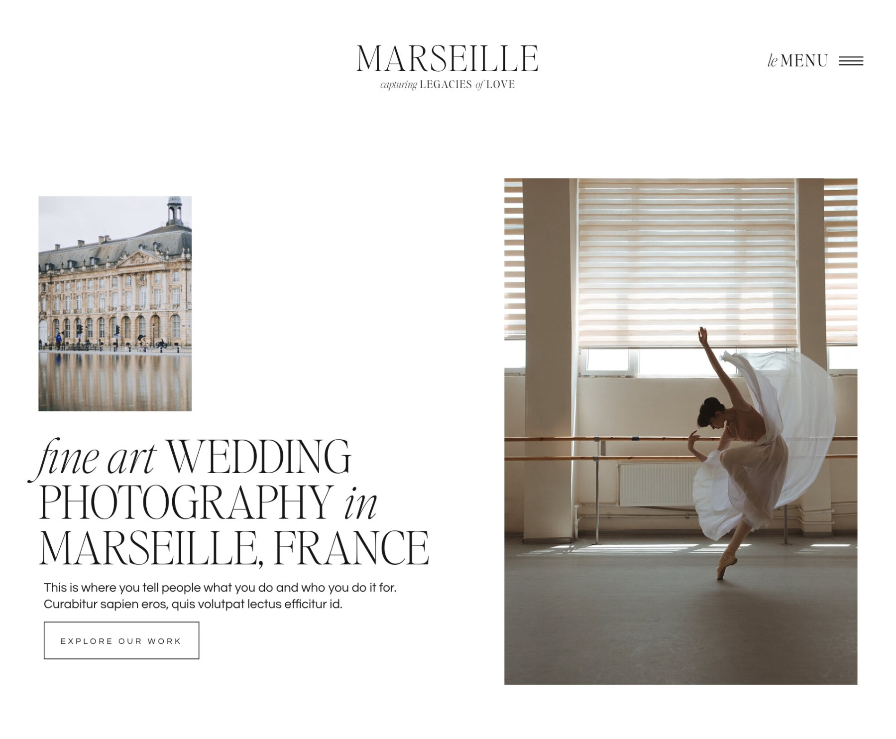
Your homepage is your first impression. Let’s make it unforgettable.
Whether you’re a designer, business owner, or content creator, a well-designed homepage is key to standing out and compelling potential clients to take action. It’s your Anthropologie storefront window, your book cover, your little teal box with a white ribbon. But so many homepages fail to capture the hearts of their visitors.

After countless website reviews, we’ve noticed 10 common mistakes that people make on their website’s homepage.
In this blog post, we will show you how to navigate these mistakes and ensure your homepage is persuasive and effective in actually doing what you want it to do (drive sales, conversions, etc!)
Table of Contents
10 Mistakes to Avoid When Designing Your Homepage
1. You lack a clear value proposition.
The Problem: If a homepage is organized and visually appealing but doesn’t communicate the value you offer, you won’t convert clients.
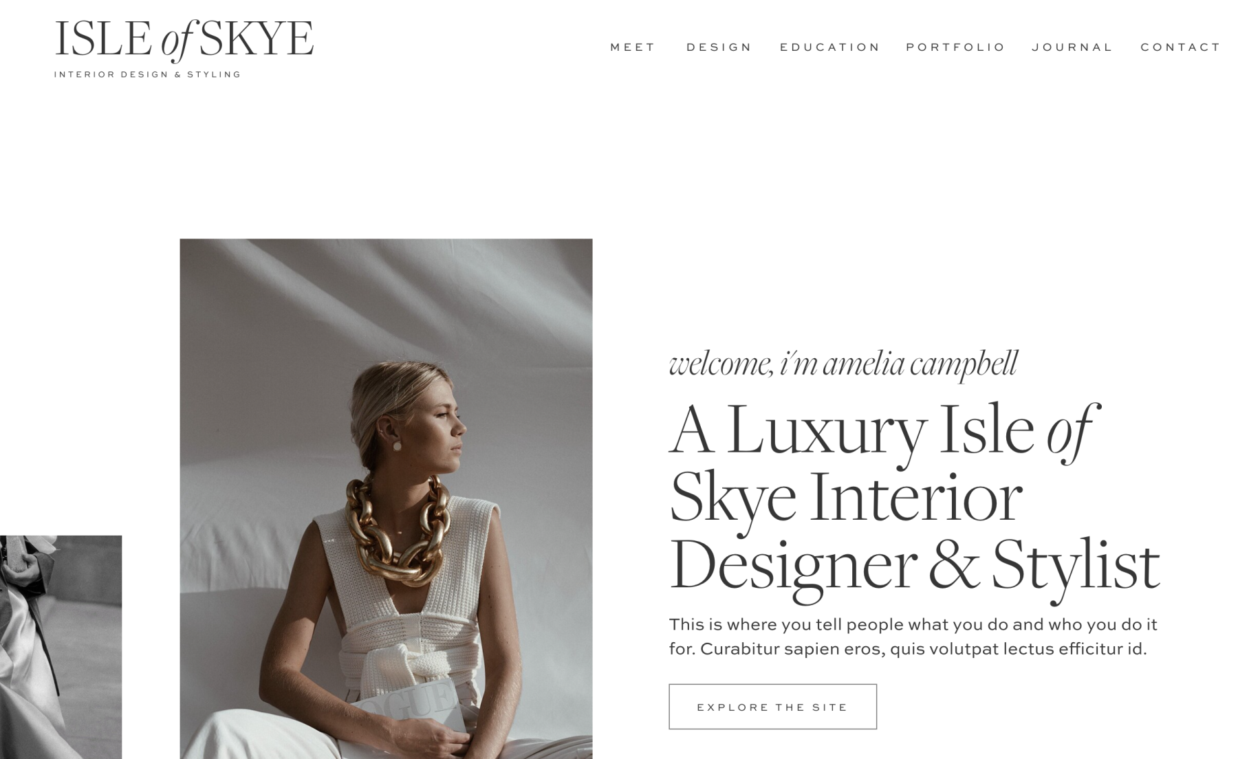
The fix: Your homepage should state clearly and concisely what your product or service provides, and why you are unique from competitors. Within a few moments of landing on your homepage, potential customers need to know what you do and who you serve.
You want to convey:
“I understand your problem.”
“This is how I can resolve your problem.”
“Here is why you can trust me.”
If you’re a wedding photographer based in the St. Louis area, this should be clearly stated at the top of your homepage. Not only will this help clients understand who you are and what you do, it tells search engines who you are and what you do. That’s pivotal for ranking.
2. Your content is confusing and indirect.
The Problem: Many homepages are beautifully designed but fail to convert clients because the content is disorganized.
The fix: Organization is key. Break up long paragraphs of text to keep your content engaging, keep headlines short and large. Remember to speak in a concise, direct tone.
Text is generally easiest to read when it’s aligned left and in a set in a regular case (skip all caps!) This is how text should be formatted in most instances on your homepage. The exceptions are elements like headings and subtitles, and when you’re including short descriptions under those headings and subtitles.
Choose fonts that people can sweep their eyes across, processing words without pausing and struggling. Size, space, color, and weight will all play a role in making sure your font is easily readable.
If you’re going to use a script on your site, keep it to one or two words. Long bits of text set in script are difficult to read. We generally only use scripts as accents for text that is decorative.
3. Your layout is challenging to navigate.
The Problem: homepages that do not have clearly labeled buttons or try to be too witty will frustrate potential clients.
The fix: Make sure everything “above the fold” is intuitive. Your homepage needs clear navigation to enhance user experience, including headlines that don’t beat around the bush.
Clearly labeled content will also help search engines navigate your content and rank your homepage for primary keywords.
You will also want to format your homepage so it reads like a story, step-by-step.
Start with a clear heading announcing what you do and who you serve. Then show your client how you can relate to their needs, and how you’re the very best person to resolve said needs. Follow this with client testimonials reinforcing your credibility. Then share a clear outline of your process or offerings (this may be a perfect time to include a video or table). Next, add in more testimonials and make sure that you’re capturing the email addresses of your visitors with a lead magnet.
4. You aren’t optimizing your page speed.
The Problem: homepages are your golden introduction. But if “Hello, it’s nice to meet you” isn’t said within the first few seconds, your visitor will walk away. Many homepages load too slowly and fail to capture the viewer’s attention.
The fix: Use Showit as your website platform and host. Their sites load quickly and do a lot of the complicated optimization work for you. We offer Showit templates HERE and you can save on a Showit account with this link.
If you’re running a more traditional WordPress site (a site that doesn’t use Showit, keep everything on the backend of your website minimal and running efficiently with a program like WP Rocket. Investing in a good host is also key. You do every optimization trick in the book but if your host is bad, your site is going to be slow. That’s actually why we added hosting for Elementor sites to our offerings.
We walk you through how to do this in other blog posts. So if you’re interested in speeding up your website check out the following:
5. You haven’t incorporated examples of your work throughout.
The Problem: Many homepages are too text-heavy, lacking visuals that convey your brand.
The fix: Take advantage of the opportunity to show off your brand, and product or service. Pictures are engaging and can often convey a message far more quickly than a paragraph of text.
A beautiful background video in the hero spot of your homepage can elevate your website to a luxury level. Adding movement to your homepage will also make your content more engaging. If you want to learn more about how to do this, read: 7 Cool Things You Can Do on Your Website
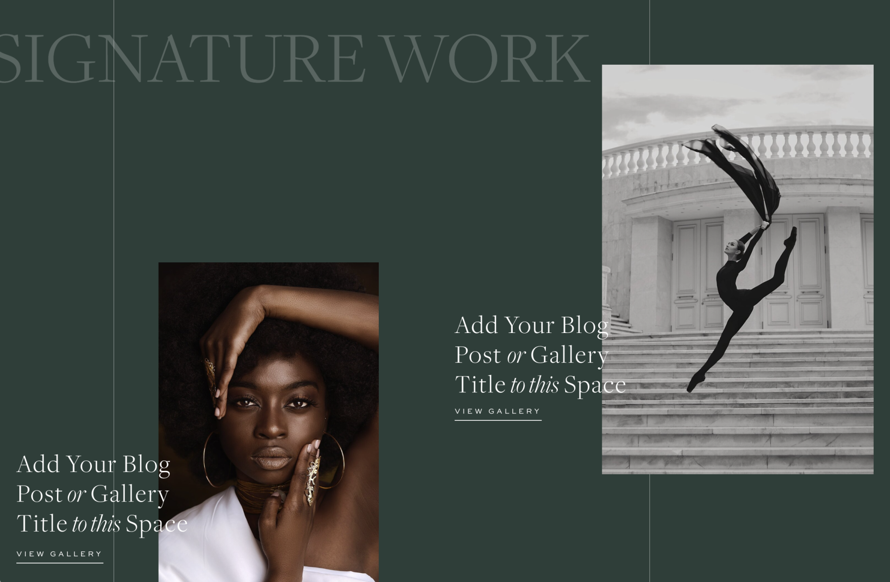
Have you recently had a brand photoshoot? Perfect! This is your opportunity to weave beautiful brand photos throughout your homepage in both the foreground and background.
If you haven’t had a brand photoshoot yet, don’t worry. We pulled together 15 stock photo sites that you can use to curate images that align with your brand.
6. You are being too professional.
The Problem: Many creatives forget to be genuine on their homepage. They put up a front of professionalism that turns out to just be a wall preventing them from real connection with potential clients.
The fix: Keep in mind the goal of personal connection. While your homepage is not the place to tell your deepest, darkest secrets, you do want to convey that you are a relatable person who will come alongside and meet your client’s needs.
The closer you work with your clients, the more important it is that they can visualize you (and your team). Even if you don’t work closely with your clients, we can’t think of a situation where making your homepage more personable is a bad thing.
Include a professional headshot, brand photos, and (if applicable) pictures of your workspace. Make sure your photographer and/or stylist understands your brand before the shoot and takes images that fit with your overall aesthetic.
Don’t forget to share your location on your homepage as well, especially if you mainly work locally.
If your brand is warm and friendly, feel free to incorporate that personality into your website copy. The tone of all text throughout your website, but especially on your homepage, should reflect your brand.
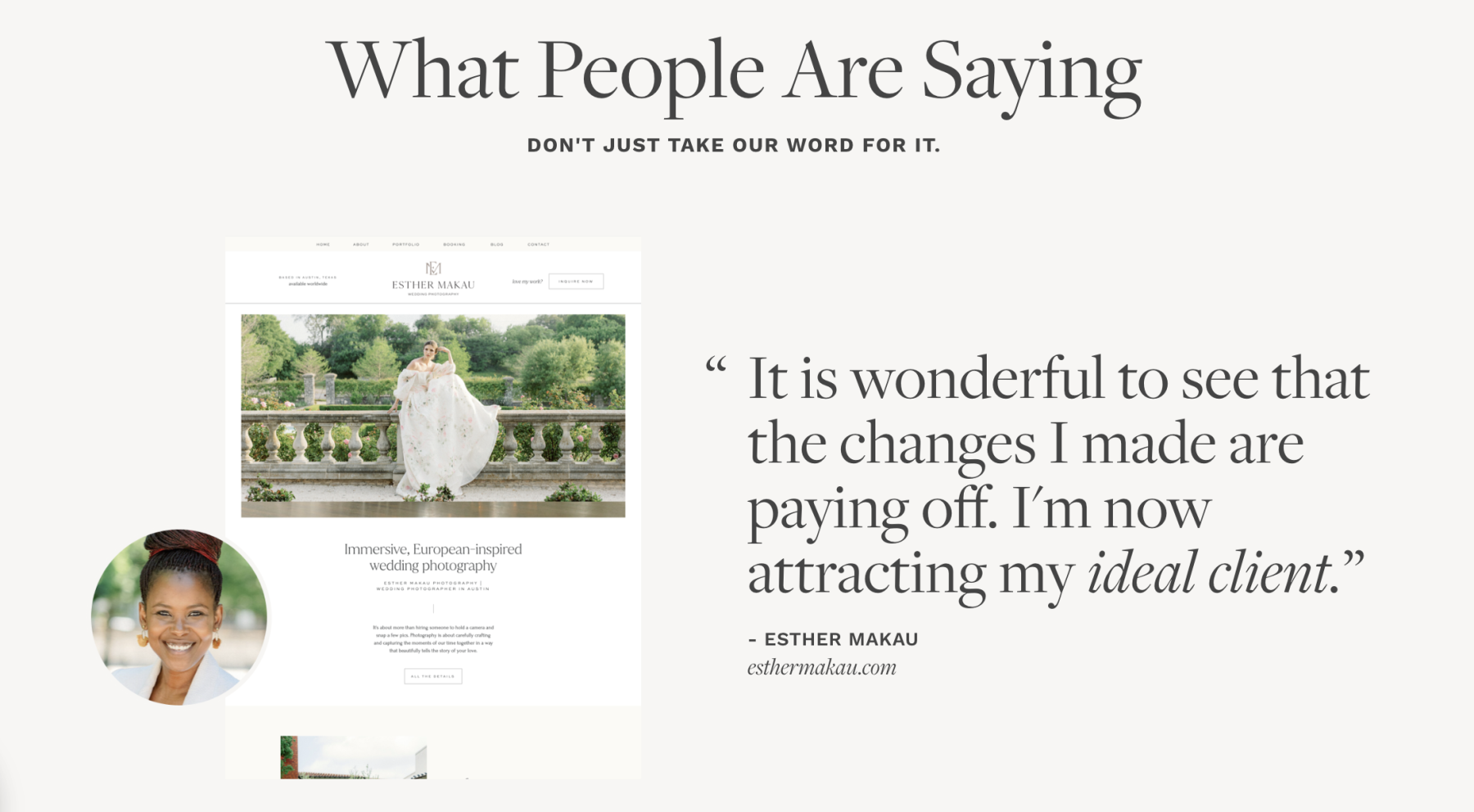
7. You put all of your testimonials on a separate page.
The Problem: So you don’t have testimonials on your homepage?? Why can we suddenly hear Professor McGonigal shouting “10 points from Gryffindor!” Every homepage needs testimonials to add credibility.
The fix: Weave social proof throughout your homepage.
Reading reviews is a part of the purchasing process for many people. And when reviews are missing, it leads people to wonder whether it’s a tried-and-true product or service.
Think about the last time you bought something from Amazon. You probably looked at the reviews—even if the product was cheap. Now imagine you were buying something that was thousands of dollars. The reviews are going to count for something.
Ask (happy) past clients for testimonials you can use on your homepage. If you’re just getting started, consider doing a few free projects in exchange for a testimonial and some feedback. Click here to read: Our 3 Tips for Getting Good Reviews.
8. You forgot that it’s about the client you’re serving, not you.
The Problem: Many homepages start strong and then drift into sharing information that is irrelevant to potential clients.
The fix: Focus your homepage around the transformation that you offer your clients. You’re there to help them along the way. Talk about their problem. Meet them where they are at. Remind them that you’ve walked in their shoes.
As you write your homepage copy, continually ask yourself, “How does this serve my client?”
We expand on this in our blog post about designing your About Page, and you can read it here: The About Page: Do This, Not That
9. Your homepage looks fire on a laptop, but it’s trash on mobile.
The Problem: Laziness. There’s no other way around it. A homepage that isn’t optimized for mobile is a job half-done.
The fix: Take time to optimize your homepage for mobile. For many creatives, the majority of our traffic comes on mobile devices.
We recommend people start with their mobile design, and then build their desktop versions. This ensures that the mobile version isn’t an afterthought.
At the very least, the mobile version of your website should go through the same amount of testing as a desktop version.
Treat your mobile design as a separate homepage because it has a different set of limitations. Sometimes the design elements (such as background videos) don’t work as well, so replace those sections with a different element that conveys the same idea.
10. You haven’t added a Lead Magnet to your homepage.
The Problem: Some homepages are practically perfect in every way (Mary Poppins, is that you?) but they lack one thing: a Lead Magnet.
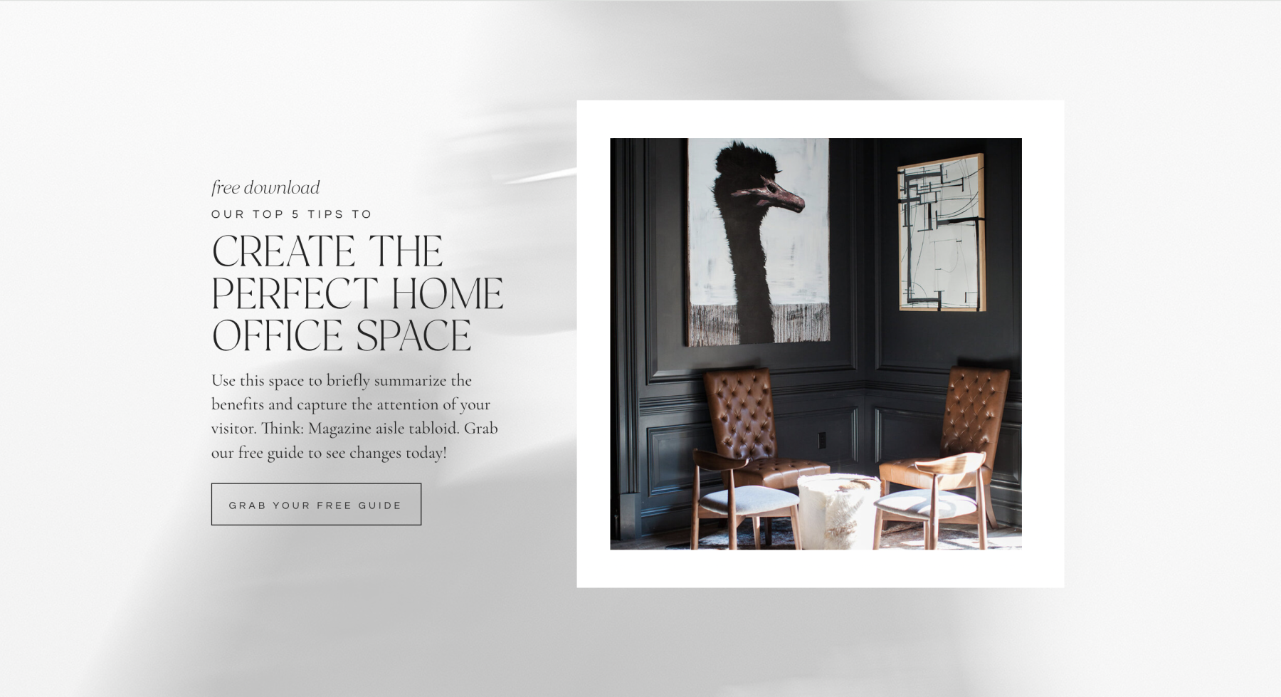
The fix: Take advantage of the opportunity to add clients to your email list by adding a freebie, also known as a Lead Magnet, to the homepage.
Wondering why growing your email list via a Lead Magnet is important?
Unlike social media, you “own the email list.” If you decide to move from one email marketing platform to another, you can take your list with you. This allows you to build a thriving clientele regardless of the fluctuation of social media.
Email provides direct communication, which makes it efficient.
Additionally, building your email list enables you to put offers directly in front of individuals who have already expressed interest in what you’re doing.
If you’d like to learn more about how to create and deliver a Lead Magnet, we’ll show you here: How to Create and Deliver a Lead Magnet PDF (Freebie)
Conclusion:
They say first impressions are everything. In the case of your homepage, we’d have to agree. A well-executed homepage will help you stand out from the competition, resonate with your audience, and leave a lasting impression.
If you avoid the 10 mistakes listed above, you’ll be well on your way to an unforgettable “hello.”



VIEW THE COMMENTS
Add A Comment