I just finished reading Cues, an incredible book by national bestselling author and founder of Science of the People, Vanessa Van Edwards. With millions watching her YouTube resources and TEDx London, I knew her book would be an excellent read. But I underestimated how impactful it would be for our own website and business.

Today’s episode is sponsored by BDOW!, formerly Sumo, the very best intelligent form and pop-up tool for your website. Deliver the right message, to the right visitor, using our advanced targeting rules. Whether you want to display a pop-up to only new visitors, or generate a unique discount code for those who subscribe to your list, you can get the job done using BDOW!
One of my personal favorite features is the Showit tab function. Basically how this works is when visitors close the pop-up, it minimizes to the bottom of the page so that visitors can open it back up if they’d like, but it also remains out of their way while they browse. You can check out how that feature works over at the Davey and Krista website.
When visitors land on our website, they’re not just reading our copy or browsing our work– they’re interpreting a whole universe of nonverbal cues. From our images to our color palette, these silent signals can either invite our audience in or inadvertently push them away.
Like in face-to-face interaction, where about 60% of our communication is nonverbal, our website communicates in much the same way.
This is also true for your website.
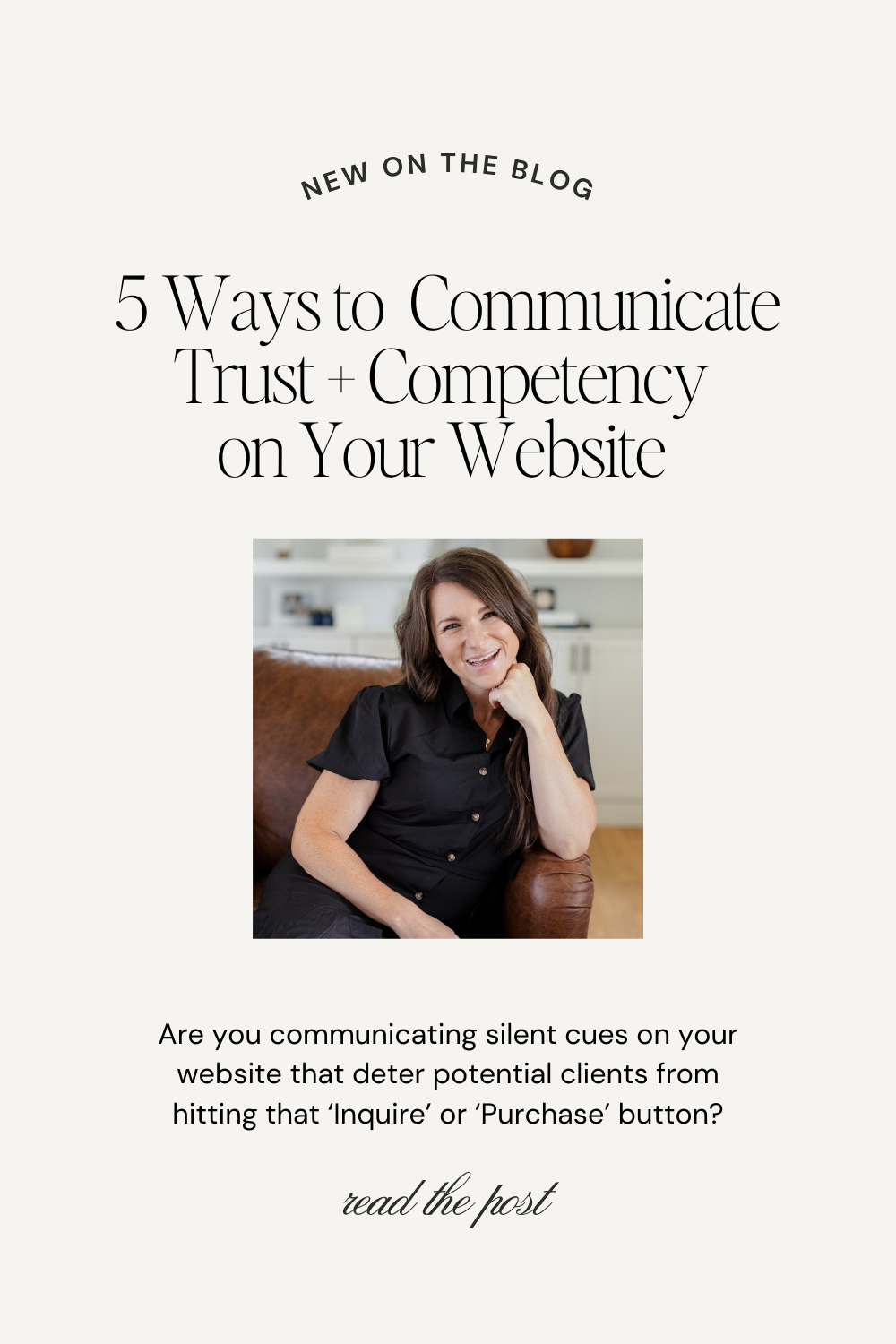
Are you communicating silent cues on your website that deter potential clients from hitting that ‘Inquire’ or ‘Purchase’ button?
Let’s find out!
Cues is a resource for anyone who wants to improve their communication skills, both in person and online. In this blog post, I share five key takeaways from Cues that you can directly apply to your website.
Note: The following is our application of Vanessa Van Edwards’ Cues.
The Power of Nonverbal Communication
The language of your website goes beyond words.
Each element, from your color palette to your headshot, communicates a level of warmth or competence. Your goal is to have a balance between the two.
Balancing warmth and competence transforms your digital space into one that’s engaging but also trustworthy and credible. This is why we put so much emphasis on Creating a Strong + Memorable Brand Identity.
But it is a challenging balance to strike.
Related: How to Elevate Your Brand
As Cues suggests, think of the fine line a doctor walks – too clinical, and they seem cold; too casual, and they lack credibility.
The goal is to cultivate respect and admiration but then to pair it with warmth.
The balance of warmth is essential.
In her book, Vanessa presents research that shows doctors who lack warmth are more likely to face malpractice suits.
It’s easy to assume that exhibiting professionalism and competence is the priority. But without warmth, these interactions tend to push people away, especially online.
This is more true than ever, as we live in an age where AI can fake just about anything.
Case in point:
A Quick Note to Remember
We often think of warmth in terms of smiles and laughter, but it extends into the digital realm through storytelling and engaging visuals.
Likewise, competence isn’t just about facts and figures. It’s reflected in well-researched content and robust case studies.
Like any good recipe, this mixture can be tweaked depending on the context — an About page might be more personable, while a Sales page requires more statistics and social proof.
Related: The About Page, Do This Not That
Adjust as needed as you apply the following to your website. Let’s dive in!
How do we combine warmth and competence throughout our online presence?
Creating the Perfect Combination
Step 1. Pose with Confidence
When was the last time you were drawn to a person with their arms crossed? Body language speaks volumes, and on the web, it’s no different.
Your website’s visuals should radiate openness, motivation, and connection. Remember the significance of open palms in images – a subtle cue for trust, as opposed to a palm-down gesture that may convey dominance.
Even the posture in your profile photos or videos should exude confidence and approachability. And the gaze? It should direct your visitors’ attention, making each image purposefully placed to enhance the storytelling and offering.
Look at this example of our friend, Jenna Kutcher. Notice the nod of her head? The angle of her face directs your attention to the words, “Are you ready to level up?”
Embrace a power posture in your website photos: relaxed shoulders, a stance slightly wider than natural, and loose arms to signal openness.
Strategic angles in photographs can not only make you look more confident but also make your website feel more authoritative.
Avoid leaning back or slouching to keep yourself from communicating incompetence or laziness. Instead, lean forward in your photo to communicate motivation and interest.
This plays a role in your conversion, as people are drawn to confidence.
To balance competence with warmth, keep your posture open to increase conversion. Focus on keeping your arms or laptop from blocking your body. It is also helpful to keep your hands relaxed.
Step 2. Remember to Smile
The smile might just be the cornerstone of warmth in human interaction, so make sure it is on your website. The smile should be real, the type that reaches the eyes, wrinkles and all.
Because a website can’t shake hands, let your smile in photos do the work. A head tilt and open-mouth smile can make your digital presence far more approachable.
These used to be some of my headshots. I loved the soft, fine-art look of the image, and I thought that looking away from the camera made me look sophisticated. In reality, it probably hurt my bookings because I was looking down at my camera instead of confidently at the viewer. Don’t make that mistake. Eye contact is essential for connection, so look at the camera!


Conversely, avoid one-sided mouth raises and smiles that don’t reach the eyes, as these can signal negative emotions. Looking at the photos above, do they communicate warmth and excitement?
Not as much as they could.
Evaluate your website photos and look for ways to incorporate eye contact, head tilts, and bright, open-mouth smiles. The goal is to communicate warmth and connection, especially in your profile photo.
Step 3. Add Warmth Through Your Copy
We can’t talk about communication without discussing the words on your website. What does your copy communicate? Does it strike the right balance between warmth and competence?
We’ve compiled a number of resources to help you write impactful copy on your website:
- The Importance of Copy That Sells
- 11 Ways to Make Your Copy More Persuasive
- How to Write High Converting Web Copy
- Why Bad Grammar is Costing You Business
If you’re looking for more hands-on support for your website copy, you may want to consider our favorite copywriters.
Based on Cues, here are a few easy ways to help your copy resonate.
Back up your statements with data, research, or case studies. This will be especially helpful for your home page and for long form sales pages where you want credibility emphasized.
You will also want to weave social proof throughout your website. Here are a few easy ways to do this: 5 Ways to Incorporate Social Proof.
As you communicate competence, add warmth throughout. A few ways to make your copy feel more inviting is to add emojis and gifs where relevant. Make sure to do this tastefully and stay true to your brand. Incorporate stories and jokes throughout your copy to build connection.
Your language should be rich with words that evoke connectivity and collaboration.
Focus on meeting your audience’s emotional and rational sides.
Step 4. Finetune Your Fonts
Typography can also influence feelings and perceptions. As you consider what your website communicates, make sure to evaluate your fonts as well.
Some fonts like Cormorant, Editor’s Note, EB Garamond, Montserrat, and Lato provide a professional tone.
While script-style typefaces like Noto Serif, Antonio, Playfair Display, Kenfolg, and Pretty Pen tend to be more playful.
In order to evaluate what your font is communicating, you may find these resources helpful:
- A Beginner’s Guide to Website Typography
- How to Choose + License Typefaces with Jen Wagner
- The Best Free Google Fonts That We Love
Step 5. Correct Your Colors
Color is one of the most important elements of design. Different colors evoke different emotions and feelings. Blue is associated with feelings of peace, calm and productivity. Yellow and orange are joyful and exciting. Green feels fresh and organic. Red helps you stand out.
Related: How to Choose the Perfect Colors for Your Brand
While I don’t think that you need to look into the psychology behind every color you choose for your website and brand, I do think it’s important to pay attention to the overall feelings your color palette exhibits. Even the opacity of a color will determine how energizing and calm it appears.
If you want to learn more about color palettes and which colors are trending in the new year, read this: 17 Trending Color Palettes for Websites in 2025.
Think about your target audience and which color palette would encourage them to trust you and compel them to learn more.
Wrap Up
Your website is a canvas where nonverbal cues can either create a connection or create a divide. By mastering the art of balancing warmth and competence through posture, visuals, copy, font, and color, you create a website that resonates.
As you refresh your website, ask yourself, “How will this page make my client feel? What does it communicate? Do I need to add more warmth or more competence?”
I hope these five steps help you apply Vanessa van Edwards’ Cues to your website. If you want to dive deeper into the art of communication, I highly recommend you read her book.
Communicating well is essential to client conversion.


VIEW THE COMMENTS
Add A Comment